How to Set A Proper Logo Design Placement

Source: John John Dias, Atypical, Behance, https://www.behance.net/gallery/183317885/Atypical
Logo design placement is a crucial aspect of brand strategy that influences how consumers perceive a brand. A logo’s position on various platforms—from digital media to physical products—can significantly impact its effectiveness and the overall brand recognition. This makes the strategic placement of the logo an essential step in both design and marketing efforts.
A well-placed logo ensures that it is the first thing a viewer’s eye is drawn to, establishing a strong brand presence. It also needs to be consistent across all forms of media to reinforce brand identity. In this introduction, we will explore the fundamentals of effective logo placement, taking into consideration the importance of visual hierarchy, balance, and consistency that contribute to a memorable brand experience.
Whether you are a new business defining your brand or an existing company looking to refine your visual presentation, understanding the principles of logo design placement will help you make informed decisions that boost your brand’s visibility and connection with your audience.
Understand the Brand's Core Values
Understanding a brand’s core values is fundamental when determining the optimal logo design placement. The placement should embody the brand’s message and resonate with its target audience. A logo is more than a visual mark; it's a symbol of what the company stands for. For instance, a logo placed prominently at the top center of a webpage can suggest leadership and dominance, suitable for a brand priding itself on authority and trust in its sector.
Conversely, a more subtle placement, like the bottom corner of a product, can communicate modesty and meticulousness, appealing to a demographic that values precision and detail. The key is to align the logo placement with the brand's personality—whether it’s bold and adventurous, or calm and reliable. This strategic alignment helps in creating a strong connection between the brand and its customers, enhancing recognition and loyalty. As a designer, it's crucial to immerse oneself in the brand’s ethos and use this understanding to guide the placement of the logo in a way that amplifies the brand’s narrative and values.
Consider the Visual Hierarchy
The concept of visual hierarchy is crucial in logo design placement as it influences how quickly and effectively the logo engages the audience. Placement should be strategized to ensure the logo stands out while harmonizing with other design elements. Typically, the upper left corner is a prime location in Western cultures due to the natural reading pattern, from left to right. This placement ensures that the logo is one of the first elements noticed, establishing brand recall.
In digital environments, such as websites or apps, the logo often doubles as a navigational tool when placed in the header. This not only serves a functional purpose but also reinforces brand presence with each interaction. On physical products, consider how the logo interacts with other visual elements; it should be prominent but not overpowering.
Effective use of space around the logo, known as 'white space,' can further enhance visibility and impact. This approach directs the viewer’s focus towards the logo, making it a central point of visual communication. By thoughtfully considering the visual hierarchy, designers can create a layout that naturally guides the viewer's eye to the logo, cementing the brand’s image in the viewer's mind.
Use the Rule of Thirds
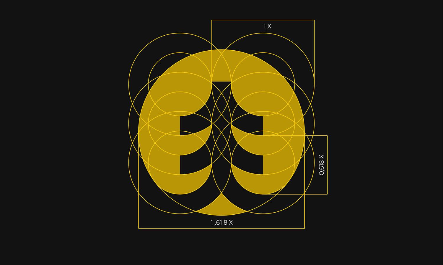
The Rule of Thirds is a powerful design principle that can significantly enhance the effectiveness of logo design placement. By dividing the page or screen into a three-by-three grid, designers can place the logo at one of the intersections of these lines, known as the points of interest. This method is widely regarded as aesthetically pleasing and naturally draws the viewer's attention.
Incorporating the Rule of Thirds in logo placement ensures that the logo is both visually balanced and strategically prominent. For instance, placing a logo at the top left intersection can capitalize on the natural way most people scan a page—from left to right—making the logo immediately noticeable and potentially more memorable. Alternatively, centering the logo at the middle intersection can emphasize the logo, making it the focal point of the layout, which is ideal for branding materials like brochures or cover pages where the logo is central to brand identity.
This technique is not just limited to static media; it also applies to digital interfaces, where strategic logo placement can enhance user experience and brand perception. By using the Rule of Thirds, designers create a harmonious and engaging visual space that enhances the overall composition and effectiveness of the brand's visual representation.

Source: azharfani, Branding Kit for Property Real Estate Company, Dribbble, https://dribbble.com/shots/21667249-Branding-kit-for-property-real-estate-company
Keep It Consistent Across Media
Maintaining consistency in logo design placement across various media is crucial for building a strong, recognizable brand identity. Consistent logo positioning helps in establishing a visual memory in the minds of consumers, which is vital for brand recognition and recall. Whether it's on a website, business card, product packaging, or promotional materials, the logo should appear in the same location to convey a unified brand message.
This consistency extends beyond just the placement of the logo. It includes the size, color, and orientation of the logo to ensure that it remains true to the brand's visual guidelines across all platforms. For digital media, consider how the logo will appear on different devices and screen sizes. Responsive design techniques can be used to maintain the logo’s prominence and visibility regardless of the device being used.
Moreover, when the logo is consistently placed, it reinforces brand authority and professionalism, creating a sense of reliability and trustworthiness among the target audience. It's not just about making the logo fit into various formats; it’s about making it stand out consistently, enhancing the brand’s omnipresence and reinforcing the brand’s identity wherever it appears. This strategic uniformity helps in forging a cohesive branding experience that resonates strongly with consumers.
Factor in Functionality
When placing a logo, it's essential to consider its functionality across different mediums and contexts. The logo's placement should not only enhance the aesthetic value of the design but also serve practical purposes. For example, on a website, the logo often appears in the top left corner, acting as a clickable element that returns users to the homepage. This dual purpose of identity and navigation enhances user experience and brand recognition.
In physical products, the logo’s placement must account for how the product is used and viewed. It should be visible in a way that complements the product's design without interfering with its use. For clothing, a logo might be subtly placed on a tag or as a small emblem on the front, balancing brand visibility with aesthetic appeal.
Additionally, the logo’s placement should consider the operational aspects of media production. For example, in digital formats, ensure the logo’s placement does not affect loading times or interfere with clickable areas, maintaining both aesthetic integrity and functionality.
Ultimately, effective logo design placement requires a thoughtful approach that balances visibility with practicality, ensuring that the logo serves as a functional asset to the brand's overall user experience, thereby enhancing both recognition and operational efficiency.
Respect the Margin and Padding
Respecting the margin and padding around a logo is crucial for clear and effective logo design placement. Adequate space around the logo, often referred to as 'white space', helps to set the logo apart from other elements, making it more striking and easier to recognize. This spacing ensures that the logo isn’t crowded by text, images, or other graphics, which can detract from its impact and readability.
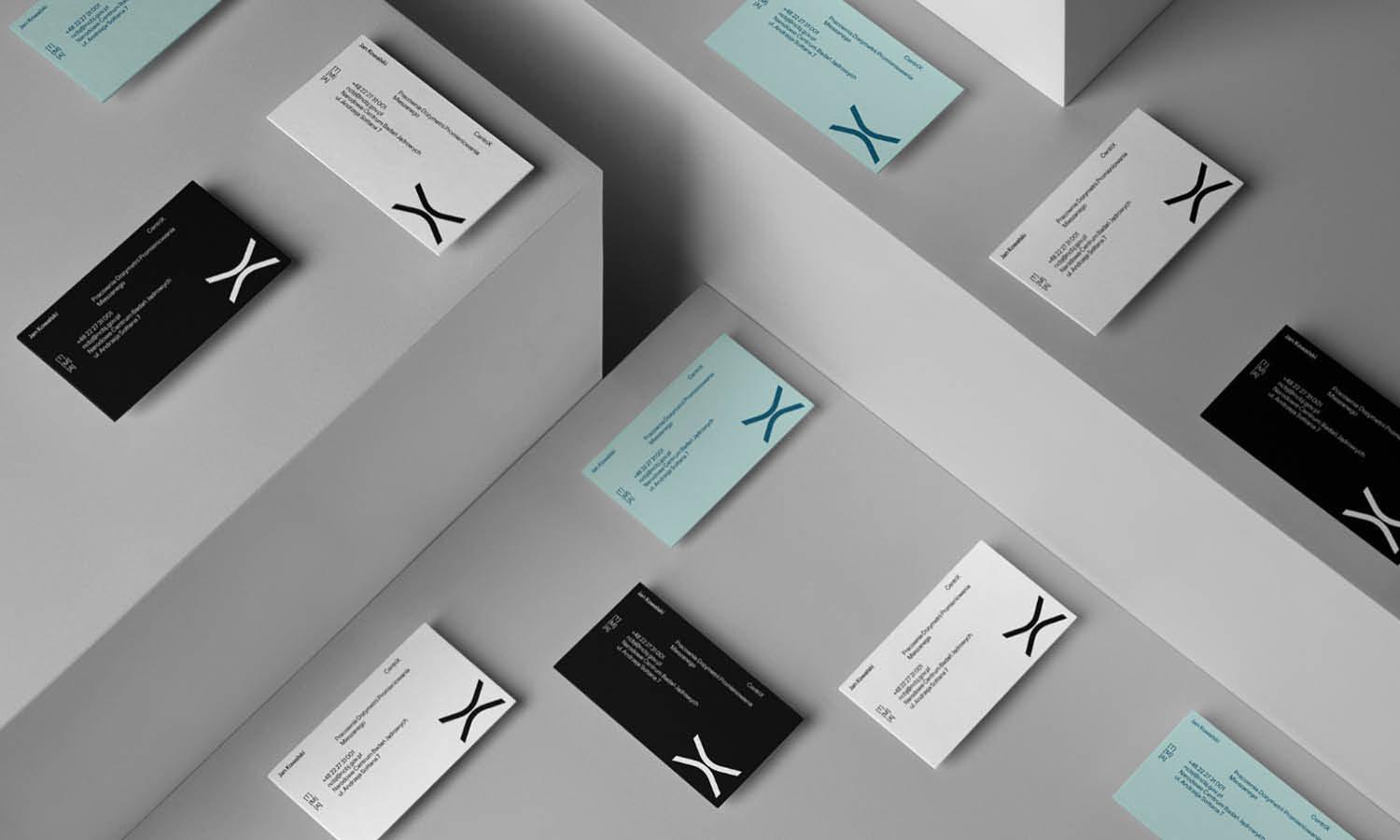
In print media, maintaining consistent margins around the logo helps in establishing a professional appearance. It prevents the logo from blending into other content, which can confuse the viewer and dilute the brand’s presence. On digital platforms, sufficient padding ensures that the logo remains distinct and legible across devices and resolutions.
Moreover, the amount of margin and padding can also communicate certain brand qualities. For instance, more generous spacing around a logo can convey luxury and sophistication, while minimal space might communicate straightforwardness and accessibility.
Carefully considered margins and padding not only enhance the visual effectiveness of the logo but also contribute to the overall balance and harmony of the design. This attention to detail ensures that the logo always looks its best, irrespective of where it is displayed, reinforcing the brand’s identity and ensuring that it stands out in a crowded marketplace.
Adapt to Different Formats and Sizes
Adapting logo design placement to different formats and sizes is essential for maintaining brand consistency across various media. A logo needs to be versatile, able to look equally effective on a large billboard as it does on a small smartphone screen. This requires thoughtful consideration of how the logo is scaled and positioned in different contexts.
For print media such as brochures and flyers, the logo should be placed in a location that is immediately visible upon first glance. This might mean the top corner or the center of the layout, depending on the design. For digital media, consider how the logo appears on different devices; a responsive design can ensure that the logo's placement and size adjust to fit the screen size and orientation.
Additionally, when transitioning a logo to unusual or non-traditional formats, such as promotional items or clothing, the placement must be adapted to the contours and use of the product. For instance, a logo might be centered on a T-shirt but placed at the cuff of a sleeve on a long-sleeved shirt.
Ensuring that your logo is adaptable across all formats not only reinforces brand recognition but also demonstrates a commitment to professional presentation in every aspect of the brand’s visual identity. This flexibility can significantly enhance the perceived value of the brand and its overall market presence.

Source: Numinous Agency, Caraballo CPA, Behance, https://www.behance.net/gallery/182421439/Caraballo-CPA-Branding-Visual-Identity
Test Visibility on Various Devices
Testing logo visibility on various devices is a critical step in effective logo design placement. As digital platforms become increasingly diverse, a logo must maintain its impact and legibility across all potential viewing scenarios. This includes different types, sizes, and resolutions of screens—from large desktop monitors to compact mobile phones.
Begin by examining the logo's visibility on different operating systems and web browsers to ensure consistent display. Adjustments may be necessary to accommodate variations in color rendering, scaling, and layout. For instance, what looks good on a high-resolution desktop screen might not translate well to a smaller, less precise mobile display.
It is also important to consider the logo’s placement in the context of user interface design. For digital applications, the logo should not only be clearly visible but should also enhance the user experience. This might mean positioning it in a standard location, such as the top-left corner of a website, where users expect to find it.
Utilizing tools like responsive web design can help ensure that the logo scales correctly and maintains its intended placement and size no matter the device. Regular testing with real devices in practical scenarios—such as in varying lighting conditions and using different network speeds—can further refine logo placement, ensuring it performs well in real-world conditions. This attention to detail guarantees that the logo effectively represents the brand across every platform, enhancing brand recognition and user engagement.
Use Mockups to Preview Placement
Using mockups to preview logo placement is an invaluable step in the design process. Mockups allow designers to visualize how a logo will appear in various contexts before finalizing its placement. This can include everything from digital screens to physical products and printed materials. By seeing a logo in situ, designers can make informed decisions about its placement to maximize visibility and impact.
For digital projects, software tools can simulate how a logo will look on different devices and within different website layouts. This helps ensure that the logo remains prominent and functional across all platforms, adjusting as necessary for screen size and orientation. For physical products, creating a mockup can involve placing the logo on 3D models of the product to see how it interacts with the product's shape, texture, and color.
Mockups also play a crucial role in client presentations. They provide clients with a tangible visualization of how the logo will look in real-world applications, which can help in securing approval and ensuring client satisfaction. Furthermore, mockups can identify potential issues with logo visibility or legibility, allowing for adjustments before large-scale production or deployment begins. This proactive approach saves time and resources by preventing costly revisions after production.
Maintain Proportional Scaling
Maintaining proportional scaling is critical in logo design placement to ensure that the logo remains legible and visually appealing across all formats. A logo should be designed with scalability in mind, meaning it must maintain its clarity and impact whether it is enlarged for a billboard or reduced for a business card.
This involves careful consideration of the logo’s design elements, such as line thickness, fonts, and overall complexity. Elements that are too detailed can become lost or muddled when scaled down, while overly simple logos may lose their distinctiveness when enlarged. Designers should use vector graphics to create the logo, as these allow for infinite scaling without loss of resolution.
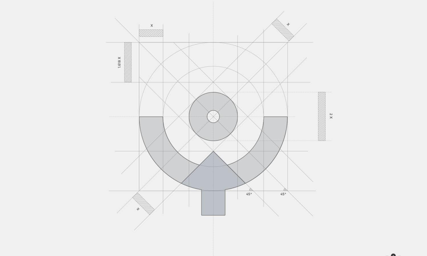
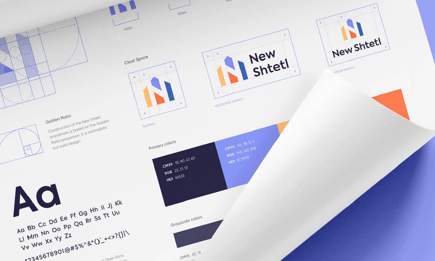
Proportional scaling also extends to the placement of the logo in relation to other design elements. The space around the logo, often referred to as the 'clear zone', should scale proportionally with the logo to maintain visual balance. This ensures that the logo does not become overwhelmed by other elements or appear isolated.
By adhering to these principles, designers can ensure that the logo serves its fundamental purpose of brand recognition and representation, irrespective of size or placement. Effective scaling strategies contribute to a logo’s versatility, making it a powerful asset in a brand’s visual identity toolkit.
Conclusion
Effective logo design placement is essential for maximizing brand impact and recognition. By considering principles such as visual hierarchy, the Rule of Thirds, and consistent scaling across various media, designers can ensure that a logo not only captures attention but also conveys the brand’s message powerfully and consistently. Remember, the strategic placement of a logo enhances user engagement and fosters brand loyalty. Every decision in the placement process should aim to strengthen the connection between the brand and its audience, making logo design placement a critical element in the broader context of brand strategy.
Let Us Know What You Think!
Every information you read here are written and curated by Kreafolk's team, carefully pieced together with our creative community in mind. Did you enjoy our contents? Leave a comment below and share your thoughts. Cheers to more creative articles and inspirations!







Leave a Comment