Reasons Why The Logo Design Are Usually on the Right

Source: Jaroslaw Dziubek, CentriX, Behance, https://www.behance.net/gallery/101687237/CentriX
The placement of a logo is a strategic decision that can significantly impact a brand's visibility and perception. While logos can appear in various positions, a noticeable trend is the placement on the right side. This orientation is not merely a stylistic choice but a calculated approach influenced by cognitive behaviors, cultural norms, and the evolving landscape of digital interfaces. Understanding why logos are often positioned on the right can offer insights into consumer psychology and design effectiveness.
In this discussion, we explore the multifaceted reasons behind this common practice in logo design. From enhancing memorability and balancing visual weight to aligning with cultural interpretations of directionality, the rationale extends beyond aesthetics. The strategic placement of logos on the right caters to both practical navigational habits and the subconscious impact on viewers, ensuring that the first and last points of interaction within a visual journey reinforce brand identity effectively.
Visual Hierarchy and Attention
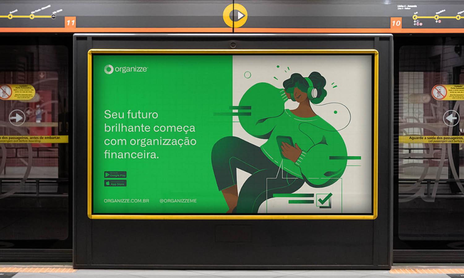
The strategic placement of a logo on the right side plays a crucial role in leveraging visual hierarchy and directing viewer attention in logo design. This positioning taps into the natural reading habits of viewers in Western cultures who typically scan from left to right. By placing the logo on the right, it ensures that the logo is one of the last elements seen, reinforcing brand recall at a crucial moment. This method is particularly effective in digital environments like websites and mobile apps, where users often expect important navigational elements on the right-hand side.
The right placement also benefits from the "terminal area effect," where the eyes naturally rest at the end of a viewing sequence, making the logo more likely to be noticed and remembered. This strategic use of visual hierarchy enhances user engagement and strengthens the overall impact of the brand's visual presentation, making the logo not just a passive brand marker but an active part of the communication strategy.
Balance and Aesthetics
Positioning a logo on the right side of a design can significantly enhance the balance and aesthetics of the overall composition. This choice is particularly effective in designs where text or other content dominates the left side, creating a visually appealing and well-distributed layout. The asymmetry of having the logo on the right introduces a dynamic tension that draws the eye across the entire design, providing a balanced viewing experience that engages the viewer more effectively. Moreover, right-side logo placement can complement modern design principles that favor clean, minimalist layouts with ample white space.
It allows the logo to stand out as a distinct visual entity, free from the clutter of other design elements. This not only enhances the aesthetic value of the design but also reinforces the logo as a key focal point, subtly emphasizing the brand identity and ensuring that it resonates with the viewer. Such strategic placement aligns with contemporary design trends and caters to a sophisticated audience that values elegance and clarity in visual communication.
Memorability
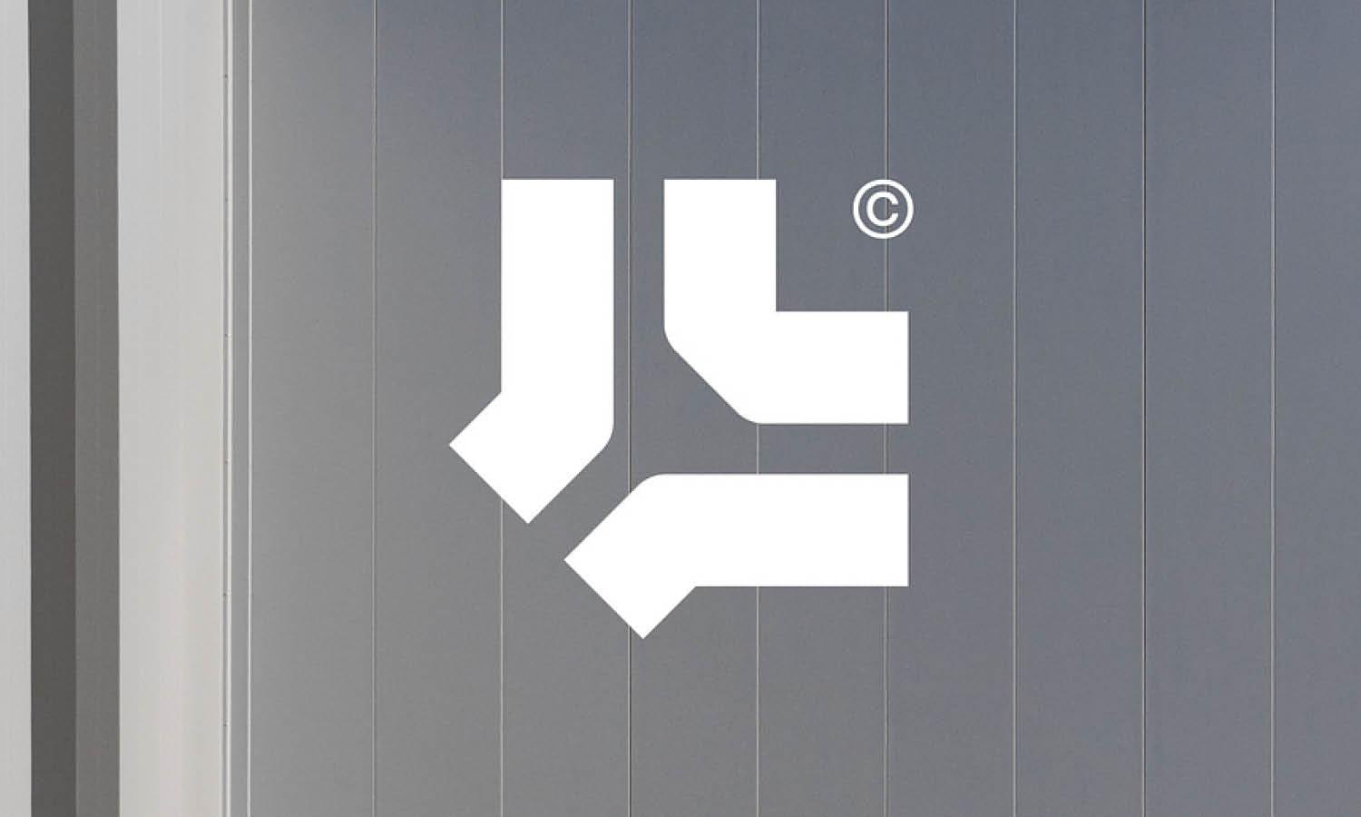
Placing the logo on the right side of a design can significantly enhance its memorability. This strategic placement utilizes the principle of recency, where the last items viewed are more likely to be remembered. In a world where visual content is incessantly bombarding consumers, creating a lasting impression is crucial for brand recognition. Logos positioned on the right often deviate from the more common left-aligned logos, providing a unique visual end point that sticks in the viewer's memory after other elements have been processed. This is particularly important in advertising and digital media, where the goal is to leave a strong, lasting impression that connects the viewer to the brand long after the interaction with the media has ended.
Additionally, right-aligned logos tend to stand out in a competitive market where following the norm is common. By breaking away from convention, right-placed logos can forge a distinct identity, making the brand not just seen but also remembered. This tactic is not merely about being different; it's about creating a strategic advantage in brand positioning that resonates with the audience on a more permanent basis.

Source: Lucas Fields, Otam Logo & Business Card Design, Dribbble, https://dribbble.com/shots/18375746-Otam-Logo-Business-Card-Design
Alignment with User Expectations
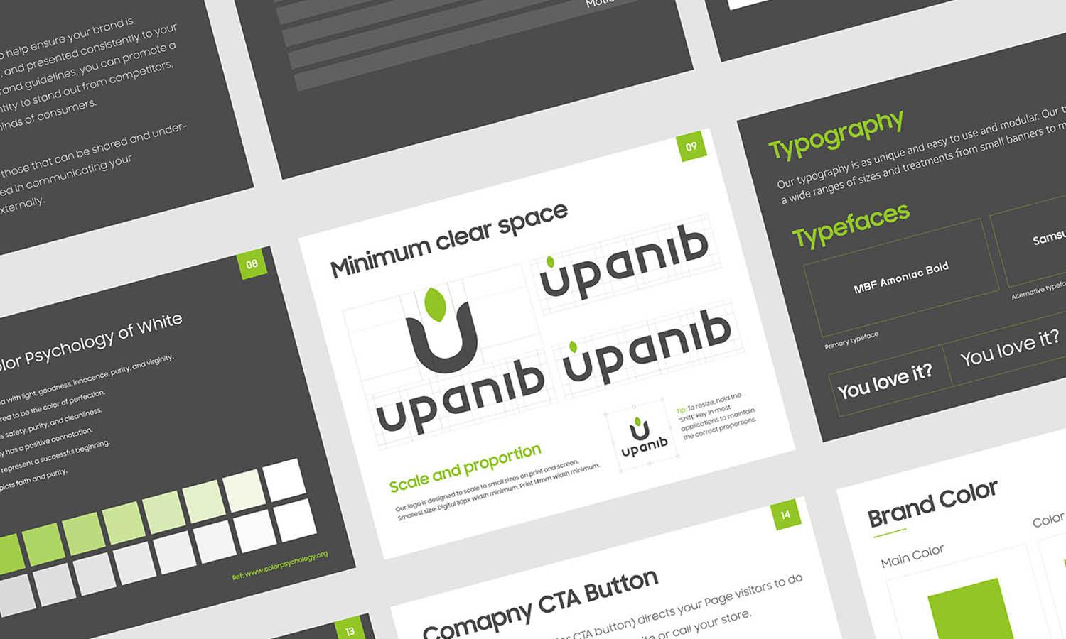
In digital environments, user expectations dictate much of the design strategy, and placing the logo on the right aligns perfectly with these expectations. Users often interact with various digital platforms where key functionalities, like navigation buttons or call-to-action prompts, are typically located on the right side. This alignment extends to logo placement, creating a seamless user experience that feels intuitive and natural. When a logo is positioned on the right, it harmonizes with the layout and navigational patterns of most websites and apps, reducing cognitive load and enhancing user engagement.
This placement also supports the design's overall usability by maintaining consistency with the way users expect interactive elements to be organized. For instance, in mobile applications, the right side of the screen is more accessible for thumb interaction for the majority of users, making right-aligned logos more practical and user-friendly. Aligning the logo with user expectations not only fosters a sense of familiarity and comfort but also reinforces brand reliability and professionalism, key attributes that contribute to a positive user experience and customer loyalty.
Optimal Eye Movement
Understanding the dynamics of eye movement across different media plays a crucial role in effective logo placement. Positioning the logo on the right side can capitalize on the natural eye movement patterns of viewers, especially in cultures where reading from left to right is the norm. When viewers scan a webpage or a printed material, their eyes typically move horizontally across the page, finishing on the right side. This end-point positioning of the logo ensures that it is one of the last elements seen during the initial scanning process, potentially making a more lasting impression. Eye-tracking studies have shown that placing important elements where the gaze naturally settles can enhance visibility and retention.
The right-side placement also benefits from the peripheral vision area, which is highly sensitive to capturing attention before the viewer consciously focuses on the logo. This subtle yet powerful engagement through optimal eye movement helps in reinforcing the brand identity each time a user interacts with the material, enhancing both recognition and recall. By aligning the logo with these natural viewing patterns, designers can create a more intuitive and memorable visual experience that naturally guides the viewer’s attention towards the brand symbol, making the logo not just seen but also effectively registered.
Cultural Influences
The placement of logos on the right side can also reflect deeper cultural influences that affect how a design is perceived and interacted with globally. In many cultures, directional symbolism plays a significant role in the interpretation of visual elements. For instance, in Western cultures, the right side is often associated with forward movement and future orientation, which can imbue a logo with connotations of progress and innovation when placed accordingly. Similarly, in Middle Eastern cultures, where text and thus attention may start from the right due to the right-to-left reading pattern, a right-side logo placement resonates more naturally with local viewing habits, enhancing engagement and acceptance.
This cultural alignment not only ensures that the logo is in harmony with local customs and practices but also enhances the brand’s cultural sensitivity, which can be crucial in global marketing strategies. By considering these cultural nuances, designers can craft a logo’s placement that not only catches the eye but also respects and reinforces local identities and values, fostering a stronger connection between the brand and its diverse audiences. This strategic consideration helps in building a globally resonant brand that values cultural inclusivity and relevance.
Professionalism in Business Settings
In business environments, the strategic placement of a logo on the right side is often associated with a higher level of professionalism. This alignment adheres to the structured layout norms of many corporate documents, presentations, and business cards, where critical information is typically aligned to the left, allowing the logo on the right to stand out without competing for attention. The right-side placement also aligns with the customary finish point of reading, ensuring that the logo is prominently displayed in the viewer's line of sight as they complete their engagement with the material. This subtle positioning can reinforce the brand's presence and authority in formal interactions and communications.
Moreover, in the digital realm, such as in email signatures or web interfaces, a right-aligned logo adheres to common user interface guidelines, promoting a clean and organized look that is crucial for professional correspondence and interaction. By positioning the logo on the right, businesses communicate a deliberate and thoughtful approach to design, implying a meticulous and professional attitude that mirrors their business practices. This not only enhances the aesthetic appeal of business materials but also supports the company's branding strategy by consistently placing the logo in a position that is both visually effective and symbolically powerful.

Source: Wesley Marc Bancroft, Alongside | Business Card, Dribbble, https://dribbble.com/shots/19112861-Alongside-Business-Card
Space Utilization
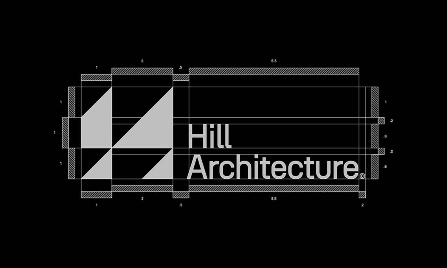
Effective space utilization is a critical consideration in logo design, particularly when dealing with complex visual layouts that include various elements such as text, images, and interactive components. Positioning the logo on the right side can be a strategic choice that maximizes the use of space and contributes to a balanced design. This placement often complements a left-heavy design where important content such as headings, text, and navigation tools are aligned to the left, providing a counterbalance that enhances overall visual harmony. The right-side logo placement can also be advantageous in designs where space is constrained or heavily segmented, allowing the logo to be prominently displayed without cluttering the composition or competing with other elements for attention.
In user interfaces, such as websites or applications, right-aligned logos can help delineate the boundary of content and navigational areas, aiding in user navigation and improving the overall usability of the digital product. Moreover, in advertising, placing the logo on the right can ensure visibility in streamlined designs, where the primary focus is on the message conveyed on the left, with the logo acting as a secondary reinforcement of the brand identity. This strategic use of space not only optimizes the visual impact of the logo but also ensures that it complements the structural and functional aspects of the design, making it both aesthetically pleasing and functionally effective.
Graphical Balance
Achieving graphical balance is essential in logo design, and positioning the logo on the right can play a significant role in maintaining visual equilibrium across a layout. When logos are placed on the right, they often counterbalance other elements on the left, such as text, images, or additional graphics, creating a more aesthetically pleasing and harmonious design. This right-side placement helps distribute the visual weight evenly, preventing the design from feeling lopsided or overly concentrated on one side. Especially in layouts where the left side is text-heavy or contains key navigational elements, positioning the logo on the right can provide a focal point that draws the eye across the entire design, facilitating a smoother visual flow and enhancing viewer engagement.
Furthermore, in multimedia content such as websites or interactive applications, right-aligned logos ensure that they remain visible and prominent even as users interact with various elements of the content. This strategic placement not only supports the functional aspects of design but also reinforces the visual integrity of the brand, ensuring that the logo remains a constant, balancing presence within the viewer’s field of vision.
Psychological Impact
The placement of a logo can significantly influence the psychological impact it has on viewers, and positioning a logo on the right side has specific implications. In cultures where reading from left to right is the norm, the right side of a page or screen is often where the journey of reading or scanning concludes, making it a powerful position for leaving a lasting impression. This placement leverages the psychological principle of recency, where the last thing seen is most likely to be remembered. By positioning the logo on the right, designers can make the brand more memorable and ensure that it remains in the viewer's mind after other content has been absorbed. Additionally, the right side is traditionally associated with actions and forward movement in many cultures, suggesting dynamism and progress.
When viewers see a logo placed on this side, it can subconsciously communicate a sense of innovation and forward-thinking associated with the brand. This strategic use of placement can significantly enhance the perceived value of the brand, influencing customer perceptions and emotional responses in a subtle yet effective way. Such considerations are crucial in creating a brand identity that resonates deeply with the target audience and stands out in a competitive market.
Conclusion
The strategic placement of a logo on the right side is not merely a design preference but a well-considered decision that influences brand perception, memorability, and viewer engagement. From enhancing visual balance and meeting cultural expectations to optimizing eye movement and creating psychological impact, the right-side positioning of a logo plays a crucial role in how a brand communicates its identity. By understanding these factors, designers can craft more effective and impactful branding strategies that resonate with their audience and stand out in the competitive landscape of logo design.
Let Us Know What You Think!
Every information you read here are written and curated by Kreafolk's team, carefully pieced together with our creative community in mind. Did you enjoy our contents? Leave a comment below and share your thoughts. Cheers to more creative articles and inspirations!


Leave a Comment