
The Basics of Grid Systems in Logo Design

Source: Paul Wilson, Hill Architecture, Behance, https://www.behance.net/gallery/146677423/Hill-Architecture
A strong logo often feels simple, balanced, and intentional, even when viewers cannot explain why. Grid systems in logo design help create that order by providing a framework for alignment, proportion, spacing, and shape construction. The grid does not appear in the finished mark. It works behind the scenes, guiding relationships between visual elements. A logo grid may use lines, circles, squares, repeated units, or custom guides to organize forms and spacing. However, it should strengthen the central concept rather than generate one automatically. Learning the basics helps designers use grids with confidence while still relying on visual judgment. The goal is not mathematical perfection, but a clearer, more controlled, and better-balanced logo.
What Is a Grid System in Logo Design?
A logo grid is a structured set of guides used to organize a mark. It can establish alignment, define proportions, control spacing, and connect shapes through shared measurements. Depending on the design, it may be as simple as one central axis or as detailed as a network of circles, squares, and angled lines. The grid is a design aid rather than a rulebook. It helps a designer make consistent decisions, but it does not determine what the logo should communicate.
The Difference Between a Grid and a Template
A template provides a predefined arrangement. A grid is more flexible because it can be built around an original concept and adjusted to fit its form. Two logos may use similar guides while producing completely different results.
Why the Final Grid Is Usually Invisible
Construction lines are removed before delivery. Viewers experience their effect through cleaner alignment, smoother relationships, and balanced spacing rather than seeing the framework itself. A successful grid supports the logo quietly without becoming part of its visible identity.
The Main Elements of a Logo Grid
A logo grid can combine several construction tools, but each should serve a clear purpose.
Axes and Alignment Lines
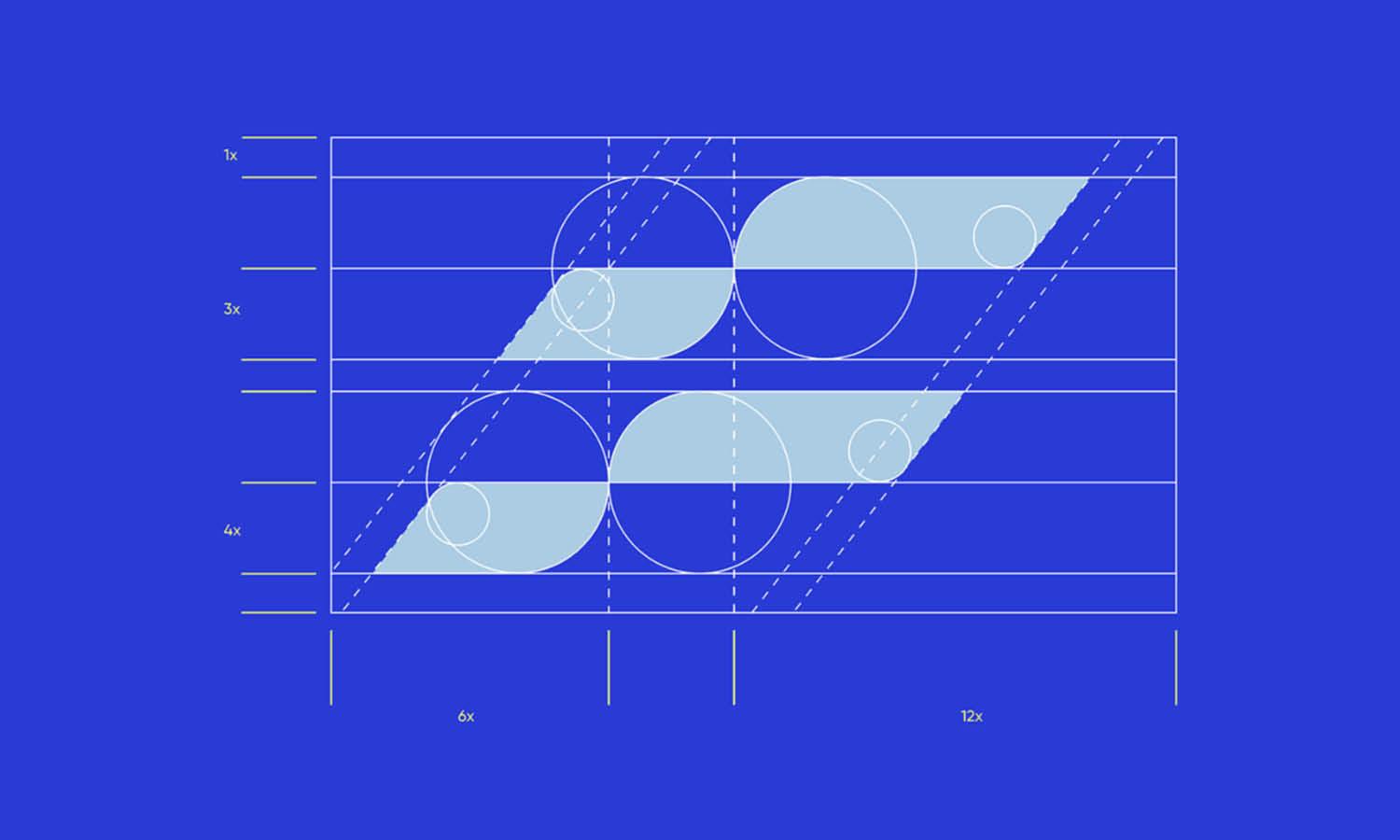
Horizontal and vertical axes establish orientation, symmetry, and placement. Diagonal lines can guide slanted forms, movement, or repeated angles. These guides are useful when several parts must feel connected.
Modules and Repeated Units
A module is a base measurement repeated throughout the design. It may control stroke width, spacing, corner size, or the dimensions of related shapes. Repetition creates consistency without making every element identical.
Circles, Squares, and Geometric Guides
Circles help shape curves and rounded transitions, while squares and rectangles define widths, heights, and block-like forms. These construction shapes should clarify genuine relationships within the logo.
Clear Space and Boundaries
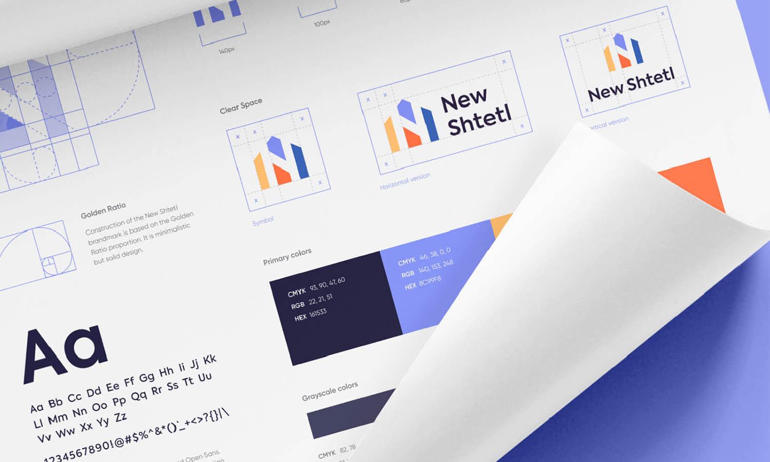
A grid may also define the protected area around a logo. Clear space prevents nearby text, images, or page edges from crowding the mark, helping it remain visible and recognizable across different applications.
How Grids Create Proportion and Consistency
One of the main benefits of a logo grid is that it creates clear relationships between elements. Instead of adjusting every line, curve, and gap independently, the designer can compare them to a shared system.
Controlling Relative Scale
A grid helps determine how large one part should be in relation to another. In a monogram, the width of one letterform may relate to the height of another. In a combination mark, the symbol and wordmark can follow a consistent size relationship.This does not mean all measurements must match. It means differences should appear deliberate.
Maintaining Consistent Spacing
A base unit can guide internal gaps, negative spaces, and distances between separate shapes. Repeated spacing helps multiple forms feel like parts of one design, especially when a mark contains repeated or enclosed elements.
Unifying Curves and Angles
Shared radii and repeated angles create visual continuity. A small rounded corner may relate to a larger curve elsewhere, while matching diagonals can give the mark a stronger direction. The forms feel connected because they follow the same visual language.

Source: Luis Vasquez, Zevle, Behance, https://www.behance.net/gallery/145774315/Zevle
Common Grid Structures Used for Logos
The right grid depends on the concept, the mark’s shape, and the relationships needing refinement.
Square and Rectangular Grids
Square and rectangular grids support horizontal and vertical alignment. They work well for modular symbols, block-like marks, and monograms with clear divisions. They can also organize equal margins, repeated widths, and controlled negative space.
Circular Grids
Circular grids guide rounded forms, radial arrangements, curved monograms, and symbols made from repeated circular sections. Overlapping circles can shape transitions, but some curves need custom adjustments to look natural.
Diagonal and Isometric Grids
Diagonal grids support logos that suggest movement, speed, or direction. Isometric grids help organize forms that imply depth or three-dimensional space. Both are useful when multiple angled elements must follow a consistent orientation.
Custom Construction Grids
Many logos need a grid created specifically for their concept. A custom structure may combine axes, circles, modules, and angled guides. This allows the framework to follow the design rather than forcing the design into a standard pattern.
How to Apply a Grid to a Logo Concept
A grid works best after the main idea has begun to take shape. Starting with geometry alone can produce a polished but forgettable symbol.
Begin With the Core Concept
Identify the message, relationship, or form the logo needs to express. Sketch broadly before measuring anything. Focus first on the idea and overall silhouette. Once a promising direction appears, use the grid to refine it.
Establish the Main Axis and Proportions
Mark the central axis, overall width and height, dominant shapes, and major internal divisions. A symmetrical logo may use the axis as an exact center. In an asymmetrical mark, it can still help organize visual weight.
Choose a Useful Base Unit
Select a measurement that can repeat throughout the design. It might guide stroke thickness, internal spacing, corner sizes, or distances between forms. The unit should be simple enough to apply consistently.
Build and Refine the Main Forms
Use guides to align shapes, repeat dimensions, and smooth transitions. Compare curves, corners, and negative spaces as one system, then check the logo at large and small sizes.
Remove Unnecessary Construction
When the mark feels resolved, simplify the grid. Delete guides that no longer serve a purpose and avoid adding geometry merely to make the construction appear sophisticated. The finished logo should communicate clearly without requiring viewers to understand how it was built.
Mathematical Alignment Versus Optical Balance
A logo can be mathematically centered yet still look uneven. The eye does not judge forms through measurement alone. Shape, weight, direction, and negative space all influence perceived balance.
Why Exact Measurements Can Look Uneven
A pointed shape may appear lighter than a rounded one, even when both occupy similar space. An open form can create more visual room on one side, while a dense shape may feel heavier. Letterforms also carry different visual weights, so equal spacing does not always appear equal.
Making Controlled Optical Adjustments
After constructing the logo on a grid, make small visual corrections where needed. You may move an element slightly, enlarge a lighter form, reduce a heavy section, or reshape a curve. These changes should be intentional and limited. Test the logo at several sizes and view it without construction lines. If it feels stable, clear, and balanced, the adjustment is working. The grid provides discipline, but trained visual judgment should determine the final result.

Source: Imtiaz Hossain Naim, Labase: Construction & Engineering Company Branding, Behance, https://www.behance.net/gallery/182846933/Labase-Construction-Engineering-Company-Branding
Basic Grid Mistakes to Avoid
A grid can improve a logo, but problems arise when the construction system becomes more important than the design.
Choosing a Grid Before Developing the Idea
Beginning with a fashionable geometric pattern can produce a generic concept. The idea should lead, while the grid supports its refinement.
Adding Geometry That Serves No Purpose
Extra circles, lines, or ratios do not make a mark more effective. Every guide should help define a real relationship within the design.
Forcing Every Element Into Exact Symmetry
Some logos need uneven spacing, varied forms, or directional tension. Forcing an asymmetrical concept into a rigid structure can remove its character.
Ignoring Small-Scale Performance
Subtle geometric relationships may disappear when a logo is reduced. Test realistic sizes and simplify narrow gaps, fine details, or delicate intersections when necessary.
Presenting the Grid as Proof of Quality
An elaborate construction diagram cannot compensate for a weak idea. The final logo must remain recognizable, relevant, and visually clear even when the grid is never shown.
When a Grid Is Most Helpful
Grids are particularly useful for repeated shapes, controlled spacing, geometric curves, and related proportions. Monograms, modular icons, letter-based symbols, and combination marks often benefit. A grid also helps when a logo must remain consistent across different sizes and applications. Defined measurements help preserve spacing, alignment, and shape relationships. Not every logo needs an elaborate system. Handmade, illustrative, or intentionally irregular marks may require only basic alignment guides and spacing checks. Even then, a light grid can improve the final silhouette and visual balance. The amount of structure should match the character of the logo. A precise geometric mark may need detailed construction, while an expressive mark may need only enough guidance to feel stable.
Conclusion
Grid systems in logo design offer a reliable way to organize alignment, proportion, spacing, curves, and repeated forms. They help transform an initial concept into a cleaner and more consistent mark without replacing creativity or visual judgment. The most useful grid supports the idea without forcing it into unnecessary geometry. Mathematical accuracy can strengthen consistency, but small optical adjustments may still be needed for the logo to feel balanced. A strong result is not defined by the complexity of its construction diagram. It succeeds because its underlying structure supports clarity, recognition, and a convincing final form. Used with restraint, a grid becomes a quiet but valuable part of the design process.
Let Us Know What You Think!
Every information you read here are written and curated by Kreafolk's team, carefully pieced together with our creative community in mind. Did you enjoy our contents? Leave a comment below and share your thoughts. Cheers to more creative articles and inspirations!
Related Articles





Leave a Comment