
Optimizing Logo Design Resolution for Different Platforms

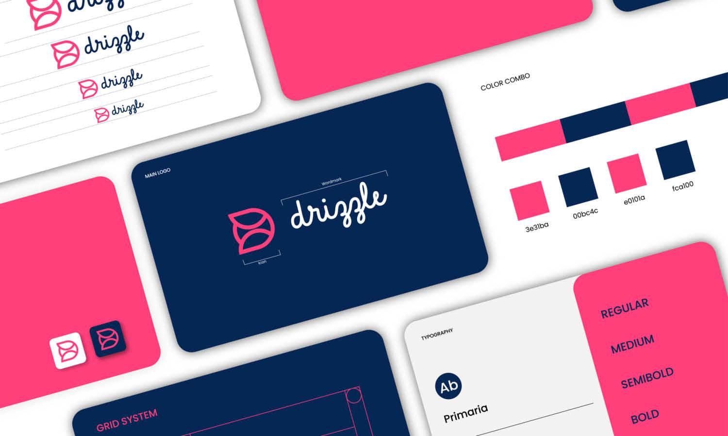
Source: Rashed Branding, Holding Company Visual Identity, Dribbble, https://dribbble.com/shots/20263963-Holding-company-Visual-identity
A logo may look crisp inside design software but become blurry on a website, cramped in a social profile, or pixelated when printed. These problems usually happen because the same file has been used for several platforms with different technical requirements. Logo resolution optimization is the process of preparing the correct file format, dimensions, color mode, and level of detail for each use. Websites need lightweight assets that scale across screens, social platforms apply their own cropping, mobile apps require several icon sizes, and printed materials depend on suitable output resolution. The goal is not to redesign the logo for every placement. It is to create a reliable master file and export controlled variations that preserve clarity, proportions, and recognition wherever the identity appears.
Understanding Resolution in Logo Design
Resolution affects how clearly a logo reproduces, but it does not work the same way in every file type or medium. Understanding a few basic terms makes platform-specific preparation much easier.
Raster and Vector Logo Files
Raster formats, including PNG and JPEG, are built from pixels. They can look sharp at their intended dimensions but lose quality when enlarged beyond the available pixel data. Vector formats, such as SVG, AI, and EPS, use mathematical paths instead of fixed pixels. They can be scaled without creating jagged edges, making them the strongest foundation for logo resolution optimization.
Pixels, DPI, and PPI
Pixel dimensions determine how large a raster logo can appear on a screen. PPI describes pixel density in digital displays, while DPI generally refers to the number of printed dots used within an inch. Screen exports should therefore be planned around pixel dimensions, while print files must also account for physical size and output density.
Why Increasing Dimensions Does Not Restore Quality
Enlarging a small PNG does not add real detail. Software can create extra pixels, but it cannot accurately rebuild the logo's original curves and edges. Returning to the vector source produces a cleaner result than repeatedly sharpening an undersized image.
Preparing a High-Quality Master Logo File
A strong master file makes it easier to prepare accurate exports without rebuilding the logo for every platform.
Building the Logo as a Vector
Create and preserve the primary logo in an editable vector format. Lettering, symbols, spacing, and proportions should remain fully scalable so the artwork can be exported at any required size.
Creating Primary Logo Variations
Prepare approved variations that suit different spaces, such as horizontal, stacked, symbol-only, monochrome, and reversed versions. A compact mark may work better in an app icon, while the full wordmark may be more appropriate for a website header.
Keeping Editable and Exported Files Separate
Store master artwork separately from finished PNG, SVG, PDF, and JPEG exports. This prevents accidental edits to the source and reduces the chance of an outdated or low-resolution file being reused.
Optimizing Logo Resolution for Websites
Website logos must remain sharp across desktops, tablets, and phones while loading quickly enough to support a smooth browsing experience.
Choosing SVG for Scalable Web Display
SVG is often the preferred website format because it scales cleanly at different display sizes. It is especially useful in responsive headers where the logo may expand or contract with the layout.
Using PNG When SVG Is Unsupported
A transparent PNG is useful when a platform does not accept SVG. Export it at sufficient pixel dimensions for its intended placement rather than uploading a small image and enlarging it through the website settings.
Preparing Logos for Retina Screens
High-density screens may show softness in raster graphics exported only at their displayed dimensions. A logo intended to appear at 250 pixels wide can be exported at 500 pixels wide and displayed at half that size for a sharper result.
Balancing Image Quality and Loading Speed
Large files can slow a page without improving visible quality. Remove excessive transparent space, avoid exporting dimensions far beyond the layout's needs, and apply suitable compression while checking that edges remain clean.

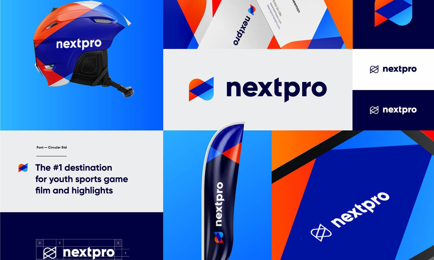
Source: Ashik, RowFile Brand Identity Design, Dribbble, https://dribbble.com/shots/21157706-RowFile-Brand-Identity-Design
Adapting Logo Files for Social Media Platforms
Social media platforms resize, compress, and crop uploaded graphics. These automatic changes can affect both clarity and composition.
Designing for Profile Image Cropping
Profile images are often shown inside circles or rounded squares. A simplified symbol or monogram usually remains more recognizable than a long wordmark. Keep important details away from the edges to prevent cropping.
Exporting at Recommended Platform Dimensions
Create separate files for profile images, cover graphics, and branded posts. Matching the intended dimensions helps maintain predictable spacing and reduces the need for repeated resizing after upload.
Protecting Clear Space Around the Logo
Additional clear space gives the mark room to breathe and protects it from automatic masks. The spacing should feel intentional rather than leaving the artwork loosely positioned inside an oversized canvas.
Testing the Logo at Small Sizes
Check the logo at the size users will actually see. Thin strokes, narrow gaps, and small lettering may disappear on mobile feeds even when they look clear at full screen.
Preparing Logo Resolution for Mobile Applications
Mobile applications often require an app icon, splash-screen logo, and interface graphics in several sizes.
Starting With a Simplified App Icon
The complete logo may contain too much detail for a small app icon. Use a recognizable symbol, initial, or compact brand mark that can remain clear without a tagline or extended wordmark.
Exporting Multiple Pixel Sizes
Different devices use different screen densities. Export every required size directly from the vector master rather than scaling up a smaller raster file.
Checking Rounded Masks and Safe Areas
Operating systems may apply circles, rounded corners, or other masks. Keep essential artwork within the designated safe area so it is not clipped or pushed too close to the edge.
Reviewing the Logo on Actual Devices
Test the icon and interface logo on more than one screen size. Real-device checks reveal softness, crowding, and proportion issues that may not be obvious inside the design file.
Optimizing Logo Resolution for Printed Materials
Print preparation requires attention to physical dimensions, color settings, and production methods rather than screen appearance alone.
Using Vector Files Whenever Possible
Supply AI, EPS, or print-ready PDF artwork for business cards, packaging, brochures, and stationery. Vector files preserve smooth edges and allow the printer to scale the logo accurately.
Setting Raster Logos to 300 DPI
When a raster file is required, prepare it at the final physical size with suitable resolution. A 300-DPI file is commonly used for standard commercial printing, but the printer's specifications should always take priority.
Converting Colors for Print Production
Digital logos are often created in RGB, while many print workflows use CMYK or spot colors. Confirm the required color mode before exporting because conversion can change the appearance of bright or saturated colors.
Checking Small Printed Applications
More resolution cannot solve every reproduction problem. Fine lines, tiny lettering, and narrow spaces may close up on small labels or business cards. A simplified logo variation may produce a cleaner result.

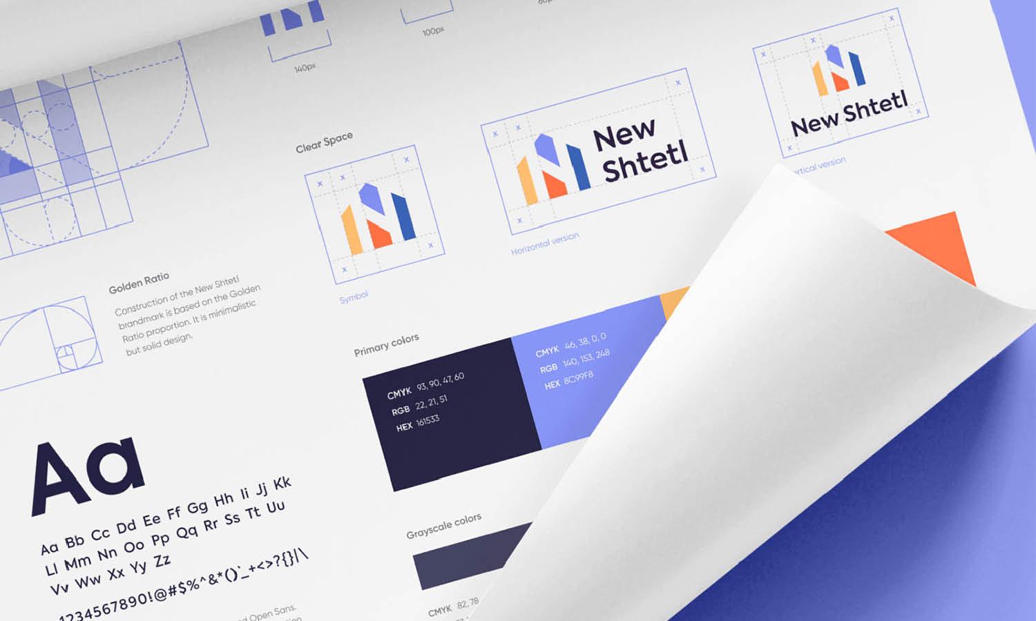
Source: Bill Kenney, Kasada Rebrand + Case Study, Dribbble, https://dribbble.com/shots/22976880-Kasada-Rebrand-Case-Study
Preparing Logos for Large-Format Displays
Large-format graphics include banners, billboards, exhibition panels, signs, and vehicle wraps. Their scale makes source-file quality especially important.
Scaling From Vector Artwork
Vector artwork can be enlarged without pixelation, allowing production teams to adapt the logo to very large surfaces while preserving its geometry.
Considering Viewing Distance
A display viewed from several metres away does not require the same detail density as a printed card held close to the eyes. Output resolution should be judged alongside the final dimensions and expected viewing distance.
Confirming Production Requirements
Ask the production provider about preferred formats, scale, bleed, color mode, and material requirements. Some suppliers request full-size files, while others work from artwork prepared at a reduced scale.
Inspecting Lines, Gradients, and Effects
Thin strokes, shadows, transparency, and gradients may reproduce differently on vinyl, fabric, metal, or illuminated signage. Simplifying fragile effects can make the final display more reliable.
Creating a Platform-Specific Logo Export System
A clear export system prevents team members from choosing files that are too small or unsuitable for the intended medium.
Naming Files Clearly
Use filenames that identify the logo variation, color version, platform, dimensions, and format. Descriptive names are more useful than labels such as '93final-logo-2.'94
Organizing Exports by Use
Create separate folders for web, social media, mobile applications, standard print, and large-format production. Keep only approved assets inside each folder.
Including a Simple Usage Guide
A brief guide can explain which file belongs in common placements and warn users against stretching, distorting, or enlarging raster artwork. This makes logo resolution optimization easier to maintain across a wider team.
Common Logo Resolution Optimization Mistakes
Resolution problems often come from file selection and handling rather than the original design.
Using One PNG for Every Application
One PNG cannot reliably cover profile icons, website headers, printed stationery, and oversized signage. Each use requires a suitable format and size.
Enlarging Low-Resolution Artwork
Upscaling may soften the pixelation, but it cannot restore the precision of the original paths. Exporting again from the vector master is the stronger solution.
Ignoring Platform Cropping
Circular masks, fixed aspect ratios, and automatic trimming can remove parts of the logo. Test the artwork inside the platform's actual display area before publishing it.
Exporting Without Final Testing
Review digital assets at their intended display size and request printed proofs when appropriate. Testing reveals weak details, color shifts, and spacing problems before the logo reaches its audience.
Conclusion
Logo resolution optimization works best when every file is prepared for a clearly defined platform. A website logo, social profile image, mobile app icon, printed mark, and billboard graphic may share the same identity, but they do not share identical technical requirements. Begin with a clean vector master, create only the approved variations the brand needs, and export each asset using suitable dimensions, formats, color settings, and clear space. Test the logo at its actual viewing size rather than judging it only while enlarged on the design canvas. When the final files are clearly named and organized by use, the logo becomes easier to apply correctly. It can then remain sharp, readable, and recognizable across digital screens, printed materials, and large-format displays.
Let Us Know What You Think!
Every information you read here are written and curated by Kreafolk's team, carefully pieced together with our creative community in mind. Did you enjoy our contents? Leave a comment below and share your thoughts. Cheers to more creative articles and inspirations!
Related Articles





Leave a Comment