Logo Design Trend: Bold Typography Takes Center Stage

Source: Erika Levko, KALT, Behance, https://www.behance.net/gallery/137789337/KALT
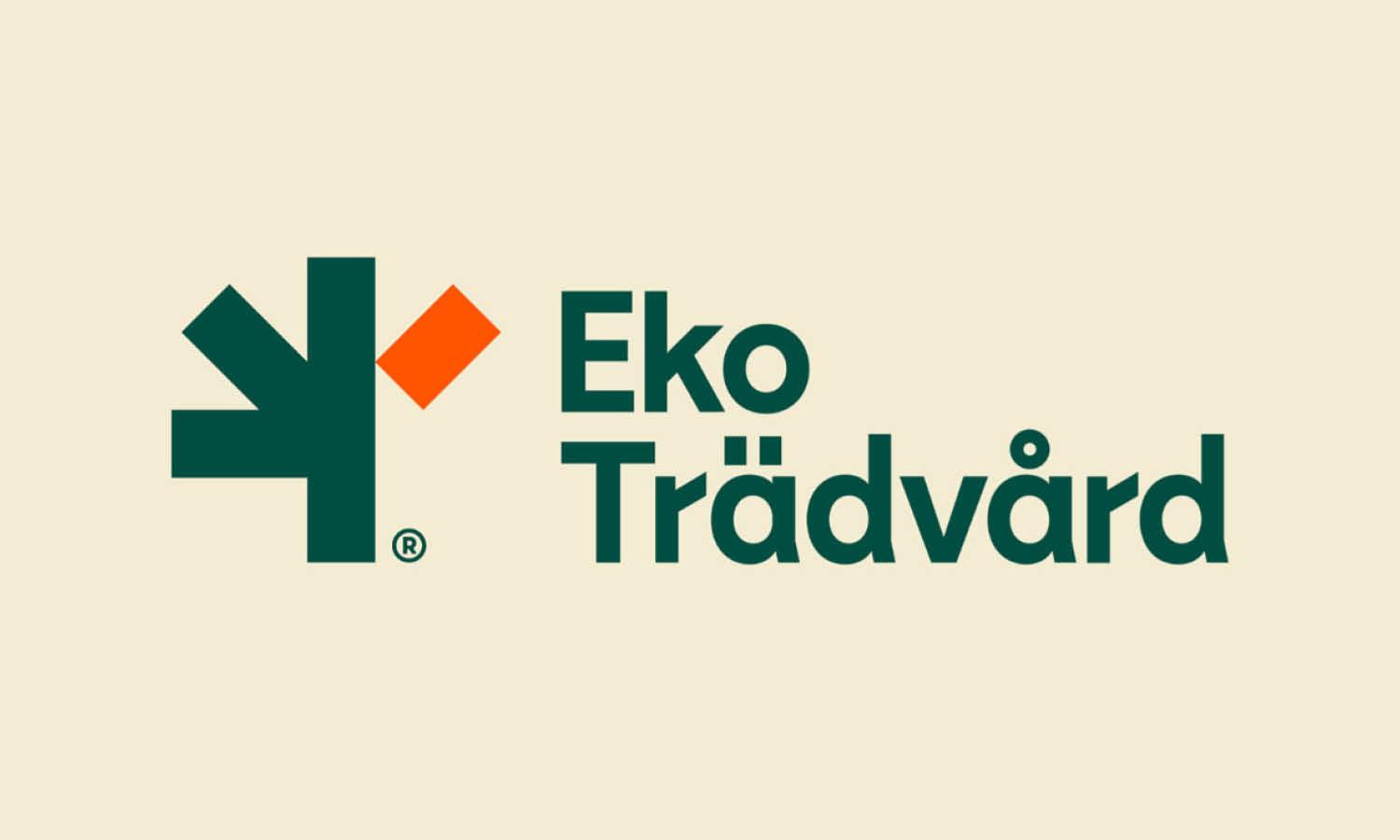
In the ever-evolving world of graphic design, bold typography has surged to the forefront as a dominant logo design trend. This striking style, characterized by its use of heavy, impactful fonts, not only captures the viewer's attention but also communicates brand messages with clarity and confidence. As digital platforms continue to grow, the need for logos to be instantly recognizable and readable has never been more critical. Bold typography meets these demands head-on, offering a perfect blend of aesthetic appeal and functional simplicity.
So, what’s the big buzz about? It's simple: typography in logo design is getting a major makeover. We're talking about fonts that don't just sit there but shout out to you from across the room. These aren’t just letters; they’re the alpha of the brand’s identity, boldly going where no font has gone before. The availability of free fonts has also opened up endless creative possibilities, allowing designers to experiment without limitations.
This trend isn't just about being seen; it's about making a statement. Brands adopting bold typography in their logos are choosing to stand out in a crowded marketplace, where visual distinctiveness can significantly influence consumer perception. Furthermore, the versatility of bold fonts allows them to be effective across various media types, from digital advertisements to print materials, ensuring a cohesive and powerful brand presence. As we delve deeper into the significance and application of bold typography in logo designs, it becomes clear why this trend has taken center stage in the design community.
Emphasizing Simplicity in Bold Typography
In the realm of logo design, simplicity is a powerful concept that bold typography beautifully encapsulates. This logo design trend leverages bold, clean lines to create an immediate and lasting impression. By focusing on strong, straightforward typography, designers can convey a brand's essence without the need for intricate graphics or elaborate details. This minimalistic approach not only enhances the logo’s visibility but also fosters brand recall.
Bold typography strips down a logo to its fundamental aspects, emphasizing the brand name through sheer typographic impact. This method is particularly effective in today’s fast-paced digital world, where a simple yet bold logo can stand out amidst the noise of visual content. Furthermore, this simplicity allows for greater flexibility in the logo's application across various media and products, ensuring that the brand identity is consistent and recognizable.
By adopting bold typography, brands can achieve a timeless quality in their logos, avoiding the pitfalls of trends that quickly become dated. The strength of this design trend lies in its ability to merge aesthetic minimalism with practical functionality, making bold typography a staple in contemporary logo design.
Enhanced Readability with Bold Typography
Bold typography in logo design significantly enhances readability, a critical factor in brand recognition and audience engagement. This trend involves using strong, legible typefaces that grab attention and convey messages clearly, even from a distance or at a glance. The clarity provided by bold fonts is invaluable in environments where quick recognition is essential, such as on billboards, web banners, or mobile apps.
The enhanced readability of bold typography is not just about size but also about the weight and spacing of the font. Heavier font weights stand out against backgrounds with varying textures and colors, ensuring that the logo remains prominent in diverse visual contexts. Moreover, adequate spacing around and within the letters avoids visual clutter, making the text legible in different sizes and formats.
This focus on readability extends beyond mere aesthetics. It plays a pivotal role in functional design, particularly in accessibility. Bold typefaces can be more easily read by people with visual impairments, making them a practical choice in universal design. Additionally, as digital platforms prioritize user-friendly interfaces, logos with bold typography align well with modern UX/UI principles, which favor clear and effortless navigation. Thus, bold typography not only enhances a brand’s visual impact but also its inclusivity and usability across various user demographics.
Modern Aesthetics in Bold Typography
Bold typography has emerged as a cornerstone of modern aesthetics in logo design, embodying clarity and boldness in a visually saturated market. This logo design trend emphasizes stark, impactful typefaces that reflect the dynamic nature of contemporary brands. By utilizing bold typography, designers create a clean and crisp visual identity that resonates with today's audience, who favor straightforward and direct communication.
The modern appeal of bold fonts lies in their ability to convey sophistication and professionalism while remaining highly approachable. These typefaces are often sans-serif, known for their clean lines and absence of decorative elements, which enhances the modern feel. The strategic use of bold typography in logo design not only catches the eye but also creates a memorable visual experience that stands the test of time.
Furthermore, the versatility of bold typography allows it to blend seamlessly with minimalist graphic elements, ensuring that the logo can adapt across various platforms and media without losing its essence. This adaptability is crucial in a digital-first world where logos must perform well on everything from tiny mobile screens to large billboards. Bold typography, therefore, is not just a trend but a practical response to the demands of modern design, ensuring brands achieve a timeless yet contemporary look that appeals across generations.

Source: Maria Rimades, LE MORO Restaurant Branding & Identity, Behance, https://www.behance.net/gallery/181344995/LE-MORO-Restaurant-branding-identity-firmennyj-stil
Brand Identity Strengthening Through Bold Typography
In the competitive realm of branding, bold typography serves as a powerful tool for strengthening brand identity. This logo design trend harnesses the power of thick, assertive typefaces to make a brand’s name resonate more profoundly with the audience. Bold typography commands attention and can express the personality of a brand with immediate effect, making it a strategic choice for businesses aiming to establish a strong presence in the market.
Utilizing bold type in logos can evoke feelings of confidence and reliability, qualities that consumers often look for in a brand. It also helps in differentiating a brand from its competitors by offering a distinct and recognizable visual identity. This distinctiveness is crucial for brand recall, where customers remember a brand not just for its products or services but for its compelling logo as well.
Moreover, the implementation of bold typography in logo design can be tailored to reflect the unique attributes of a brand, whether it’s through custom typefaces or the strategic use of color and spacing within the text. These nuances contribute to a deeper connection with the target audience, enhancing brand loyalty and recognition.
In essence, bold typography not only strengthens a brand’s visual appeal but also fortifies its market position by making it more memorable and impactful. As brands vie for attention in a cluttered marketplace, those that employ bold typography effectively are likely to leave a lasting impression on their audience, thereby solidifying their identity and influence in the industry.
Versatility Across Media with Bold Typography
Bold typography stands out for its remarkable versatility across various media, making it a leading choice in the current logo design trend. This style’s robust and unambiguous nature ensures that logos retain their clarity and impact whether displayed on digital screens, printed materials, or environmental signage. The adaptability of bold fonts allows designers to maintain consistency in branding across diverse applications, from mobile apps and websites to billboards and corporate merchandise.
One of the key advantages of bold typography is its scalability. Logos designed with bold typefaces can be easily scaled up or down without losing legibility or aesthetic appeal. This is particularly important in today’s multi-platform marketing environment where a single logo must perform effectively on a tiny smartphone screen as well as on large format advertising. Additionally, bold typefaces can withstand various reproduction techniques and materials, ensuring that the logo remains effective and recognizable regardless of the medium.
Moreover, the straightforward nature of bold typography lends itself well to combinations with other graphic elements, such as icons and shapes, facilitating brand differentiation without compromising the logo’s functionality. This flexibility makes bold typography a universally appealing option in logo design, capable of adapting to the evolving needs of brands in a dynamic visual landscape.
Emotional Impact of Bold Typography in Logo Design
Bold typography in logo design carries a significant emotional weight, influencing how a brand is perceived by its audience. This logo design trend utilizes thick, prominent typefaces that inherently convey strength, stability, and confidence. Such visual characteristics are crucial in establishing trust and credibility among consumers, especially in competitive market sectors.
The emotional impact of bold typography extends beyond mere perception; it can evoke specific feelings and associations related to the brand's identity. For example, a logo with a bold, block-type font might be seen as authoritative and dependable, ideal for industries like finance or security. Conversely, the same boldness, when used with a playful or vibrant color palette, can communicate fun and approachability, suitable for brands targeting younger demographics.
This ability to mold consumer emotions through typography makes bold fonts a strategic choice for businesses aiming to connect emotionally with their audience. By carefully selecting the right typeface, brands can craft a logo that not only stands out visually but also resonates on a deeper emotional level. This resonance is vital in building a loyal customer base and differentiating a brand in a crowded marketplace.
The strategic use of bold typography, therefore, not only enhances brand visibility but also enriches the consumer's interaction with the brand, making it a powerful element in the toolkit of modern logo design.
Minimalist Influence on Bold Typography
The minimalist design philosophy, characterized by the motto "less is more," significantly influences the current trend of bold typography in logo design. This approach aligns perfectly with the minimalist ethos by stripping down designs to their essential elements—focusing on impactful fonts that convey messages succinctly and effectively. Bold typography, with its clear and concise letterforms, eliminates unnecessary decorative details, allowing the brand’s core identity to shine through.
The integration of bold typography into minimalist designs not only enhances visual clarity but also ensures that the logo remains effective and adaptable across various applications. This is crucial in an age where digital platforms dominate and visual simplicity is key to capturing and retaining consumer attention. The strong, clean lines of bold typefaces in minimalist logos make them incredibly memorable and easy to recognize, which is vital for building brand identity.
Moreover, the minimalist use of space around bold typography helps in accentuating the message, giving the logo a modern and sophisticated look. This not only appeals to contemporary aesthetic preferences but also communicates a sense of professionalism and elegance. By combining bold typography with minimalist design principles, brands can create logos that are both timeless and expressive, ensuring they resonate well with a broad audience in today’s cluttered visual landscape.

Source: Ivan Canhamello, Burguer & Ponto, Behance, https://www.behance.net/gallery/164870245/Burguer-Ponto
Custom Typefaces in Bold Typography
Custom typefaces are increasingly becoming a hallmark of bold typography in logo design, offering brands a unique opportunity to express their identity distinctively and memorably. By designing a bespoke bold typeface, brands can infuse their logos with exclusive characteristics that set them apart from competitors and deepen the emotional connection with their target audience. This customization goes beyond mere aesthetic appeal, embedding brand values and personality directly into the font style.
Creating a custom bold typeface allows for precise control over every aspect of the design, from weight and width to the curvature of the letters. This level of customization ensures that the typeface aligns perfectly with the brand’s messaging and aesthetic preferences, reinforcing the brand’s presence in every consumer interaction. Furthermore, a unique typeface becomes synonymous with the brand itself, enhancing brand recognition and recall.
The investment in custom bold typefaces also demonstrates a brand’s commitment to quality and attention to detail, qualities highly valued by consumers. This can be particularly effective in industries where trust and professionalism are paramount, such as finance, law, or luxury goods. Moreover, a custom bold typeface can be legally protected, preventing competitors from copying or mimicking a brand’s distinctive style.
Scalability in Bold Typography
Scalability is a critical consideration in logo design, particularly when employing bold typography. The intrinsic clarity and strength of bold typefaces ensure that logos remain effective and legible across a range of sizes, from the smallest mobile screens to large-scale billboards. This feature of bold typography is essential for maintaining brand consistency across varied marketing mediums.
The weight of bold fonts provides a visual sturdiness that helps prevent loss of detail or distortion when the logo is scaled down. Conversely, when scaled up, these same characteristics prevent the logo from appearing overwhelming or cumbersome, preserving its aesthetic balance. This adaptability makes bold typography a reliable choice for brands looking to ensure their logo's effectiveness in both physical and digital formats.
Moreover, the simplicity associated with bold typefaces allows for greater flexibility in design adjustments as needed for different sizes and applications. Whether the logo needs to be displayed on a tiny app icon or emblazoned on a giant banner, its fundamental elements remain clear and recognizable. This scalability is invaluable in today’s global marketplace, where a brand must remain visually consistent across diverse consumer touchpoints.
Influence of Digital Design on Bold Typography
The digital era has significantly influenced the adoption of bold typography in logo design. As brands navigate the complexities of online visibility, bold typefaces offer a solution that stands out in cluttered digital landscapes. The immediate readability and visual impact of bold fonts cater perfectly to digital platforms where attention spans are short, and first impressions are crucial.
This trend is driven by the need for logos to be legible at various digital resolutions and sizes, from thumbnails to full-screen displays. Bold typography ensures that a brand’s identity is communicated effectively regardless of the user’s device, enhancing the user experience and brand recognition in digital environments.
Additionally, the versatility of bold fonts allows designers to integrate seamlessly with interactive elements of digital design, such as animations and clickable links, without losing legibility or aesthetic appeal. This compatibility makes bold typography an integral part of responsive web design, where a single logo must adapt to multiple screen sizes and orientations.
The emphasis on mobile optimization further underscores the importance of bold typography. With an increasing amount of web traffic coming from mobile devices, logos must be exceptionally clear and striking to capture and retain user attention. Bold typography, with its strong lines and clear forms, is ideally suited to meet these challenges, proving that its popularity in digital design is both a practical and stylistic choice.
Conclusion
Bold typography is not merely a passing fad but a pivotal logo design trend that addresses both aesthetic and functional demands in branding. Its ability to convey clarity, impact, and versatility makes it a preferred choice for contemporary brands aiming to establish a strong presence in a competitive marketplace. As we look to the future of design, bold typography will undoubtedly continue to play a crucial role in shaping brand identities across diverse industries. Its seamless integration into digital and print media ensures that this style will remain relevant and influential in the evolving landscape of visual communication.
Let Us Know What You Think!
Every information you read here are written and curated by Kreafolk's team, carefully pieced together with our creative community in mind. Did you enjoy our contents? Leave a comment below and share your thoughts. Cheers to more creative articles and inspirations!





Leave a Comment