
10 Tips to Create a Responsive Logo Design
Source: Ramotion, Fintech Company Brand Guideline, Dribbble, https://dribbble.com/shots/15433400-Coinread-Style-Guide
A logo rarely lives in one place anymore. It appears on website headers, social media profiles, mobile apps, email signatures, packaging, digital advertisements, and countless other touchpoints. A design that looks impressive on a large screen can quickly become unreadable when reduced to a small icon. That challenge has made responsive logo design an essential part of modern branding. Responsive logo design focuses on creating flexible logo systems that adapt to different sizes and contexts while maintaining a recognizable identity. Instead of relying on a single version, designers develop multiple variations that work together across platforms. The goal is consistency without sacrificing usability. These responsive logo design tips will help you create logos that remain clear, memorable, and effective regardless of where they appear.
What Is Responsive Logo Design?
Why Logo Flexibility Matters
Responsive logo design is the practice of creating a logo system that adjusts to different screen sizes, formats, and applications. Rather than forcing one complex logo into every situation, designers develop simplified versions that maintain the same visual identity. As digital platforms continue to expand, brands must communicate effectively in spaces ranging from large desktop monitors to tiny app icons. A logo that cannot adapt may lose clarity, readability, and recognition when displayed at smaller sizes.
Common Examples Of Responsive Logos
A responsive logo system often includes several variations. The full logo may appear on websites and printed materials, while a simplified version works better in narrow spaces. At the smallest scale, an icon or symbol may represent the brand by itself. This approach helps brands remain recognizable while improving usability across modern platforms.
Tip 1: Start With A Strong Core Symbol
Build Recognition Before Adding Details
One of the most valuable responsive logo design tips is to begin with a strong visual foundation. The central symbol or mark should communicate the brand clearly, even when separated from supporting elements. When a logo depends heavily on detailed typography, decorative effects, or secondary graphics, it becomes difficult to simplify later. A memorable symbol creates flexibility because it can function independently when space is limited. Think about the logos you instantly recognize from a tiny mobile icon. Most rely on distinctive shapes rather than complex details. During the design process, test your symbol on its own and ask whether it remains identifiable without additional elements.
Tip 2: Design With Scalability In Mind From The Beginning
Think Beyond The Primary Logo
Many designers create a logo at a comfortable size and only consider smaller applications afterward. This often leads to visibility issues that require major revisions. Instead, think about scalability from the first sketch. Imagine how the logo will appear on a smartphone screen, social media avatar, browser tab, or promotional product. If important details disappear at smaller sizes, adjustments may be necessary. A useful technique is to regularly zoom out during the design process. Reducing the logo to small dimensions helps reveal readability problems early. Elements that look attractive at large sizes may become visual clutter when scaled down.
Tip 3: Simplify Complex Details
Remove Elements That Disappear At Small Sizes
Complexity is often the biggest enemy of responsive logo design. Thin lines, intricate patterns, gradients, and tiny decorative features may look impressive in presentations but can quickly become ineffective in practical use. Simplification does not mean removing personality. Instead, it involves identifying which elements truly contribute to recognition and eliminating those that do not. Examine every component of the logo carefully. If a detail becomes invisible at smaller sizes, it may not deserve a permanent place in the design. Prioritizing clarity creates stronger visual communication and improves adaptability. Many successful modern logos have evolved toward simpler forms because they perform better across digital platforms. Cleaner designs are easier to scale, easier to recognize, and easier to reproduce consistently.
Source: Uchitha H, Krypstac Branding, Dribbble, https://dribbble.com/shots/19648761-Krypstac-branding
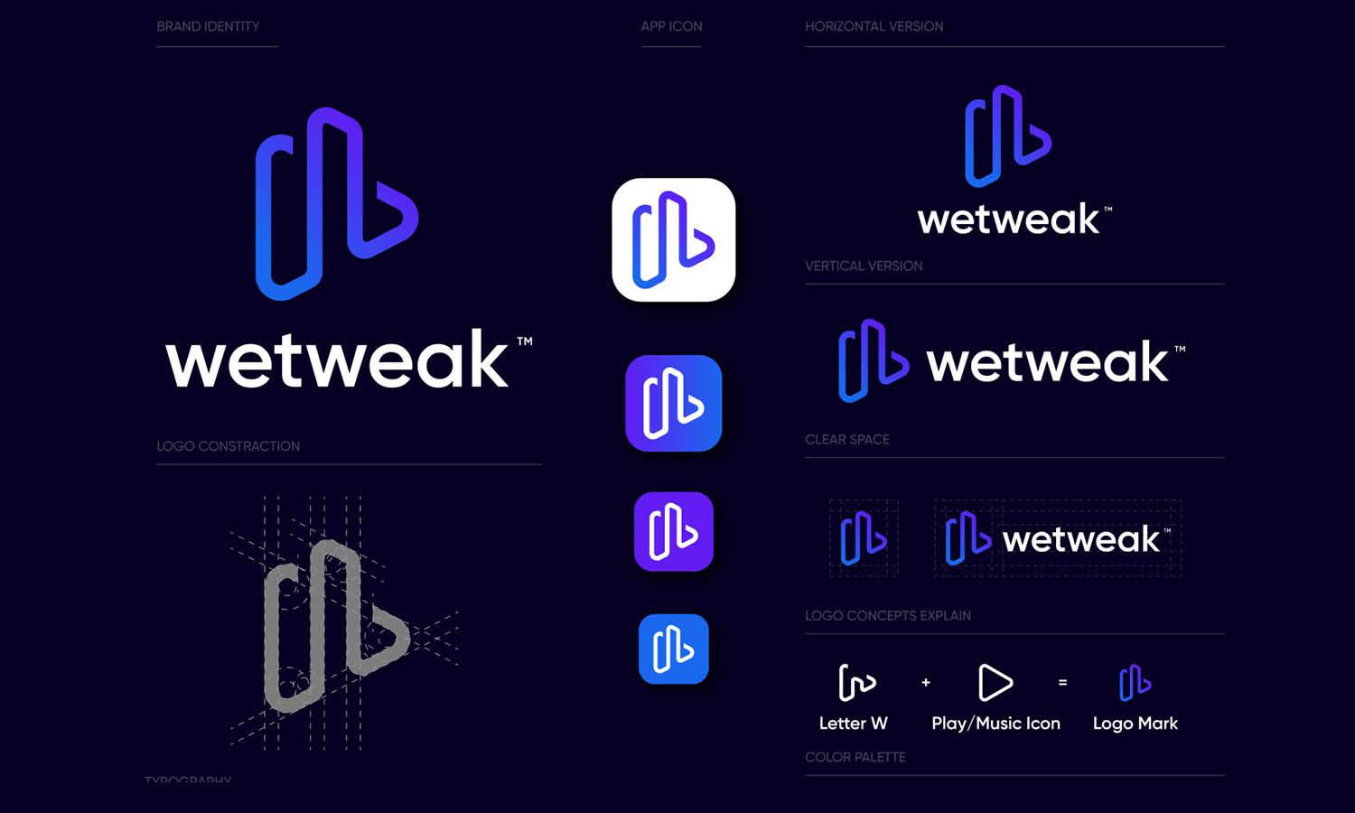
Tip 4: Create Multiple Logo Variations
Develop A Responsive Logo System
Responsive branding rarely depends on a single logo file. Instead, it uses a collection of coordinated variations designed for different situations.A typical system may include a primary logo for large applications, a secondary version for narrower layouts, and an icon-only version for compact spaces. Each serves a specific purpose while supporting the same brand identity.
Maintain Consistent Brand Identity
Although variations may differ in complexity, they should always feel connected. Consistent typography, color choices, proportions, and visual style help maintain recognition across every version.When users encounter your brand on different devices, they should immediately understand that each variation belongs to the same visual family. This consistency builds trust and strengthens brand recall. Creating multiple versions may require additional effort initially, but it dramatically improves flexibility and long-term usability.
Tip 5: Prioritize Readable Typography
Choose Fonts That Stay Clear At Smaller Sizes
Typography plays a major role in logo effectiveness. A beautiful typeface loses value if people cannot read it. When selecting fonts, prioritize clarity over decoration. Highly elaborate scripts and experimental letterforms may struggle at smaller sizes. Pay close attention to spacing, weight, and overall readability. Test the logo at various dimensions to ensure letters remain distinguishable. Characters that blend together or disappear can weaken brand communication. Responsive logo design requires typography that performs consistently across digital and physical environments. Clear letterforms improve accessibility and help audiences recognize your brand more easily, regardless of screen size or viewing distance.
Tip 6: Use A Flexible Layout Structure
Prepare For Different Screen Orientations
Logos often appear in spaces with different dimensions. A horizontal layout may fit perfectly in a website header but feel cramped inside a social media profile image. Creating alternative arrangements helps solve this problem. Many responsive systems include horizontal, stacked, and icon-based configurations. These options allow the logo to adapt naturally to different formats.
Adapt Without Losing Consistency
Each layout should preserve the same visual identity while accommodating different proportions. Consistent spacing, alignment, and hierarchy help maintain a cohesive appearance. By planning multiple arrangements from the beginning, you can avoid awkward resizing and ensure the logo remains balanced in every application.
Tip 7: Limit Your Color Complexity
Create Strong Performance Across Platforms
Color can strengthen recognition, but excessive color complexity often creates practical challenges. Large palettes, subtle gradients, and low-contrast combinations may not reproduce consistently across devices. A focused color system improves reliability and helps maintain visual consistency. Strong contrast also enhances readability in various viewing conditions.
Consider Accessibility
Responsive logo design should remain effective for diverse audiences. Testing colors against different backgrounds and accessibility standards can reveal potential issues before launch. It is also wise to create monochrome and single-color versions. These alternatives provide flexibility for situations where full-color reproduction is not possible.
Source: Firoj Kabir, Pedize Brand Book Design, Dribbble, https://dribbble.com/shots/16080755-Pedize-Brand-Book-Design
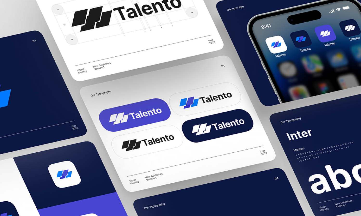
Tip 8: Test The Logo In Real-World Applications
Evaluate Actual Usage Scenarios
One of the most overlooked responsive logo design tips is thorough testing. A logo that looks perfect on a design board may behave differently in practical environments. Place the logo inside website headers, mobile interfaces, social media profiles, packaging mockups, email signatures, and advertisements. Viewing the design in realistic contexts provides valuable insights.
Identify Weaknesses Early
Testing often reveals issues that are difficult to spot during the design process. Small text may become unreadable, spacing may feel inconsistent, or important details may disappear. Addressing these problems before final delivery saves time and prevents future branding challenges. The more environments you test, the more reliable the final logo system becomes.
Tip 9: Establish Clear Rules For Logo Reduction
Know When To Simplify
Not every logo version should appear at every size. Establishing reduction rules helps maintain clarity and consistency. For example, the full logo may work above a certain width, while smaller sizes require a simplified version. Extremely small applications may use only the symbol or icon. These thresholds ensure that the logo remains legible regardless of scale.
Create Consistent Usage Guidelines
Documenting reduction rules helps everyone apply the logo correctly. Designers, marketers, developers, and external partners can follow the same standards, reducing the risk of inconsistent branding. Clear guidelines improve efficiency and protect the integrity of the visual identity over time.
Tip 10: Build A Complete Responsive Logo Design System
Think Beyond A Single File
A successful logo project should deliver more than one graphic. Modern brands need a comprehensive system that supports multiple platforms and future growth. Organize all approved variations, color formats, layout options, and file types. This preparation makes implementation easier across departments and marketing channels.
Document Usage Standards
Comprehensive documentation should include size recommendations, spacing requirements, approved backgrounds, and logo variation guidelines. A complete responsive system helps maintain consistency even as the brand expands into new products, services, and platforms. It provides a reliable framework that supports long-term brand management.
Common Mistakes To Avoid In Responsive Logo Design
Many logo problems stem from overlooking practical usage requirements. One common mistake is designing exclusively for large displays while ignoring mobile experiences. Another is keeping excessive detail that disappears when the logo is reduced. Inconsistent logo variations can also create confusion. If alternative versions feel disconnected from the primary design, brand recognition suffers. Likewise, skipping real-world testing often allows usability issues to remain hidden until after launch.
Some designers also fail to establish usage guidelines, leading to inconsistent implementation across teams and platforms. Avoiding these mistakes helps create a more adaptable and effective visual identity. Responsive logo design succeeds when flexibility, clarity, and consistency are considered throughout the entire process rather than added as afterthoughts.
Conclusion
Responsive branding is no longer a luxury reserved for large companies. Any organization that appears across digital and physical channels can benefit from a flexible logo system. By focusing on scalability, simplification, readability, and strategic variation, designers can create logos that remain recognizable in virtually any environment. These responsive logo design tips provide a practical framework for building adaptable visual identities that support modern brand communication. Rather than treating a logo as a single static asset, think of it as a system designed to evolve across platforms. That approach improves usability, strengthens recognition, and helps your brand maintain a consistent presence wherever audiences encounter it.
Let Us Know What You Think!
Every information you read here are written and curated by Kreafolk's team, carefully pieced together with our creative community in mind. Did you enjoy our contents? Leave a comment below and share your thoughts. Cheers to more creative articles and inspirations!
Related Articles


Leave a Comment