The Favicon: A Tiny but Mighty Variation of Logo Design
Source: Coric Design, Dead Flower Shop, Dribbble, https://dribbble.com/shots/21830862-Dead-Flower-Shop
In the vast digital landscape, where countless websites compete for attention, even the smallest design elements play a crucial role in branding. One such element is the favicon—a tiny yet powerful logo design variation that enhances brand visibility and recognition. Often overlooked, this miniature icon appears in browser tabs, bookmarks, and search results, offering users a quick visual reference to a website.
A favicon may be small, but its impact is significant. It acts as a digital signature, reinforcing brand identity across multiple online platforms. While traditional logo designs are created with scalability in mind, a favicon demands a more minimalistic approach, ensuring clarity at sizes as small as 16x16 pixels. The right favicon can make a website stand out in a crowded browser, improving user experience and making navigation more intuitive.
Understanding the importance of a favicon and how to design one effectively is essential for any brand striving for a strong online presence. From selecting the right colors to ensuring cross-browser compatibility, every detail matters. This article will explore the key aspects of favicon design and why it is an indispensable asset for modern branding.
The Purpose of a Favicon
A favicon is more than just a small graphic—it is a vital part of a brand’s digital identity. Acting as a condensed logo design, a favicon provides users with a quick and recognizable visual cue when browsing multiple websites. Whether it appears in a browser tab, bookmark list, or search result, this tiny icon helps reinforce a brand’s presence and makes it easier for visitors to identify and return to a site.
One of the primary functions of a favicon is to enhance user experience by improving website recognition. In a sea of open browser tabs, a distinct favicon allows users to quickly locate and switch back to a specific site without reading the tab titles. This simple yet effective tool can significantly reduce navigation time and frustration, making web browsing more efficient.
Additionally, a favicon strengthens brand consistency. Just as a well-designed logo design leaves a lasting impression on physical and digital assets, a favicon ensures that branding extends seamlessly to browser interfaces. It signals professionalism and credibility, showing that a brand has paid attention to even the smallest design elements.
A favicon also plays a crucial role in bookmarks. When a user saves a website, the favicon appears alongside the page title, making it instantly recognizable in a long list of saved sites. This visibility encourages users to revisit the page, reinforcing engagement and brand loyalty. By serving as a digital signature, a favicon ensures that a brand remains visually present wherever it appears.
How Favicons Differ From Logos
While a favicon and a logo design share the same branding purpose, they differ significantly in terms of function, design, and usage. A logo design is a brand’s primary visual identifier, created to be versatile and scalable across various mediums, including print, websites, packaging, and merchandise. A favicon, on the other hand, is a much smaller, simplified variation specifically designed for digital use, primarily within browser interfaces.
One of the key differences between a favicon and a logo design is size. A favicon is typically created in sizes as small as 16x16 pixels, while logos are designed to be scalable without losing clarity. Because of this size constraint, favicons must be highly simplified, often reducing complex logo designs into a single icon, letter, or symbol. Detailed graphics and intricate typography that work well in logos are often impractical for favicons.
Another distinction is placement. A logo appears across multiple brand assets—on websites, advertisements, social media, and print materials. A favicon, however, is limited to digital spaces such as browser tabs, bookmarks, and search result previews. Despite its small size, it plays a critical role in enhancing a website’s identity and visibility.
Designing a favicon requires careful thought, as it must maintain the essence of the brand while being readable at a tiny scale. Unlike a logo design, which can use complex elements, a favicon is most effective when it is bold, minimal, and instantly recognizable.
Standard Favicon Dimensions
A favicon is a small yet essential component of a website’s branding, and its dimensions play a crucial role in ensuring clarity and visibility. Unlike traditional logo designs, which are created in various sizes for different uses, favicons must be designed to remain sharp and recognizable even at a tiny scale.
The most widely used favicon size is 16x16 pixels, as it is the standard dimension displayed in browser tabs. This size ensures that the icon does not take up unnecessary space while remaining legible. However, modern web design often requires additional sizes to support different display environments.
For better resolution and improved adaptability across devices, 32x32 pixels is another common favicon dimension, particularly for high-resolution screens. 48x48 pixels is frequently used for Windows desktop shortcuts, while 64x64 pixels or larger versions may be necessary for mobile applications and pinned websites.
In addition to these, Apple Touch Icons, which function similarly to favicons for iOS devices, are often designed at 180x180 pixels to ensure clarity on high-resolution Retina displays. Android devices also support favicons at various sizes, such as 192x192 pixels, for home screen shortcuts.
Creating multiple favicon sizes ensures consistency across different platforms and devices. To optimize branding, designers often generate a favicon set that includes various resolutions, allowing for seamless display across different environments while preserving the integrity of the logo design.
Source: Coric Design, Dead Flower Shop, Dribbble, https://dribbble.com/shots/21830862-Dead-Flower-Shop
A favicon may be small, but its impact is significant. It acts as a digital signature, reinforcing brand identity across multiple online platforms. While traditional logo designs are created with scalability in mind, a favicon demands a more minimalistic approach, ensuring clarity at sizes as small as 16x16 pixels. The right favicon can make a website stand out in a crowded browser, improving user experience and making navigation more intuitive.
File Formats for Favicons
Choosing the right file format is essential when designing a favicon, as different browsers and devices support varying formats. Unlike traditional logo designs, which can be created in a wide range of file types, favicons require specific formats to ensure compatibility across platforms.
The most commonly used file format for favicons is ICO. This format is widely supported by all major browsers and allows multiple resolutions to be stored in a single file. Because of its adaptability, ICO remains the preferred choice for favicons.
Another widely used format is PNG. This format supports transparency, making it ideal for favicons that need a clean, seamless background. PNG favicons are commonly used in modern browsers and mobile applications due to their high-quality rendering and smaller file size.
For scalable and responsive favicon designs, SVG (Scalable Vector Graphics) is an excellent choice. Unlike pixel-based formats, SVG favicons retain sharpness at any size, making them a flexible option for high-resolution displays. However, not all browsers fully support SVG favicons, so including backup formats is advisable.
Additional formats such as GIF and JPEG can be used, but they are less common. GIF favicons can support simple animations, though this is rarely utilized in web design. JPEG, while supported, is not ideal due to its lack of transparency.
To ensure optimal performance, designers often provide multiple favicon file types. A well-prepared favicon set includes ICO, PNG, and SVG versions, allowing seamless display across browsers, operating systems, and devices while maintaining brand consistency.
The Importance of Simplicity
A favicon may be one of the smallest elements in a brand’s visual identity, but its impact is significant. Due to its limited size, a favicon must be designed with simplicity in mind to remain clear and recognizable. Unlike a full logo design, which can incorporate intricate details, typography, and complex graphics, a favicon must distill the essence of the brand into a minimalistic form.
Simplicity is crucial because favicons are displayed at 16x16 pixels or slightly larger, leaving little room for elaborate elements. Overly detailed designs can become blurred or unrecognizable when scaled down, diminishing their effectiveness. A well-designed favicon should be a strong, bold mark that maintains its identity even at the smallest resolutions.
Many brands simplify their logo design for favicon use by focusing on initials, monograms, or recognizable symbols. For instance, companies like Facebook, Google, and Twitter use single-letter favicons or minimalistic icons that align with their full logos. This approach ensures clarity while maintaining brand consistency.
The best favicons are visually distinct and instantly recognizable, even at a glance. By prioritizing simplicity, designers create favicons that enhance user experience, making it easier for visitors to locate and return to a website. A clutter-free favicon strengthens brand presence while ensuring usability across various digital interfaces.
Color Considerations for Visibility
Color selection is a vital aspect of favicon design, as it directly impacts visibility and recognizability. Unlike a full logo design, which can use a broad color palette, a favicon requires a strategic approach to color choices to remain clear and effective at small sizes.
High-contrast colors are essential for ensuring that the favicon stands out against different browser backgrounds and tabs. Light colors on a dark background or vice versa create a strong visual impact, making the favicon easier to spot. For example, Google’s multicolor favicon maintains contrast, ensuring each letter remains distinct.
Transparency also plays a role in favicon visibility. PNG and SVG formats support transparent backgrounds, allowing the favicon to adapt seamlessly to different interface themes. This is particularly useful for dark mode browsers, where a white or light-colored favicon may appear more visible than a dark one.
A well-designed favicon considers color variations for different display environments, ensuring it remains legible on both desktop and mobile devices. By choosing bold, high-contrast hues and eliminating unnecessary details, designers create favicons that maintain visibility and enhance brand recognition across multiple digital platforms.
Using Initials or Symbols
When designing a favicon, using initials or symbols is a highly effective approach. Due to the small size constraints, full logo designs with intricate details or long brand names do not translate well into a favicon. Instead, simplifying the design into a recognizable initial or symbol ensures clarity and strong visual impact.
Many well-known brands have successfully adapted their logo designs into simple yet memorable favicons. For example, Facebook uses the lowercase “f,” while Twitter utilizes its iconic bird silhouette. These designs distill the essence of their full logos into a compact, visually distinct mark that remains recognizable even at 16x16 pixels.
Symbols also work exceptionally well for favicon design. If a brand has a unique, standalone graphic element in its logo design, using that as the favicon ensures consistency while maintaining simplicity. Nike’s swoosh or Apple’s bitten apple are prime examples of effective symbols that work flawlessly as favicons.
When choosing between initials or symbols, clarity is key. Letters should be bold and legible, avoiding decorative fonts that become illegible at small sizes. Symbols should be distinct and not rely on complex detailing. By prioritizing readability and recognizability, a favicon featuring initials or symbols enhances brand identity and ensures a strong presence across digital platforms.
Source: David Prasetya, Alley Cat - Branding Vol.2, Dribbble, https://dribbble.com/shots/22940297-Alley-Cat-Branding-Vol-2
Where Favicons Appear
A favicon serves as a digital brand marker, appearing in multiple locations across web and mobile interfaces. While it is most commonly recognized in browser tabs, its presence extends beyond that, reinforcing brand identity in various online spaces.
One of the primary locations where a favicon appears is in browser tabs. When multiple tabs are open, the favicon helps users quickly identify and switch back to a specific website. Without a favicon, a site may blend into the background, making it harder for visitors to recognize.
Another significant placement is in bookmarks and favorites lists. When a user saves a website, the favicon appears next to the page title, making it easier to locate later. A distinctive favicon increases the chances of users returning to the site, improving engagement.
Favicons also appear in search engine results for some browsers, further reinforcing a website’s presence before a user even clicks on the link. Additionally, they are visible in browser history, providing a quick visual cue for recently visited sites.
On mobile devices, favicons are used for pinned website shortcuts on home screens. A well-designed favicon ensures that the site stands out among app icons, making it more accessible for repeat visits.
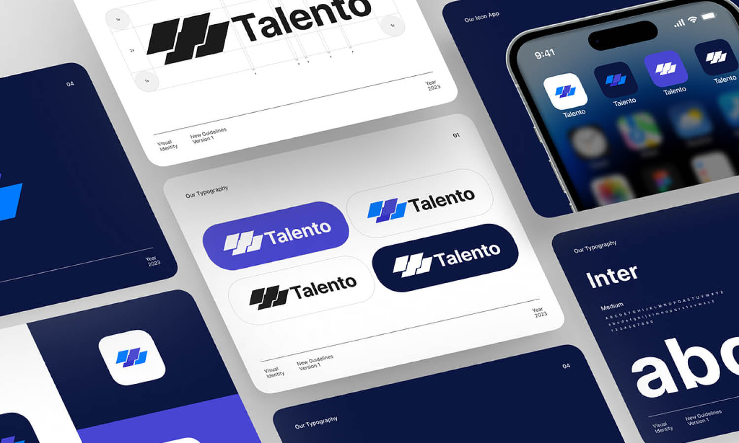
Understanding where favicons appear helps designers create a logo design variation that is clear, bold, and effective across different digital touchpoints, ensuring a strong brand presence in all user interactions.
How to Generate a Favicon
Creating a favicon is a simple yet essential step in branding a website. Since a favicon is a small-scale adaptation of a logo design, it should be optimized for clarity and readability at minimal dimensions.
The first step in generating a favicon is designing an appropriate icon. Using graphic design software like Adobe Illustrator, Photoshop, or Canva, designers can extract a simplified version of the logo design. It is important to use high contrast, bold shapes, and minimal details to ensure visibility at sizes as small as 16x16 pixels.
Once the design is finalized, the next step is formatting it correctly. While ICO is the most widely supported file format for favicons, other formats such as PNG, SVG, and GIF are also used. Online favicon generators, such as Favicon.io, RealFaviconGenerator, and Favicon.cc, allow users to convert images into various favicon formats and sizes required for different browsers and devices.
For best results, multiple versions of the favicon should be created in sizes like 16x16, 32x32, 48x48, and 180x180 pixels to support different screen resolutions and operating systems. After generating the favicon, it should be tested across various browsers to ensure proper display.
A well-crafted favicon strengthens a brand’s presence across digital platforms. By following a structured approach to favicon generation, designers can ensure their logo design remains recognizable and effective in small-scale digital environments.
Embedding a Favicon on a Website
Once a favicon has been created, the next step is embedding it into a website to ensure it displays correctly across browsers and devices. Adding a favicon is a straightforward process that involves placing the icon file in the website's root directory and linking it within the HTML code.
The favicon file, typically named favicon.ico, should be uploaded to the main directory of the website. However, modern websites also use PNG, SVG, or other formats for improved resolution and flexibility.
To embed the favicon, the following line of code should be added inside the <head> section of the website’s HTML file:
<link rel="icon" href="favicon.ico" type="image/x-icon">
For PNG or SVG formats, the code should be modified accordingly:
<link rel="icon" href="favicon.png" type="image/png">
For websites requiring multiple favicon sizes to support various devices, additional links can be included:
<link rel="apple-touch-icon" sizes="180x180" href="apple-touch-icon.png">
<link rel="icon" sizes="32x32" href="favicon-32x32.png" type="image/png">
After embedding the favicon, it should be tested across multiple browsers to confirm it appears correctly in tabs, bookmarks, and search results. By properly integrating a favicon, designers ensure that their logo design remains visually present and recognizable in all digital interactions.
Conclusion
A favicon may be small, but it plays a significant role in enhancing a brand’s online presence. As a condensed variation of a logo design, it provides instant recognition in browser tabs, bookmarks, and mobile home screens. A well-designed favicon maintains simplicity, uses high-contrast colors, and aligns with the brand’s identity. By selecting the right dimensions, file formats, and embedding it correctly, businesses ensure seamless visibility across devices. Whether using initials, symbols, or minimalistic graphics, an effective favicon strengthens brand identity and improves user experience, making it an essential element of modern logo design.
Let Us Know What You Think!
Every information you read here are written and curated by Kreafolk's team, carefully pieced together with our creative community in mind. Did you enjoy our contents? Leave a comment below and share your thoughts. Cheers to more creative articles and inspirations!






Leave a Comment