Essential Key Principles of Logo Design Sizing

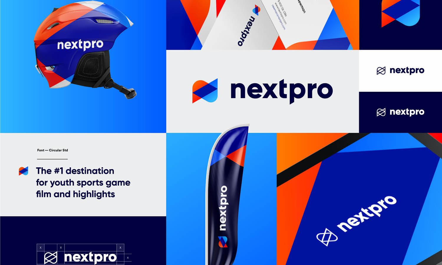
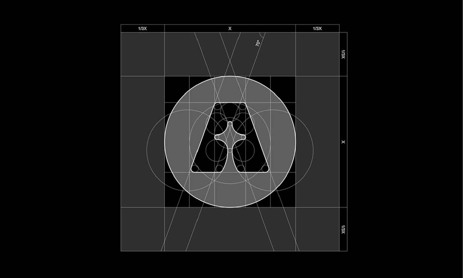
Source: SlabPixel Designer, Stagetimer - Brand Guideline, Dribbble, https://dribbble.com/shots/22476436-Stagetimer-Brand-Guideline
Achieving the perfect logo design sizing is crucial for ensuring a brand’s visual identity remains strong and recognizable across different platforms. A well-designed logo should maintain clarity and impact, whether displayed on a small business card or a large billboard. Without proper sizing considerations, a logo may lose readability, distort in scale, or fail to adapt to different applications.
One of the key challenges in logo design is ensuring that the design remains effective in various sizes. A logo that looks great at full scale might become illegible when shrunk for a mobile app icon or a social media profile picture. Additionally, elements such as typography, spacing, and intricate details must be carefully balanced to retain visibility at different dimensions.
To address these challenges, designers must implement best practices that guarantee flexibility and functionality. Whether designing for print, digital, or merchandise, every logo should be scalable, well-proportioned, and versatile. This article explores essential principles of logo design sizing, helping designers and businesses create logos that maintain consistency and professionalism in any format. By following these guidelines, brands can ensure their logos remain effective and recognizable across all applications, reinforcing a strong and cohesive identity.
Maintain Scalability
One of the most critical aspects of logo design sizing is scalability. A well-designed logo should retain its integrity and clarity regardless of size. Whether it appears on a small mobile app icon or a large outdoor banner, the design must remain visually consistent and easily recognizable.
Scalability ensures that a logo adapts to various digital and print formats without distortion or loss of quality. This requires designing in vector format, such as SVG, AI, or EPS, which allows for unlimited resizing without pixelation. Raster formats like PNG or JPEG can lose resolution when enlarged, making them unsuitable for large-scale applications.
To maintain scalability, designers should prioritize clean lines, minimal detailing, and balanced proportions. Intricate patterns or fine typography may look stunning at large sizes but become unreadable when reduced. Testing a logo at different scales during the design process helps identify potential issues before finalization.
Additionally, a scalable logo should have different variations for various uses. A primary logo may work well for large applications, while a simplified version or an icon-based mark may be more effective in smaller spaces. By ensuring scalability, designers create logos that remain effective, professional, and adaptable across all branding materials.
Consider Minimum Size Restrictions
Establishing a minimum size for a logo is essential in logo design sizing to preserve readability and brand recognition. When a logo is scaled down too much, intricate details, typography, and graphic elements can become indistinguishable, compromising its effectiveness.
A logo’s minimum size should be determined based on its complexity. Logos with detailed typography or fine lines require a larger minimum size than simple, bold designs. Designers should test the logo at various small dimensions to ensure all elements remain legible. If a logo becomes difficult to read or loses impact, adjustments may be necessary.
Another consideration is the medium on which the logo will appear. Digital platforms, such as websites and social media, often require smaller logo applications, whereas print materials may allow for slightly larger scaling. Business cards, app icons, and promotional merchandise often demand a logo that is optimized for small-scale use without sacrificing clarity.
To address size limitations, designers may create alternative logo versions. A responsive logo system, which includes primary, secondary, and icon-only variations, helps maintain brand consistency while allowing for flexibility in different sizing scenarios. By setting a clear minimum size restriction, businesses can ensure that their logos remain visually effective and maintain their professional identity across all platforms.
Optimize for Various Devices
Proper logo design sizing ensures that a brand’s identity remains clear and effective across various devices, from desktop monitors to smartphones and tablets. Each platform has different display requirements, making it crucial for logos to maintain visibility and legibility at any scale.
For websites and mobile applications, logos should be designed to accommodate responsive layouts. A large desktop header may support a full logo, while a mobile-friendly version might require a simplified or icon-based alternative. Testing logos on different screen sizes ensures they remain sharp and properly proportioned in all viewing conditions.
Social media platforms also impose unique sizing constraints. Profile pictures, cover images, and post thumbnails all require specific dimensions. A logo must fit within these guidelines while maintaining its core design elements. Failing to optimize for different devices can result in cropped logos, illegible text, or distorted branding.
Additionally, resolution plays a critical role in digital logo presentation. High-resolution vector formats, such as SVG, ensure logos remain crisp at any size without pixelation. Designers should avoid low-resolution images that may appear blurry or stretched when resized.

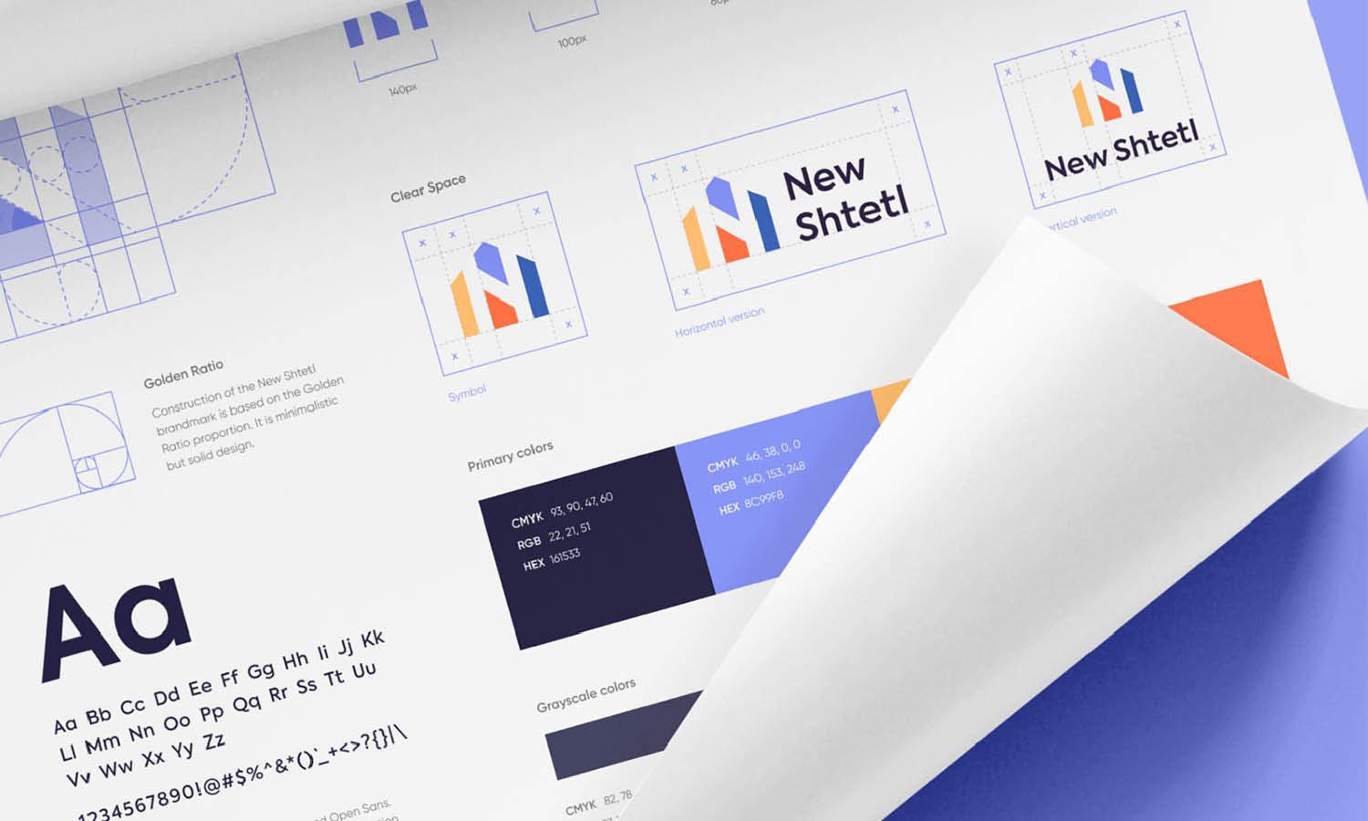
Source: Olga Vasik, Astro Brand Guide, Dribbble, https://dribbble.com/shots/17960440-astro-brand-guide
Preserve Aspect Ratio
Maintaining the correct aspect ratio is fundamental in logo design sizing to prevent distortion and ensure a logo’s integrity. The aspect ratio defines the proportional relationship between a logo’s width and height. Altering these proportions can stretch or compress the design, resulting in an unprofessional and unrecognizable appearance.
When resizing a logo, it should always be scaled proportionally to maintain its intended design. Stretching a logo horizontally or vertically can distort typography, misalign graphic elements, and compromise the overall aesthetic. To prevent this, designers should lock aspect ratios when adjusting sizes, ensuring the logo remains balanced and visually consistent.
Different applications require specific logo orientations, such as horizontal, vertical, or square formats. However, rather than distorting a single version, designers should create alternative logo layouts to accommodate different display needs. For example, a long horizontal logo may be challenging to fit into a compact space, requiring a stacked or icon-only variation for smaller applications.
Preserving aspect ratio is particularly crucial in digital and print environments where automatic resizing may occur. Many platforms, including social media sites and website builders, adjust images to fit predefined spaces. Uploading a logo with incorrect proportions can lead to unintended stretching or cropping.
Create Different Logo Variations
A single logo design may not always fit every branding need, making multiple variations essential for maintaining clarity and consistency. Logo design sizing should be flexible enough to accommodate different platforms, mediums, and display constraints without losing brand identity.
The primary logo, often detailed and full-sized, works well for large-scale applications such as websites, signage, and promotional materials. However, in smaller applications like social media icons or mobile apps, a simplified version may be required. A secondary logo, which could be a stacked, condensed, or monogram version, ensures adaptability without compromising brand recognition.
For extreme space limitations, an icon-only variation can be effective. This may include a brand’s initials, a custom symbol, or a recognizable portion of the primary logo. This version is particularly useful for social media profiles, favicons, and app icons where minimal space is available.
When creating variations, designers should maintain a cohesive visual identity by using consistent colors, typography, and proportions. Testing each version across different applications ensures they remain legible and visually appealing in every context.
Test Readability at Small Sizes
A crucial factor in logo design sizing is ensuring readability at smaller scales. When a logo is reduced, intricate details, fine typography, and complex graphics can become unrecognizable, making it essential to test readability across different sizes.
Small applications, such as business cards, social media icons, and mobile app interfaces, often require logos to be resized significantly. If a logo contains excessive detail, thin lines, or delicate typography, it may lose clarity when scaled down. Testing the design in various sizes helps determine the minimum viable size for maintaining legibility.
Typography plays a major role in small-scale readability. Fonts with thin strokes or elaborate serifs may become unreadable when reduced. To counteract this, designers should consider using bolder, more legible typefaces or adjusting letter spacing to prevent crowding. If necessary, a simplified wordmark version with fewer details can be used for smaller applications.
Another effective strategy is to create a responsive logo system. This involves designing different logo versions optimized for various size constraints. A full logo may work well at large sizes, while a simplified mark or icon version ensures clarity at smaller scales.
By thoroughly testing a logo’s readability at different sizes, designers can ensure that branding remains impactful across all mediums. A well-optimized logo retains its effectiveness, whether displayed on a large billboard or a tiny social media thumbnail.
Use Vector Files for Resizing
A critical factor in logo design sizing is ensuring that a logo remains crisp and clear at any scale. Using vector files is the best way to achieve this, as they allow for infinite resizing without any loss of quality. Unlike raster images, which rely on pixels, vector files use mathematical equations to define shapes, making them resolution-independent.
Common vector file formats include SVG, AI, EPS, and PDF, all of which maintain sharpness and clarity regardless of size. These formats ensure that a logo can be enlarged for billboards or reduced for business cards without becoming pixelated or blurry. In contrast, raster files like PNG, JPG, or GIF are limited by their fixed resolution, which can lead to quality loss when resized.
Vector files also provide flexibility for different applications. They can be easily modified, recolored, or adapted without degradation. Additionally, they allow for smooth scaling across print and digital media, ensuring consistency in branding.
When exporting a logo for different uses, it’s best to keep an editable vector file for professional applications and provide raster versions in appropriate resolutions for web and social media use. By prioritizing vector formats, designers can ensure that logos remain visually strong and professional across all sizes and platforms.

Source: Happy Milliarta, Odama Brand Guideline, Dribbble, https://dribbble.com/shots/14972995-Odama-Brand-Guideline
Ensure Proper White Space
Proper logo design sizing is not just about the logo itself but also about the space surrounding it. White space, also known as negative space, plays a vital role in ensuring that a logo remains visually clear, uncluttered, and impactful across various applications.
A well-spaced logo maintains its presence and readability, even when placed alongside other design elements. Without sufficient padding, a logo can feel cramped or lost within a layout, diminishing its effectiveness. Consistent white space helps a logo stand out, ensuring it remains the focal point in any composition.
To maintain proper white space, brands often establish clear spacing guidelines. A common method is defining a margin around the logo, typically based on the height of a letter or symbol within the design. This ensures that no other elements encroach on the logo’s visual boundary, preserving its integrity.
White space is especially crucial in smaller applications, such as mobile interfaces and social media icons, where crowded designs can lead to visual confusion. Ensuring enough padding prevents the logo from blending into the background or being overwhelmed by surrounding graphics.
Adapt for Print and Digital Use
Proper logo design sizing ensures that a logo remains effective across both print and digital mediums. Since each medium has different resolution requirements, color modes, and scaling considerations, a well-prepared logo must be adaptable for various applications.
For print, logos should be created in CMYK color mode to ensure accurate color reproduction. High-resolution vector files, such as AI, EPS, or PDF, are essential to maintain sharpness and detail in printed materials like business cards, brochures, and signage. Logos for large-scale prints, such as billboards or banners, require scalable vector formats to prevent pixelation.
In contrast, digital applications require RGB color mode for optimal display on screens. Logos should be optimized in PNG, SVG, or JPG formats, depending on the platform. PNG files with transparent backgrounds work well for websites and presentations, while SVG files ensure scalability without quality loss in web design and mobile interfaces.
Additionally, different screen resolutions must be considered. A logo that appears crisp on a desktop may lose quality on a mobile device if not properly resized. Responsive logo variations help maintain clarity and adaptability across different display sizes.
Check Legibility in Different Backgrounds
Ensuring a logo remains legible across different backgrounds is a crucial aspect of logo design sizing. Background colors, textures, and images can impact the visibility and effectiveness of a logo, making it essential to test designs in various settings.
A well-designed logo should be adaptable to both light and dark backgrounds without losing clarity. This is why many brands create multiple color variations, such as full-color, monochrome, and inverted versions. A dark logo may not stand out against a deep-colored background, requiring a lighter alternative for better contrast.
Logos should also be tested on busy or textured backgrounds. If a background contains multiple colors or patterns, a logo with a transparent background may blend in too much, reducing its visibility. Adding a subtle outline, drop shadow, or a solid background behind the logo can improve contrast and readability.
Another key factor is typography legibility. Fine or thin fonts may disappear on certain backgrounds, particularly if the contrast is weak. Choosing bold, high-contrast text options ensures that the brand name remains clear regardless of placement.
Designers should test logos across various platforms, including websites, business cards, social media, and advertisements, to ensure consistency. By checking legibility in different backgrounds, brands can maintain a strong and recognizable logo, ensuring clarity in every application.
Conclusion
Mastering logo design sizing is essential for creating a versatile and professional brand identity. A well-sized logo ensures readability, scalability, and adaptability across various platforms, from business cards to billboards. By considering factors such as aspect ratio, minimum size, white space, and background contrast, designers can maintain clarity and impact in every application. Using vector files, creating responsive variations, and testing across print and digital mediums further enhance logo effectiveness. Prioritizing these principles allows brands to present a polished, recognizable logo that maintains consistency and professionalism, ensuring a strong visual presence in all branding efforts.
Let Us Know What You Think!
Every information you read here are written and curated by Kreafolk's team, carefully pieced together with our creative community in mind. Did you enjoy our contents? Leave a comment below and share your thoughts. Cheers to more creative articles and inspirations!




Leave a Comment