10 Reasons Why You Should Use Grid In Logo Design

Source: Astaamiye, M Letter Construction Grid, Dribbble, https://dribbble.com/shots/15120355-M-Letter-Construction-Grid
Behind every great logo design, there is often a hidden structure guiding its form. One of the most powerful tools designers use to achieve clarity and balance is the grid. While it may seem technical at first glance, a grid is simply a framework that helps organize shapes, lines, and typography with precision. Instead of placing elements randomly, designers rely on a grid to create order and visual harmony.
In logo design, small details make a big difference. Slight misalignments or inconsistent spacing can weaken an otherwise strong concept. By using a grid, you establish consistent proportions, improve alignment, and ensure that every element works together as a unified system. This structured approach not only enhances aesthetics but also strengthens the overall impact of the mark.
Whether you are designing a minimalist symbol or a complex geometric emblem, a grid provides the foundation needed to build a timeless identity. In this article, we will explore ten compelling reasons why using a grid in logo design can elevate your work and help you create marks that are both visually balanced and professionally crafted.
Grid Enhances Consistency Across Brand Identity
Consistency is a key factor in building a strong and recognizable brand, and a grid plays an essential role in achieving it. In logo design, consistency means maintaining uniform spacing, alignment, and proportion throughout the entire mark. When you rely on a grid, you create a repeatable system that keeps every visual element in harmony.
A grid ensures that lines align cleanly, curves follow intentional paths, and typography sits comfortably within defined boundaries. This structured approach reduces visual noise and prevents awkward gaps or uneven spacing. As a result, the logo design feels stable and carefully crafted rather than accidental.
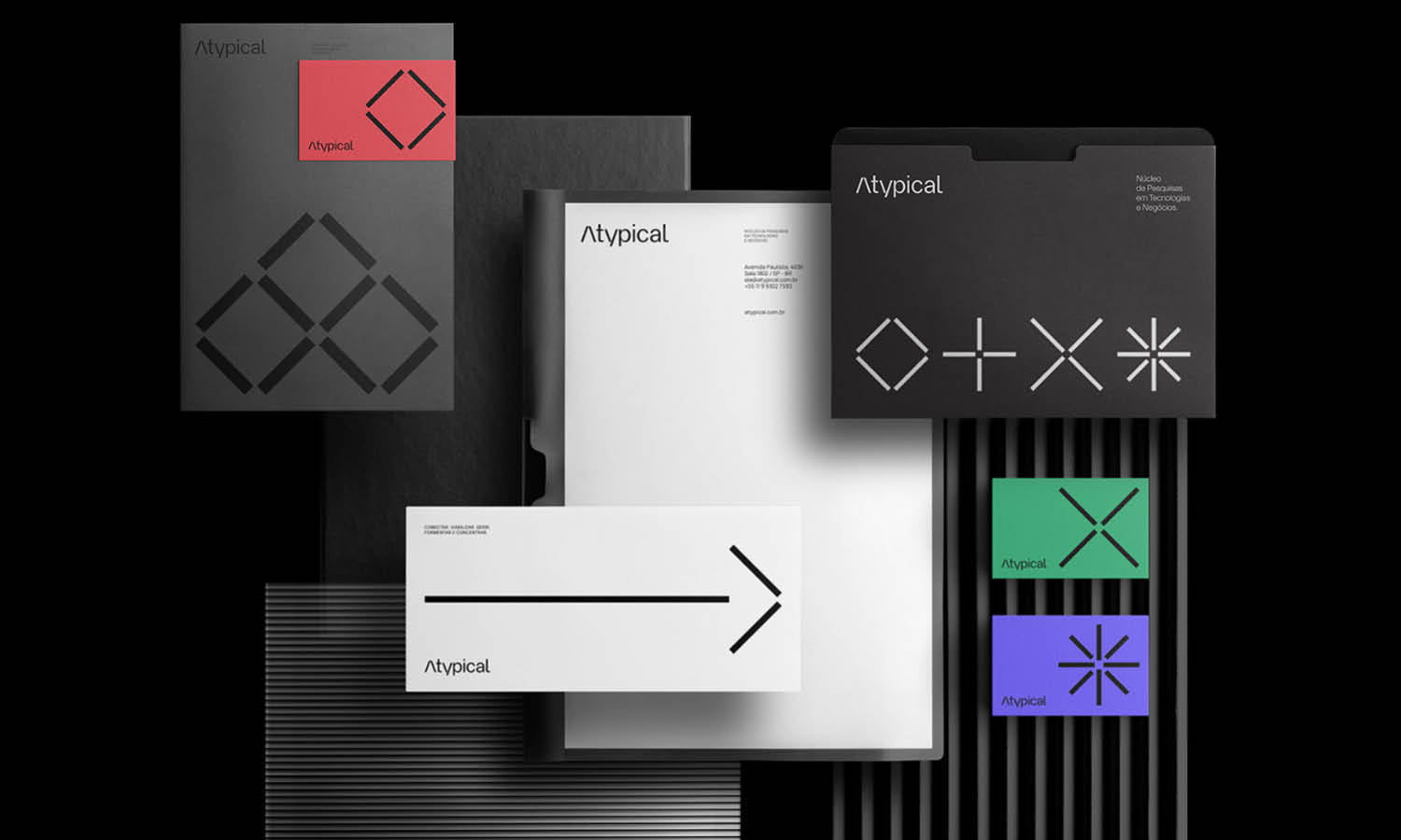
Beyond the logo itself, a grid-based logo design also supports consistency across other brand materials. Because the proportions are clearly defined, it becomes easier to extend those measurements into packaging, social media graphics, or marketing layouts. The grid acts as a visual blueprint that keeps the brand cohesive. While audiences may never see the grid behind the scenes, they will recognize the sense of order and reliability it creates.
Grid Supports Scalability And Adaptability
A great logo design must work in many sizes and formats, from tiny mobile icons to large signage. A grid helps ensure that your design remains clear and readable no matter where it appears. By building your logo design on a structured grid, you maintain strong proportions that scale smoothly without distortion.
When elements are aligned to a grid, resizing becomes more predictable. Icons maintain their shape, spacing remains balanced, and typography stays legible. This is especially important in responsive environments where logos may shift between horizontal, stacked, or simplified variations.
Using a grid in logo design also makes it easier to create alternate versions of the mark. Because the structure is clearly defined, you can remove or rearrange elements while preserving visual balance. This adaptability allows the logo to function across digital platforms, print materials, and merchandise without losing its integrity or impact.
Grid Encourages Precision And Attention To Detail
Precision is what separates an average mark from an exceptional logo design. A grid gives you measurable guidelines that help refine every curve, corner, and intersection. Instead of relying purely on visual instinct, you can use a grid to align anchor points, control spacing, and maintain consistent stroke widths. This technical clarity elevates the overall quality of your logo design.
When working on symmetrical icons or geometric symbols, even the smallest misalignment can disrupt the visual flow. A grid allows you to compare distances and angles accurately, ensuring that elements mirror each other perfectly when needed. This attention to detail creates a logo design that feels polished and intentional.
Using a grid also improves your decision-making process. Rather than endlessly adjusting elements without direction, you follow a structured system. Over time, this habit sharpens your design discipline and strengthens your craftsmanship. Clients may not notice the grid itself, but they will notice the clean edges, balanced spacing, and professional finish that result from it.

Source: The Monochromatic Institute, Grid Construction for Leading Edge Scaffolding, Dribbble, https://dribbble.com/shots/16259595-Grid-construction-for-Leading-Edge-Scaffolding
Grid Simplifies Complex Design Concepts
Some brands require layered symbols or intricate geometric relationships in their logo design. Without structure, these concepts can quickly become cluttered. A grid helps break complex ideas into manageable sections, allowing you to organize shapes logically and maintain clarity throughout the composition.
By dividing the canvas into consistent units, a grid provides a clear roadmap for placing multiple elements. Circles can intersect at precise points, lines can follow intentional angles, and negative space can be carefully controlled. This organized approach ensures that even a detailed logo design remains visually simple and easy to understand.
A grid does not limit creativity; instead, it supports it. With a strong framework in place, you can experiment confidently, knowing that your design will stay balanced. In logo design, simplicity often comes from well-structured complexity, and a grid is one of the most reliable tools for achieving that harmony.
Grid Strengthens Geometric Harmony
Many of the most iconic marks in logo design are built on simple geometric relationships. Circles, squares, and triangles often form the foundation of memorable brand symbols. A grid helps you control these shapes with precision, ensuring that every curve and angle relates proportionally to the whole composition. This geometric harmony creates a sense of order that feels both natural and visually satisfying.
When you apply a grid to logo design, you can align circular forms to exact centers, match widths across different elements, and maintain consistent spacing between components. These subtle alignments may not be obvious to the viewer, but they contribute to a refined and cohesive final result. The grid acts as a silent guide, helping you maintain balance without overcomplicating the design.
Geometric harmony also enhances brand perception. A well-structured logo design communicates stability, logic, and professionalism. By relying on a grid, you create relationships between elements that feel intentional rather than accidental. This structured approach gives your logo a timeless quality that can endure design trends and remain effective for years to come.

Source: Antonio Calvino, HS Grid, Dribbble, https://dribbble.com/shots/7659665-HS-Grid
Grid Speeds Up The Creative Process
At first glance, using a grid in logo design might seem restrictive. However, it often makes the creative process faster and more efficient. With a grid in place, you spend less time guessing about alignment or spacing and more time refining the concept itself. The framework provides clear boundaries that guide your decisions.
Instead of repeatedly adjusting elements by eye, you can rely on grid lines to position shapes and typography accurately. This reduces trial and error and helps you move smoothly from rough concept to polished logo design. The grid becomes a supportive tool rather than a limitation.
Over time, working with a grid strengthens your workflow habits. You begin to anticipate proportion and alignment naturally, which speeds up revisions and client feedback stages. In logo design, efficiency combined with structure leads to better results and a more confident, streamlined design process.
Grid Builds Professional Credibility
First impressions matter, especially in logo design. A well-constructed mark instantly communicates trust and professionalism. Using a grid helps you achieve that polished look by ensuring every element is aligned, balanced, and proportionally consistent. While viewers may not see the grid itself, they will notice the clarity and order it creates.
When a logo design lacks structure, small inconsistencies can make it feel unrefined. Uneven spacing, awkward alignment, or disproportionate elements can subtly weaken brand perception. A grid prevents these issues by giving you a reliable framework to follow. Each line, curve, and shape is positioned with intention rather than guesswork.
For clients and stakeholders, a grid-based logo design also demonstrates thoughtful craftsmanship. Presenting your work with visible grid construction can reinforce the logic behind your decisions. It shows that the design is not random but built on measurable relationships. This level of precision strengthens confidence in both the logo and the designer behind it.
Grid Creates Timeless And Memorable Logos
Trends in logo design evolve quickly, but strong structure never goes out of style. A grid provides a solid foundation that keeps your composition grounded in balance and proportion. By building your logo design on a grid, you create a mark that feels stable and enduring rather than trendy and temporary.
Timeless logos often rely on simple geometry and clear alignment. A grid supports these qualities by organizing elements into harmonious relationships. Whether you are designing a minimalist symbol or a typographic mark, the grid ensures that every component contributes to a unified whole.
Memorability also comes from clarity. When a logo design is structured with a grid, it becomes easier to recognize and recall. Clean alignment and consistent spacing reduce visual clutter, allowing the core idea to stand out. In the long run, a grid helps you craft logos that not only look professional today but remain effective and relevant for years to come.
Conclusion
Using a grid in logo design is not about limiting creativity, but about strengthening it with structure and precision. A grid helps you achieve balance, consistency, and scalability while refining every detail of your composition. From improving geometric harmony to building professional credibility, the grid provides a reliable foundation for timeless brand marks. When applied thoughtfully, a grid transforms logo design into a more intentional and strategic process, resulting in logos that are clear, memorable, and built to last across every platform and application.
Let Us Know What You Think!
Every information you read here are written and curated by Kreafolk's team, carefully pieced together with our creative community in mind. Did you enjoy our contents? Leave a comment below and share your thoughts. Cheers to more creative articles and inspirations!


Leave a Comment