
How to Choose the Right Logo Size for Your Website
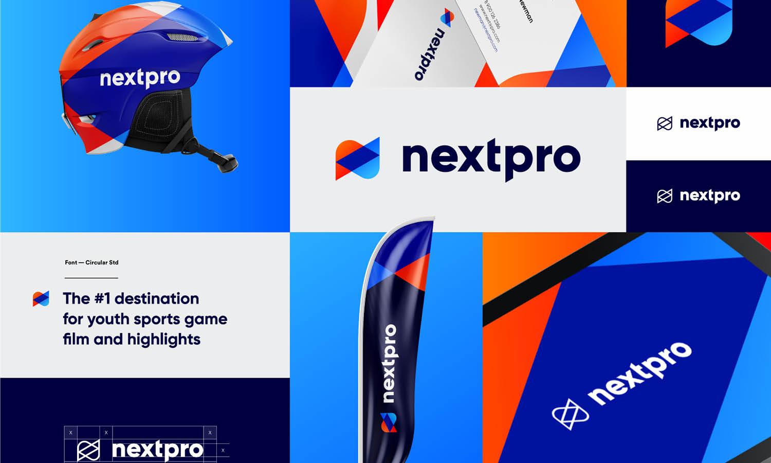
Source: Balkan Brothers, Termgrid - Logo, Dribbble, https://dribbble.com/shots/19494470-Termgrid-Logo
Selecting the right logo size for a website is essential for creating a professional and visually appealing online presence. A logo is more than just a design—it represents a brand’s identity, making it crucial to ensure it is displayed correctly across various digital platforms. Whether appearing in the website header, footer, favicon, or mobile version, the logo should be clear, well-proportioned, and adaptable to different screen sizes.
A poorly sized logo can negatively impact the overall user experience. If it is too large, it may disrupt the website layout or slow down page loading times. On the other hand, if it is too small, it may become unreadable or fail to make an impact. Finding the right balance requires an understanding of common website dimensions, device responsiveness, and file formats that ensure clarity without compromising performance.
This article will guide you through the essential factors to consider when choosing the ideal logo size for a website. From understanding standard dimensions to optimizing for various devices, these key insights will help ensure your logo remains sharp, professional, and aligned with your brand’s identity. A well-optimized logo enhances both visual appeal and usability, making a lasting impression on visitors.
Understand Website Logo Placement
Choosing the right logo size for a website starts with understanding where the logo will appear. Different placements require different dimensions to maintain visual appeal and usability. The most common locations for a website logo include the header, footer, favicon, and mobile navigation menu. Each placement serves a unique purpose and must be optimized accordingly.
The header logo is typically the most prominent, as it represents the brand across all pages. It should be large enough to remain visible without overpowering the navigation elements. Footer logos, on the other hand, are often smaller and used for branding reinforcement or copyright purposes.
A favicon is a miniature version of the logo that appears in browser tabs and bookmarks. Since it is significantly reduced in size, a simplified or icon-only version of the logo is recommended for clarity.
For mobile-responsive websites, the logo must adapt seamlessly to smaller screens. It should be proportionate to the mobile navigation bar to avoid excess spacing or crowding. A horizontally oriented logo often works best for modern website layouts, while a square or stacked version may be suitable for specific placements.
By determining the ideal placement, brands can ensure their logo remains professional, legible, and well-integrated into the overall design. Thoughtful positioning enhances brand recognition and creates a cohesive user experience across all touchpoints.
Follow Standard Header Logo Dimensions
The logo size in a website header is crucial for balancing visibility and aesthetics. Since the header is a fixed or sticky element in most designs, the logo must be sized appropriately to complement navigation links, menus, and other interface elements.
A typical header logo size ranges between 250x100 pixels and 400x100 pixels for desktop screens. This ensures clarity while maintaining a sleek and professional appearance. For websites with a compact navigation bar, a slightly smaller logo around 200x75 pixels may be more suitable.
When designing a responsive website, the logo should scale proportionally across different devices. Mobile header logos are usually smaller, ranging between 150x50 pixels and 280x60 pixels, to fit within limited screen space. A horizontally elongated logo works best in most cases, but brands with square or stacked logos may need an alternate version for better adaptability.
The file format also plays a role in maintaining sharpness. SVG files are highly recommended for header logos because they retain their quality regardless of screen resolution. PNG files with transparent backgrounds are also commonly used to ensure seamless integration with various website themes.
A properly sized header logo enhances brand visibility without disrupting the website’s structure. It should be large enough to establish a strong presence yet subtle enough to maintain balance with other design elements. Finding the right dimensions will help create a professional and visually appealing user experience.
Ensure Logo Scalability
A well-designed logo size for a website should be scalable to maintain clarity across different screen sizes and resolutions. Scalability ensures that a logo looks crisp on large desktop screens while remaining legible on smaller devices like smartphones and tablets.
Vector-based file formats such as SVG (Scalable Vector Graphics) are the best choice for achieving seamless scalability. Unlike raster formats like PNG or JPEG, SVG files retain their sharpness regardless of how much they are resized. This is especially important for modern, responsive websites where logos need to adapt dynamically.
Another key factor in scalability is aspect ratio consistency. A horizontal logo with a ratio of around 4:1 works well for most website headers, while a square or stacked version is useful for smaller placements like mobile menus and favicons. Keeping proportions consistent prevents the logo from appearing stretched or distorted when resized.
Designing a logo with simplified details also improves scalability. Logos with intricate patterns or thin lines may lose clarity when reduced in size. A streamlined design ensures that all elements remain visible at any dimension.
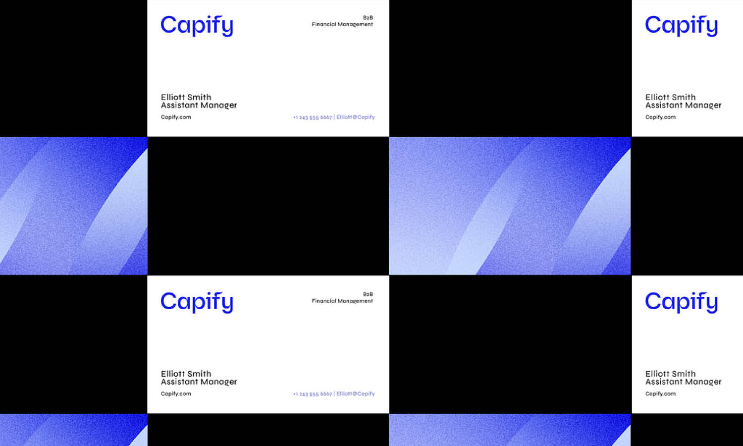
Source: Stian, Treecard, Dribbble, https://dribbble.com/shots/16718697-Treecard
Optimize for Retina Displays
A logo size on a website must be optimized for high-resolution screens, including Retina displays, to ensure a crisp and professional appearance. Retina displays have a higher pixel density than standard screens, meaning low-resolution logos may appear blurry or pixelated.
To achieve sharpness on Retina screens, logos should be saved at twice their intended display size. For example, if a website header logo is set to display at 250x100 pixels, the uploaded file should be 500x200 pixels. This allows the browser to scale the image down while retaining high detail.
Using SVG files is another effective way to optimize for Retina displays. Unlike pixel-based formats such as PNG or JPEG, SVG files use mathematical formulas to render graphics, ensuring perfect clarity at any resolution. This makes them ideal for logos displayed on high-definition screens.
For websites that rely on raster formats, high-quality PNG files with transparent backgrounds are recommended. PNGs maintain better sharpness than JPEGs, which may introduce compression artifacts.
Testing the logo across different devices and screen types is essential to confirm its clarity. A blurry or pixelated logo can undermine a brand’s professionalism, while a well-optimized Retina-compatible logo enhances the visual experience. Ensuring high-resolution quality strengthens brand recognition and contributes to a sleek and polished website design.
Maintain Readability on All Devices
A well-designed logo size on a website should maintain readability across all devices, from large desktop monitors to compact mobile screens. A logo that is too small may lose its impact, while an oversized logo can interfere with the layout and navigation. Striking the right balance ensures clarity and brand recognition.
One of the key factors in readability is contrast. A logo should be visible against different background colors and patterns used in the website’s design. If a logo blends into the background, it may lose its effectiveness. Using a high-contrast version or an alternate color scheme can improve visibility.
The logo’s typography and symbols should remain legible at all sizes. Avoid using intricate fonts or excessive detailing that may become unrecognizable when the logo is scaled down. Instead, opt for clean, bold lines and clear lettering that are easy to read even at smaller dimensions.
Testing the logo on multiple screen sizes is essential to ensure it adapts well to various devices. A logo that looks sharp on a desktop might appear distorted on a mobile phone if not properly optimized. By maintaining readability across all platforms, brands can create a strong and professional presence that leaves a lasting impression on visitors.
Check Logo Size on Mobile Viewports
Optimizing the logo size for a website involves ensuring it displays correctly on mobile viewports. Since mobile screens are significantly smaller than desktop monitors, a logo must be scaled to fit within compact spaces without losing clarity.
A typical mobile-friendly logo falls within the range of 150x50 pixels to 280x60 pixels, depending on the website layout. This size ensures that the logo remains visible while leaving enough space for navigation menus and other elements.
One important factor to consider is proportional scaling. A horizontally stretched logo may appear compressed on mobile devices, while a tall logo might take up too much vertical space. Brands with intricate logos should consider an alternative, simplified version for mobile use.
Another crucial element is touch-friendly spacing. If a logo is placed too close to navigation buttons or text, it may create usability issues. Proper padding around the logo enhances visibility and prevents accidental clicks.
Testing how the logo appears in mobile browsers and various screen resolutions helps identify any potential resizing issues. Responsive design frameworks automatically adjust logo dimensions, but manual adjustments may be necessary to maintain consistency.
By optimizing the logo for mobile viewports, brands can ensure a seamless user experience across all devices. A well-sized logo enhances readability and reinforces brand identity, making navigation intuitive and visually appealing.
Use Transparent Backgrounds for Flexibility
Choosing the right logo size for a website goes beyond just dimensions—it also involves selecting the correct background format. A transparent background ensures flexibility, allowing the logo to blend seamlessly with different website layouts and color schemes.
Logos with solid or white backgrounds can create unwanted visual blocks when placed on colored or patterned sections of a website. This can make the design look unpolished and disrupt the overall aesthetic. A PNG file with a transparent background eliminates this issue, ensuring that the logo integrates smoothly into any part of the website.
Using a vector-based SVG file is another excellent choice, as it not only maintains transparency but also scales without losing quality. This is particularly useful for websites with responsive designs where the logo size may need to adjust dynamically.
For dark-themed websites, a light-colored logo version should be available to maintain visibility. Similarly, a dark logo variant works best on light backgrounds. Having multiple versions of a logo with transparent backgrounds allows for greater adaptability across different sections of a website.
By utilizing transparency, brands can ensure their logo remains professional and visually cohesive. This approach allows the logo to maintain its impact while adapting to various placements without compromising design integrity.
Source: Ofspace, Dorik - No-Code Page Builder, Dribbble, https://dribbble.com/shots/18931413-Dorik-no-code-page-builder
Test Logo Visibility Against Website Colors
Selecting the correct logo size for a website is only part of the equation—ensuring visibility against different background colors is just as important. A well-designed logo should stand out clearly and maintain readability, regardless of where it is placed on the website.
The first step is to test the logo against various sections of the website, including headers, footers, and content areas. If the logo’s colors blend too much with the background, it may become difficult to see. A lack of contrast can weaken brand recognition and affect the website’s overall aesthetics.
To enhance visibility, brands should have multiple logo variations. A light-colored logo works best on dark backgrounds, while a dark-colored logo provides better contrast on light backgrounds. Some designs may also require a monochrome or grayscale version for better adaptability.
Another factor to consider is opacity and layering. If the website has semi-transparent overlays or gradient backgrounds, the logo should be adjusted accordingly to prevent distortion or blending issues. Testing how the logo appears under different lighting conditions and screen settings further ensures consistency.
By evaluating the logo’s visibility across different website elements, brands can maintain a strong and professional presence. A clearly visible logo enhances usability, improves user experience, and reinforces brand identity, making a lasting impact on visitors.
Use a Favicon-Friendly Logo Size
A logo size on a website is not limited to headers and footers—it also needs to be optimized for favicons. A favicon is the small icon displayed in browser tabs, bookmarks, and search results, helping users quickly identify a website. Since favicons are significantly smaller than standard logos, they require a simplified design to remain recognizable.
The recommended favicon sizes range from 16x16 pixels to 48x48 pixels, with 32x32 pixels being the most common. These dimensions ensure compatibility with most browsers and devices. Some modern platforms also support higher-resolution favicons, such as 64x64 pixels or 512x512 pixels, for better clarity on Retina displays.
For best results, favicons should use square dimensions to avoid cropping or distortion. If a brand’s main logo is wide or intricate, a simplified version—such as a monogram, symbol, or icon—should be used instead. This ensures that the favicon remains clear even at the smallest sizes.
Using the ICO format is recommended for favicons because it supports multiple resolutions in a single file. However, PNG and SVG formats are also widely accepted and work well for modern browsers.
By optimizing a favicon’s size and design, brands can enhance their website’s professional appearance and improve user recognition. A well-designed favicon contributes to a cohesive branding experience and reinforces the website’s identity across different browsing environments.
Test Logo Appearance in Different Browsers
Ensuring a proper logo size for a website involves more than just choosing the right dimensions—it also requires testing across different browsers. Since each browser processes images and styles slightly differently, a logo may appear crisp and well-placed in one browser but distorted or misaligned in another.
The most commonly used browsers include Google Chrome, Mozilla Firefox, Safari, Microsoft Edge, and Opera. Each of these browsers renders graphics based on unique engine settings, which can affect logo clarity, alignment, and transparency. Testing how the logo appears in each browser ensures a consistent and professional look across all platforms.
One common issue is scaling discrepancies. Some browsers may resize a logo differently, especially in responsive layouts. If a logo appears stretched or pixelated, adjusting its dimensions or using an SVG file can help maintain sharpness.
Another factor to check is background transparency. Some browsers display PNG transparency differently, leading to unwanted white or colored backgrounds. Testing the logo on various backgrounds ensures it integrates seamlessly.
Testing on different screen resolutions, including standard and high-DPI displays, also helps verify clarity. Some older browsers may not support newer image formats, so having multiple versions of the logo (SVG, PNG, and JPG) ensures compatibility.
By thoroughly testing the logo’s appearance across multiple browsers, brands can maintain a polished and professional presence. This attention to detail enhances user experience and ensures a visually cohesive website.
Conclusion
Choosing the right logo size for a website is essential for maintaining a professional and visually appealing design. A well-sized logo ensures clarity, enhances brand recognition, and adapts seamlessly to different screen sizes and devices. From optimizing header dimensions to ensuring scalability, each aspect contributes to a cohesive user experience. Testing the logo across various browsers and backgrounds further guarantees consistent visibility. By carefully selecting and adjusting the logo size, brands can create a strong digital presence that aligns with their identity. A properly optimized logo strengthens the website’s overall design and leaves a lasting impression on visitors.
Let Us Know What You Think!
Every information you read here are written and curated by Kreafolk's team, carefully pieced together with our creative community in mind. Did you enjoy our contents? Leave a comment below and share your thoughts. Cheers to more creative articles and inspirations!
Related Articles


Leave a Comment