How to Create A Proper Logo Design Guideline

Source: Rashed Mamun, Upanib Brand Guidelines, Behance, https://www.behance.net/gallery/145659561/Upanib-Brand-Guidelines?isa0=1#
Creating a logo design guideline is essential for maintaining a consistent and professional brand identity. A logo is more than just a visual mark—it represents a company’s values, personality, and credibility. Without clear guidelines, a logo may be misused, leading to inconsistencies that weaken brand recognition. A well-structured logo design guideline ensures that the logo is applied correctly across different platforms, materials, and mediums.
A proper logo design guideline provides clear instructions on logo variations, color schemes, typography, sizing, and placement. It also defines how the logo should appear in various contexts, including digital screens, printed materials, and merchandise. By establishing these rules, businesses can maintain a unified brand image and prevent any distortions or misrepresentations of their logo.
Whether for an internal design team, external collaborators, or marketing professionals, a logo design guideline serves as a reference point to uphold branding consistency. It eliminates guesswork and ensures that the logo maintains its visual integrity regardless of where it is used. This article will outline key elements to include in a logo design guideline, providing a structured approach to creating a document that protects and reinforces a brand’s identity.
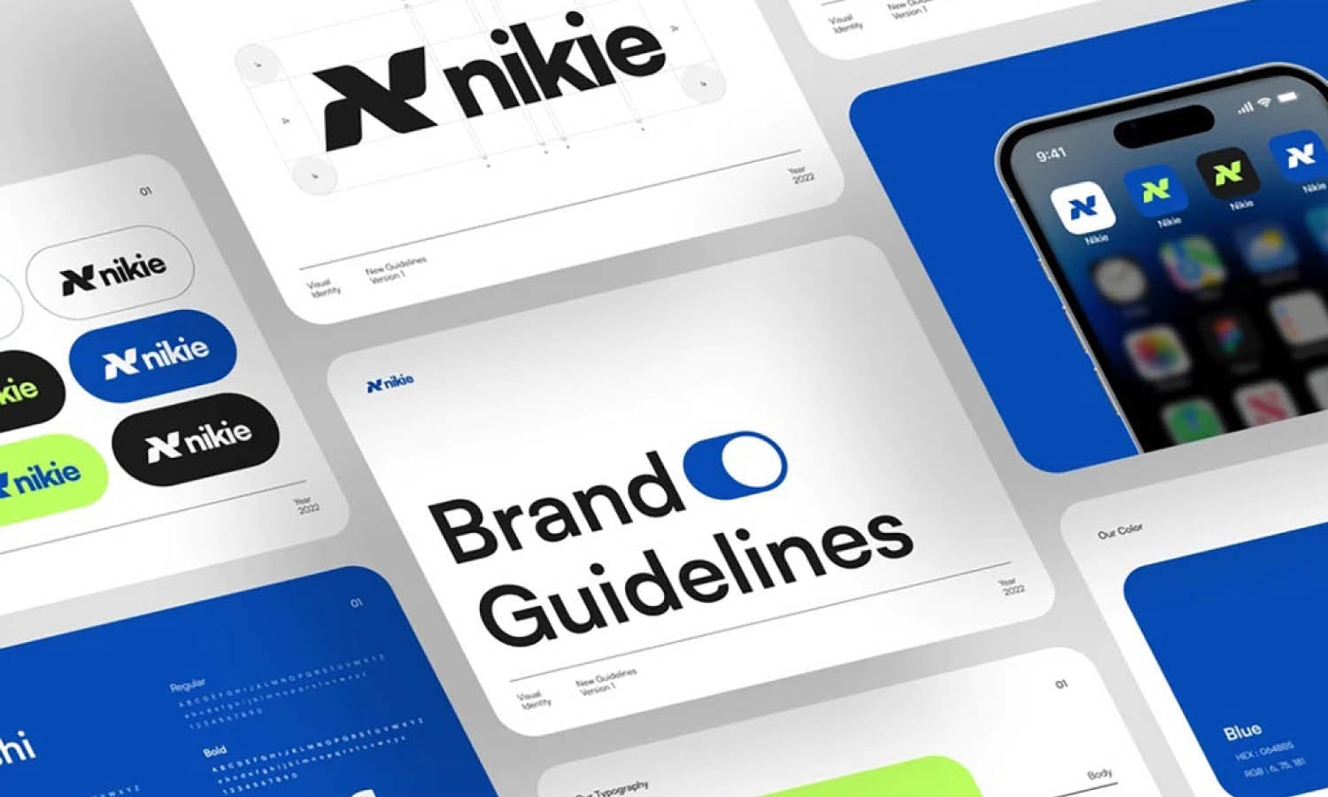
Define Logo Variations
A well-structured logo design guideline should include different logo variations to ensure adaptability across multiple platforms and mediums. A brand’s logo may not always appear in its full-color version, so providing alternative designs helps maintain consistency and visibility in various applications.
The primary logo variation is the full-color logo, which represents the brand in its most recognizable form. This version is typically used in standard marketing materials, websites, and digital platforms. However, in cases where a full-color logo is not practical, a monochrome version should be available. A black or white logo ensures clarity in grayscale printing, embossing, or single-color backgrounds.
A simplified logo or wordmark variation is also important for small-scale applications, such as app icons, social media profile pictures, or promotional merchandise. This version removes unnecessary details while maintaining brand recognition. Additionally, a transparent background version should be included to ensure seamless placement on different colored backgrounds without unwanted white boxes or borders.
Businesses should also consider horizontal and vertical orientations to fit different layout requirements. A horizontal version works well for website headers, while a stacked version may be better suited for packaging or print materials. By defining these variations, a logo design guideline ensures that the logo remains flexible, legible, and effective in all branding scenarios.
Specify Minimum Size Requirements
Establishing minimum size requirements is crucial in a logo design guideline to ensure the logo remains clear and legible in all applications. If a logo is reduced too much, details can become lost, text may be unreadable, and overall brand recognition may weaken.
To maintain clarity, the absolute minimum size for digital and print applications should be defined. A common guideline is that the logo should never be smaller than 1 inch (or 25 mm) in width for print and at least 100 pixels in width for digital use. However, this measurement may vary depending on the complexity of the logo design. Logos with intricate details or small text may require a larger minimum size to remain readable.
For favicon and app icon usage, a simplified version of the logo should be used, ensuring it remains recognizable even at 16x16 pixels or 32x32 pixels. When used in responsive web design, a scalable logo that adapts to different screen sizes should be considered.
It is also essential to test the logo across different devices and printing techniques to determine the most effective minimum size. By defining these specifications, a logo design guideline helps prevent branding inconsistencies and ensures that the logo always appears in its best form, regardless of the medium.
Outline Clear Space Rules
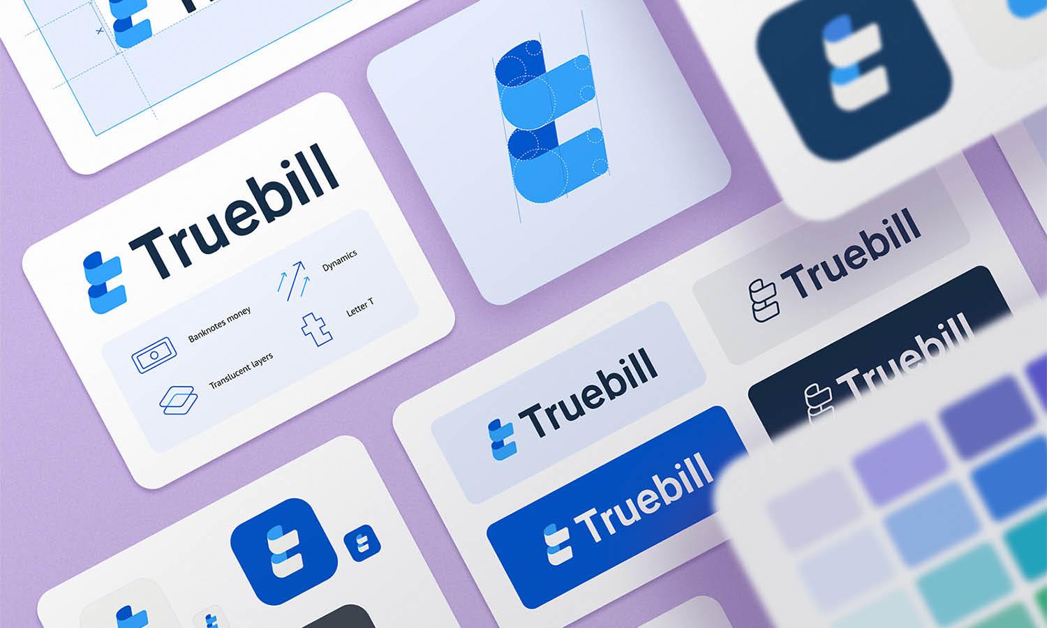
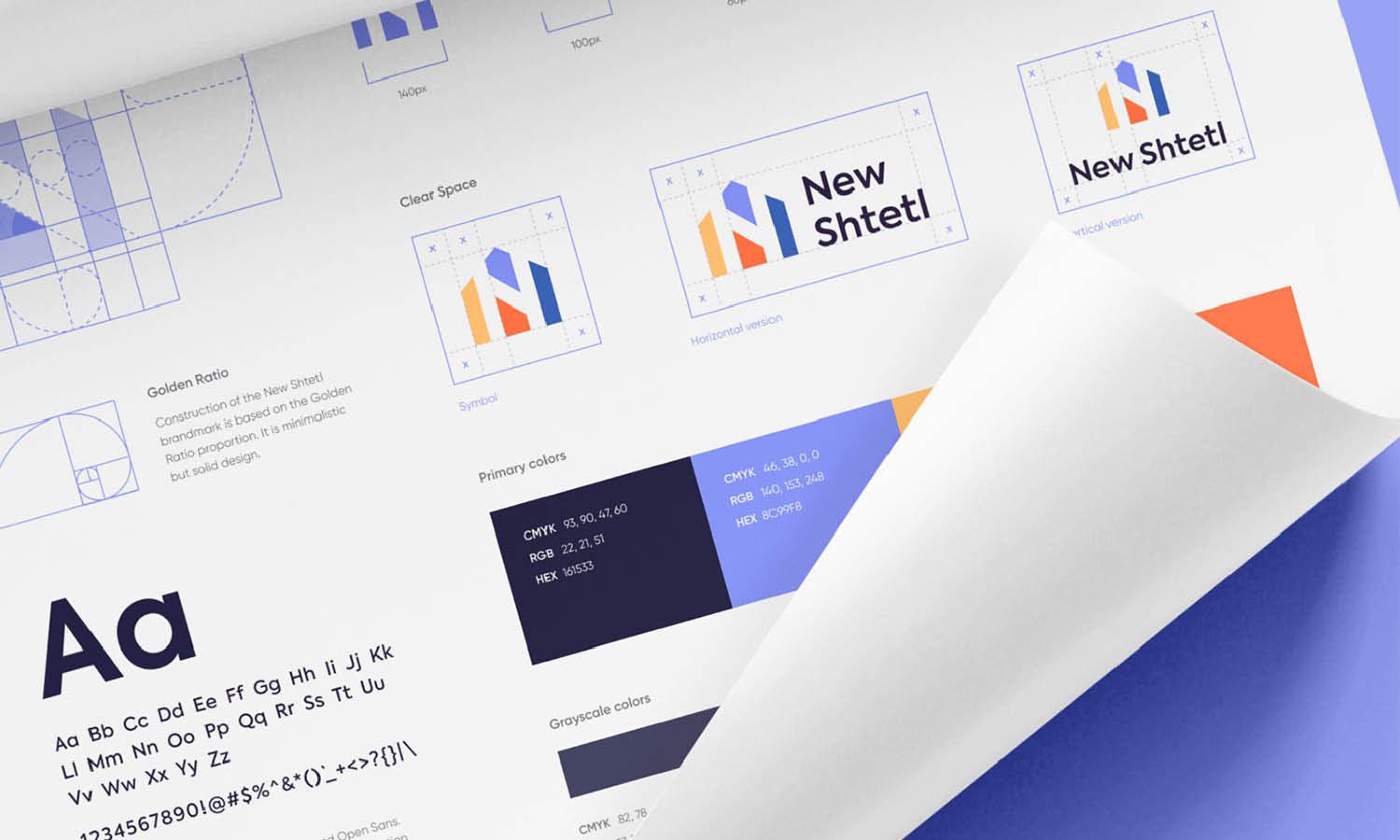
A logo design guideline should establish clear space rules to maintain the logo’s visual integrity and ensure it is always presented in the best possible way. Clear space refers to the area surrounding the logo that must remain free of any other design elements, text, or graphics. This buffer zone prevents visual clutter and ensures the logo stands out effectively.
To determine the appropriate clear space, a common method is using a part of the logo itself—such as the height of a letter or an icon element—as a measuring unit. For example, the minimum clear space may be equal to the height of the logo’s main character or symbol. This rule helps maintain proportional spacing across different applications.
Clear space guidelines should apply to all logo variations, whether in print, digital platforms, or merchandise. Additionally, it is essential to emphasize that the clear space should never be compromised by overlapping text, borders, or images. This ensures that the logo remains legible and recognizable in all contexts.
Providing visual examples within the logo design guideline can help illustrate improper usage versus correct spacing. By enforcing clear space rules, businesses can protect their brand identity and ensure that the logo retains its intended impact across all platforms.

Source: Muhammad Dani Asyrofi, Movbot - Brand Guideline, Dribbble, https://dribbble.com/shots/21564621-Movbot-Brand-Guideline
Provide Approved Color Codes
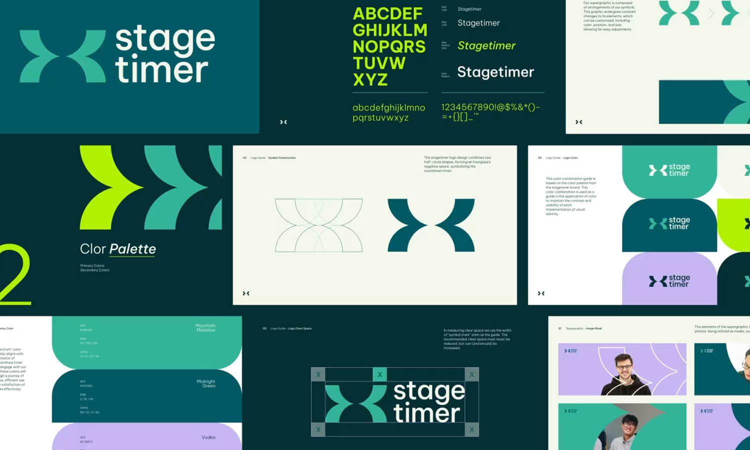
Color consistency is a fundamental aspect of any logo design guideline. Defining approved color codes ensures that the logo always appears in its correct shades, maintaining brand recognition across different materials and platforms.
The primary brand colors should be clearly listed with their corresponding RGB, CMYK, HEX, and Pantone (PMS) values. RGB is used for digital screens, CMYK is essential for print applications, HEX is crucial for web design, and Pantone ensures accurate color reproduction in high-quality printing. By providing these values, designers and printers can precisely match the intended logo colors.
A logo design guideline should also specify acceptable alternative color variations. These may include monochrome (black or white) versions, grayscale adaptations, and single-color options. These variations are essential when full-color printing is not feasible or when the logo is displayed against complex backgrounds.
Additionally, guidelines should clarify which background colors complement or conflict with the logo’s primary colors. If certain background hues affect readability, restrictions should be set to avoid those combinations.
Visual examples should be included to show correct and incorrect color applications. By defining approved color codes, a logo design guideline ensures brand consistency, avoiding unintended color shifts that can alter the brand’s perception across different mediums.
Choose the Right Typography
Typography plays a crucial role in a logo design guideline, as it directly impacts readability, brand personality, and overall visual identity. Selecting the right fonts ensures consistency across different branding materials and platforms.
A logo design guideline should specify the primary typeface used in the logo and any secondary fonts for complementary text, such as taglines or branding materials. The chosen font should align with the brand’s tone—whether modern and minimalistic, bold and authoritative, or classic and elegant. For instance, sans-serif fonts convey a clean and contemporary feel, while serif fonts exude tradition and professionalism.
It is essential to include guidelines on font modifications. If the logo typography has been customized or altered, clear instructions should be provided to prevent unauthorized adjustments. This ensures that the logo retains its original design intent.
Additionally, the guideline should address font usage across different mediums. For digital applications, specify web-safe alternatives that closely match the primary typeface. In print, ensure the font is available in a high-resolution format to maintain clarity and sharpness.
Examples of incorrect font usage should be included to prevent distortion, improper scaling, or substitution with non-approved fonts. By defining typography rules within a logo design guideline, brands can maintain visual consistency and reinforce a strong, recognizable identity.
Include Do’s and Don’ts
A logo design guideline should include a do’s and don’ts section to provide clear instructions on proper and improper logo usage. This section ensures consistency and prevents branding misinterpretations across various platforms.
The do’s should outline best practices for using the logo. This includes maintaining the correct proportions, ensuring legibility, using approved color variations, and applying the proper clear space. Examples of correct applications, such as placement on brand materials, social media, and merchandise, help reinforce these guidelines.
The don’ts should highlight common mistakes to avoid. This may include stretching or distorting the logo, changing colors outside the approved palette, adding unauthorized effects (such as shadows or gradients), or placing the logo on a background that reduces visibility. Unauthorized modifications, such as replacing the font or altering design elements, should also be strictly prohibited.
Providing visual examples of correct and incorrect usage makes it easier for designers, marketers, and third-party vendors to follow the guidelines effectively. A structured list of do’s and don’ts helps eliminate inconsistencies and ensures the logo is always used in a professional and brand-aligned manner.
By including this section in a logo design guideline, brands can maintain integrity, protect their identity, and prevent visual inconsistencies that may weaken brand recognition.
Address Background Considerations
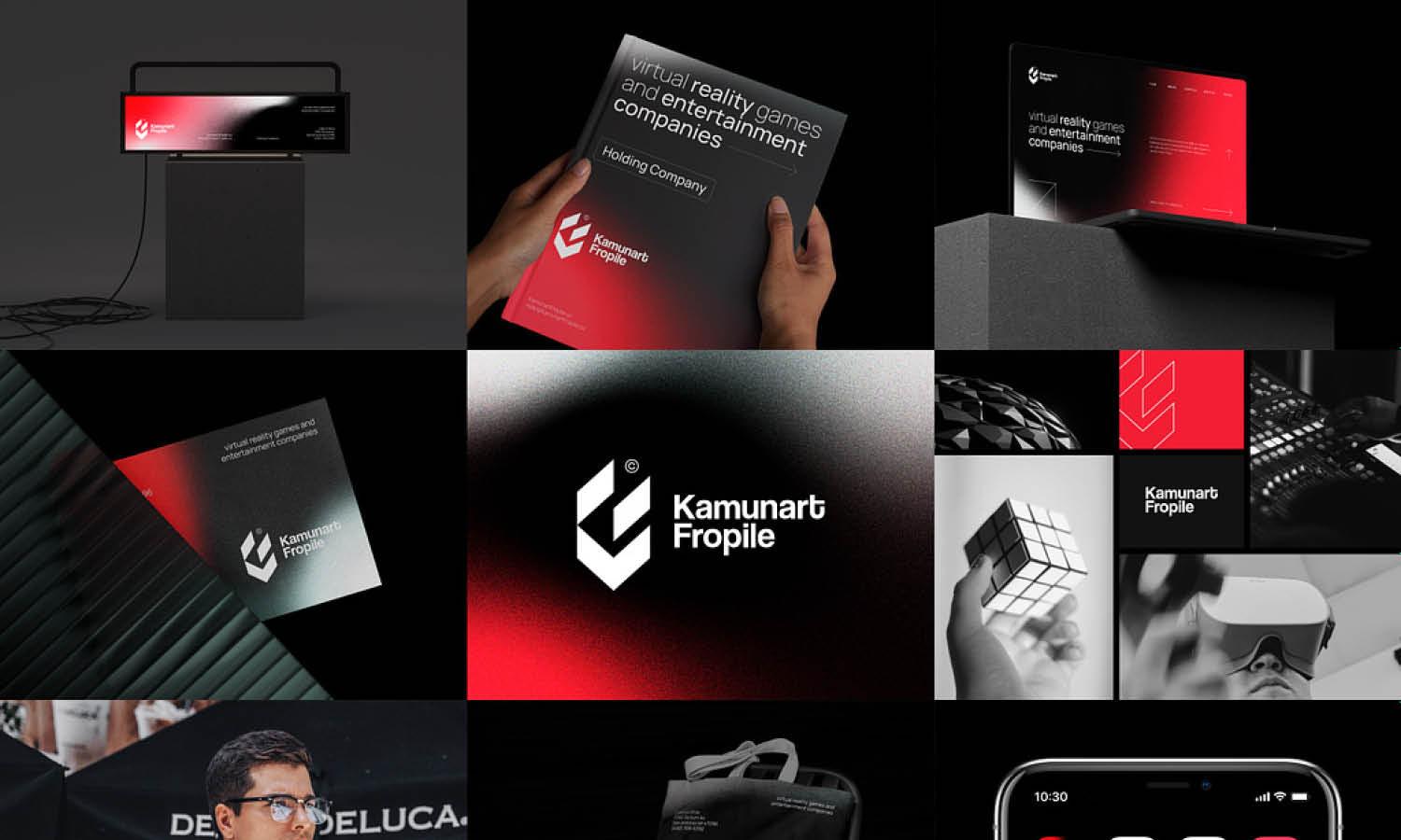
A logo design guideline should establish rules for how the logo interacts with different backgrounds to ensure visibility and consistency. Without proper background considerations, the logo may become difficult to read, lose impact, or appear unprofessional in certain applications.
One of the most important aspects is defining approved background colors. The guideline should specify which colors or textures work best to enhance the logo’s clarity. Typically, a light logo version should be available for dark backgrounds, while a dark logo version should be used for light backgrounds.
In cases where the logo must appear over complex or photographic backgrounds, a transparent version or a logo with a subtle outline can help maintain contrast and legibility. The guideline should also provide instructions on when to use a logo container or background shape to ensure the logo stands out without being visually overwhelmed.
Additionally, some colors may create unwanted optical effects or reduce legibility. If certain background hues should be avoided, the guideline should explicitly state them and provide examples of incorrect usage.
By defining background considerations in a logo design guideline, businesses ensure that their logo remains recognizable and professional in any context, whether on websites, printed materials, or promotional merchandise. Clear instructions help prevent unintentional branding mistakes and maintain a polished visual identity.

Source: Olga Vasik, Astro Brand Guide, Dribbble, https://dribbble.com/shots/17960440-astro-brand-guide
Define Logo Placement Guidelines
A logo design guideline should include clear logo placement rules to ensure consistency across different materials and platforms. Proper logo placement reinforces brand recognition and ensures that the logo maintains a strong, professional appearance.
The guideline should specify preferred placements for different branding applications. For instance, on websites, the logo is typically placed in the top-left or center of the header for optimal visibility. In print materials such as business cards or letterheads, specific margins and alignment rules should be outlined to maintain consistency.
For marketing materials and packaging, defining centered, left-aligned, or right-aligned positioning helps maintain uniformity across all brand assets. If a secondary logo or emblem is used, instructions should clarify how it interacts with the primary logo to avoid visual clutter.
Another key consideration is logo placement on merchandise such as apparel, promotional products, or vehicle wraps. The guideline should specify the best positions for branding impact while avoiding distortion caused by curved or irregular surfaces.
Additionally, placement guidelines should consider minimum margins from edges to prevent the logo from appearing cramped or improperly cropped. Including visual examples of correct and incorrect placements can further clarify proper usage.
By defining logo placement rules in a logo design guideline, businesses can ensure their brand identity remains visually cohesive across all marketing and branding materials.
Specify File Formats and Resolutions
A logo design guideline should define the correct file formats and resolutions to ensure high-quality reproduction across all applications. Using the wrong format can lead to poor image quality, distortion, or printing issues, which can negatively impact brand consistency.
For digital use, the guideline should include PNG and SVG files. PNG files support transparency, making them ideal for websites and social media. SVG files are vector-based, allowing the logo to scale without losing quality, making them perfect for responsive web design.
For print materials, high-resolution EPS and PDF files should be provided. EPS files are vector-based, ensuring crisp, scalable graphics for large formats like banners and billboards. PDF files maintain high quality while being easily shareable with printers and designers.
JPG files may also be included, but only for non-transparent applications such as social media and web banners. However, they should be used in high resolution to prevent pixelation.
The minimum resolution should be specified for different uses. For example, 300 DPI (dots per inch) is required for high-quality print, while 72 DPI is standard for digital screens.
By outlining proper file formats and resolutions in a logo design guideline, businesses can ensure that their logo retains its professional appearance across all branding materials, from websites to large-scale advertisements.
Adapt for Different Mediums
A logo design guideline should define how the logo adapts to different mediums, ensuring clarity and consistency in various applications. Since logos appear across digital and physical platforms, they must be flexible enough to maintain visibility and impact.
For digital platforms, the logo should be optimized for websites, social media, and mobile apps. This includes using responsive designs that scale appropriately for different screen sizes. A favicon version should also be included for web browsers, typically at 16x16 pixels or 32x32 pixels.
For print materials, the logo should be adaptable for business cards, brochures, signage, and packaging. High-resolution vector formats like EPS and PDF ensure crisp printing without losing quality. Additionally, different printing techniques, such as screen printing or embroidery, may require simplified logo versions to avoid fine details being lost.
On merchandise and promotional items, such as t-shirts, mugs, and billboards, the logo must be legible even when printed at different sizes. Some products may require a single-color or minimal-detail version of the logo for better reproduction.
The guideline should also specify how the logo appears in motion graphics and video content, including any animation guidelines to maintain brand integrity.
By addressing adaptation for different mediums in a logo design guideline, businesses ensure that their brand remains recognizable and professional, whether on a digital screen, printed advertisement, or physical merchandise.
Conclusion
A well-crafted logo design guideline is essential for maintaining brand consistency, ensuring that the logo remains clear, recognizable, and professional across all applications. By defining logo variations, typography, color codes, placement rules, and file formats, businesses can prevent misinterpretations and misuse of their brand identity. A detailed logo design guideline serves as a valuable reference for designers, marketers, and third-party vendors, allowing the logo to be used correctly in both digital and print mediums. By following these structured guidelines, businesses can protect their visual identity and reinforce a strong, cohesive brand presence in every application.
Let Us Know What You Think!
Every information you read here are written and curated by Kreafolk's team, carefully pieced together with our creative community in mind. Did you enjoy our contents? Leave a comment below and share your thoughts. Cheers to more creative articles and inspirations!






Leave a Comment