
Common Challenges with Low-Resolution Logo Designs

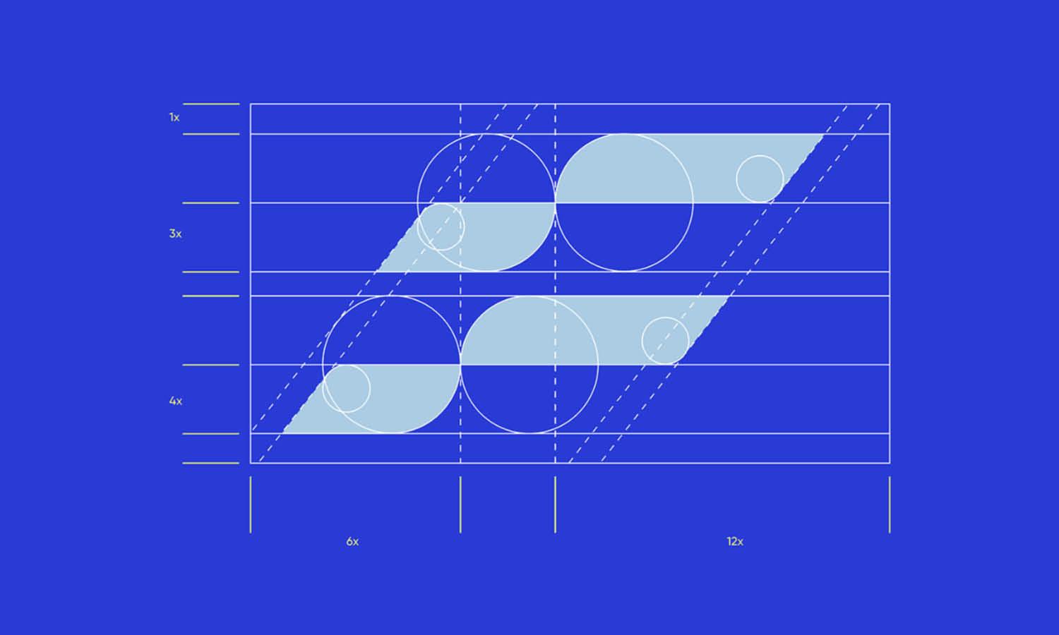
Source: Ala Kallala, Viewfinder, Behance, https://www.behance.net/gallery/184310285/Viewfinder
A logo can look acceptable in a small preview, then fall apart when enlarged. Edges become jagged, lettering turns soft, and fine details disappear. These problems appear when a file contains too little image information for its intended use. A low resolution logo design can therefore affect far more than appearance. It may limit where the logo can be placed, slow down printing, create inconsistent brand materials, and require costly reconstruction. Understanding these challenges helps teams recognize weak files before they reach production. Early detection makes it easier to protect clarity and consistency.
Understanding What Makes a Logo Low Resolution
A logo becomes low resolution when its file does not contain enough visual information to reproduce clearly at the required size. This usually happens with raster formats such as JPEG and PNG, which use fixed pixels.
Insufficient Pixel Dimensions
A small raster image may work in a website header but fail on a poster or package. Enlarging it spreads limited pixels over a wider area, revealing blocky edges.
Low DPI or PPI Settings
PPI describes pixel density on screens, while DPI is commonly used when discussing print output. A logo prepared only for a small digital display may not contain enough detail for sharp commercial printing.
Missing Vector Source Files
Vector files use editable paths, allowing clean scaling. When only a small JPEG or PNG remains, the flexibility of the original artwork is lost.
Pixelation When the Logo Is Enlarged
Pixelation is often the first visible warning that a logo file is too small. Instead of smooth lines, square blocks begin to appear along the edges. Resizing software enlarges existing pixels but cannot recreate missing detail.
Jagged Curves and Diagonal Lines
Curves, circles, and diagonal strokes are especially vulnerable. Their edges may develop a stair-step appearance that makes the design feel rough, even when the original logo was carefully constructed.
Blocky Symbols and Icons
A leaf, star, monogram, or abstract mark may become uneven when stretched, making it harder to recognize. Pixelation can also alter negative space, causing openings to close or narrow gaps to merge. This is especially noticeable in compact marks that rely on precise spacing rather than decorative detail.
Blurred Edges and Unclear Typography
Not every low-resolution logo becomes obviously pixelated. Some files are softened during resizing, causing the design to look blurry instead. This is equally damaging because logos depend on precise edges and readable lettering.
Soft or Distorted Letterforms
Thin strokes, small counters, and tightly spaced characters can merge together. Custom typography may lose distinctive cuts or curves, making the brand name harder to read.
Weak Boundaries between Elements
When an icon sits close to text or another shape, blurred edges can make the elements appear to overlap. Contrast may weaken, especially when similar colors meet.
Reduced Legibility at Small Sizes
A weak source file can also perform badly when reduced. Social avatars, favicons, and mobile headers apply additional compression, causing delicate details and letterforms to disappear.

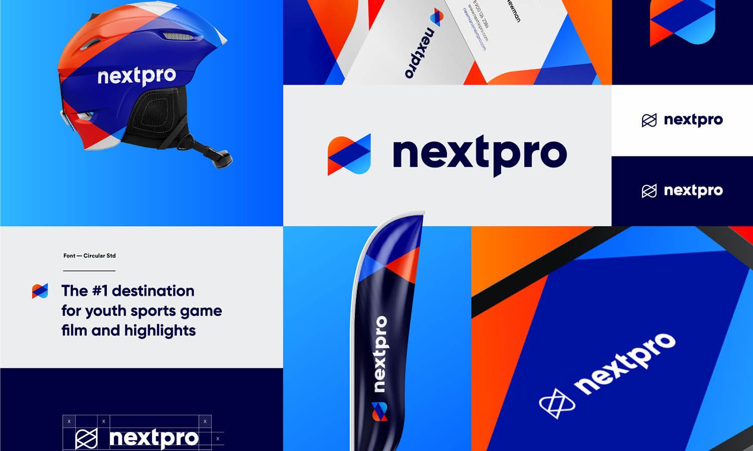
Source: Armie Parsian, Nexus Architecture, Behance, https://www.behance.net/gallery/169656521/Nexus-Architecture
Poor Results on Printed Materials
Print exposes weaknesses that may be less noticeable on screen. A low resolution logo design can appear rough or unfocused once transferred onto a physical surface.
Blurry Business Cards and Stationery
Small printed items still require clean source artwork. Fine lettering may fill in, thin lines may break, and compression marks around the logo can become visible against plain paper.
Pixelated Posters and Signage
Large-format applications magnify every weakness. A file that looks acceptable at a few centimeters wide can become severely pixelated on a banner, shop sign, event backdrop, or exhibition display.
Weak Packaging and Label Printing
Packaging often combines small details with close viewing. Low-resolution artwork may lose registration marks, fine borders, or tiny text, making the finished product look less polished than the surrounding design.
Inconsistent Quality across Digital Platforms
Digital use does not remove the need for suitable resolution. Websites, social channels, presentations, and apps display logos at different dimensions and may resize files automatically.
Soft Images on High-Resolution Screens
Modern screens pack more pixels into the same physical space. A logo may appear sharp on an older monitor but soft on a high-density phone or laptop.
Unclear Social Media Profile Images
Profile images are cropped, compressed, and reduced by each platform. When the source is weak, these processes can erase fine details or make the logo appear fuzzy.
Distorted Website Headers
Stretching a narrow logo to fill a wider header can reduce sharpness and alter proportions. Inconsistent files may also cause the logo to look different between desktop and mobile layouts.
Lost Details in Complex Logo Designs
Detailed logos need especially careful file preparation. Illustrations, borders, textures, thin strokes, and effects need sufficient resolution to remain distinct.
Disappearing Fine Lines
Hairline strokes and small patterns may break apart or vanish during resizing. This can change the balance of the composition or make one side appear lighter than the other.
Muddy Gradients and Shadows
Smooth gradients can develop visible bands, while soft shadows may become blotchy. JPEG compression can add halos or block-like artifacts around areas with subtle tonal changes.
Unrecognizable Small Elements
Tiny initials, symbols, or illustrative features may collapse into indistinct shapes. Once lost, those details may become unrecognizable on packaging or small digital placements. Complex logos may also become visually heavier because formerly separate details blend into one dark area. Simplifying the displayed version can help, but it cannot repair an inadequate source file.
Limited Editing and Customization
A low-resolution raster file is difficult to adapt because its elements are flattened. Designers cannot select a shape, letter, or color without rebuilding the artwork.
Difficulty Changing Individual Colors
Recoloring may leave rough edges or unwanted pixels from the original shade. Anti-aliased boundaries can create visible halos, especially when converting a logo for dark backgrounds.
Limited Control over Typography and Spacing
Flattened text cannot be edited like live type. Changing a letter, adjusting kerning, or correcting alignment often requires identifying the original font or redrawing the wordmark.
Problems Creating Alternate Logo Versions
Monochrome, reversed, simplified, and responsive variations are harder to produce accurately. Each adaptation may introduce inconsistencies when the original shapes cannot be edited.

Inaccurate Vector Tracing and File Conversion
Saving a small image as SVG, EPS, or PDF does not automatically make it a true, clean vector logo. The raster information remains limited unless the artwork is reconstructed.
Uneven Curves and Rough Outlines
Automatic tracing follows the visible edges of the pixels, including blur and compression noise. The result may contain wobbly curves instead of smooth geometry.
Altered Letterforms and Shapes
Tracing can close small gaps, flatten corners, or distort custom lettering. Even subtle changes may affect the personality and recognition of the logo.
Excessive Anchor Points
Poor traces often contain hundreds of unnecessary points. This makes the file difficult to refine, increases its complexity, and can create further irregularities when shapes are edited.
Brand Consistency and Credibility Problems
Logo quality influences how audiences experience a brand. A blurry mark can make strong materials feel unfinished beside clear photography and typography.
An Unpolished Visual Impression
Rough edges suggest that the artwork was not prepared for its setting. Customers may not know the cause, but they can notice the lack of refinement.
Mismatched Logo Versions
Without a dependable master file, team members and suppliers may create their own replacements. One version may be sharper, another wider, and another slightly different in color.
Inconsistent Colors and Proportions
Repeated recreation can change spacing, shape, and scale relationships. Over time, inconsistent versions across websites, packaging, and signage can weaken recognition. The problem becomes more visible when several versions appear in the same campaign. Even small differences in width, alignment, or color can make the identity feel loosely controlled rather than intentionally consistent.
Production Delays and Additional Costs
Resolution problems often surface after production begins. Printers, embroiderers, and sign makers may stop work when the logo fails technical requirements.
Rejected Files and Revision Requests
A vendor may request a vector original or a larger raster image before continuing. Locating the correct file can delay approval, especially when several people handled the assets.
Professional Redrawing Costs
When no usable master exists, a designer may need to reconstruct the logo. Missing fonts, complex shapes, and unclear details increase the cost.
Missed Deadlines and Compromised Results
Urgent projects may be forced to use a smaller logo, remove details, postpone production, or accept weaker output. Teams may also spend valuable time searching old folders, contacting former designers, or comparing uncertain versions. Prevention is usually cheaper than solving the problem under deadline pressure.
Preventing Low-Resolution Logo Problems
The safest approach is to keep an editable vector master in formats such as AI, EPS, SVG, or print-ready PDF. Export separate versions for web, social media, presentations, and print. High-resolution PNG files suit transparent uses but should be exported from the vector original. Avoid repeated JPEG saving, which adds compression damage, and check file size and pixel dimensions before enlarging artwork. Do not assume changing a file extension improves quality. Clear source artwork must already exist inside the file. A simple asset folder with labeled master, print, web, and social versions can prevent staff and suppliers from using the wrong file.
Conclusion
Low-resolution logo files create challenges at nearly every stage of brand production. They can cause pixelation, blurred typography, missing details, inconsistent digital display, poor print results, difficult editing, and unexpected production delays. They become more serious when the vector artwork is unavailable and teams rebuild the logo from weak copies. Organized master files give teams and suppliers a dependable source for every application. By addressing a low resolution logo design before it reaches a website, package, sign, or printed campaign, a brand can preserve clarity, consistency, and recognition without repeated corrections or last-minute compromises.
Let Us Know What You Think!
Every information you read here are written and curated by Kreafolk's team, carefully pieced together with our creative community in mind. Did you enjoy our contents? Leave a comment below and share your thoughts. Cheers to more creative articles and inspirations!
Related Articles







Leave a Comment