
Determining the Right Dimensions for Your Logo Design

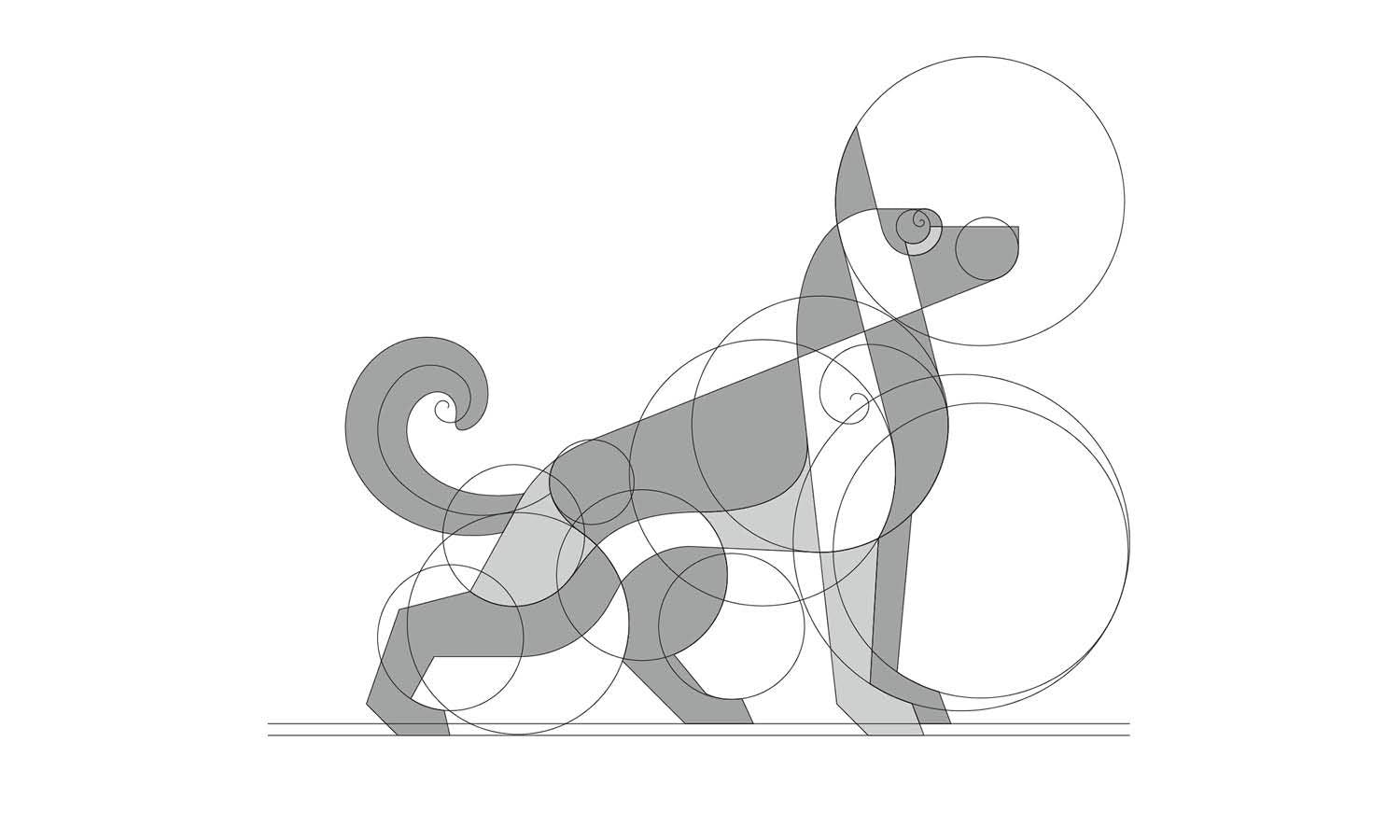
Source: Jonisson Almeida, Rede Farroupilha, Behance, https://www.behance.net/gallery/181394163/Rede-Farroupilha
Choosing suitable logo dimensions is not about finding one universal width and height. A logo may appear in a narrow website header, a square social profile, a business card, a product label, or a large storefront sign. Each placement creates different limits. The better approach is to build a flexible sizing system. The logo’s proportions should remain consistent, while its exported dimensions change according to the available space. Minimum readable size, file format, resolution, and logo variation also matter. These decisions prevent stretched artwork, blurred edges, unreadable lettering, and awkward spacing. Starting with a scalable master file and testing the design in realistic settings helps keep the identity clear across digital and printed applications.
Understanding What Logo Dimensions Actually Mean
Logo dimensions describe the width and height of the artwork or file. For digital use, they are normally measured in pixels. For print, they may be measured in inches, millimeters, or centimeters. These numbers show how much space the logo occupies, but they do not guarantee quality by themselves.
Width and Height
A logo measuring 1,200 by 400 pixels is three times wider than it is tall. It could be printed at 60 by 20 millimeters while keeping the same proportions. The best measurement depends on the available area and design detail.
Aspect Ratio
Aspect ratio is the relationship between width and height. Preserving it prevents the logo from looking stretched or compressed. Lock the proportions in your design software so both measurements change together.
Dimensions Versus Resolution
Dimensions and resolution are different. Pixel dimensions describe the number of pixels in a file, while resolution affects how densely those pixels appear in print. A raster file can still look poor if enlarged from a smaller image. Vector artwork avoids this problem because it scales without losing sharpness.
Start With the Logo’s Natural Proportions
Before choosing exact measurements, consider the logo’s overall shape. Its proportions determine which placements it can fill comfortably and where an alternative arrangement may be necessary.
Horizontal Logos
Horizontal logos often combine a symbol and wordmark side by side. They suit website headers, letterheads, signs, and other wide spaces. Height is usually the main limitation, since excessive reduction can make the lettering unreadable.
Square and Circular Logos
Square, circular, and balanced marks suit compact areas such as social profiles, app icons, labels, and stamps. When a platform crops the image into a circle, keep important details away from the corners.
Vertical Logos
Vertical logos can look distinctive but are difficult to place in shallow areas. Rather than squeezing a tall design into a navigation bar, prepare a horizontal or simplified variation. This protects readability without changing the identity.
Determine Dimensions Based on the Intended Use
The final placement should guide the dimensions you prepare. Evaluate the actual space and the way the audience will view the logo instead of exporting arbitrary sizes.
Website Headers
Website logos should remain visible without dominating the navigation. A displayed height of roughly 40 to 100 pixels often works, depending on the layout. Export a larger version than the display size so it stays crisp on high-density screens.
Social Media Profiles
Most platforms accept square files, even when the image appears inside a circle. A canvas of at least 800 by 800 pixels usually supports clean resizing. Long wordmarks may become too small, so a compact symbol or monogram often works better.
Business Cards and Stationery
Print materials require physical measurements. A logo on a business card may be only 25 to 50 millimeters wide. At that scale, small taglines and decorative details can disappear. Print a sample at actual size before approval.
Packaging and Merchandise
Packaging dimensions depend on the printable panel, container shape, and surrounding information. Merchandise adds texture, embroidery limits, and production constraints. Measure the usable print area rather than the entire product.
Signs and Large-Format Graphics
For banners, storefronts, and vehicle graphics, vector files matter more than enormous pixel dimensions. A supplier can scale the artwork accurately while you focus on visibility and viewing distance.

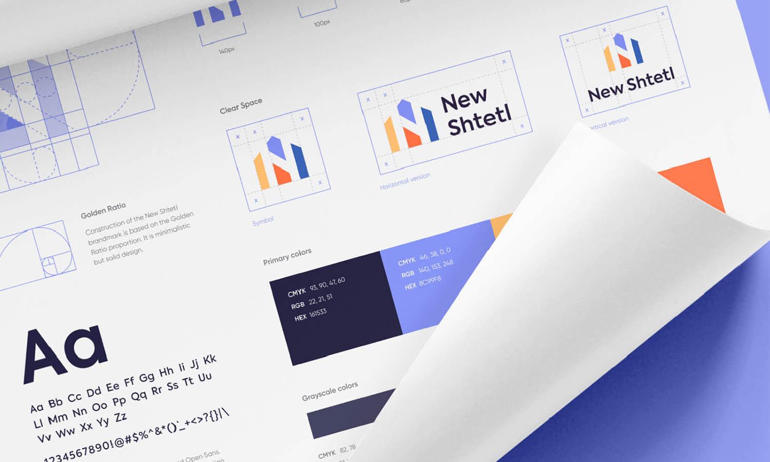
Source: Tuell Design, Logo Grid & Clearspace, Dribbble, https://dribbble.com/shots/22002678-Logo-Grid-Clearspace
Establish a Reliable Master Logo Size
A dependable master file provides one accurate source for every export. It prevents quality loss caused by repeatedly resizing raster files.
Build the Master File in Vector Format
Create the logo in a vector program and save versions in formats such as AI, EPS, SVG, or print-ready PDF. PNG and JPEG files should be exported from this master rather than treated as the original artwork.
Use a Comfortable Working Canvas
The artboard does not need to match every final placement. Choose a canvas large enough for careful editing while keeping the proportions accurate. A horizontal logo needs a wide artboard, while a square mark needs equal width and height.
Keep Clear Space Separate From Logo Dimensions
Clear space is the protected area around the logo. It stops nearby text, images, and edges from crowding the design. Avoid adding excessive blank space permanently inside every file. Document the clear-space rule separately.
Create Standard Export Presets
Prepare small, medium, and large digital exports, along with print-ready vector files. Consistent presets make future delivery faster and reduce sizing errors.
Set Minimum Dimensions for Legibility
Minimum dimensions define the smallest size at which the logo remains readable and recognizable. Without this limit, people may reduce the artwork until important details disappear.
Test Fine Details
Thin lines, narrow gaps, and small shapes can merge when reduced. View tests at 100 percent rather than while zoomed in. Weak details may need to be thickened, simplified, or removed from a compact version.
Evaluate Typography
Small lettering often becomes unreadable first. Check letterforms, spacing, punctuation, and taglines carefully. The brand name should remain clear without requiring viewers to zoom in or move closer.
Define Separate Digital and Print Minimums
Screens and printed materials reproduce detail differently. A minimum width of 120 pixels may work online, while the print version may need a minimum width of 30 millimeters. Record both values instead of using one rule everywhere.
Prepare a Simplified Small-Size Version
When the full logo cannot remain clear at small dimensions, remove the tagline or reduce decorative detail. A simplified version is better than forcing the complete design into an unreadable space.
Prepare Multiple Logo Dimension Variations
One logo arrangement rarely fits every layout. Approved variations let the identity adapt without stretching, cropping, or excessive reduction.
Primary Logo
The primary logo is the preferred full arrangement. It may include a symbol, wordmark, and tagline. Use it in spacious layouts and prominent brand placements.
Secondary Logo
A secondary logo rearranges the same elements into another shape. A wide logo may have a stacked version, while a tall logo may have a horizontal alternative.
Brand Mark or Icon
The brand mark is the most compact version. It may use a symbol, monogram, or initial and works well for favicons, social avatars, app icons, and small product markings.
All versions should feel clearly related. The goal is dimensional flexibility, not a collection of unrelated designs.

Source: Rolans Kims, Primera Logo Grid, Dribbble, https://dribbble.com/shots/15393974-Primera-logo-grid
Test Logo Dimensions in Realistic Contexts
Measurements that look correct on an artboard may fail in real use. Context testing reveals spacing, readability, and balance problems before approval.
Preview at Actual Size
Inspect digital exports at 100 percent and print physical samples at their intended dimensions. Magnified previews can make weak details appear clearer than they really are.
Test Common Mockups
Place the logo in website headers, mobile screens, business cards, labels, uniforms, and signs. This reveals its visual weight and indicates when another arrangement would fit better.
Check Different Viewing Distances
A logo on stationery is seen nearby, while a storefront sign may be viewed from across a street. Confirm that the main shape and brand name remain recognizable at the expected distance.
Review Across Devices and Materials
Check digital placements on desktop and mobile screens. For print, consider how paper, fabric, metal, and plastic affect edges, contrast, and fine detail.
Common Logo Dimension Mistakes to Avoid
Most sizing problems happen when artwork is resized without considering proportion, source quality, or legibility.
Stretching the Logo to Fit
Never change the width or height independently just to fill a space. Stretching alters letterforms, shapes, and spacing. Resize proportionally or use an approved alternate layout.
Using One Export for Everything
A small website PNG will not produce a sharp banner, while an oversized image may slow a webpage. Prepare files for their intended output instead of reusing one raster export.
Ignoring Small-Scale Readability
Do not approve the logo only at presentation size. Reduce it to realistic dimensions and check the type, spacing, and smallest details.
Measuring the Canvas Instead of the Artwork
A file may have the correct dimensions while the visible logo occupies only a small area. Excessive transparent space causes alignment problems and makes the design appear smaller. Crop exports to suitable artwork bounds while keeping the required padding.
Conclusion
The right logo dimensions balance natural proportions, intended use, legibility, and file preparation. Start with a scalable vector master, preserve the aspect ratio, and export sizes suited to each placement rather than searching for one universal measurement. Website headers, profile images, stationery, packaging, merchandise, and signs require different decisions. Primary, secondary, and icon variations help the identity fit those spaces without distortion or excessive reduction. Minimum-size rules protect lettering and fine details. Before finalizing any file, test it at actual size and in context. A strong sizing system provides a controlled range of logo dimensions that keeps the brand clear, balanced, and recognizable wherever it appears.
Let Us Know What You Think!
Every information you read here are written and curated by Kreafolk's team, carefully pieced together with our creative community in mind. Did you enjoy our contents? Leave a comment below and share your thoughts. Cheers to more creative articles and inspirations!
Related Articles






Leave a Comment