The Essential Guide to Logo Design Grid Systems
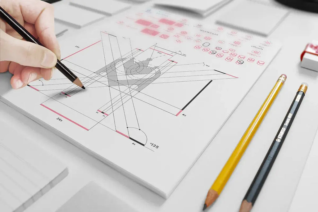
Source: Astaamiye, M Letter Construction Grid, Dribbble, https://dribbble.com/shots/15120355-M-Letter-Construction-Grid
A well-crafted logo design often looks simple and effortless, but behind that simplicity is usually a carefully structured system. One of the most important tools professional designers use to achieve precision and balance is the grid. A grid provides a visual framework that helps organize shapes, align elements, and maintain consistent proportions throughout the logo design process.
In logo design, a grid acts as a guide that allows designers to construct symbols and typography with accuracy. By placing elements within a structured grid, designers can ensure that every curve, line, and spacing feels intentional. This approach helps create logos that are not only visually appealing but also balanced and harmonious.
Grid systems are especially valuable when building geometric logos or marks that rely on symmetry. They help designers maintain consistent spacing, align shapes perfectly, and refine proportions during the design process. As a result, the final logo design appears polished and professional.
Another advantage of using a grid is scalability. Logos designed with a strong grid foundation tend to maintain clarity across different sizes and platforms. Whether the logo appears on a website, product packaging, or social media profile, the structured grid ensures that the design remains recognizable and visually consistent.
Understanding how a grid works in logo design can significantly improve the quality of a designer’s work. By learning to use grid systems effectively, designers can create logos that are balanced, precise, and timeless.
Understanding The Role Of Grid In Logo Design
In professional logo design, structure and clarity are essential. One of the most effective tools designers use to achieve these qualities is the grid. A grid acts as an invisible framework that helps organize elements, align shapes, and maintain consistent proportions throughout the design process. While the final logo design may appear simple, a well-planned grid often guides every detail behind the scenes.
Using a grid in logo design allows designers to place visual elements with precision. Shapes, icons, and typography can be positioned according to clear alignment rules, preventing elements from appearing random or unbalanced. The grid ensures that spacing remains consistent and that each part of the design relates harmoniously to the others.
Another important role of the grid in logo design is improving clarity. When elements follow a structured grid system, the overall design becomes easier for viewers to understand. Balanced alignment and consistent spacing help create logos that feel professional, organized, and visually appealing.
A grid also supports the development of geometric logos. Many designers construct curves, circles, and angles using grid guidelines to ensure symmetry and proportion. This approach allows complex shapes to be refined and adjusted without losing visual harmony.
Ultimately, the grid serves as a guiding system rather than a limitation. It provides structure while still allowing creative freedom. By understanding the role of the grid in logo design, designers can create marks that feel balanced, intentional, and visually memorable across different applications.
Why Grid Systems Improve Visual Balance
Visual balance is one of the most important qualities in successful logo design, and a grid system plays a key role in achieving it. A grid helps designers organize elements so that the visual weight of shapes, symbols, and typography feels evenly distributed. Without a grid, logo design elements can easily appear misaligned or disproportionate.
When designers use a grid, they gain a clear reference for positioning elements. Horizontal and vertical guides help maintain alignment, while consistent spacing prevents the logo from feeling cluttered or uneven. This structured approach ensures that every part of the logo design contributes to a cohesive visual composition.
The grid also helps control proportions. In logo design, even small adjustments in spacing or size can dramatically affect how balanced the design appears. By building the logo on a grid, designers can measure relationships between elements more accurately, allowing them to fine-tune proportions and achieve harmony.
Another advantage of using a grid is that it supports symmetry and rhythm within the design. Repeating shapes, equal spacing, and consistent alignment all contribute to a logo design that feels stable and visually pleasing. These subtle details often make the difference between an amateur logo and a professional one.
Ultimately, grid systems help designers maintain visual discipline. Instead of relying solely on instinct, the grid provides a structured guide that supports thoughtful decision-making. This balance between creativity and structure helps produce logo design work that is both attractive and professionally crafted.
Types Of Grids Used In Logo Design
Different grid structures can support different styles of logo design. Designers choose a grid based on the visual concept, the shapes involved, and the level of precision required. Understanding the types of grid systems helps designers create logos that are both structured and visually appealing.
One of the most common grids used in logo design is the square grid. This grid is made up of evenly spaced horizontal and vertical lines that form perfect squares. A square grid is ideal for aligning shapes, positioning icons, and creating consistent spacing between elements. Many modern logo design projects begin with this simple but effective structure.
Another popular option is the modular grid. This type of grid divides the design space into multiple small sections. Designers often use modular grids when building complex logos that require careful alignment between multiple shapes or letters.
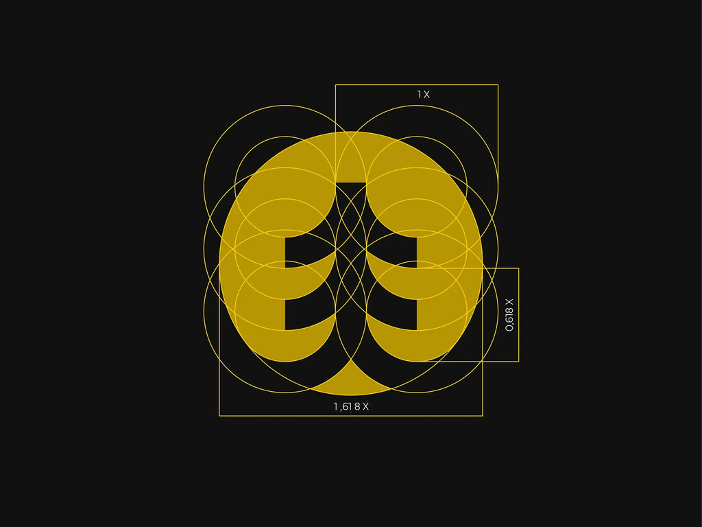
Circular grids are also widely used in logo design. These grids are built using circles and arcs that intersect at different points. Designers use circular grids when constructing logos with curves, rounded symbols, or symmetrical forms. Circular structures can help maintain smooth proportions and visually balanced curves.
Some designers also rely on proportional grids inspired by mathematical ratios. These grids can guide spacing, scaling, and visual relationships between elements in logo design. Although viewers may never see the grid itself, it plays an important role in shaping the final result.
By understanding these grid types, designers can choose the most appropriate framework for their logo design. The right grid helps transform rough ideas into structured and professional visual identities.

Source: Antonio Calvino, HS Grid, Dribbble, https://dribbble.com/shots/7659665-HS-Grid
The Relationship Between Geometry And Grid
Geometry plays a fundamental role in logo design, and the grid acts as the structure that supports geometric construction. When designers combine geometric principles with a grid system, they can build logos that feel precise, balanced, and visually harmonious.
In many logo design projects, geometric shapes such as circles, triangles, rectangles, and arcs are constructed directly on a grid. The grid provides measurement and alignment guides that help designers maintain consistent proportions. Without a grid, even small variations in shape placement can disrupt the visual balance of a logo.
A grid also helps designers control the relationships between geometric elements. For example, curves may be drawn using intersecting circles, while angles can be aligned to specific grid intersections. These geometric constructions ensure that each part of the logo design connects smoothly with the rest of the composition.
Another advantage of combining geometry with a grid is clarity. Geometric structures often produce simple and recognizable forms, which are essential qualities in effective logo design. The grid supports this clarity by keeping shapes aligned and evenly spaced.
Many well-known logos are built using geometric grids that guide the placement of curves, angles, and proportions. Even though viewers rarely see the grid itself, it plays a major role in shaping the final design.
By understanding how geometry interacts with a grid, designers can create logo design solutions that feel deliberate, refined, and visually consistent across different applications and sizes.
How Grids Help Maintain Proportions
Maintaining proper proportions is one of the most important aspects of professional logo design, and a grid plays a crucial role in achieving this balance. A grid provides a structured framework that helps designers measure spacing, align elements, and control the size relationships between different components of the design. When a logo design is built on a grid, each element feels intentionally placed rather than randomly arranged.
In logo design, proportions determine how well different parts of the logo work together visually. For example, the size of an icon compared to the typography must feel balanced. By using a grid, designers can easily compare widths, heights, and spacing to ensure the proportions remain consistent throughout the design.
A grid also helps refine the details of a logo design. Small adjustments to curves, angles, or spacing can significantly improve the overall visual harmony. With the support of a grid system, designers can fine-tune these elements while maintaining a consistent structure across the entire composition.
Another benefit of using a grid is that it encourages discipline in the design process. Instead of relying only on intuition, the grid provides measurable guidelines. This approach helps designers make thoughtful decisions that improve the overall quality of the logo design.
Ultimately, a well-constructed grid allows designers to control proportions with accuracy and confidence. When the proportions of a logo design are carefully balanced through a grid system, the result is a mark that appears polished, stable, and visually pleasing across different contexts.
Using Circular Grids In Logo Construction
Circular grids are widely used in logo design, especially when designers need to create smooth curves, symmetrical shapes, and balanced compositions. Unlike traditional square grids, circular grids are built from intersecting circles and arcs that guide the construction of curved elements. This type of grid is particularly helpful for logos that rely on rounded forms or geometric symbols.
In logo design, circular grids help designers maintain consistent curvature throughout the design. When curves are created using circular guides, they connect more naturally and appear visually smoother. This precision helps prevent awkward or uneven shapes that might occur when curves are drawn freely.
Many well-known logo design examples use circular grid construction to build icons and symbols. By placing circles of different sizes on a grid, designers can develop complex shapes while maintaining consistent proportions. The intersection points of these circles often define the boundaries of curves, angles, and edges within the logo.
Another advantage of circular grids is symmetry. Circular structures naturally support balanced designs, which is why they are often used for emblems, badges, and geometric marks. A grid of circles allows designers to mirror shapes and maintain equal spacing between elements.
Using circular grids does not limit creativity; instead, it provides a reliable foundation for exploring different logo design ideas. By combining circular guides with a well-planned grid system, designers can construct logos that feel harmonious, precise, and visually refined.
Grid Systems For Typography In Logos
Typography is a key component of many logo design projects, especially in wordmarks and lettermarks. A grid helps designers structure typographic elements so that letters align properly and spacing remains consistent. By using a grid in logo design, designers can create text-based logos that appear clean, readable, and visually balanced.
One of the main advantages of a grid is its ability to guide letter alignment. In logo design, each letter must relate visually to the others. A grid allows designers to control baseline alignment, spacing, and proportions between characters. This structure helps ensure that the typography looks organized rather than uneven or awkward.
A grid also assists with adjusting letter spacing and visual rhythm. Designers can measure consistent distances between characters using the grid, which improves readability and balance. Proper spacing ensures that the typography remains clear whether the logo design appears in large formats or small digital spaces.
Another important aspect of grid-based typography is proportion control. Some letters may naturally appear larger or heavier than others. With the help of a grid, designers can make small adjustments to letter size or positioning while keeping the overall logo design visually balanced.
Using a grid does not limit typographic creativity. Instead, it provides a structured foundation that supports experimentation and refinement. By aligning letters carefully within a grid system, designers can develop typography that strengthens the identity and professionalism of the logo design.
Source: Daniel Rotter, MTB Collective - Logo Grid, Dribbble, https://dribbble.com/shots/14949851-MTB-collective-Logo-grid
Improving Scalability With Grid-Based Logo Design
Scalability is an essential requirement in modern logo design. A logo must remain clear and recognizable whether it appears on a large billboard or a small mobile screen. One of the most effective ways to achieve this flexibility is by building the logo on a structured grid.
A grid helps maintain consistent proportions throughout the logo design. When the logo is resized, the relationships between shapes, lines, and typography remain balanced. This ensures that the design does not lose clarity or visual harmony at different sizes.
Grid-based logo design also improves the clarity of shapes and spacing. Elements constructed using a grid are easier to refine and simplify when necessary. Clean alignment and balanced proportions make the logo easier to read and recognize across various platforms.
Another advantage of using a grid is that it supports responsive design needs. Modern brands often display their logo in multiple formats, including websites, social media icons, packaging, and print materials. A well-structured grid allows designers to adapt the logo design while maintaining the integrity of the original concept.
By developing a logo design with a strong grid foundation, designers create a mark that performs well in many different environments. The grid ensures consistency, clarity, and balance, helping the logo remain effective and recognizable regardless of scale.
The Grid As A Tool For Creative Consistency
Many designers believe that using a grid might limit creativity, but in reality, a grid often strengthens the creative process in logo design. A grid provides a clear structure that helps designers explore ideas while maintaining visual consistency. Instead of restricting creativity, the grid acts as a supportive framework that keeps the logo design organized and balanced.
In logo design, consistency is essential for creating a professional visual identity. A grid helps ensure that spacing, alignment, and proportions remain uniform throughout the design. When elements follow a grid structure, the logo appears more polished and cohesive. This visual harmony makes the design easier for audiences to recognize and remember.
Another benefit of using a grid is that it simplifies the refinement process. During logo development, designers often test multiple variations of shapes, icons, or typography. With a grid system in place, these adjustments can be made while maintaining consistent proportions and alignment.
A grid also helps designers maintain visual discipline. By following structured guidelines, designers can avoid unnecessary elements or uneven spacing that might weaken the overall composition. This balance between creative exploration and structured design helps produce stronger logo design outcomes.
Ultimately, the grid becomes a powerful creative tool rather than a constraint. By using a grid strategically, designers can experiment with ideas while ensuring the final logo design remains visually balanced, consistent, and professional across different applications.
Practical Tips For Applying Grid In Logo Design
Applying a grid effectively can greatly improve the quality of a logo design. While grids may seem technical at first, they become a natural part of the design process with practice. Many professional designers begin their concepts by sketching a simple grid to guide the placement of shapes and typography.
One practical approach is to start with a basic square grid. This type of grid helps organize elements and maintain consistent spacing across the logo design. Designers can use the grid to align icons, adjust letter positioning, and refine proportions during the early stages of development.
Another useful technique is combining multiple grid styles. For example, a designer may use a square grid for alignment while incorporating circular guides to construct curves. This combination allows logo design elements to remain structured while still supporting smooth and balanced shapes.
Digital design tools also make grid usage easier. Most vector design software allows designers to create custom grids, guidelines, and snapping tools. These features help maintain accuracy and simplify the process of adjusting proportions and alignment within the logo design.
Finally, designers should remember that the grid is a guide rather than a rigid rule. Once the structure of the logo design is established, small adjustments can be made to improve visual harmony. By practicing with grid systems, designers can create logos that feel precise, balanced, and visually refined.
Conclusion
Understanding how to use a grid in logo design can significantly improve both the structure and visual quality of your work. A well-applied grid helps maintain balance, alignment, and proportion, allowing designers to create logos that feel polished and professional. From typography to geometric shapes, the grid supports consistency across every element. While creativity remains essential, combining it with a structured grid system leads to stronger and more reliable design results. By mastering grid techniques, designers can produce logo design solutions that are clear, scalable, and visually effective in any context.
Let Us Know What You Think!
Every information you read here are written and curated by Kreafolk's team, carefully pieced together with our creative community in mind. Did you enjoy our contents? Leave a comment below and share your thoughts. Cheers to more creative articles and inspirations!






Leave a Comment