Reasons Why The Logo Design Are Usually on the Left

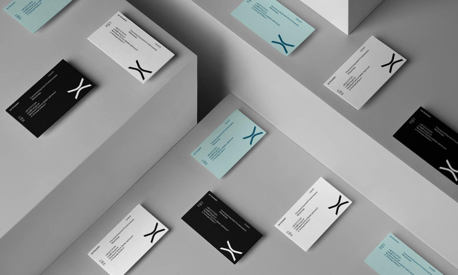
Source: Victor Berriel, Autotax, Behance, https://www.behance.net/gallery/183007605/Autotax
In modern branding and website layouts, the position of a logo design plays a crucial role in how people perceive and interact with a brand. One common pattern that many designers follow is placing the logo design on the left side of a page or header. From corporate websites to small business platforms, the left placement has become a widely accepted visual standard. But have you ever wondered why the logo design is usually placed on the left?
The answer is closely related to user behavior, visual hierarchy, and the way people naturally scan content. Most audiences read from left to right, which means the left side becomes the natural starting point of attention. By placing the logo design on the left, designers ensure that the brand identity is the first element users notice when they open a page. This approach helps strengthen brand recognition and creates a clear visual structure.
Another important reason involves usability and consistency. Over time, users have become familiar with seeing a logo design on the left side of a website or interface. Because of this expectation, the left placement makes navigation feel intuitive and comfortable. When people immediately recognize the logo’s position, they can quickly understand where they are and how to move through the page.
Understanding why designers place logo design elements on the left can help businesses create better layouts, improve user experience, and build stronger brand presence.
Left Placement Follows Natural Reading Direction
One of the most important reasons why a logo design is usually placed on the left side of a layout is the natural reading direction of most users. In many languages, including English, people read from left to right. Because of this habit, the eyes automatically start scanning content from the left side of the screen. Designers use this natural behavior to place the logo design where users are most likely to look first.
When a logo design appears on the left, it becomes the starting point of the visual journey. As soon as visitors land on a page, their eyes move toward the left area before exploring the rest of the content. This placement ensures that the brand identity is immediately visible, which helps strengthen recognition and familiarity. In digital design, capturing attention in the first few seconds is extremely important, and positioning the logo design on the left helps achieve that goal.
The left placement also creates a predictable layout that users feel comfortable navigating. Because people are used to seeing the logo design on the left, the page feels organized and easy to understand. Visitors quickly identify the brand and then continue reading the navigation menu or main content that usually follows to the right.
For designers, using the left side for logo design placement is a simple yet effective strategy. It aligns with natural reading behavior, improves the visibility of the brand, and provides a clear starting point for the entire layout. This is why the left position has become a common standard in modern design.
Left-Aligned Logo Design Improves Brand Recognition
Another strong reason why designers place a logo design on the left is its ability to improve brand recognition. Since the left side of a page is usually the first area users see, placing the logo design there ensures that the brand identity immediately becomes visible. This instant exposure helps users quickly associate the page with the brand behind it.
In both website interfaces and printed materials, the logo design serves as the visual signature of a company. When the logo appears consistently in the same position, users begin to develop a habit of recognizing it right away. Over time, the left placement becomes part of the brand’s visual language, making it easier for audiences to remember and identify the company.
Consistency is a key factor in building strong brand recognition. By keeping the logo design on the left across websites, mobile interfaces, and digital platforms, designers create a stable and predictable layout. Users do not have to search for the logo because they already know where it will appear. This familiarity strengthens trust and reinforces the brand image.
The left placement also works well with navigation structures. Many website menus are positioned next to the logo design, allowing users to see the brand name before exploring the navigation links. This arrangement connects the brand identity with the browsing experience, making the overall design feel cohesive and professional.
Because of these advantages, placing the logo design on the left continues to be one of the most effective ways to improve brand visibility and recognition.
The Left Position Creates A Clear Visual Starting Point
In any well-structured layout, designers must guide the viewer’s eyes through the content in a logical order. One of the reasons a logo design is commonly placed on the left is because it naturally creates a clear visual starting point. When users arrive on a page, their attention typically begins on the left side before moving across the screen. By placing the logo design there, designers establish the brand as the first visual element users encounter.
This approach helps organize the layout and improves how information is consumed. The logo design on the left acts as an anchor that introduces the brand before users explore other elements such as navigation menus, headlines, or images. As a result, visitors can quickly understand who the brand is and where they are on the website or platform.
From a design perspective, creating a clear starting point is essential for visual hierarchy. The logo design serves as the primary identity marker, and positioning it on the left ensures it receives immediate attention. Once users recognize the logo, their eyes naturally move toward the rest of the interface, creating a smooth reading and browsing experience.
The left placement also reduces visual confusion. If the logo design were placed randomly or inconsistently, users might spend extra time searching for the brand identity. By keeping the logo on the left, designers create a predictable and easy-to-follow layout structure.
Because of these advantages, the left position has become a reliable design strategy that establishes clarity, strengthens brand identity, and guides users through the page in a natural and intuitive way.

Source: Will Gomes, Lolla, Behance, https://www.behance.net/gallery/184051417/Lolla
Left Placement Supports Balanced Website Layouts
Another important reason why designers place a logo design on the left is that it helps create balanced and organized website layouts. In many modern interfaces, the header section contains several elements such as navigation menus, search icons, and call-to-action buttons. Positioning the logo design on the left allows these elements to align neatly across the top of the page.
When the logo design sits on the left side, the remaining space on the right can be used effectively for navigation links and interactive elements. This arrangement creates a natural flow where the brand identity appears first, followed by tools that help users explore the website. The result is a layout that feels structured, clean, and easy to understand.
Design balance is a key principle in visual communication. The logo design on the left provides a stable visual anchor that supports the rest of the header content. Without this anchor, the layout might feel uneven or confusing. By placing the logo on the left, designers maintain a clear separation between branding and navigation.
This placement also improves consistency across different devices. Whether users view a website on a desktop, tablet, or mobile screen, the logo design often remains positioned on the left or in the upper-left area. This consistency ensures that the brand identity remains easy to locate regardless of screen size.
Overall, placing the logo design on the left helps designers create balanced layouts that feel organized, professional, and visually harmonious while keeping the brand clearly visible.
Users Instinctively Look To The Left First
One key reason a logo design is commonly placed on the left is that users instinctively look to that area first when scanning a page. Human eye movement often follows predictable patterns, especially when people interact with digital content. Because many users read from left to right, the left side naturally becomes the first place their attention goes when they land on a website or interface.
Designers take advantage of this behavior by placing the logo design on the left to ensure the brand identity is seen immediately. When visitors open a website, their eyes quickly scan the upper-left area before moving across the page. If the logo design is positioned there, it becomes the first recognizable visual element users encounter.
This instinctive viewing pattern helps strengthen brand awareness. Every time users visit the page, they see the logo design on the left without having to search for it. Over time, this repeated exposure helps the brand become more memorable and recognizable.
The left placement also helps reduce cognitive effort. Users do not need to spend time figuring out where the brand identity is located. Instead, they naturally recognize the logo design as soon as they begin scanning the layout. This quick recognition allows them to focus more on the content, navigation, and actions they want to take.
Because users instinctively look toward the left side first, placing the logo design there supports natural viewing behavior and ensures the brand is immediately visible.
Left Logo Design Enhances Navigation Clarity
Another reason why designers position a logo design on the left is to improve navigation clarity. In many website layouts, the header section contains both the logo and the main navigation menu. Placing the logo design on the left creates a logical structure where the brand appears first, followed by navigation links that guide users through the website.
This arrangement helps visitors quickly understand how to move around the page. When the logo design is on the left, users can immediately identify the brand and then shift their attention toward the navigation options located nearby. This creates a clear and intuitive browsing flow.
In many cases, the logo design also functions as a clickable element that returns users to the homepage. When placed on the left, this feature becomes easy to locate and access. Visitors who want to restart their browsing experience can simply click the logo without searching through the page.
The left placement also helps organize the header visually. The logo design acts as the starting anchor, while navigation menus extend toward the right side. This structure keeps the layout neat and prevents elements from competing for attention.
By placing the logo design on the left, designers create a more understandable navigation system. The result is a smoother user experience where visitors can easily recognize the brand and move through the website with confidence.
Consistency With Common Web And Print Design Standards
Another important reason why logo design is usually placed on the left is consistency with common design standards. Over the years, designers across websites, applications, and printed materials have followed similar layout patterns. One of the most recognizable standards is positioning the logo design on the left side of the header or page. Because this approach has been used widely, it has become a familiar structure for users.
Consistency plays a major role in design usability. When users visit different websites, they often expect certain elements to appear in predictable places. The logo design on the left has become one of these expectations. By following this convention, designers create an environment that feels comfortable and easy to navigate.
In web design, many large platforms and well-known brands place their logo design on the left side of the interface. This repeated pattern reinforces the idea that the left position is the standard location for brand identity. When smaller businesses or new websites follow the same approach, users instantly understand where to find the logo.
The same principle also appears in printed materials such as brochures, magazines, and corporate documents. Designers frequently position the logo design on the left side of headers or top sections to maintain visual consistency. This placement helps unify brand presentation across both digital and physical platforms.
By keeping the logo design on the left, designers align with established design standards that audiences already recognize. This consistency makes layouts easier to understand and helps maintain a professional appearance across different media.

Source: Redwan, Easy™ : Mobile App - Website - Branding, Dribbble, https://dribbble.com/shots/20301956-Easy-Mobile-App-Website-Branding
Left Placement Strengthens Visual Hierarchy
Visual hierarchy is a fundamental principle in design, and placing the logo design on the left helps strengthen this structure. Visual hierarchy refers to the arrangement of elements in a way that guides viewers through the content in a logical order. When the logo design appears on the left, it naturally becomes the first element users notice.
This placement allows the brand identity to act as the starting point of the layout. Once users recognize the logo design on the left, their eyes move toward the navigation menu, headlines, and other important content. This organized flow makes the page easier to read and understand.
The left position works especially well in header layouts. Designers typically place the logo design on the left while aligning navigation links toward the center or right side. This arrangement creates a clear separation between brand identity and functional elements such as menus or buttons.
A strong visual hierarchy also improves clarity and reduces confusion. When the logo design is placed randomly or in an unexpected position, users may struggle to understand the layout. However, placing it on the left establishes a familiar structure that helps guide the viewer’s attention.
By positioning the logo design on the left, designers create a clear visual path that supports readability, organization, and brand visibility. This simple placement decision plays an important role in building a structured and effective layout.
Better Alignment With Menu And Navigation Elements
Another important reason why logo design is commonly placed on the left is its ability to align naturally with navigation menus. In most website layouts, the header contains both the brand identity and the primary navigation links. By positioning the logo design on the left, designers can create a logical structure where the brand appears first and the menu follows beside it.
This layout supports a smooth browsing experience. When users open a page, they typically notice the logo design on the left and then shift their attention toward the navigation options placed next to it. The left position therefore helps establish a clear relationship between the brand and the tools that guide users through the website.
From a design perspective, alignment is a key element in creating clean and professional layouts. A logo design placed on the left allows menus, search bars, or call-to-action buttons to extend naturally toward the center or right side of the header. This arrangement prevents visual clutter and keeps the layout balanced.
The left placement also works well across responsive designs. Whether viewed on a desktop screen or a mobile device, the logo design often remains positioned in the upper-left area while navigation elements adapt around it. This consistency helps users quickly locate the brand and understand how to navigate the page.
Because of these advantages, placing the logo design on the left helps designers align branding with navigation elements in a way that feels organized, intuitive, and visually cohesive.
Left Logo Design Improves Overall User Experience
The final reason why logo design is often placed on the left is its positive impact on overall user experience. Good design is not only about visual appeal but also about making interactions simple and intuitive. By positioning the logo design on the left, designers create a familiar layout that users can understand instantly.
Many digital interfaces follow similar structural patterns. When users repeatedly encounter a logo design on the left side of a page, they begin to associate that position with brand identity and homepage access. This familiarity reduces confusion and allows visitors to navigate websites more efficiently.
The left placement also helps users feel oriented within the website. Because the logo design is clearly visible at the beginning of the layout, visitors can quickly recognize which brand they are interacting with. If they want to return to the homepage, the logo usually serves as a clickable element that makes the process simple.
From a usability perspective, predictable layouts make browsing smoother and more enjoyable. When designers place the logo design on the left, they align with common user expectations and reduce unnecessary complexity. This small design decision can significantly improve how comfortable users feel while exploring a website.
Ultimately, placing the logo design on the left supports clarity, familiarity, and ease of navigation. These benefits contribute to a stronger user experience and help create interfaces that are both functional and visually effective.
Conclusion
Placing a logo design on the left has become a common practice because it aligns with natural reading behavior, clear visual hierarchy, and familiar design patterns. When the logo design appears on the left, users can quickly recognize the brand and begin navigating the page with ease. This placement also supports balanced layouts and works well with menus and navigation elements. Over time, audiences have grown comfortable with this structure, making it an effective design choice. By positioning the logo design on the left, designers create interfaces that feel organized, intuitive, and consistent across different digital and print experiences.
Let Us Know What You Think!
Every information you read here are written and curated by Kreafolk's team, carefully pieced together with our creative community in mind. Did you enjoy our contents? Leave a comment below and share your thoughts. Cheers to more creative articles and inspirations!


Leave a Comment