Common Mistakes to Avoid in Grid-Based Logo Design

Source: Antonio Stojceski, Yosauce Logo Gridding, Dribbble, https://dribbble.com/shots/5328681-Yosauce-Logo-Gridding
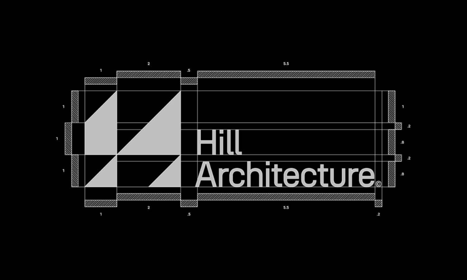
Grid-based logo design is a foundational strategy used by graphic designers to create visually cohesive and balanced logos. This method employs a structured framework of intersecting lines, which guide the placement and scaling of graphic elements, ensuring that the design is proportionally harmonious. The precision and control afforded by a grid system enable designers to achieve a clean, orderly appearance that is essential for brand recognition and visual impact.
However, navigating grid-based design can be fraught with pitfalls that potentially compromise the effectiveness of a logo. Common mistakes range from neglecting grid theory basics to disregarding the scalability of the design. Such errors not only affect the aesthetic quality of the logo but also its functional adaptability across different mediums.
By highlighting typical missteps and emphasizing best practices, this article aims to equip designers with the knowledge to refine their grid-based logo design skills, enhancing both creativity and execution. Understanding these principles is crucial for anyone looking to master this powerful design technique and create logos that leave a lasting impression.
Ignoring the Basics of Grid Theory
A fundamental grasp of grid theory is essential for any designer working with grid-based logo design. This theory underpins the structure of the design, ensuring that all elements are harmoniously aligned and balanced. Ignoring grid theory can lead to logos that look disorganized and visually unappealing. Basic principles like the rule of thirds, symmetrical vs. asymmetrical balance, and the use of modular grids should be considered to enhance the visual dynamics of the logo.
A well-implemented grid can direct the viewer’s eye in a purposeful manner, creating a stronger impact and ensuring the logo’s components are proportionally scaled. By neglecting these principles, designers risk crafting a logo that fails to communicate effectively or resonate with its intended audience. Therefore, it is crucial for designers to not only understand grid theory but to apply it meticulously to avoid common pitfalls that can detract from a logo's effectiveness.
Overcomplicating the Grid
In grid-based logo design, simplicity often leads to the most effective and memorable outcomes. Overcomplicating the grid with too many divisions or inconsistent line weights can overwhelm the logo, making it difficult to decipher and scale down for smaller applications like business cards or favicons. Designers should aim to use the grid as a guide rather than a constraint, allowing creative flexibility while maintaining order. A common mistake is to implement multiple grid systems without a clear rationale, which can fragment the logo’s design and disrupt its visual flow.
Instead, designers should focus on using a single, well-considered grid that enhances the logo’s visual story without dominating it. By keeping the grid simple and functional, designers ensure that the logo remains versatile across various uses and sizes, maintaining clarity and impact in all contexts. This approach not only aids in the technical reproduction of the logo but also in building a strong and coherent brand identity.
Neglecting White Space
White space, or negative space, plays a pivotal role in grid-based logo design, providing a visual breathing room that enhances readability and overall impact. In the context of grid-based designs, white space helps to define the boundaries between different elements, improving visual hierarchy and focus. Neglecting to incorporate adequate white space can lead to a cluttered and confusing logo, which may diminish its effectiveness and memorability. Effective use of white space does not mean leaving large areas empty but strategically placing gaps that enhance the design’s clarity and allow each component to stand out.
This careful balancing act ensures that the logo can be easily recognized and remains visually appealing across various applications. Designers should consider white space as an active element of design rather than a passive background, using it to guide the viewer’s eye and reinforce the logo’s message. By integrating white space effectively, designers can create a clean, sophisticated logo that communicates a brand’s identity clearly and effectively.

Source: Shubhang Rajput, Lilliemountain Logo Grid, Dribbble, https://dribbble.com/shots/6701429-Lilliemountain-Logo-Grid
Inconsistent Grid Use
Consistency in applying a grid structure is crucial for achieving a harmonious and balanced logo design. When grids are used inconsistently, it can lead to a disjointed visual experience, where elements appear misaligned or randomly placed. This lack of uniformity can severely disrupt the aesthetic and functional quality of a logo, making it less effective as a branding tool. To avoid this, designers must adhere strictly to the grid throughout the design process, ensuring that every element aligns with predetermined guidelines. This approach not only enhances the visual neatness but also supports scalable designs that maintain integrity across different sizes and mediums.
Consistent grid use helps in creating a strong, cohesive brand image that is instantly recognizable and reliable. It also simplifies the design process by providing clear guidelines for element placement and proportion, which are vital for a successful grid-based logo. By respecting the grid, designers can craft logos that are both aesthetically pleasing and functionally robust, making a lasting impression in any brand’s visual communication.
Forgetting Scalability
Scalability is a critical aspect of grid-based logo design that cannot be overlooked. A scalable logo must maintain its integrity and impact when resized for various applications—from large billboards to small digital icons. Forgetting scalability can result in a logo that becomes illegible or loses its aesthetic appeal when scaled down. To ensure a logo is scalable, designers should use a grid system that supports clarity at any size. This involves avoiding overly intricate details that might blend together or disappear when the logo is reduced.
Simple, bold lines and clear spaces within the grid can help maintain the logo's visibility across different scales. Additionally, testing the logo in multiple sizes during the design process can preempt scalability issues, allowing adjustments before finalizing the design. By focusing on scalability, designers can create versatile logos that serve a brand's needs across all platforms, ensuring consistent recognition and effective branding in every visual touchpoint.
Using Inappropriate Grid Shapes
Choosing the right grid shape is essential for effective grid-based logo design. Each grid shape, whether it be circular, triangular, or rectangular, imparts a different dynamic to the logo. Using an inappropriate grid shape can misalign the design’s visual balance and its intended message. For instance, a circular grid might suggest unity and continuity, which is ideal for brands aiming for a soft, inclusive image. Conversely, angular grids, such as triangular or diamond-shaped, convey stability and energy, better suited for dynamic, cutting-edge companies.
The choice of grid should align with the brand’s identity and the message it aims to communicate. Misalignment can lead to a confusing brand image, reducing the logo’s effectiveness in conveying the right brand message. Therefore, understanding the implications of various grid shapes and selecting one that enhances the logo's purpose is crucial for crafting an impactful and meaningful design.
Lack of Focal Point
A clear focal point is crucial in grid-based logo design, as it guides the viewer's eye to the most important element of the logo. Without a focal point, a logo can appear scattered and fail to communicate its message effectively. Designers using grid systems must strategically place key elements at intersections or central points on the grid to capture attention and make the logo memorable. This technique ensures that the brand's identity is immediately recognizable and impactful. Additionally, the focal point should be the most visually striking part of the logo, often enhanced by scale, color, or unique typography that aligns with the overall brand strategy.
When a logo lacks this central focus, it risks being overlooked or forgotten amidst the vast sea of visual stimuli in the market. Therefore, maintaining a strong focal point within a grid-based design is not just about aesthetics but about creating a potent symbol of the brand’s essence.

Source: Tuell Design, M + K + Camera Grid, Dribbble, https://dribbble.com/shots/15128083-M-K-Camera-Grid
Poor Color Choices
Color is a powerful tool in logo design, capable of influencing perception and emotions. Poor color choices can significantly detract from the effectiveness of a grid-based logo design, leading to miscommunication of the brand's intended message. Designers should choose colors that enhance the visibility and legibility of the logo, especially when applied within the structured confines of a grid. Colors need to complement each other and maintain enough contrast to ensure the logo is equally impactful in both color and grayscale formats. Furthermore, consideration of color psychology and brand identity alignment is essential; the right colors can evoke the desired emotional response and connect with the target audience on a deeper level.
For instance, blues and greens typically convey professionalism and tranquility, making them suitable for corporate and wellness brands, respectively. Ultimately, the thoughtful application of color within a grid-based design not only enhances aesthetic appeal but also fortifies the brand’s communication strategy.
Ignoring Typography
Typography in grid-based logo design is not just a matter of choosing a font; it's about integrating type seamlessly into the overall design to enhance readability and brand identity. Ignoring the role of typography can lead to a disconnect between the logo’s text and its visual elements, weakening the overall impact. Effective typography should align with the grid’s structure, ensuring that text elements are proportionally balanced and strategically placed to complement the logo's graphical components. This involves selecting typefaces that reflect the brand’s personality and are versatile across various applications.
Additionally, the size, weight, and spacing of the type need careful consideration to maintain legibility across different media. Designers should also be wary of trends and choose typography that promises longevity over fleeting popularity, thus safeguarding the brand's relevance in the long term. By giving typography the attention it deserves in grid-based logo design, designers can significantly boost the logo's effectiveness and ensure it communicates the brand’s message clearly and powerfully.
Skipping Mock-ups
Creating mock-ups is an essential step in the grid-based logo design process, allowing designers to test how the logo performs in real-world applications before finalization. Skipping this step can result in logos that look good on screen but fail in practical use on various media, such as print, digital, or merchandise. Mock-ups help identify potential issues with scalability, color fidelity, and placement that might not be apparent in a digital sketch. They provide a realistic preview of how the logo interacts with different backgrounds, materials, and sizes, which is crucial for ensuring the design's versatility and effectiveness.
This stage is also valuable for gathering feedback from clients or target audiences, offering insights that could lead to crucial refinements. By integrating mock-ups into the design process, designers can avoid costly revisions post-launch and ensure the logo fulfills its intended function as a brand identifier across all platforms.
Conclusion
Mastering grid-based logo design demands attention to detail across various elements—from typography and color choices to the strategic use of white space and grid alignment. Each component plays a critical role in creating a cohesive, impactful logo that resonates with audiences and stands the test of time. By avoiding common pitfalls like neglecting scalability and overlooking the importance of mock-ups, designers can leverage the grid system to its fullest potential, ensuring that every logo they create not only looks visually stunning but also effectively communicates the brand’s core message. As such, grid-based design remains a cornerstone of professional logo creation, embodying precision and creativity in equal measure.
Let Us Know What You Think!
Every information you read here are written and curated by Kreafolk's team, carefully pieced together with our creative community in mind. Did you enjoy our contents? Leave a comment below and share your thoughts. Cheers to more creative articles and inspirations!


Leave a Comment