The Perfect Checklist for Your Logo Design Guidelines

Source: Faza Dzikrulloh, Nikie - Visual Identity Guidelines, Dribbble, https://dribbble.com/shots/20164344-Nikie-Visual-Identity-Guidelines
Creating a strong and recognizable brand identity starts with an effective logo design, but ensuring its consistency across all platforms requires well-structured guidelines. Without clear rules, logos can be misused, distorted, or displayed in ways that weaken brand recognition. A carefully crafted logo design guideline serves as a roadmap to maintaining the integrity of a company’s visual identity.
A logo design guideline is more than just a document—it is a set of standards that dictate how a logo should be used in different scenarios. From defining color palettes and typography to setting size and spacing requirements, these guidelines ensure that the logo remains professional and adaptable across various media. Whether applied to websites, print materials, social media, or promotional items, consistency in logo design strengthens a brand’s credibility and impact.
This article provides a comprehensive checklist for developing the perfect logo design guidelines. Each element plays a crucial role in maintaining visual coherence and preventing common design mistakes. By following these guidelines, businesses, designers, and marketers can safeguard the essence of their brand and create a logo that stands out with clarity and purpose. Let’s explore the key elements that make up the perfect logo design guidelines.
Define Logo Variations
A well-structured logo design must be adaptable to different formats and applications. This is why establishing clear guidelines for logo variations is essential. A brand’s logo should not be confined to a single version; instead, it should have multiple variations to suit different backgrounds, mediums, and design constraints.
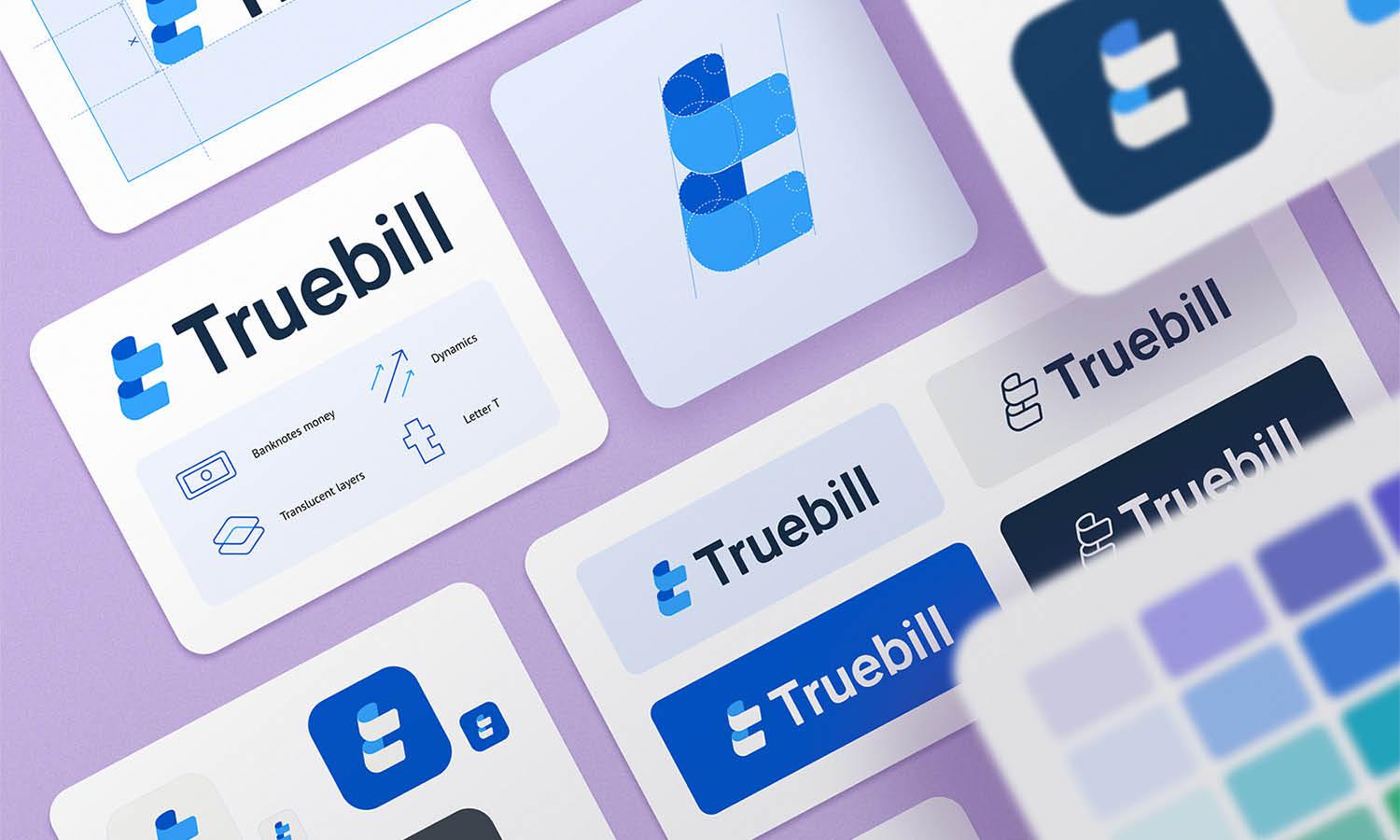
The primary logo version represents the brand in its full form, incorporating all design elements, such as colors and typography. However, there will be instances where a simpler version is required. A monochrome version, in black or white, ensures that the logo remains recognizable when color printing is unavailable or when applied on single-color merchandise. Additionally, a grayscale version is useful for newspaper prints and certain digital formats.
A responsive or simplified logo variation is necessary for small-scale applications, such as social media profile pictures, favicons, and mobile app icons. This version retains the essence of the original design while eliminating intricate details that may become unreadable at smaller sizes.
Another key variation is a transparent-background version, typically provided in PNG or SVG format. This ensures seamless integration onto various designs without an unsightly white or colored box around it.
Specify Logo Dimensions
Defining proper logo design dimensions is crucial for maintaining clarity and visual impact. Logos that are scaled incorrectly can lose their legibility or appear distorted, compromising brand professionalism. Establishing clear guidelines on minimum and maximum logo dimensions ensures that the logo remains effective across different formats and applications.
A minimum size requirement should be specified to prevent illegibility. For instance, a logo used on small items such as business cards or mobile interfaces should maintain a level of detail that remains distinguishable. Setting a minimum width—often around 1 inch (25mm) for print and 50 pixels for digital use—can prevent the logo from becoming unreadable when scaled down.
Similarly, maximum size recommendations should be outlined for large-scale applications such as billboards and signage. Enlarging a logo beyond a certain point may expose pixelation or inconsistencies in vector scaling. Ensuring that the logo maintains proper resolution and proportions in high-definition formats like SVG or EPS is essential for large-scale printing.
In addition to minimum and maximum sizes, specifying aspect ratio rules prevents unintended stretching or warping of the logo. The guidelines should emphasize that the logo must always be resized proportionally to maintain its intended design integrity.
Establish Clear Space Rules
Clear space rules are essential in logo design to ensure visibility, balance, and professionalism. A well-defined guideline for logo spacing prevents visual clutter and maintains the logo’s impact across different placements.
Clear space refers to the minimum empty area surrounding a logo that must remain free of any text, images, or other design elements. This ensures that the logo is not overwhelmed by surrounding content and retains its intended prominence. Without adequate spacing, a logo can appear cramped, making it difficult to recognize and diminishing brand consistency.
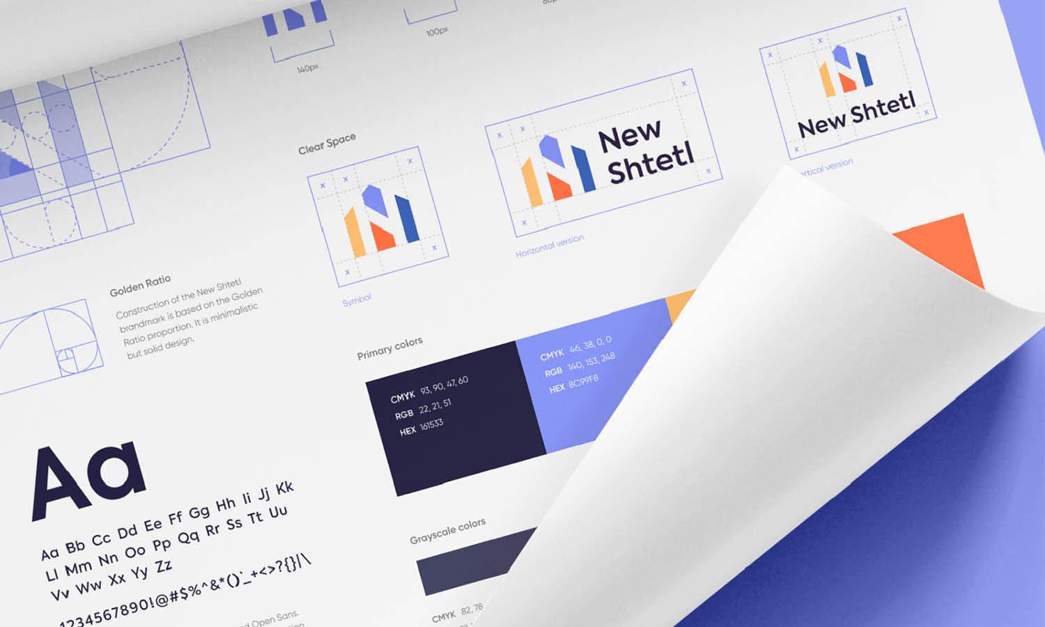
A standard method for determining clear space is using a proportionate measurement based on an element within the logo, such as the height of a letter or an icon. For example, a common rule is to leave at least the height of the logo’s main symbol or lettermark as padding around all sides. This prevents misalignment and ensures uniformity across different media.
In print, web, and merchandise applications, respecting clear space rules ensures the logo remains visually distinct. This is especially important in co-branding scenarios, where multiple logos appear together. Proper spacing prevents logos from competing for attention and ensures a balanced composition.

Source: Reza Moradi, Linkkify, Dribbble, https://dribbble.com/shots/18144731-Linkkify-Brand-Book-Design
Choose an Appropriate Color Palette
A well-defined color palette is a crucial aspect of logo design and plays a significant role in brand identity. The right colors enhance recognition, evoke emotions, and create a lasting impression. Establishing clear guidelines for logo colors ensures consistency across different mediums and applications.
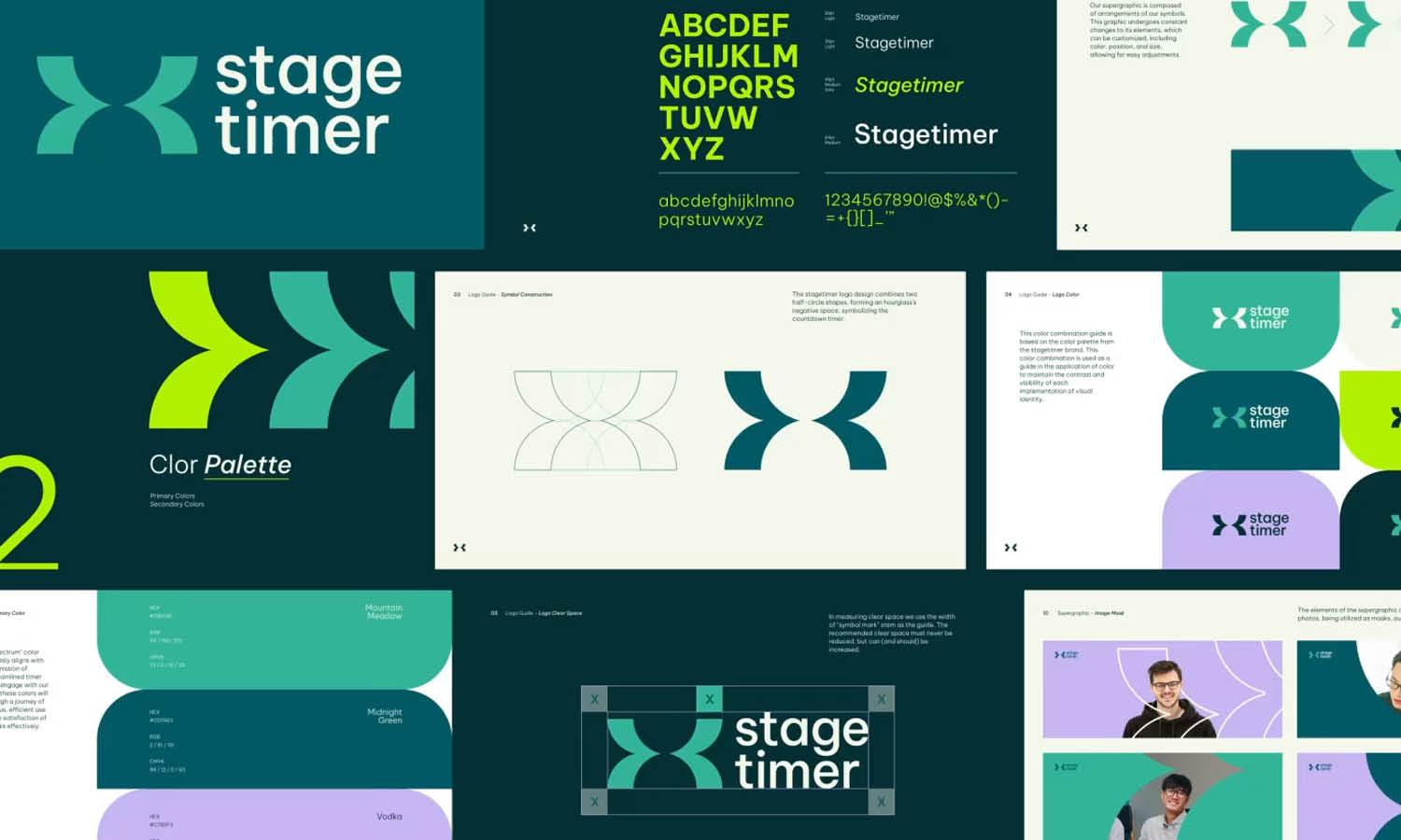
Primary logo colors should be specified using precise values, including HEX, RGB, CMYK, and Pantone codes. This prevents discrepancies between digital and print applications, ensuring that the brand’s colors remain uniform across platforms. A logo may also include secondary colors, which provide flexibility for different design needs while maintaining brand harmony.
It is essential to determine how the logo appears in different color variations. A full-color version is ideal for primary branding, while a monochrome version (black or white) ensures visibility in single-color printing. A grayscale variation may be useful for newspapers or low-color environments.
Another important consideration is logo adaptability on light and dark backgrounds. The guidelines should define how the logo should appear in such scenarios, whether it requires a background color adjustment or an alternate version with higher contrast.
Provide Usage on Light and Dark Backgrounds
A logo design should remain clear and legible regardless of the background it is placed on. Defining proper guidelines for logo usage on light and dark backgrounds ensures that the logo maintains its visibility, contrast, and overall brand impact.
A full-color logo often works best on neutral or white backgrounds, but on darker backgrounds, the colors may not appear as intended. To address this, a logo variation with adjusted colors or an alternate version should be specified. A common approach is using a white or light-colored version of the logo when placed on dark backgrounds to maintain contrast and readability.
Additionally, if a logo features multiple colors, designers should test how it appears on both light and dark backgrounds to ensure balance. Some logos may require an outline or subtle shadow to improve clarity when placed against complex or busy backgrounds.
Transparent-background versions of the logo should also be provided to ensure seamless integration into different designs without unwanted borders or boxes. Vector formats like SVG or transparent PNG files are essential for flexibility.
Establishing these guidelines helps prevent improper logo usage that could compromise brand identity. By specifying how the logo should appear in different lighting conditions, businesses can maintain a professional and consistent logo design across all digital and print materials.
Select the Right Typography
Typography plays a crucial role in logo design, influencing both readability and brand perception. Selecting the right typefaces and establishing guidelines for their use ensures consistency across all brand materials.
A logo design typically includes a primary font that represents the brand’s identity. This font should be distinctive, legible, and align with the brand’s personality. Serif fonts convey tradition and sophistication, while sans-serif fonts create a modern and clean appearance. Script and decorative fonts add uniqueness but should be used sparingly to maintain readability.
In addition to the primary logo font, brands should define secondary typefaces for marketing materials, website headers, and promotional content. These supporting fonts should complement the logo typography without overwhelming the design. Establishing rules for font weights, sizes, and spacing ensures uniformity across various applications.
Another key aspect of typography guidelines is scalability. The chosen font should remain legible at different sizes, whether on a business card or a billboard. Avoid overly intricate typefaces that lose clarity when resized.
Kerning, tracking, and line spacing should also be addressed in the guidelines to maintain a polished and professional appearance. Clear specifications help prevent inconsistencies that could dilute brand identity.
By defining strict typography guidelines, businesses can ensure that their logo design and brand messaging remain cohesive, readable, and visually impactful across all platforms.
Set Guidelines for Scaling
Scaling is a critical factor in logo design as it ensures that the logo maintains clarity and visual integrity across different applications. Without proper guidelines, resizing a logo can lead to distortion, pixelation, or loss of legibility, ultimately affecting brand representation.
One of the primary rules for scaling a logo design is maintaining proportionality. The logo should never be stretched or compressed, as this can alter its intended shape and impact. Instead, resizing must always be done proportionally to preserve its original design.
Minimum and maximum size limits should also be defined to prevent readability issues. For example, when used on small-scale applications like favicons or social media icons, intricate details may become unclear. Establishing a minimum width and height ensures that the logo remains distinguishable. Similarly, for large-scale applications such as billboards, high-resolution vector files (SVG, EPS) should be used to prevent pixelation.
Another essential aspect of scaling guidelines is adaptability. Responsive logos—simplified variations optimized for different screen sizes—allow for flexibility without compromising the brand’s identity. A complex logo may require a minimalistic version when displayed in small spaces.
By setting clear scaling guidelines, businesses can ensure that their logo design remains legible and professional across digital platforms, print materials, and promotional merchandise. Proper resizing practices contribute to consistent branding and enhance the overall impact of a logo.

Source: Muhammad Sohail, Sohail - Brand Guideline, Dribbble, https://dribbble.com/shots/14676057-Sohail-Brand-Guideline
Define Logo Placement Across Media
Proper logo placement is essential for maintaining a consistent and professional brand identity. Without clear guidelines, a logo design can be positioned incorrectly, reducing its visibility or interfering with other design elements. Establishing placement rules ensures the logo appears balanced and recognizable across all media.
For print materials such as business cards, letterheads, and brochures, the logo should be positioned in a way that maintains hierarchy and readability. Common placements include the top left, top center, or bottom right, depending on the design layout. Ensuring adequate spacing from edges and other elements prevents overcrowding.
In digital applications, such as websites and mobile apps, the logo design is typically placed in the header, navigation bar, or footer for easy brand recognition. It should remain visible and clear regardless of screen size. A responsive logo may be necessary for smaller screens to maintain legibility.
For promotional merchandise, such as apparel and packaging, the placement should align with industry standards while ensuring visibility. Logos on clothing often appear on the chest, sleeve, or back, while product packaging should feature the logo prominently without overwhelming the design.
Co-branding situations require additional guidelines to define how the logo appears alongside other brands. Ensuring equal prominence and proper spacing prevents misrepresentation. By defining logo placement guidelines, businesses can ensure that their logo design remains impactful and recognizable across all mediums, reinforcing a strong and unified brand presence.
Include Dos and Don’ts
A well-structured logo design guideline should include a section that clearly outlines the dos and don’ts of logo usage. This ensures that the logo maintains its integrity and remains consistent across all applications. Without these instructions, improper modifications can weaken the brand identity.
Dos:
Use the Approved Logo Versions: Always use the official versions provided in the brand guidelines to maintain consistency.
Maintain Proper Clear Space: Ensure that the logo has sufficient surrounding space to avoid visual clutter.
Resize Proportionally: Always scale the logo while maintaining its original aspect ratio to prevent distortion.
Use the Correct Colors: Apply the designated color palette as specified in the guidelines to maintain brand recognition.
Ensure Legibility: When using the logo on different backgrounds, ensure sufficient contrast for visibility.
Don’ts:
Do Not Alter the Logo’s Proportions: Stretching or compressing the logo distorts its design and diminishes professionalism.
Do Not Change Colors Arbitrarily: Using unauthorized colors weakens brand consistency.
Do Not Add Effects: Avoid unnecessary shadows, gradients, or other modifications that alter the original design.
Do Not Place the Logo Over Busy Backgrounds: Ensure clarity by using an alternate version or placing it on a solid background.
Do Not Modify Typography: The logo’s font should remain unchanged to preserve brand identity.
By defining these dos and don’ts in the guidelines, businesses can prevent misuses that could dilute their logo design and overall branding.
Adapt the Logo for Social Media
A strong social media presence requires a well-optimized logo design that maintains clarity and recognizability across various platforms. Since profile pictures, banners, and posts have unique size constraints, brands must establish guidelines for adapting their logo to different social media formats.
The primary concern for social media adaptation is logo visibility at small sizes. Most platforms use circular or square profile images, making it necessary to have a simplified or icon-based version of the logo. If the full logo contains intricate details, a secondary variation, such as a monogram or symbol, may be required for better clarity.
Another key factor is maintaining color contrast. Social media platforms often use different background colors depending on dark or light mode settings. The guidelines should specify logo variations that ensure legibility in all viewing conditions. Transparent-background versions (PNG or SVG) should also be provided for seamless integration.
For cover images, banners, and post graphics, logo placement must be considered to prevent cropping or misalignment. Each platform has different dimensions for these elements, so a responsive logo layout helps maintain a polished brand presence.
By adapting the logo design for social media and defining clear usage guidelines, businesses can ensure that their branding remains professional, consistent, and instantly recognizable across all digital platforms.
Conclusion
Creating comprehensive logo design guidelines ensures consistency, professionalism, and brand recognition across all platforms. By defining variations, dimensions, spacing, typography, and color usage, businesses can maintain a strong visual identity. Proper scaling, placement, and adaptation for digital and print applications prevent distortions and misrepresentation. Additionally, clear dos and don’ts help safeguard the integrity of the logo design. Whether used in social media, merchandise, or advertisements, following structured guidelines ensures that the logo remains impactful and recognizable. A well-documented set of logo design guidelines is essential for preserving brand identity and maintaining a cohesive visual presence.
Let Us Know What You Think!
Every information you read here are written and curated by Kreafolk's team, carefully pieced together with our creative community in mind. Did you enjoy our contents? Leave a comment below and share your thoughts. Cheers to more creative articles and inspirations!


Leave a Comment