Tools and Resources for Effective Grid System Logo Design

Source: Elif Kamesoglu, Necta, Behance, https://www.behance.net/gallery/180262865/Necta?isa0=1
Creating a strong and memorable logo design requires more than creativity alone. Structure, balance, and precision play a major role in shaping a professional visual identity. This is where the concept of a grid becomes essential. A grid provides a framework that helps designers align elements consistently, ensuring that every part of the logo design feels intentional and visually harmonious.
In modern logo design workflows, designers rely on a variety of tools and resources to build and apply grid systems effectively. From vector-based software to specialized plugins and online templates, these resources simplify the process of maintaining proportion and symmetry. They also allow designers to experiment with layouts while still keeping a solid structural foundation.
Whether you are a beginner exploring the basics or a professional refining your craft, understanding how to use grid tools can significantly improve your results. A well-constructed grid not only enhances visual clarity but also ensures scalability across different media and platforms. This article will guide you through essential tools and resources that can elevate your grid-based logo design process and help you achieve more precise and polished outcomes.
Understanding Grid Systems In Logo Design
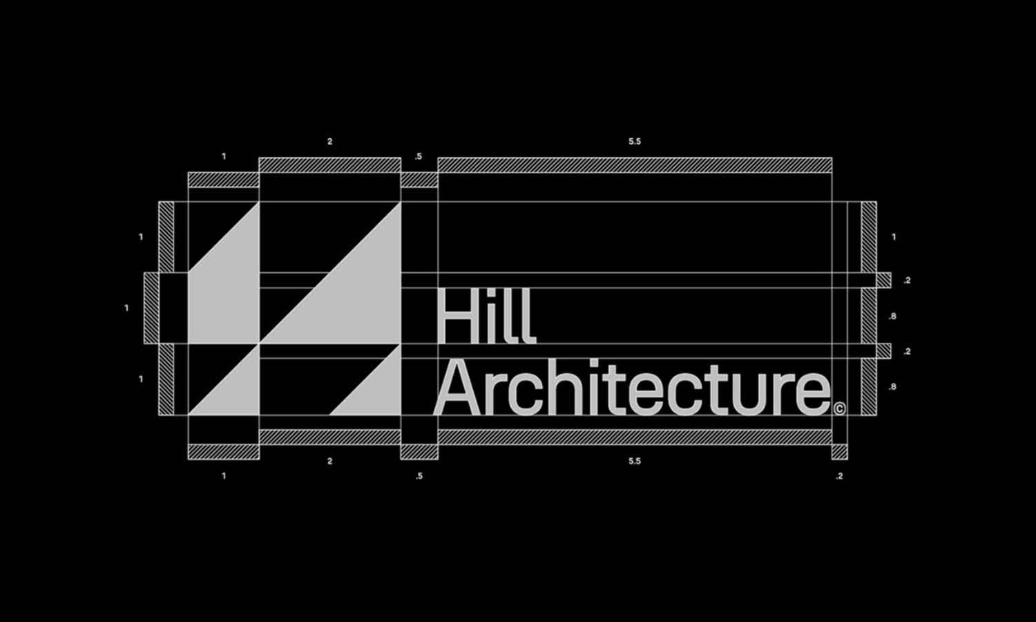
A grid is one of the most powerful tools in logo design, providing a structured foundation that helps designers create balanced and visually appealing compositions. At its core, a grid is a system of intersecting lines that guide the placement of elements. By using a grid, designers can ensure that every part of the logo design aligns with precision and maintains consistency throughout the process.
In grid-based logo design, proportions become easier to control. Designers can define spacing, scale, and alignment using the grid as a reference point. This approach not only improves visual harmony but also enhances readability and recognition. Whether designing a simple icon or a complex brand mark, the grid acts as a framework that supports creative decisions.
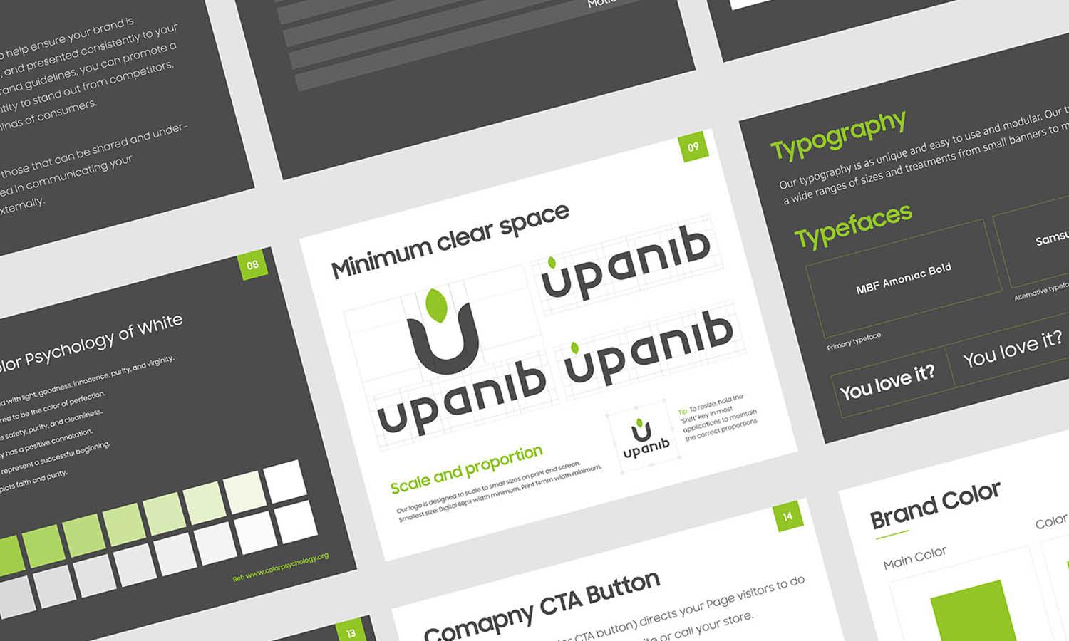
Another key benefit of using a grid in logo design is scalability. A well-structured grid ensures that the logo maintains its clarity across different sizes and platforms, from business cards to large billboards. It also helps in creating variations of the logo while keeping the design consistent.
Understanding grid systems allows designers to move beyond guesswork and rely on intentional design choices. By mastering the fundamentals of grid usage, you can elevate your logo design process and produce work that feels both professional and timeless.
Vector Design Software For Precise Grid Creation
Vector design software plays a crucial role in creating precise and scalable grid systems for logo design. Tools such as Adobe Illustrator, Affinity Designer, and CorelDRAW provide built-in grid features that allow designers to construct accurate layouts with ease. These applications are specifically designed to handle vector graphics, making them ideal for grid-based logo design work.
One of the main advantages of using vector software is the ability to create and customize grids according to your needs. Designers can adjust spacing, subdivisions, and alignment settings to match the specific requirements of a logo design. This flexibility ensures that every element fits perfectly within the grid structure, resulting in a clean and balanced composition.
Additionally, vector tools offer snapping features that automatically align shapes and paths to the grid. This helps reduce errors and speeds up the design process. With precise control over anchor points and curves, designers can maintain consistency and symmetry throughout the logo design.
Using professional vector software also ensures that your grid-based logo design remains scalable without losing quality. Whether the logo is displayed on digital screens or printed materials, the integrity of the design stays intact. By mastering these tools, designers can create more refined, accurate, and visually compelling logo designs using grid systems.
Popular Grid Tools Used By Professional Designers
In the world of grid-based logo design, professional designers often rely on a variety of tools that simplify the process of building accurate and consistent layouts. These grid tools are designed to enhance precision while allowing creative flexibility. Whether integrated within design software or available as standalone resources, they play an essential role in achieving polished results.
Many designers use built-in grid systems found in software like Adobe Illustrator, but there are also dedicated grid generators that offer more control. Tools such as modular grid generators and golden ratio calculators help designers establish proportions that feel visually balanced. These resources are especially useful when creating logo design concepts that require harmony and symmetry.
Another popular category includes overlay grid tools, which allow designers to apply grids on top of existing sketches or drafts. This makes it easier to refine shapes and align elements without starting from scratch. Additionally, some designers use printable grid templates during the sketching phase to guide their initial ideas before moving to digital platforms.
By incorporating these tools into their workflow, designers can maintain consistency across different stages of logo design. A well-chosen grid tool not only improves efficiency but also ensures that the final design is structured, scalable, and visually cohesive. Exploring different grid resources can help you find the right balance between creativity and precision.
Utilizing Built-In Grid Features In Design Apps
Modern design applications come equipped with powerful built-in grid features that make the logo design process more efficient and precise. These features are especially valuable when working with grid-based logo design, as they allow designers to align elements accurately without relying on manual adjustments.
Most vector design tools provide customizable grid settings, enabling designers to adjust spacing, divisions, and alignment based on the needs of the project. This flexibility allows you to create a grid that supports your logo design concept, whether it is minimal and geometric or more complex and detailed. The ability to toggle grids on and off also helps maintain a clean workspace while still benefiting from structured guidance.
Snap-to-grid functionality is another essential feature that improves accuracy in logo design. With this option enabled, shapes and paths automatically align to the nearest grid lines, reducing inconsistencies and saving time. Designers can focus more on creativity while ensuring that every element follows a consistent structure.
Additionally, many design apps include guides and rulers that work alongside the grid system. These tools provide extra control for fine-tuning alignment and spacing. By fully utilizing built-in grid features, designers can streamline their workflow and produce logo designs that are both visually balanced and professionally executed.
Online Resources For Grid Templates And Guides
Online resources have become an essential part of modern grid-based logo design, offering designers quick access to ready-made templates and structured guides. These resources are especially helpful for those who want to streamline their workflow while maintaining precision and consistency in their designs. By using pre-built grid templates, designers can focus more on creativity without spending too much time setting up the foundational structure.
There are many platforms that provide downloadable grid templates tailored for logo design. These templates often include modular grids, circular grids, and golden ratio-based layouts, which are commonly used to create visually balanced designs. Designers can easily import these templates into their preferred software and adapt them to fit their specific project needs.
In addition to templates, online tutorials and guides offer valuable insights into how to effectively apply grid systems in logo design. These resources often include step-by-step instructions, real-world examples, and practical tips that help designers understand the reasoning behind grid usage. Learning from these guides can improve both technical skills and design intuition.
By leveraging online resources, designers can enhance their efficiency and gain new perspectives on grid-based logo design. Whether you are just starting out or looking to refine your process, these tools and guides can help you create more structured, professional, and visually appealing logo designs.
Typography Tools That Align With Grid Structures
Typography plays a crucial role in grid-based logo design, as it directly impacts readability, balance, and overall visual harmony. Using typography tools that align with grid structures allows designers to create logos where text elements integrate seamlessly with the rest of the composition. This alignment ensures that every detail feels intentional and well-organized.
Many modern design tools include advanced typography features that support grid alignment. Designers can adjust kerning, tracking, and baseline grids to ensure that text fits perfectly within the overall grid system. This level of control is essential when working on logo design projects that rely heavily on type, such as wordmarks or lettermarks.
Font management tools and libraries also play an important role in this process. By selecting typefaces that complement the grid structure, designers can maintain consistency and visual clarity. Some fonts are specifically designed with geometric proportions, making them ideal for grid-based logo design.
Additionally, typography plugins and extensions can further enhance workflow by offering alignment aids and spacing tools. These features help designers maintain consistency across different elements of the logo design. By combining strong typography with a well-defined grid, designers can create logos that are not only visually appealing but also highly functional and easy to recognize.
Plugins And Extensions To Enhance Grid Workflow
Plugins and extensions have become valuable additions to any grid-based logo design workflow, offering extra functionality that goes beyond standard design software features. These tools are specifically created to improve efficiency, accuracy, and overall design quality when working with grids. By integrating plugins into your process, you can streamline repetitive tasks and focus more on creative exploration.
Many grid-focused plugins provide advanced alignment tools, allowing designers to quickly snap elements into place with greater precision. Some extensions also generate custom grid systems automatically, including modular layouts and proportional guides. This can be particularly useful when working on complex logo design projects that require consistent spacing and symmetry.
Other plugins are designed to enhance measurement and spacing, offering real-time feedback on distances between elements. This helps maintain uniformity throughout the logo design and ensures that every component adheres to the grid structure. Additionally, certain extensions allow designers to save and reuse grid presets, making it easier to maintain consistency across multiple projects.
By incorporating plugins and extensions into your workflow, you can significantly improve both speed and accuracy in grid-based logo design. These tools not only simplify technical tasks but also support a more organized and professional design process, ultimately leading to more refined and visually balanced results.
Learning Platforms For Mastering Grid Techniques
Mastering grid techniques in logo design requires both practice and access to the right educational resources. Learning platforms play an important role in helping designers understand how to effectively apply grid systems in their work. These platforms offer structured courses, tutorials, and real-world examples that make complex concepts easier to grasp.
Online learning platforms such as design-focused websites and video-based courses provide in-depth lessons on grid usage in logo design. These resources often cover topics like proportional systems, alignment strategies, and the application of grids in different design styles. By following guided lessons, designers can build a strong foundation and gradually improve their skills.
In addition to formal courses, many platforms offer community-driven content where designers share their workflows and techniques. This can be a valuable source of inspiration and practical knowledge. Seeing how professionals use grids in real projects helps bridge the gap between theory and application.
Regularly engaging with learning platforms allows designers to stay updated with evolving trends and techniques in grid-based logo design. Whether you are a beginner or an experienced designer, investing time in learning can lead to more confident decision-making and higher-quality results. A strong understanding of grid principles ultimately enhances both creativity and precision in logo design.
File Management And Export Tools For Grid-Based Logos
Effective file management and export tools are essential in maintaining the integrity of grid-based logo design. Once a logo is created using a structured grid, it is important to preserve its precision across different formats and platforms. Proper organization ensures that designers can easily access, update, and deliver files without compromising the original grid structure.
Designers often work with multiple file types, including editable vector files, presentation formats, and export-ready assets. Using organized folder systems and clear naming conventions helps keep grid-based logo design projects efficient and easy to manage. This is especially useful when working with clients or collaborating with teams.
Export tools within design software allow designers to generate files in various formats such as SVG, PNG, and PDF. These formats ensure that the logo design maintains its quality and scalability, which is a key advantage of using a grid system. Export settings can also be customized to match specific requirements, including resolution, color profiles, and dimensions.
Additionally, some tools allow batch exporting, making it easier to create multiple versions of a grid-based logo design for different use cases. By managing files effectively and using the right export tools, designers can ensure that their grid-based logo design remains consistent, professional, and ready for real-world applications.
Best Practices For Combining Tools In Grid Logo Design
Combining different tools effectively is key to achieving a successful grid-based logo design. While each tool offers unique features, understanding how to integrate them into a cohesive workflow can significantly improve both efficiency and design quality. A well-structured approach allows designers to take full advantage of each resource while maintaining consistency throughout the project.
One of the best practices is to start with sketching or basic grid planning before moving into digital tools. This helps establish a strong foundation for the logo design. From there, vector software can be used to refine shapes and align elements precisely within the grid. Plugins and extensions can further enhance accuracy and speed during this stage.
It is also important to maintain consistency when switching between tools. Using the same grid proportions and alignment rules ensures that the logo design remains cohesive. Saving grid presets and templates can help streamline future projects and reduce setup time.
Another key practice is to regularly review and adjust your design within the grid. This allows you to balance creativity with structure, ensuring that the final logo design is both visually appealing and technically sound. By thoughtfully combining tools and resources, designers can create grid-based logo designs that are polished, scalable, and highly effective.
Conclusion
Using the right tools and resources can greatly enhance your grid-based logo design process. A well-structured grid helps create balance, consistency, and scalability, while modern software, plugins, and learning platforms make the workflow more efficient. By combining these tools thoughtfully, designers can achieve precise and visually appealing results without limiting creativity. Whether you are refining your skills or starting fresh, understanding how to apply a grid in logo design will lead to stronger, more professional outcomes that perform well across different platforms and branding needs.
Let Us Know What You Think!
Every information you read here are written and curated by Kreafolk's team, carefully pieced together with our creative community in mind. Did you enjoy our contents? Leave a comment below and share your thoughts. Cheers to more creative articles and inspirations!




Leave a Comment