
How To Maintain Quality in Logo Design Scaling

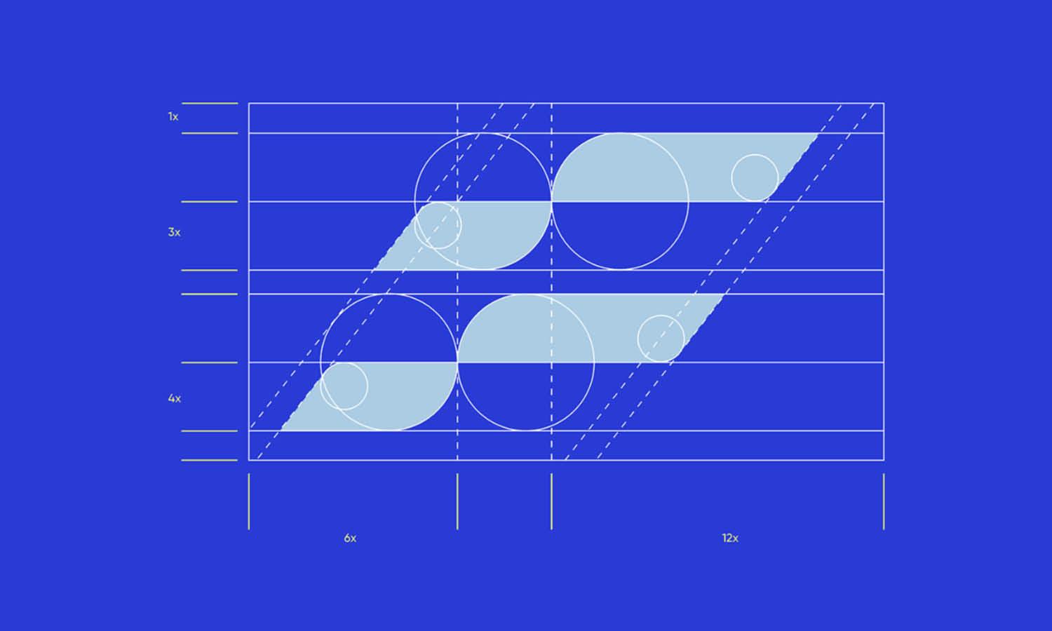
Source: Mental Health I Logo Design & Brand Identity, Dribbble, https://dribbble.com/shots/20387322-Mental-Health-I-Logo-Design-Brand-Identity
A logo rarely stays at one fixed size. It may appear as a small browser icon, a website header, a product label, a presentation graphic, or a large outdoor sign. Each application places different demands on the design. A version that looks polished on a laptop may become unreadable when reduced, while artwork that seems smooth at normal size may reveal rough curves when enlarged. Maintaining logo scaling quality means protecting both technical clarity and visual consistency. Sharp edges matter, but so do proportions, spacing, line weight, and recognition. Strong results begin with the right source file, continue through careful size adjustments, and depend on suitable export settings. Instead of treating scaling as a final production step, plan for it from the beginning. A logo built and tested for different sizes is easier to manage and more reliable across print and digital applications.
Understand What Affects Logo Scaling Quality
Several factors determine how well a logo performs after resizing. File type is important, but visual complexity also affects the result.
Raster Images and Pixelation
Raster files, such as JPEG and PNG, are made from a fixed grid of pixels. When a small raster logo is enlarged, the software stretches those pixels, often producing blurred edges, visible blocks, or jagged curves. A high-resolution raster file may work at a specific size, but it still has limits.
Vector Graphics and Flexible Scaling
Vector artwork is built from mathematical paths rather than fixed pixels. Formats such as AI, EPS, and SVG can usually be enlarged or reduced without losing edge sharpness. This makes vector files the most dependable foundation for scalable logo artwork.
Visual Complexity
A technically scalable file can still fail visually. Thin strokes may disappear, narrow gaps may close, and decorative details may merge when reduced. Gradients, textures, and intricate shapes can also become harder to reproduce. Reliable logo scaling quality depends on knowing which elements remain clear at each intended size.
Begin with a Clean Vector Master File
A clean vector master file should be the starting point for every logo version. Exporting from the original artwork provides more control and prevents quality from declining through repeated resizing or compression.
Use Suitable Vector Formats
AI files are useful for editing in Adobe Illustrator, while EPS and PDF are commonly used for professional production. SVG works well for responsive websites because it can scale directly in the browser. Keeping several approved formats helps different teams use the logo without rebuilding it.
Convert Important Elements Properly
Fonts may need to be converted to outlines before delivery so the wordmark does not change on another computer. Strokes, masks, gradients, and effects should also be checked for compatibility. In some production settings, expanding strokes or simplifying effects can prevent unexpected changes.
Keep the Master File Organized
Clearly named layers, grouped elements, and separate color versions make future scaling safer. Store horizontal, stacked, icon-only, and monochrome arrangements in an organized source package. A well-prepared master file reduces accidental edits and keeps exported versions consistent.
Preserve Proportions, Spacing, and Alignment
A logo can remain technically sharp and still look wrong after resizing. Distorted proportions, inconsistent spacing, and poor alignment can weaken the design even when no pixelation is visible.
Scale Width and Height Together
Always resize the logo proportionally. Stretching it horizontally or vertically changes the relationship between the symbol, wordmark, and supporting elements. Even slight distortion can make familiar letterforms or shapes feel noticeably incorrect.
Protect Clear Space
Clear space should remain proportional as the logo changes size. A logo placed too close to text, photographs, borders, or page edges may look cramped. Scale the surrounding exclusion zone along with the logo rather than treating it as a fixed measurement.
Check Optical Alignment
Mathematical alignment does not always produce visual balance. Curves, diagonals, and asymmetrical symbols may need slight optical adjustments. Review the logo in its final context instead of relying only on alignment tools. A small repositioning can make the composition feel more stable.

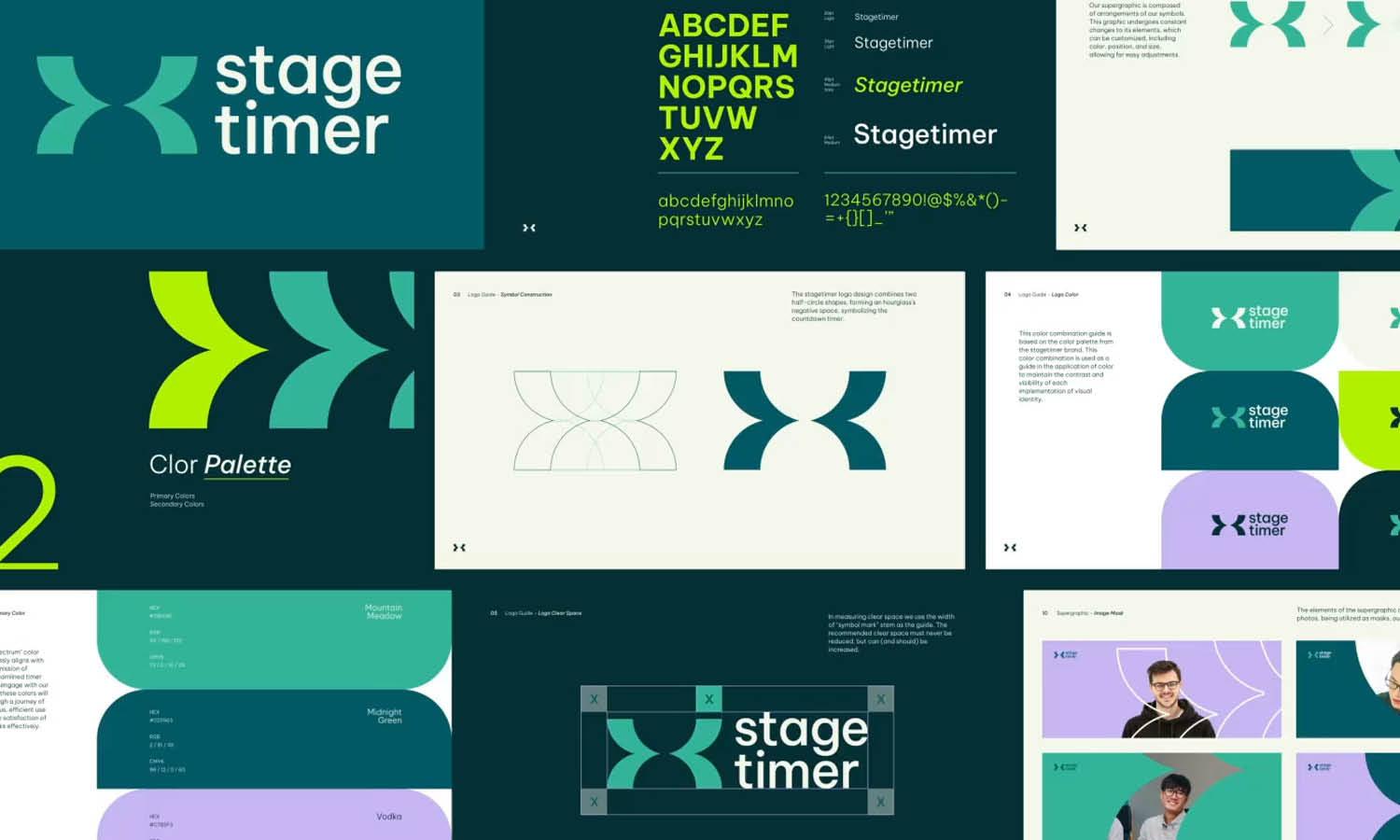
Source: Paul von Excite, Jobseeker Branding, Dribbble, https://dribbble.com/shots/17240380-Jobseeker-Branding
Adapt the Logo for Small-Scale Applications
Small applications create some of the hardest scaling challenges. A full logo that works on a brochure may become crowded in a favicon, app icon, social avatar, or compact website header.
Remove Unnecessary Detail
Tiny decorative shapes, textures, and narrow internal lines can disappear at small sizes. Simplifying them improves recognition without changing the core identity. The aim is to preserve the most distinctive features.
Strengthen Thin Strokes
Very light lines may break apart on screens or small printed materials. Slightly increasing stroke weight can help the logo remain visible while maintaining its original character.
Increase Internal Spacing
Counters, gaps, and negative spaces may need to be opened when a logo is reduced. Otherwise, nearby shapes can merge into a dark area. More breathing room keeps the mark clear.
Create a Responsive Logo Variation
A simplified symbol, monogram, or compact arrangement may perform better than the full logo at very small sizes. This responsive variation should retain the same visual language, colors, and proportions. It adds flexibility while protecting logo scaling quality in restricted spaces.
Prepare the Logo for Large-Scale Use
Vector artwork can enlarge without pixelation, but large applications reveal imperfections that are easy to miss on screen. Signs, vehicles, exhibition graphics, and wall displays make every curve and alignment decision more visible.
Inspect Curves and Anchor Points
Check the master artwork for uneven handles, accidental corners, overlapping paths, and unnecessary anchor points. Simplifying paths can produce smoother curves and cleaner production files. Large-format output often exposes small construction flaws.
Review Line Weight at Viewing Distance
A line that looks balanced on a monitor may appear too thin across a street or large room. Test the logo at a realistic viewing distance and consider slightly heavier elements where needed. It should remain recognizable before the viewer approaches.
Consider Production Limitations
Vinyl cutting, engraving, embroidery, screen printing, and dimensional signage have minimum line and spacing requirements. Consult the production provider early and adjust details before final output. A technically correct file still needs to suit the manufacturing process.
Use the Right Export Settings for Each Application
Export settings can preserve or reduce logo scaling quality. Flawless source artwork can still produce poor results when the file type, dimensions, resolution, or color settings are unsuitable.
Match the Format to the Purpose
SVG is often suitable for websites and interfaces. PNG works well when transparency is needed, while JPEG suits uses that require no transparent background. PDF and EPS are commonly requested for professional printing and large-format production.
Export Raster Files at the Required Dimensions
Create raster files directly from the vector master at the final pixel dimensions. Avoid enlarging an existing PNG or JPEG, since this only stretches available pixels. Fresh exports also provide better control over anti-aliasing and transparency.
Choose an Appropriate Resolution
Digital applications usually depend more on exact pixel dimensions than print resolution settings. Printed materials often need higher pixel density, especially when raster effects are included. Confirm the required specifications with the printer instead of relying on one universal setting.
Check Color Mode and Transparency
Use RGB for screen applications and the requested CMYK or spot-color settings for print. Test transparent backgrounds to ensure no unwanted white box or edge appears. Open and inspect every exported file before delivery.

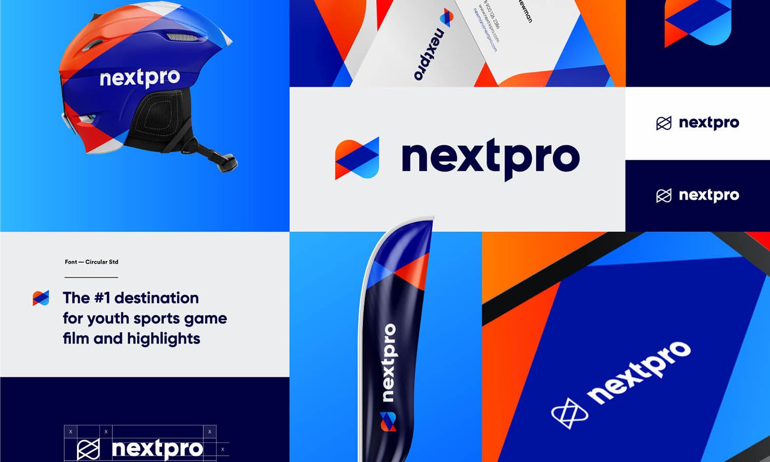
Source: Azharfani, Branding Kit for Property Real Estate Company, Dribbble, https://dribbble.com/shots/21667249-Branding-kit-for-property-real-estate-company
Test Every Scaled Version in Context
A logo should be reviewed where it will actually appear. Design software is useful, but it cannot fully represent every screen, material, background, or production condition.
Test Multiple Sizes
Check the logo at its smallest expected size, a common everyday size, and a large display size. This reveals disappearing details, weak lines, and spacing problems that one view may hide.
Review It on Different Backgrounds
Place approved versions on light, dark, colored, photographic, and low-contrast backgrounds. This confirms when a full-color, monochrome, or reversed logo should be used.
Produce Physical Samples
For packaging, clothing, signage, labels, or promotional products, request a proof or sample before approving a full run. Screen previews cannot always predict ink spread, material texture, stitching, or reflection.
Check Recognition and Readability
Confirm that the symbol remains recognizable, the wordmark stays legible, and the visual hierarchy is clear. If the logo only works when viewed closely, use a more suitable size-specific variation.
Build a Reliable Logo Scaling System
A simple asset system makes consistent scaling easier for clients, designers, printers, developers, and internal teams. It replaces guesswork with approved versions and clear instructions.
Prepare Standard Logo Variations
Provide horizontal, stacked, icon-only, monochrome, reversed, and simplified versions when needed. Each variation should serve a clear purpose rather than act as an unnecessary duplicate.
Define Minimum Sizes
Document the smallest approved size for print and digital use. Minimum-size guidance prevents the wordmark from becoming unreadable or the symbol from losing important details.
Provide Clear Usage Guidelines
Include file-format recommendations, clear-space rules, background restrictions, and instructions for choosing the correct version. Even a concise reference sheet can prevent stretching, poor contrast, incorrect exports, and misuse. A reliable system protects logo scaling quality after the original files are delivered.
Conclusion
Maintaining quality during logo scaling requires more than dragging a corner handle. The logo needs a clean vector foundation, protected proportions, suitable spacing, and carefully prepared versions for small and large applications. Export settings must match the final use, and every version should be tested in realistic conditions. Small-size adaptations may need fewer details, stronger strokes, or wider internal spaces. Large applications may require smoother paths, clearer shapes, and adjustments based on viewing distance or production limits. By preparing responsive variations, defining minimum sizes, and organizing approved files, you create a system that keeps the identity clear and consistent. Strong logo scaling quality comes from planning, testing, and selecting the right version for each application, allowing the logo to remain recognizable wherever it appears.
Let Us Know What You Think!
Every information you read here are written and curated by Kreafolk's team, carefully pieced together with our creative community in mind. Did you enjoy our contents? Leave a comment below and share your thoughts. Cheers to more creative articles and inspirations!
Related Articles






Leave a Comment