
Visual Hierarchy and Its Role in Logo Design

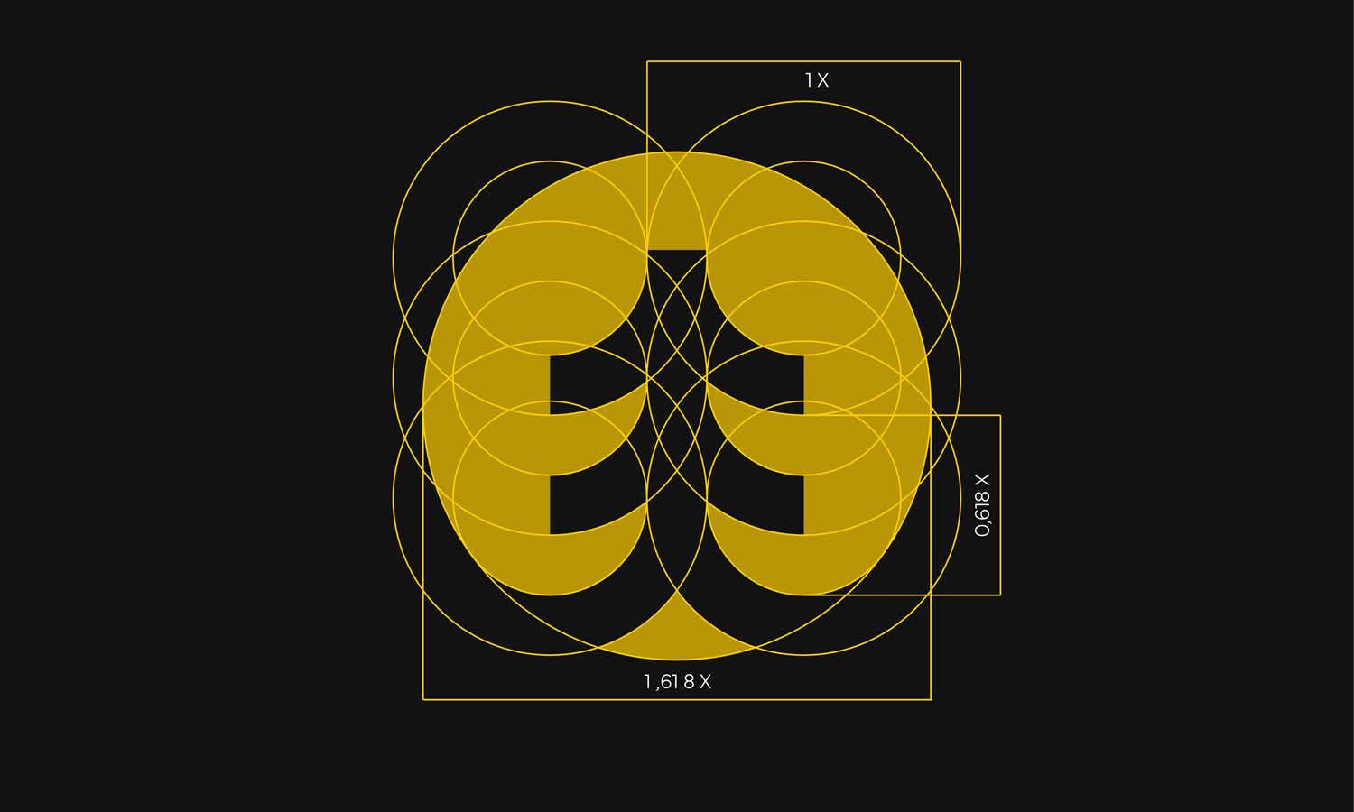
Source: VASK Studio, LATTO Brand Identity, Dribbble, https://dribbble.com/shots/21857882-LATTO-Brand-Identity
A logo often has only a few seconds to communicate. People may see it on a phone screen, storefront, package, or social profile without stopping to study every detail. Visual hierarchy helps the design make sense within that brief moment. In visual hierarchy logo design, each element receives a clear level of importance so viewers know where to look first, what to notice next, and which information is supporting. This order is shaped through scale, contrast, position, spacing, color, and typography. A symbol might lead the eye, followed by the brand name and then a smaller tagline. When the sequence feels natural, the logo becomes easier to understand and remember. When it is unclear, even attractive elements can compete and weaken recognition. Strong hierarchy gives a logo structure while keeping the composition balanced and unified.
What Visual Hierarchy Means in Logo Design
Visual hierarchy is the deliberate arrangement of elements according to their importance. In a logo, it determines which feature becomes the main point of attention and how the remaining parts support it. The purpose is not simply to enlarge one component, but to create a readable relationship between everything included in the mark.
Primary, Secondary, and Supporting Elements
The primary element carries the strongest identity. It may be a symbol, monogram, wordmark, or distinctive letterform. Secondary elements provide essential context, such as the full brand name beside an icon. Supporting elements, including taglines, locations, or category labels, add information without competing with the core identity.
The Intended Viewing Order
A well-structured logo guides the eye through a planned sequence. Viewers may notice the icon first, read the name second, and register the tagline last. This order should feel immediate. When people must search for the brand name or cannot tell which feature matters most, the hierarchy needs refinement.
Why Visual Hierarchy Matters to Logo Recognition
Logo recognition depends on speed and clarity. Viewers often encounter brands in crowded environments where signs, images, and messages compete for attention. A clear hierarchy allows the logo to communicate its defining feature before the viewer moves on.
Creating an Immediate Focal Point
A focal point gives the eye a place to begin. Without one, several elements may appear equally important, causing the viewer to scan rather than recognize the logo. A strong symbol, bold wordmark, or distinctive shape can create this entry point. It does not need to dominate aggressively; it only needs enough emphasis to lead.
Supporting Recognition and Recall
People usually remember a logo through its most distinctive feature, such as an icon, letterform, color relationship, or compact shape. When hierarchy consistently presents that feature first, audiences learn what to associate with the brand. Repeated exposure then strengthens recognition across packaging, websites, signage, and other applications.
The Main Elements That Create Logo Hierarchy
Visual hierarchy logo design relies on several connected decisions. Scale, contrast, position, spacing, and typography work together to direct attention and separate primary information from supporting details.
Scale and Proportion
Larger elements naturally attract attention first. A prominent symbol above a smaller name will usually lead, while a large wordmark paired with a modest icon may reverse that order. The difference should be noticeable without making the smaller element feel disconnected.
Contrast and Color
Contrast creates separation through differences in value, saturation, shape, line thickness, or visual weight. A bright or dark feature may draw attention, but color should not carry the hierarchy alone. The logo must still communicate clearly in grayscale or single-color reproduction.
Position and Alignment
Placement affects what viewers notice first. Central, upper, or left-side elements often gain emphasis, depending on the layout and reading direction. Alignment creates order by showing how the symbol, name, and supporting text relate. Even an asymmetrical arrangement needs a clear visual path.
Spacing and Negative Space
Negative space gives important elements room to register. Crowded components may compete because none has enough separation. More space around a symbol can increase its prominence without changing its size. Spacing can also distinguish a closely connected name from a more distant tagline.
Typography and Font Weight
Type size, weight, style, capitalization, and letter spacing establish hierarchy within textual logos. A bold brand name paired with a lighter descriptor clearly signals priority. These contrasts should remain controlled, since too many type treatments can fragment the identity.

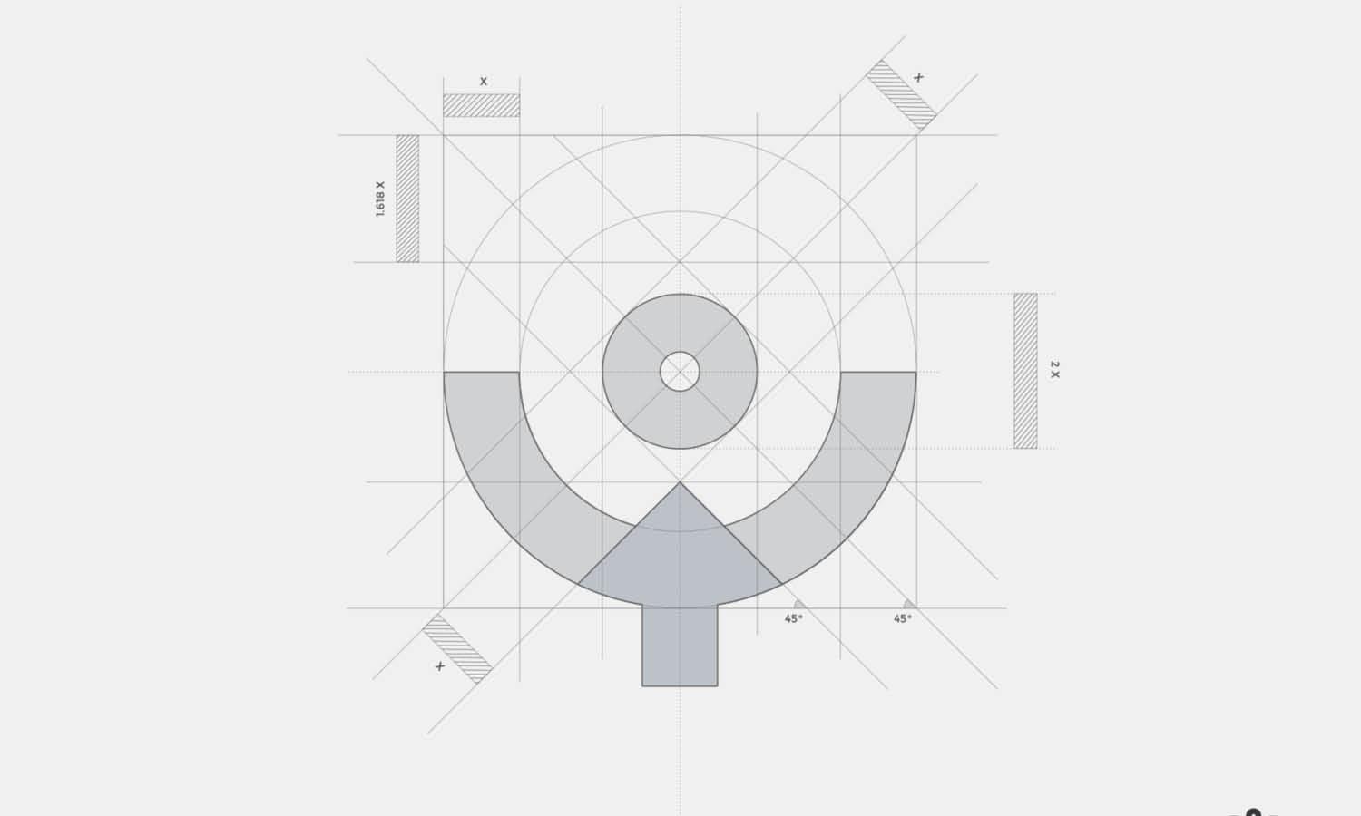
Source: VASK Studio, TRENT, Dribbble, https://dribbble.com/shots/20008623-TRENT
Establishing a Clear Order Between Logo Elements
Combination logos may include a symbol, brand name, descriptor, and tagline. The challenge is deciding which part should lead and how the others can support it without appearing unrelated.
Choosing the Dominant Element
The dominant element should reflect how the brand is most likely to be recognized. A business with a distinctive symbol may emphasize its icon. A newer brand with an unfamiliar name may need the wordmark to lead. The decision should support identification rather than simply favoring the most decorative component.
Balancing the Symbol and Brand Name
The symbol and name should feel like one unit even when one is more prominent. Their scale, alignment, and spacing need to create a visual partnership. If the icon is too large, the name may resemble a caption. If it is too small, it may feel unnecessary.
Positioning Taglines and Descriptors
Supporting text should remain readable without competing with the main identity. Smaller size, lighter weight, wider spacing, or greater separation can reduce its prominence. It should also be removable when limited space makes it impractical.
Adapting Visual Hierarchy Across Logo Variations
A logo system may include horizontal, stacked, simplified, monochrome, and icon-only versions. Although the arrangement changes, the hierarchy should remain familiar so viewers continue to recognize the same defining feature.
Horizontal and Stacked Arrangements
A horizontal logo may guide the eye from the symbol into the wordmark, while a stacked version may give the symbol more prominence above the name. These layouts do not need identical proportions. Small changes in scale and spacing help preserve balance in each format.
Simplified and Responsive Logos
At smaller sizes, secondary details may be removed. A tagline can disappear, a detailed symbol can be simplified, or the full logo can reduce to a monogram. Responsive variations succeed when the hierarchy has already identified which elements are essential.
Monochrome Applications
Color may strengthen hierarchy, but shape, weight, scale, and spacing must also support it. If the visual order disappears in black and white, the design may rely too heavily on color and need stronger structural differences.
Common Visual Hierarchy Mistakes in Logo Design
Hierarchy problems often arise when too many elements receive equal attention. Each component may look appealing alone, yet the complete logo feels noisy or difficult to understand.
Too Many Competing Focal Points
A bold icon, heavy wordmark, bright tagline, and decorative frame can all fight for attention. Reducing the emphasis of secondary features gives the viewer a clearer place to begin.
Weak Differences Between Elements
Hierarchy can also fail when elements are too similar in size, color, weight, or placement. A brand name and tagline set in nearly identical type may blend into one block. Controlled differences help establish their separate roles.
Overpowering Taglines or Decorative Details
An oversized slogan, prominent border, or elaborate flourish may become more noticeable than the identity itself. Decorative features should reinforce the main mark rather than redirect attention away from it.
Hierarchy That Disappears at Small Sizes
A logo may appear balanced when enlarged but lose structure when reduced. Thin text becomes unreadable, small gaps close, and details merge. Testing at realistic sizes reveals whether the intended order remains clear.

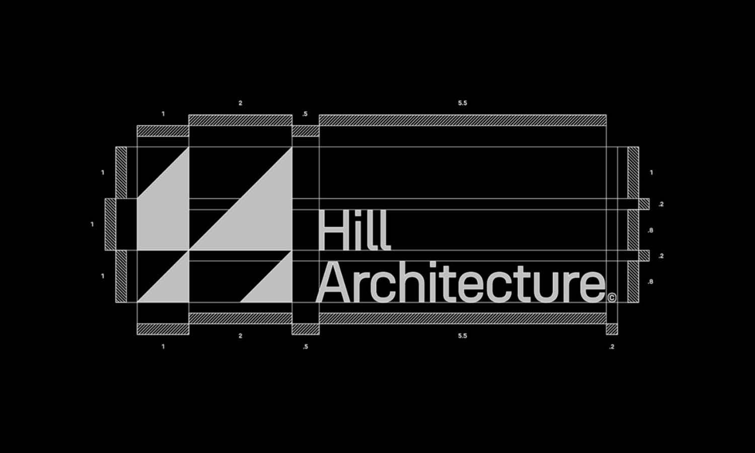
Source: Younique, Abstract Logomark, Dribbble, https://dribbble.com/shots/22789219-Abstract-logomark
How to Test and Refine Logo Hierarchy
Designers can become so familiar with a logo that they stop noticing where the eye actually goes. Simple tests help confirm whether viewers experience the intended order.
Use the Glance Test
Display the logo briefly, then hide it. Ask what was noticed first and which details were remembered. Consistent answers suggest that the focal point is clear. Widely different responses may indicate competing elements.
Review the Logo at Multiple Sizes
Test the design at large, medium, and very small sizes. The dominant feature should remain recognizable, while supporting information should stay readable or disappear appropriately.
Test in Grayscale and Silhouette
Grayscale removes color influence and exposes differences in value and weight. A silhouette test reduces the logo to its overall shape, revealing whether the composition has a strong structure beneath its styling.
Gather Viewer Feedback
Ask specific questions such as “What did you notice first?” or “Which part looked like the brand name?” These responses reveal more about hierarchy than a general question about whether someone likes the design.
Conclusion
Visual hierarchy gives every logo element a clear role. It helps viewers identify the main feature, understand the relationship between symbol and type, and absorb supporting information without confusion. Effective visual hierarchy logo design does not require extreme contrast or oversized components. It depends on controlled choices involving scale, position, spacing, color, and typography. A strong hierarchy also helps the identity remain recognizable across horizontal, stacked, simplified, and monochrome versions. Testing the logo at different sizes, removing color, and observing what viewers notice first can reveal weaknesses before final delivery. When hierarchy works well, viewers do not need to analyze the design. They simply understand it quickly, remember its defining feature, and connect that feature with the brand.
Let Us Know What You Think!
Every information you read here are written and curated by Kreafolk's team, carefully pieced together with our creative community in mind. Did you enjoy our contents? Leave a comment below and share your thoughts. Cheers to more creative articles and inspirations!
Related Articles





Leave a Comment