
Key Benefits of Using Grid Systems in Logo Design

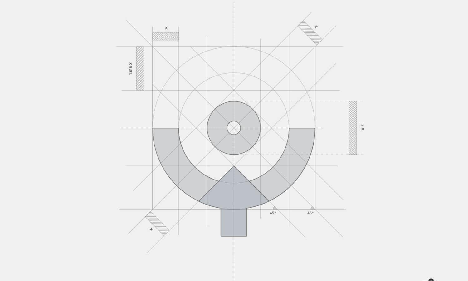
Source: Daniel Rotter, MTB Collective - Logo Grid, Dribbble, https://dribbble.com/shots/14949851-MTB-collective-Logo-grid
A strong logo often looks simple, but that simplicity usually comes from careful decisions about proportion, spacing, alignment, and shape. Grid systems give designers a structured way to make those decisions. Rather than relying only on instinct, a grid provides visible reference points that help organize the parts of a logo and reveal where adjustments are needed. The most useful grid systems logo design benefits are not about making every mark perfectly geometric. They are about creating a dependable framework for refinement. A grid can help a symbol feel balanced, a wordmark align more clearly, and several logo variations stay visually connected. It can also make the design process easier to explain to clients and collaborators. Used well, a grid supports creativity instead of replacing it. It provides order where order is helpful while leaving room for optical corrections, experimentation, and expressive choices.
Creating More Consistent Proportions
Proportion affects how the parts of a logo relate to one another. Viewers may not identify a specific flaw, but they often notice when one shape is too large, a gap is too narrow, or a detail feels disconnected. A grid helps designers examine those relationships deliberately.
Establishing Clear Size Relationships
Grid lines and repeated modules make it easier to compare the size of symbols, strokes, letterforms, and negative spaces. The same unit might define the height of an icon, the width of a gap, or the radius of a curve. The measurements do not need to be identical. Their purpose is to create a shared visual rhythm that makes separate elements feel related.
Reducing Accidental Imbalance
Small inconsistencies can accumulate during revision. Similar curves may use different radii, or one corner may sit slightly higher than another. A grid provides stable references for checking symmetry, repetition, and visual weight. Changes become intentional rather than based on repeated guesswork.
Preserving the Original Concept
The grid should refine an idea rather than generate it. It can improve proportion while preserving the personality, movement, or meaning that made the concept distinctive.
Improving Alignment and Visual Balance
Alignment helps a logo feel calm, connected, and easy to understand. A grid organizes important edges, centers, and baselines so the composition does not appear loosely assembled.
Aligning Important Elements
A grid can connect a symbol with a wordmark, center initials inside a badge, or position a border around an icon. Shared baselines and centerlines give separate components a clear relationship. In combination marks, the symbol may need to align with the visual center of the lettering rather than its exact bounding box. The grid provides a measured starting point before those final corrections.
Balancing Positive and Negative Space
Visual balance depends on both filled shapes and empty areas. Grids help designers compare the gaps within, between, and around elements. Checking these spaces against common measurements can prevent one area from feeling crowded while another feels weak. A more even rhythm improves clarity and recognition.
Supporting Optical Adjustments
Mathematical alignment does not always look correct. Curves may need to extend beyond a baseline, and asymmetrical symbols may need slightly off-center placement. The grid remains useful because it shows where the optical adjustment begins. Designers can depart from exact measurements with a clear reason.
Making the Design Process More Efficient
Logo refinement often involves many small changes. Without a framework, designers may spend too much time shifting elements, comparing nearly identical versions, or trying to remember earlier measurements.
Providing Clear Reference Points
A structured guide gives each adjustment a reason. Instead of moving an icon “a little higher,” the designer can compare it with a centerline. Instead of changing a curve repeatedly, the designer can test it against a consistent radius. These references maintain direction during long revision sessions and make it easier to revisit earlier versions.
Speeding Up Iterations
When a logo uses repeated shapes or spacing, a grid allows related features to be adjusted together. Designers can test wider gaps, smaller internal forms, or new symbol-to-wordmark ratios while preserving the basic construction. This makes concept comparisons more reliable because each variation follows the same structural logic.
Limiting Unproductive Adjustments
Once key relationships are defined, changes can be evaluated against the concept. The grid discourages endless movement that does not improve meaning, clarity, or character.

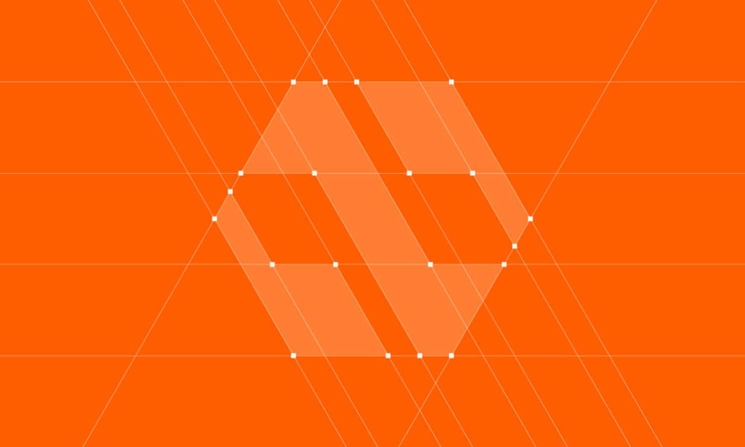
Source: Aditya Chhatrala, Leap Logo Grid, Dribbble, https://dribbble.com/shots/17164064-Leap-logo-grid
Strengthening Scalability and Adaptability
A logo may appear as a tiny profile image, a website header, a product label, or a large sign. Grid-based construction helps preserve its relationships as its size and format change.
Maintaining Clarity at Small Sizes
Small applications quickly expose weak spacing and unnecessary detail. Narrow gaps may close, thin strokes may disappear, and complex shapes may lose recognition. A grid helps designers identify which details should be removed, enlarged, or separated. This is useful for favicons, app icons, social media images, and compact packaging labels.
Supporting Larger Applications
At large sizes, uneven curves and poorly aligned edges become more noticeable. Clear proportional relationships allow the logo to expand without revealing accidental construction problems. The design therefore remains controlled on storefronts, displays, signage, and other large surfaces.
Creating Responsive Logo Variations
Many identities need horizontal, stacked, compact, and symbol-only versions. A shared grid helps these formats feel related. Spacing and placement may change, but stroke relationships, proportions, and visual rhythm can remain consistent across the full logo family.
Making Complex Logo Concepts Easier to Refine
Some concepts involve overlapping forms, layered symbols, repeated curves, or several geometric components. A grid gives designers a practical way to organize that complexity.
Organizing Multiple Shapes
Shared measurements can connect separate forms. Circles may use related radii, diagonal lines can follow matching angles, and overlapping elements can meet at consistent points. Even an expressive or abstract symbol feels more unified when its parts follow a clear internal logic.
Identifying Unnecessary Details
Placing a complex concept on a grid often reveals elements that contribute little. An extra corner, decorative cut, or secondary curve may interrupt the larger structure. Removing or simplifying those details can improve clarity without weakening the central idea.
Creating Smoother Curves and Transitions
Circles, arcs, and anchor points help refine transitions between curved and straight sections. Repeated geometric relationships create a smoother foundation that can then be adjusted by eye. The goal is not to force every curve into a formula, but to make connected forms feel deliberate.
Supporting Collaboration and Clearer Presentation
Clients, creative directors, and other designers may all need to understand how a logo works. A grid provides a visual language for discussing decisions that might otherwise seem subjective.
Explaining Design Choices to Clients
Construction guides can show why elements align, how spacing was determined, or how a symbol relates to its lettering. This helps clients see that the design comes from deliberate choices rather than decoration alone. A simple diagram is usually more useful than an overly technical display of circles and measurements.
Improving Team Consistency
Shared guides help multiple designers create layouts, related assets, and revisions using the same structural logic. They also make handoff easier because important relationships do not depend on one designer’s memory.
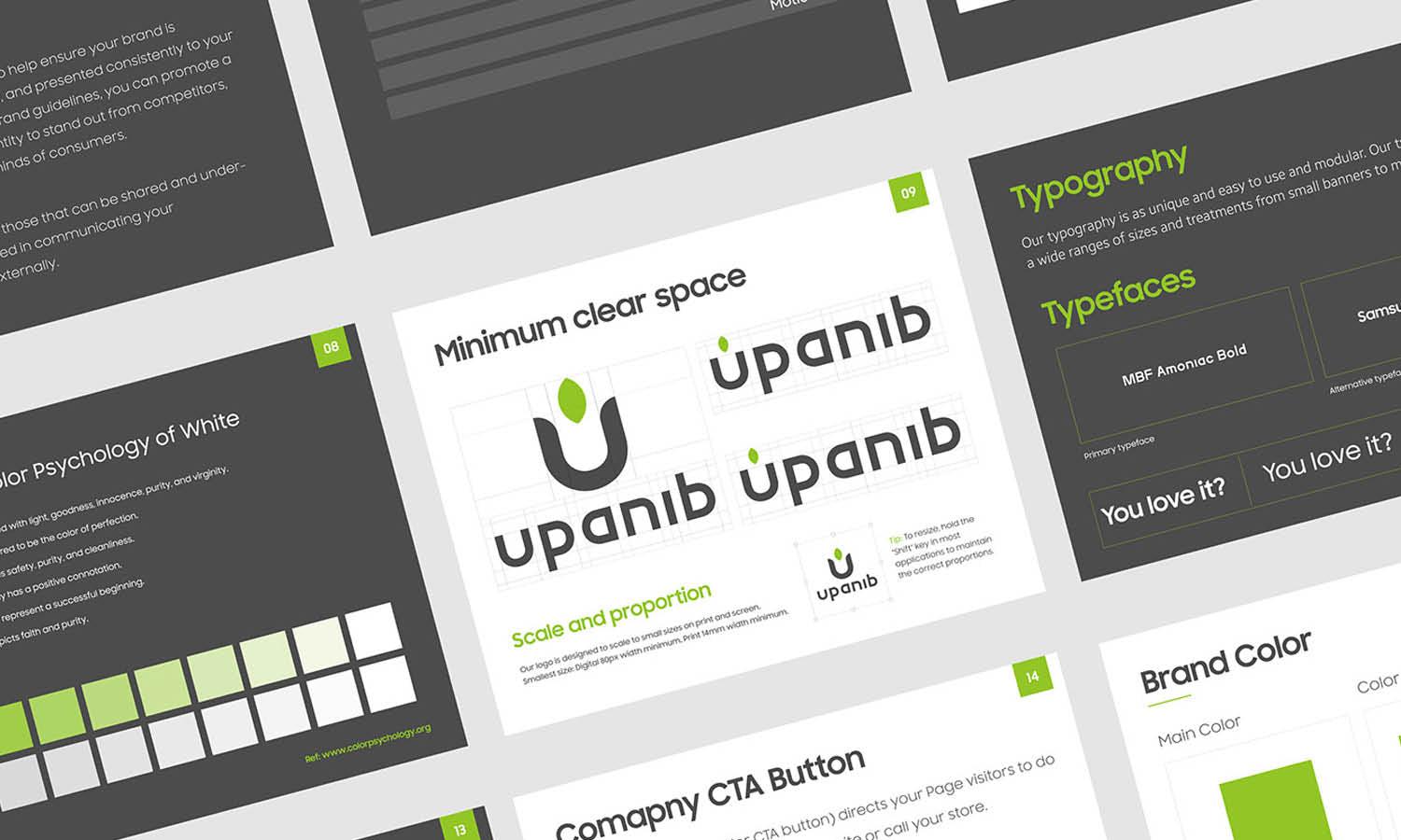
Creating Useful Brand Guidelines
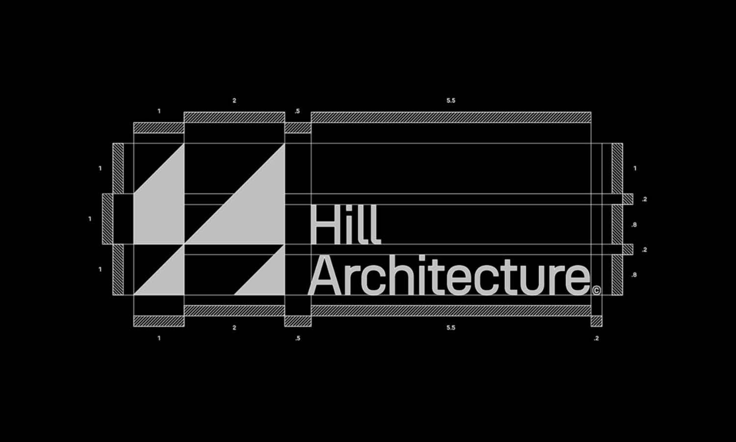
Grid-based information can define clear space, symbol-to-wordmark proportions, minimum sizes, and alignment rules. These instructions support consistent use without burdening everyday users with unnecessary construction details.

Source: Matthias Vancoillie, NV - Grid, Dribbble, https://dribbble.com/shots/10979730-NV-Grid
Encouraging Consistency Without Restricting Creativity
Grid-based logo design can feel mechanical when the structure becomes more important than the idea. The better approach is to treat the grid as a guide rather than a command.
Treating the Grid as a Guide
Designers can adapt, break, or remove parts of the grid when the concept requires it. An expressive curve may move beyond a geometric boundary, while a hand-drawn feature may benefit from irregular spacing. The framework still provides a controlled starting point, making each departure a conscious choice.
Combining Geometry With Visual Judgment
Human perception does not follow measurement perfectly. Optical balance, character, and emotional tone often require corrections that ratios alone cannot explain. Strong logo construction combines measurable order with visual sensitivity. The grid builds the foundation, while the designer decides where precision should be preserved or softened.
Choosing When a Grid Is Useful
Not every logo needs an elaborate construction system. A wordmark or organic symbol may require only simple alignment guides. The grid is most valuable when it solves a real problem, such as inconsistent spacing, weak proportion, difficult scaling, or unclear relationships between elements.
Conclusion
Grid systems help designers bring greater control to proportion, alignment, spacing, refinement, and adaptation. They can make a logo easier to evaluate during development and more dependable across different sizes and formats. They also provide a clearer way to communicate construction decisions to clients and collaborators. Their value depends on how they are used. A grid should support the central concept, not become the concept itself. It should reveal relationships, reduce accidental inconsistencies, and provide a reliable foundation for optical adjustment. Designers do not need to build every logo from an elaborate network of circles and lines. A simple modular guide may be enough. When the structure is chosen with purpose, it can remain almost invisible in the finished mark while helping the logo feel more cohesive, balanced, and carefully resolved.
Let Us Know What You Think!
Every information you read here are written and curated by Kreafolk's team, carefully pieced together with our creative community in mind. Did you enjoy our contents? Leave a comment below and share your thoughts. Cheers to more creative articles and inspirations!
Related Articles




Leave a Comment