How To Use The Golden Ratio For Logo Design

Source: Daniel Rotter, ASCAN - Logo Construction, Dribbble, https://dribbble.com/shots/19393662-ASCAN-Logo-construction
The Golden Ratio, a mathematical constant of approximately 1:1.618, has been revered in art and architecture for centuries due to its aesthetically pleasing properties. This timeless principle is also a powerful tool in the realm of logo design, where achieving visual harmony and balance is paramount. When applied effectively, the Golden Ratio can elevate a brand's visual identity, making it more cohesive and memorable.
Incorporating the Golden Ratio into logo design involves more than just aesthetic appeal; it's about creating a deep resonance with the viewer through naturally appealing proportions. This introduction to the Golden Ratio will guide you through its basic understanding and demonstrate practical ways to apply it to your logo projects.
Whether you are a seasoned designer or a novice looking to improve your design skills, understanding how to use the Golden Ratio can significantly enhance the effectiveness and attractiveness of your logo designs. By mastering this concept, you'll be able to craft logos that not only stand out but also maintain a timeless quality that resonates well with any audience.
Understand the Golden Ratio
The Golden Ratio, denoted by the Greek letter phi (Φ), is approximately 1.618 and is often referred to as the perfect proportion due to its frequent appearance in nature and classic art. This unique ratio is a critical element in creating visually appealing and harmonious designs, including logos. Understanding how the Golden Ratio influences visual perception is essential for designers looking to elevate their work.
In logo design, the Golden Ratio can serve as a mathematical roadmap to balance and proportionality, guiding the placement and scaling of various elements. It is achieved when the ratio of the smaller part to the larger part is the same as the ratio of the larger part to the whole. This relationship creates a sense of natural balance that is pleasing to the eye, lending an air of sophistication and timelessness to the logo.
By studying examples from nature, such as the arrangement of leaves on a stem or the spirals of a shell, designers can gain insights into how the Golden Ratio can be applied to their work. This foundational knowledge allows for the creation of logo designs that are not only aesthetically pleasing but also inherently balanced, promoting a brand's identity in a subtle yet impactful way.
Apply to Logo Shapes
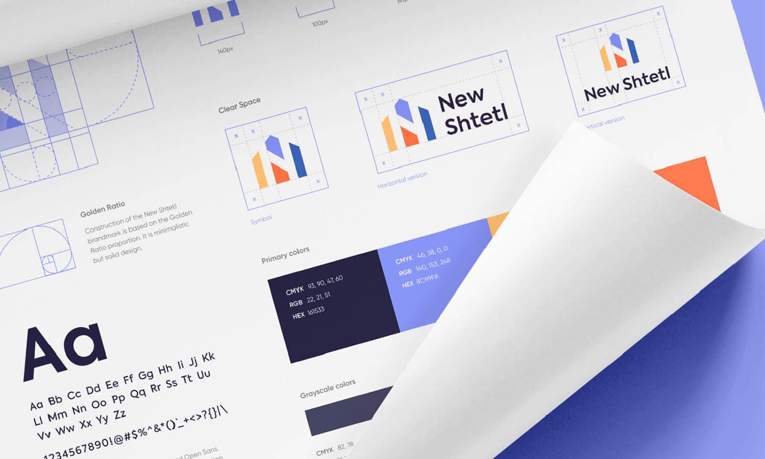
Applying the Golden Ratio to logo shapes involves more than just aesthetic considerations; it's about instilling a sense of balance that enhances brand recognition. When designing a logo, consider how various elements can align according to the Golden Ratio to achieve visual harmony. This can involve adjusting the dimensions of icons, text, and even negative space to adhere to this proportion.
Start by sketching out basic shapes like circles, squares, or triangles, and then divide these shapes using lines based on the Golden Ratio. This division creates smaller segments within the main shape, which can guide the placement of logo elements. For instance, if using a rectangle, you might divide it into squares and rectangles that follow the Golden Ratio, placing text or symbols at these division points.
Another approach is to use the Golden Spiral, a curve that radiates out from a central point, growing exponentially in accordance with the Golden Ratio. This spiral can help determine the flow of visual elements, leading the viewer's eye through the logo in a natural progression. By positioning the most important elements of the logo along this spiral, designers can create a focal point that stands out yet feels integral to the overall design.
Through careful application of the Golden Ratio to logo shapes, designers can craft logos that are not only structurally sound but also connect with viewers on a subconscious level, making the brand memorable and appealing.
Create a Golden Rectangle
One of the most effective ways to incorporate the Golden Ratio into logo design is through the use of a Golden Rectangle. This geometric figure is created by maintaining the 1:1.618 ratio between its width and height. Designing within this rectangle can help establish a strong, visually appealing foundation for your logo.
To create a Golden Rectangle, start by deciding the shorter side of the rectangle, then multiply this length by 1.618 to find the longer side. Alternatively, if you begin with the longer side, divide it by 1.618 to determine the shorter side's length. This rectangle can then be subdivided into smaller squares and rectangles, each adhering to the Golden Ratio, providing multiple options for placing and sizing logo elements.
When designing a logo, use the divisions within the Golden Rectangle to place text, icons, and other key components. This not only ensures that each element is proportionally balanced but also helps in creating a cohesive and harmonious look. The symmetry and proportions derived from this method are naturally pleasing to the eye, making the logo more effective and memorable.
Implementing the Golden Rectangle can transform an ordinary logo into a compelling piece of visual identity. It allows for a design that feels well-structured and thought-out, enhancing the overall impact of the brand.

Source: Davit Chanadiri, Geometry Horse, Dribbble, https://dribbble.com/shots/4061919-Geometry-Horse
Design Spirals Based on the Ratio
The Golden Spiral, derived from the Golden Rectangle, provides a natural and aesthetically pleasing flow in logo design. This logarithmic spiral is formed by creating quarter-circle curves that connect the opposite corners of squares in the Golden Rectangle, each square diminishing by a factor of the Golden Ratio.
To incorporate the Golden Spiral into a logo, you can use it as a guide for the placement and trajectory of the logo’s elements. Begin by overlaying the spiral on the initial sketch of your logo. Use the path of the spiral as a guide to position the most important elements along the curve. This placement can influence how the viewer’s eye travels across the logo, typically starting from the logo’s broader end and moving towards the center, which is often the focal point.
The Golden Spiral is particularly useful in designs that incorporate curves, swirls, or any elements that can follow a circular or semi-circular path. It can enhance the logo’s dynamism and give it a sense of movement and growth, all while maintaining a rooted sense of balance and proportion.
Designers can utilize this method to create logos that not only capture attention but also keep the viewer’s gaze within the logo, thereby increasing brand recognition and visual impact. The use of the Golden Spiral lends a logo the beauty of mathematical precision, which is subtly perceptible and universally appreciated.
Set Up a Grid System
Establishing a grid system based on the Golden Ratio is crucial for achieving balance and proportion in logo design. A grid helps organize design elements systematically, ensuring they align with the underlying mathematical harmony. To start, divide your design space into sections using the ratio 1:1.618. This can mean dividing the total width by 1.618 to find the height of each grid block, or vice versa.
Each block in the grid represents a module, and these can be further subdivided following the same ratio to maintain consistency across the design. When placing logo elements, such as text, icons, or symbols, align them within these modules. This method ensures that all parts of the logo relate harmoniously to each other, adhering to a visually coherent structure that is naturally appealing.
The Golden Ratio grid is not just a tool for placement but also helps in maintaining the visual flow of the design. It guides the designer in creating a path for the viewer’s eye to follow, making the logo not only aesthetically pleasing but also effective in communicating the brand’s message. By using a grid system, designers can create complex yet balanced logos that stand the test of time and maintain their integrity across various applications.
Scale Logos Proportionally
Scaling logo elements proportionally according to the Golden Ratio ensures that the logo maintains its balance and aesthetic appeal at different sizes. When you scale a logo, it’s vital that every component adjusts in proportion to maintain the overall harmony and integrity of the design.
To apply proportional scaling, start with the largest element of your logo and determine its size using the Golden Ratio. Each subsequent element should then be scaled down by a factor of 1.618 or scaled up if needed, maintaining this ratio throughout all elements. This approach helps in creating a cohesive logo where every part complements the others, enhancing the overall visual impact.
This technique is particularly useful when a logo needs to be resized for various uses, such as on large billboards or small business cards. By keeping the proportions consistent, the logo remains recognizable and effective, regardless of scale. Moreover, it prevents elements from becoming too dominant or too insignificant compared to the rest of the design.
Employing the Golden Ratio in scaling not only adds a layer of sophistication to logo designs but also instills a sense of natural elegance. Designers can ensure their logos look balanced and professionally crafted at any size, making the brand’s visual identity stronger and more adaptable.
Enhance Visual Harmony
Enhancing visual harmony in logo design using the Golden Ratio involves meticulous placement and proportioning of every element to achieve a pleasing balance. This mathematical ratio, found naturally in many aesthetic formations, can be a critical tool in ensuring that all parts of the logo work together seamlessly.
To apply the Golden Ratio for enhanced visual harmony, start by analyzing the main components of your logo. These could include the symbol, logotype, and any additional graphics or decorative elements. By ensuring that each of these components relates to one another through the Golden Ratio, you create a cohesive visual experience that is naturally attractive to the human eye.
Consider the overall layout of the logo—how each element aligns with others, the spacing between them, and their proportional relevance. Using the Golden Ratio as a guide, adjust the sizes and distances to ensure that the more significant elements have a more substantial presence, while smaller elements do not overwhelm but rather complement the main design.
This approach not only improves the aesthetic appeal of the logo but also enhances its effectiveness. A logo with well-balanced proportions is more likely to be memorable and make a positive impression, thus reinforcing the brand’s identity and message. Employing the Golden Ratio can transform an ordinary design into a masterpiece of visual harmony, making the brand stand out in competitive markets.

Source: DAINOGO, Fox Logo with Golden Ratio Grids, Dribbble, https://dribbble.com/shots/4367838-Fox-Logo-with-Golden-Ratio-Grids
Determine the Typography Size
Determining the appropriate typography size in logo design using the Golden Ratio ensures that the text elements complement the overall logo and enhance its readability. Typography, a critical component of logo design, can benefit significantly from the application of this ratio, as it helps in achieving an optimal balance between the text and other design elements.
Start by selecting your primary logo text—usually the brand name—and use the Golden Ratio to scale any secondary text elements, such as taglines or descriptors. For instance, if your main text is set at a certain size, the secondary text should be scaled down by a factor of 1.618, ensuring that it supports rather than competes with the main text.
This method not only applies to the size of the text but also to its placement relative to other elements in the logo. Use the Golden Ratio to determine the spacing between letters (kerning) and the spacing between lines of text (leading), enhancing the overall legibility and aesthetic quality of the logo.
Applying the Golden Ratio to typography in logo design does more than just improve visual appeal—it ensures that the logo is functional across various mediums. Whether viewed on a large billboard or a small digital screen, the text remains legible and effectively communicates the brand’s message, making the logo versatile and adaptable to all branding needs.
Create Visual Flow
Creating visual flow in logo design is essential for guiding the viewer's eye through the design in a pleasing and effective manner. Utilizing the Golden Ratio can significantly enhance this flow, ensuring that each component of the logo is visually connected and harmonious. This ratio, when applied correctly, creates a natural movement that leads the viewer’s eye across the design.
To achieve a strong visual flow, start by arranging the primary elements of the logo—such as the symbol and text—along lines or curves that reflect the Golden Ratio. These elements should be placed so that they create a path leading from one component to the next in a fluid, seamless manner. The use of the Golden Spiral can be particularly effective here, as it naturally draws the eye inward or outward depending on the direction of the spiral.
Additionally, consider the weight and balance of each element in relation to others. Heavier or more prominent features should be balanced with lighter ones to maintain visual equilibrium, a key aspect of creating flow. By strategically placing these elements according to the Golden Ratio, you can create a logo that not only looks organized and balanced but also feels dynamic and alive.
This thoughtful arrangement enhances the overall user experience by making the logo not only easy to look at but also engaging. Such a design encourages prolonged interaction with the logo, ultimately increasing the viewer's connection to the brand.
Enhance Brand Recall
Enhancing brand recall with logo design using the Golden Ratio involves creating a visually memorable logo that stands out in the minds of consumers. By employing this mathematical ratio, designers can craft logos that are not only balanced and aesthetically pleasing but also more likely to be remembered.
The Golden Ratio helps in structuring the logo in a way that is inherently pleasing to the human eye. This is due to its frequent occurrence in nature, which many people find naturally attractive. When a logo is designed with elements that proportionally align with the Golden Ratio, it resonates more deeply with viewers, making the logo easier to recall.
To optimize brand recall, focus on the most recognizable part of the logo, such as the main icon or the brand name, and apply the Golden Ratio to these elements to make them the focal point of the design. This ensures that the most important parts of your logo are what people remember the most.
Moreover, consistent use of the Golden Ratio across different brand materials, such as business cards, marketing materials, and digital assets, reinforces the unique visual identity of the brand. This consistency makes the brand more recognizable and memorable across various platforms.
Ultimately, employing the Golden Ratio in logo design not only elevates the aesthetic quality of the logo but also boosts its memorability. This strategic approach ensures that the logo not only attracts attention but also sticks in the memory, thereby enhancing brand recall.
Conclusion
Incorporating the Golden Ratio into logo design is more than an artistic choice—it’s a strategic decision that can significantly enhance the visual impact and effectiveness of a brand's identity. By applying this timeless mathematical concept, designers can create logos that are not only aesthetically pleasing but also inherently balanced and harmonious. The principles outlined here offer a foundation for utilizing the Golden Ratio to create logos that resonate with audiences and endure over time. Embrace this approach to elevate your designs and ensure your logos make a lasting impression in the competitive landscape of branding.
Let Us Know What You Think!
Every information you read here are written and curated by Kreafolk's team, carefully pieced together with our creative community in mind. Did you enjoy our contents? Leave a comment below and share your thoughts. Cheers to more creative articles and inspirations!








Leave a Comment