Comparative Analysis: Left Versus Right in Logo Design

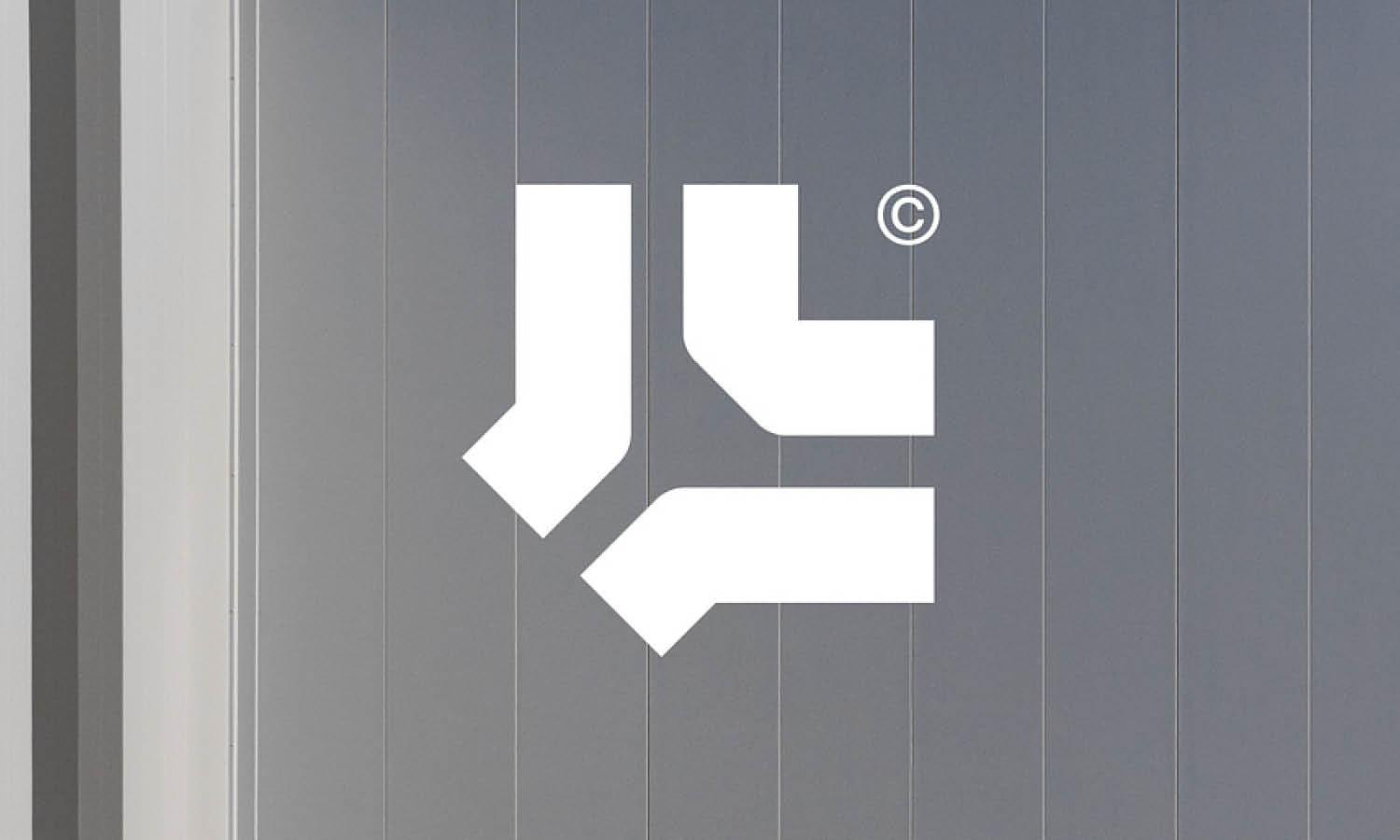
Source: Guilherme Vissotto, Organizze, Behance, https://www.behance.net/gallery/170082105/Organizze
In the intricate world of logo design, the strategic placement of elements can significantly influence a brand's visual and psychological impact. This analysis delves into the subtle yet powerful differences between using the left and right sides in logo creation. As designers, understanding these nuances is crucial for crafting logos that not only attract attention but also resonate deeply with audiences. The decision to place key components on the left or right can stem from cultural perceptions, psychological implications, and even operational functionality.
Each choice in the design process communicates something about the brand's identity and values, making the orientation of elements more than just an aesthetic decision. By exploring the effects of these placements, this article aims to provide designers with insights that help in making informed decisions that enhance brand recognition and alignment. Through a comparative approach, we will uncover how left and right placements can affect user engagement and perception in the dynamic field of logo design.
Visual Balance and Symmetry
In logo design, visual balance and symmetry play pivotal roles in creating aesthetically pleasing and memorable logos. A well-balanced logo can communicate stability and harmony, essential attributes for any brand wishing to establish trust and reliability. The strategic placement of elements on either the left or right side significantly influences this balance. For instance, a logo with symmetric elements provides a sense of order and formality, often suited for corporate or financial institutions seeking to project security. On the other hand, asymmetric logos can convey dynamism and modernity, appealing to tech startups or creative agencies looking to stand out.
Designers must consider the weight, color, and size of each component to maintain visual equilibrium, ensuring that the logo remains effective across various applications. Whether opting for symmetry to evoke tradition or asymmetry to suggest innovation, the balance between the left and right elements within a logo crucially impacts its effectiveness and audience perception.
Cultural Interpretations
The interpretation of logos can vary dramatically across different cultures, influencing how elements placed on the left versus the right are perceived. In Western cultures, where reading typically starts from the left, placing a brand’s most significant element on the left side can capitalize on natural viewing patterns, potentially increasing brand recall. Conversely, in cultures where text is read from right to left, like Arabic-speaking regions, the right side might be prioritized for the most impactful elements. This cultural consideration is crucial for global brands that aim to resonate with diverse audiences.
Moreover, certain symbols or images may carry different connotations depending on their placement. For example, a logo element that appears on the left might be seen as more conservative or traditional, while placement on the right could be viewed as more innovative or progressive. Understanding these cultural nuances allows designers to create more effective, culturally sensitive logos that appeal to a broader audience, enhancing the logo's ability to communicate the brand’s essence across different cultural contexts.
Directional Tendencies
Directional tendencies in logo design significantly influence how a viewer's eye navigates a brand's visual identity. Traditionally, in cultures accustomed to reading from left to right, elements that lead from the left often suggest progress and forward movement. This left-to-right orientation aligns with natural reading habits, promoting quicker comprehension and familiarity, which are vital in rapid consumer decision-making environments. Conversely, right-to-left directional elements can create a visual pause, offering a subtle cue for contemplation or reflection, which might be strategically used by brands that wish to appear more thoughtful or luxurious.
This understanding of directional flow is essential in logo design, as it affects the viewer's interaction with the brand at a subconscious level. Designers leverage these tendencies to guide the viewer's attention strategically, enhancing the storytelling aspect of the logo. Effective use of directional cues can lead to a more engaging and memorable logo, which in turn boosts brand recognition and effectiveness.

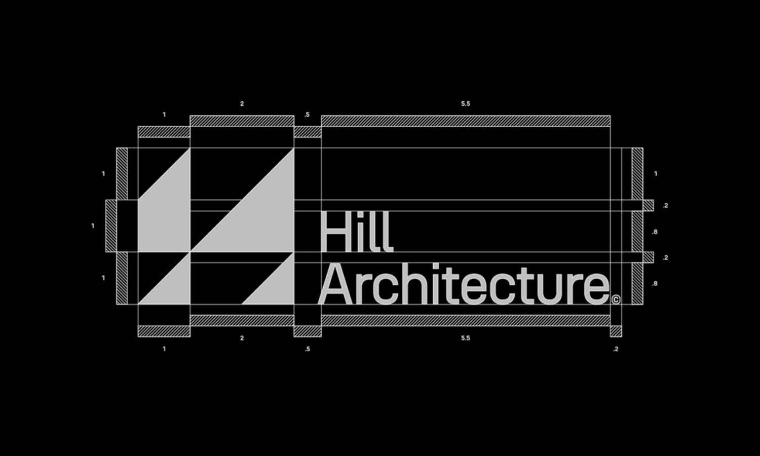
Source: Justinas Kutkauskas, MarketMove, Behance, https://www.behance.net/gallery/170997709/MarketMove
Brand Positioning
In the strategic world of logo design, the placement of elements either on the left or right side can subtly but powerfully communicate a brand's positioning. Left-aligned elements might be perceived as more traditional and stable, appealing to brands that wish to highlight their heritage and reliability. In contrast, placing key components on the right can be perceived as innovative and forward-thinking, suitable for brands that want to project a progressive or cutting-edge image. This subtle positioning helps brands convey their unique value propositions and market positioning without the need for words.
Additionally, the spatial dynamics of logo elements can reflect a brand’s dynamic or static nature. For instance, a logo with elements that seem to move towards the right can suggest momentum and future orientation, appealing to a younger, more dynamic audience. Understanding and applying these principles allows designers to craft logos that do more than represent a brand visually; they communicate the brand's core message and identity, resonating deeply with the intended audience.
User Experience
In logo design, user experience (UX) is paramount, as it directly influences how a brand is perceived and interacted with across different platforms. The strategic placement of logo elements on the left or right can significantly affect usability and recognition. For instance, in digital environments, logos often appear at the top left of web pages and apps, aligning with the natural starting point of a viewer's gaze in left-to-right reading cultures. This placement ensures that the logo is the first element encountered, reinforcing brand recognition. Conversely, right-sided elements can be effective in drawing attention in scrolling environments, like social media feeds, where users typically scan from top to bottom and left to right.
The integration of logo design with user interfaces must be considered to maintain consistency and usability across all touchpoints. This includes ensuring that logos are scalable, legible, and visually effective in both large formats such as billboards and small formats like smartphone icons. By prioritizing UX in logo design, designers can enhance user engagement and ensure a seamless, intuitive interaction with the brand, ultimately contributing to a positive brand experience and customer loyalty.
Typography Emphasis
Typography is a critical element in logo design, as it shapes the character and readability of the brand name within the logo. The emphasis on typography can vary greatly depending on whether text elements are aligned to the left, right, or center. Left-aligned typography often conveys a clear, straightforward message, appreciated in more traditional or conservative industries. It aligns with the natural reading direction, facilitating quick comprehension and a solid, anchored appearance. Right-aligned text can introduce a sense of modernity and innovation, suitable for brands aiming to project a cutting-edge or artistic image.
Such alignment may challenge conventional reading patterns, capturing attention through its uniqueness. Centered text, while balancing the logo aesthetically, needs careful handling to maintain legibility and impact, especially in complex logos. Designers must consider not only the placement but also the choice of typeface, weight, and color to optimize readability and convey the appropriate brand ethos. Effective typography in logo design not only communicates the name but also enhances brand personality, making it a crucial aspect for designers to master.
Iconography and Symbolism
Iconography and symbolism are essential components of effective logo design, as they convey deep layers of meaning about a brand's identity and values. The strategic placement of icons and symbols on the left or right side of a logo can dramatically influence the message and perception of the brand. Icons placed on the left are often perceived as more foundational and stable, reflecting core values or established traditions of a brand. This positioning is effective for companies that want to emphasize their heritage and reliability. Conversely, symbols on the right side can suggest innovation and forward-thinking, appealing to a progressive audience looking for modernity and freshness.
This right-side placement can be particularly impactful in technology or design industries, where cutting-edge ideas are celebrated. Additionally, the cultural significance of specific symbols can vary; for instance, a rising sun on the left might symbolize beginnings in some cultures, while on the right, it could denote progress and future aspirations. Effective use of iconography in logo design requires a nuanced understanding of these elements, ensuring that they resonate appropriately with the intended audience while reinforcing the brand's overall messaging.

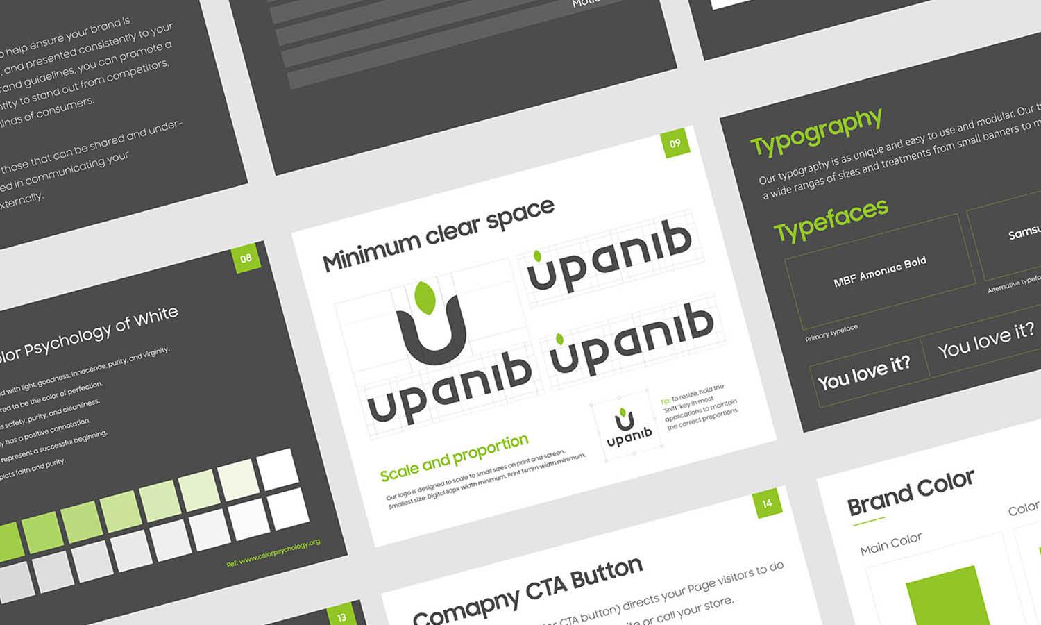
Source: Lucas Fields, Otam Logo & Business Card Design, Dribbble, https://dribbble.com/shots/18375746-Otam-Logo-Business-Card-Design
Marketing Implications
The placement of elements within a logo design has significant marketing implications, influencing how consumers perceive and interact with a brand. Logos with left-oriented elements can benefit from the natural tendency of viewers in Western cultures to scan from left to right, potentially increasing brand recognition and recall. This makes left-aligned logos particularly effective in traditional advertising mediums such as print and television. On the other hand, right-aligned elements in a logo can capture the viewer’s attention in digital formats, where dynamic content and right-to-left animations are more engaging. This alignment can be strategically used in digital marketing campaigns to stand out in a cluttered online environment.
Additionally, the symmetry or asymmetry of a logo can affect its adaptability across different platforms and formats, impacting the consistency of marketing efforts. A well-designed logo considers these aspects, ensuring it is versatile and effective in conveying the brand's message, whether displayed on a massive billboard or a mobile screen. Marketers and designers must collaborate to leverage these design choices, optimizing the logo's impact in various marketing strategies and helping the brand establish a strong, recognizable presence in the market.
Psychological Impact
The positioning of elements within a logo design has a profound psychological impact, influencing how viewers perceive a brand. The left and right sides of a logo can evoke different cognitive and emotional responses based on human perception and cultural conditioning. Left-oriented elements often convey stability, reliability, and tradition. This is because, in many cultures, the left side is associated with the past, familiarity, and foundational principles. Logos that position key symbols or text to the left can create a sense of trust and heritage, making them ideal for industries such as banking, law, or healthcare.
On the other hand, right-oriented elements often evoke feelings of progress, movement, and innovation. Since the right side is associated with the future in many cultures, a logo that leans towards this direction can give a sense of forward-thinking ambition. This can be particularly effective for brands in the technology, automotive, or creative industries. Additionally, the visual weight and positioning of a logo’s components can subconsciously affect how users interact with it. If a design is unbalanced, viewers may perceive the brand as unstable or untrustworthy. Therefore, careful consideration of left versus right placement in logo design ensures that psychological cues align with the brand’s intended message, creating an impactful and meaningful brand identity.
Visual Flow
Visual flow in logo design dictates how the viewer’s eye moves across the composition, influencing how the brand’s message is perceived. The arrangement of elements—whether aligned to the left, right, or center—guides attention and affects the overall impact of the design. In cultures that read from left to right, viewers naturally start scanning from the left, making left-aligned logos easier to process. This can create a smooth, intuitive experience, reinforcing clarity and approachability. A logo designed with left-to-right movement often feels progressive and inviting, ideal for companies that emphasize seamless user experience and accessibility.
Conversely, right-oriented logos can create a sense of intrigue and uniqueness. Since they challenge traditional reading patterns, they demand extra cognitive engagement, making the design more memorable. This technique works well for brands that want to appear unconventional or cutting-edge. Additionally, logos that incorporate movement—such as symbols pointing or leaning toward a specific direction—can direct the viewer’s gaze and reinforce brand messaging. A forward-leaning shape suggests growth and advancement, while a static or backward-leaning element may imply heritage and trustworthiness.
The strategic use of visual flow in logo design ensures that the brand’s identity is communicated effectively, enhancing brand recall and engagement. By carefully placing elements to align with natural viewing tendencies, designers can create logos that resonate deeply with audiences while maintaining aesthetic harmony.
Conclusion
The strategic placement of elements in logo design plays a crucial role in shaping brand perception. Whether aligned to the left or right, each decision impacts balance, symbolism, and psychological response. Understanding how visual flow, typography, iconography, and cultural interpretations influence audience engagement allows designers to craft more effective logos. A well-structured logo not only enhances recognition but also communicates a brand’s values with clarity. By considering directional tendencies and brand positioning, designers can create logos that resonate with their target audience, ensuring both aesthetic appeal and functional effectiveness in various applications.
Let Us Know What You Think!
Every information you read here are written and curated by Kreafolk's team, carefully pieced together with our creative community in mind. Did you enjoy our contents? Leave a comment below and share your thoughts. Cheers to more creative articles and inspirations!


Leave a Comment