Logo Design Variations That Every Brands Should Have

Source: Habibi, Brand Logo Talento, Dribbble, https://dribbble.com/shots/20227280-Brand-Logo-Talento
A strong brand identity is rarely built on a single logo alone. In today’s digital and multi-platform world, businesses need multiple logo design variations to ensure their brand remains consistent, recognizable, and adaptable across different environments. From websites and mobile apps to packaging, merchandise, and social media, each platform presents unique visual requirements. Without the right logo design variation, even a well-crafted logo may struggle to maintain clarity and impact.
A logo design variation allows a brand to adjust its visual identity without losing its core personality. Instead of forcing one logo format to work everywhere, designers create alternative versions that preserve the brand’s symbol, typography, and overall style while adapting to different layouts and sizes. These variations help brands maintain visual harmony while improving usability across digital and print materials.
For example, a full logo design might work perfectly on a website homepage but become difficult to read on a social media icon or product label. With the right variation strategy, brands can switch between primary logos, submarks, icons, and simplified versions while still maintaining strong recognition.
Understanding and implementing the right logo design variation is an essential part of modern brand systems. By preparing multiple variations, businesses ensure that their logo design remains flexible, professional, and effective wherever their brand appears.
Primary Logo Design Variation
The primary logo design variation is the main and most recognizable version of a brand’s identity. It is the complete representation of the brand and usually includes the brand name, symbol or icon, typography, and sometimes a tagline. This logo design variation acts as the foundation of the entire brand system and sets the visual tone for all other versions of the logo.
In most cases, the primary logo design is used in prominent locations where there is enough space to display the full composition clearly. Common placements include websites, advertisements, presentations, business cards, and product packaging. Because it is the most detailed version, this variation often carries the strongest brand impact and helps audiences quickly recognize the company.
A well-crafted primary logo design variation should be balanced, readable, and scalable. Designers must ensure that all elements work together harmoniously so the logo remains visually appealing in both digital and print formats. Color choices, typography, and spacing all play important roles in maintaining clarity and consistency.
Another key function of the primary logo design variation is to serve as a guide for other logo versions. Secondary logos, icons, and submarks are usually derived from the elements found in the main design. When the primary logo is thoughtfully designed, it becomes easier to develop supporting variations that still reflect the brand identity.
For any brand building a professional identity, establishing a strong primary logo design variation is the first and most important step toward a flexible and cohesive visual system.
Secondary Logo Design Variation
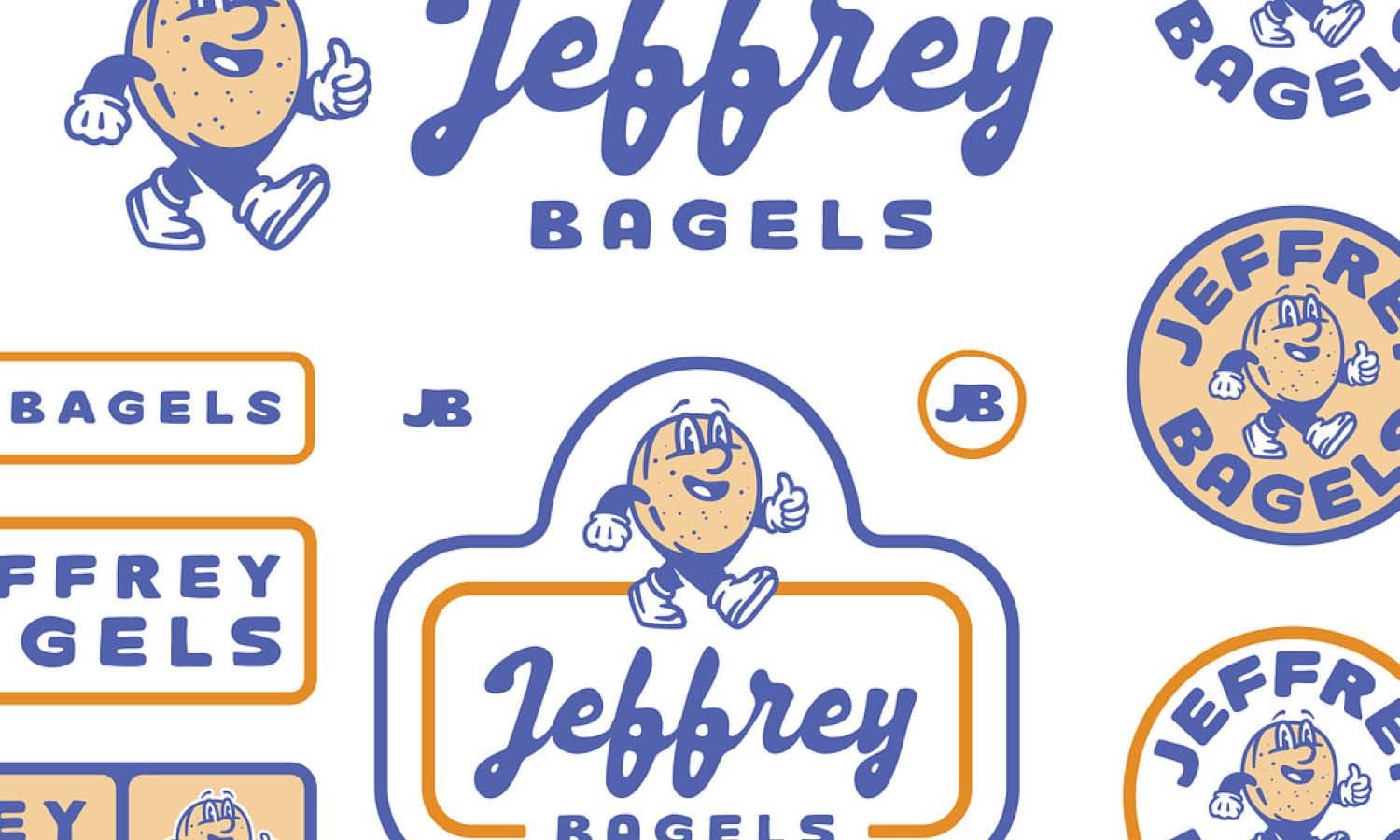
The secondary logo design variation is an alternative arrangement of the primary logo elements. While it still includes the same icon, typography, and brand identity components, the layout is modified to better fit different spaces and design contexts. This logo design variation helps brands maintain consistency while adapting to various visual environments.
One common example of a secondary logo design variation is a stacked or horizontal format. If the primary logo is wide and detailed, a secondary variation may place the icon above the brand name or adjust the alignment to create a more compact structure. This flexibility allows the logo to work effectively in areas where the primary version may feel too large or unbalanced.
Secondary logo variations are frequently used in marketing materials, social media graphics, website sections, and promotional layouts. These applications often require a slightly different format to maintain visual harmony within the overall design.
Designers create secondary logo design variations to ensure the brand remains recognizable without forcing a single layout into every situation. Instead of stretching or shrinking the primary logo, the secondary version provides a more practical and visually pleasing option.
When thoughtfully designed, a secondary logo design variation strengthens the brand identity by offering flexibility while preserving the core visual elements. This approach allows businesses to maintain a consistent and professional appearance across many platforms and design formats.
Submark Logo Design Variation
A submark logo design variation is a compact and simplified version of a brand’s main logo. This variation usually focuses on the most recognizable elements of the brand, such as initials, a symbol, or a minimal badge. Because it removes unnecessary details, the submark is highly versatile and works well in spaces where the full logo design may appear too large or complicated.
Many brands rely on a submark logo design variation for small-scale applications. These include social media profile images, website favicons, watermarks, product labels, and mobile interfaces. In these situations, clarity and simplicity are essential, and a smaller logo variation ensures the brand remains visible and recognizable.
When designing a submark logo design variation, designers usually extract the strongest visual elements from the primary logo. This might include the brand initials inside a circle, a simplified icon, or a minimal graphic mark that still reflects the brand identity. The goal is to maintain a clear connection to the main logo design while creating a version that performs well at very small sizes.
A successful submark variation should be clean, balanced, and instantly recognizable. Even without the full brand name, audiences should still be able to associate the mark with the company. This helps strengthen brand recall across different platforms.
By incorporating a submark logo design variation into the brand system, businesses gain a flexible tool that ensures their visual identity remains consistent and effective across both digital and physical touchpoints.

Source: Mike Bruner, Leisure Club, Dribbble, https://dribbble.com/shots/17086899-Leisure-Club-drib
Icon Or Symbol Logo Design Variation
An icon or symbol logo design variation focuses entirely on the graphical element of a brand’s identity. Instead of using the full brand name, this variation highlights a distinctive icon that represents the company visually. When designed well, a symbol-based logo design variation can communicate the brand personality quickly and effectively.
This type of logo design variation is especially useful for digital platforms where space is limited. Mobile apps, social media icons, website favicons, and interface buttons often require a small yet recognizable visual mark. In these environments, a simple icon variation helps maintain brand presence without overcrowding the design.
Creating an effective icon or symbol variation requires careful attention to shape, balance, and simplicity. The symbol must remain clear even at very small sizes. Designers often remove text elements from the main logo design and refine the graphic mark so it can stand independently while still representing the brand identity.
Well-known brands often rely on icon logo design variations because they allow audiences to recognize the brand instantly. Over time, a strong symbol can become just as recognizable as the full logo itself.
Including an icon or symbol logo design variation in a brand system provides flexibility for modern digital environments. It ensures that the brand remains visually consistent while adapting to platforms that require minimal and highly scalable design elements.
Wordmark Logo Design Variation
A wordmark logo design variation focuses entirely on the brand name presented through distinctive typography. Unlike symbol-based logos, this variation removes icons or graphic marks and allows the lettering itself to represent the brand identity. When designed carefully, a wordmark logo design variation can create a clean, professional, and memorable visual presence.
This type of logo design variation works particularly well for brands with unique or recognizable names. By emphasizing typography, the brand name becomes the main visual element, making it easier for audiences to remember and identify the company. Many well-known brands rely on wordmark logos because they provide clarity and strong brand recognition.
A wordmark variation is commonly used in areas where readability is important. These placements may include website headers, editorial content, advertisements, documents, and packaging. In these situations, a simple text-focused logo design variation ensures that the brand name remains clear without visual distractions.
Designers usually create a wordmark variation by refining the typography used in the primary logo design. This may involve adjusting spacing, weight, or letter structure to ensure the design remains balanced and visually appealing. The typography should reflect the brand’s personality, whether it feels modern, elegant, playful, or professional.
Including a wordmark logo design variation within a brand system provides flexibility and strengthens brand communication. Even without symbols or graphics, a well-designed wordmark can stand confidently as a powerful representation of the brand.
Monogram Or Lettermark Logo Design Variation
A monogram or lettermark logo design variation uses the initials of a brand instead of the full company name. This variation is especially useful for brands with long names that may be difficult to display in smaller spaces. By focusing on initials, designers create a simplified and visually compact logo design variation that remains recognizable.
This type of logo design variation is commonly used by luxury brands, corporate companies, and organizations that want a refined and minimal identity. A monogram often combines two or more letters into a unique symbol, creating a stylish and memorable mark that represents the brand.
Lettermark variations are extremely practical for many branding applications. They work well on social media icons, product packaging, merchandise, watermarks, and promotional materials where a full logo might appear too large or complicated. Because the design is simplified, the monogram variation remains clear even at very small sizes.
When creating a monogram logo design variation, designers pay close attention to typography, spacing, and letter balance. The letters must interact harmoniously while still maintaining readability. Subtle adjustments to curves, alignment, and proportions often help transform simple initials into a distinctive brand symbol.
A well-crafted monogram logo design variation adds versatility to a brand identity system. It provides a compact yet powerful visual mark that reinforces the brand while maintaining a clean and professional appearance across different platforms.
Horizontal Logo Design Variation
The horizontal logo design variation arranges the brand icon and typography side by side. This layout is one of the most practical logo design variations because many digital and print spaces are wider than they are tall. A horizontal variation helps maintain balance and readability in these environments without shrinking or distorting the original design.
Many websites use horizontal layouts in their navigation bars or headers. In these areas, a vertical or stacked logo may take up too much space or disrupt the page structure. By creating a horizontal logo design variation, brands can place their identity neatly within wide design areas while keeping the brand name clearly visible.
This type of logo design variation is also commonly used in email signatures, website menus, online banners, and presentation templates. Because the icon and text appear in a single line, the design feels organized and easy to read.
When designing a horizontal variation, designers often adjust the spacing between the icon and typography to maintain visual harmony. Careful alignment and proportion ensure that the logo still feels balanced even though its layout has changed.
A well-designed horizontal logo design variation provides flexibility without altering the brand identity. It ensures the logo works effectively in modern digital layouts where horizontal space is frequently the most available format.

Source: Lance, Custom Logotypes, Dribbble, https://dribbble.com/shots/23663974-Custom-Logotypes-Recent-Work
Vertical Or Stacked Logo Design Variation
The vertical or stacked logo design variation places the icon above or below the brand name, creating a taller layout. This variation is useful when working with narrow or square spaces where a horizontal logo may feel too wide. By stacking the elements, designers create a balanced composition that fits comfortably into vertical design areas.
This logo design variation often appears on posters, product packaging, social media graphics, and promotional materials. In these situations, vertical space is typically more available than horizontal space, making a stacked arrangement more practical.
A vertical logo design variation also helps maintain strong visual hierarchy. By positioning the symbol above the brand name, the icon can act as a visual anchor while the typography reinforces the brand identity beneath it.
Designers typically derive this variation directly from the primary logo design by rearranging the same elements into a stacked structure. The colors, typography, and symbol remain consistent so the brand identity stays recognizable across all variations.
Including a vertical or stacked logo design variation ensures the brand remains adaptable across many different layouts. It allows designers to maintain consistency while placing the logo comfortably within tall or centered design spaces.
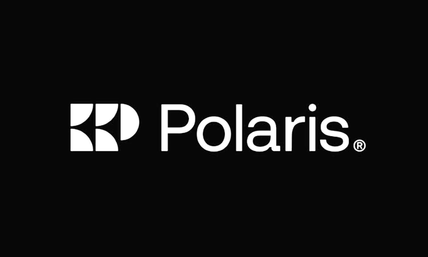
Black And White Logo Design Variation
A black and white logo design variation is an essential part of a professional brand identity system. This variation removes all color elements and relies only on contrast, shapes, and typography to communicate the brand visually. A strong logo design should always remain clear and recognizable even when color is not available.
Many real-world applications require logos to appear in a single color format. Examples include printed documents, invoices, newspaper advertisements, stamps, engravings, and embossing on packaging materials. In these situations, a black and white logo design variation ensures the brand identity remains consistent and professional.
Designers often create this variation by simplifying the primary logo design and converting color elements into solid black or white forms. The goal is to maintain the same structure and proportions while ensuring the design still looks balanced without color support.
Testing a logo design variation in black and white is also an effective way to evaluate the strength of the design itself. If the logo still looks clear, readable, and visually appealing without color, it usually indicates that the structure of the design is strong.
By including a black and white logo design variation in the brand toolkit, businesses gain a flexible solution for both print and digital environments. This variation ensures the logo remains effective in situations where color reproduction may be limited or unavailable.
Inverted Color Logo Design Variation
An inverted color logo design variation is created by reversing the colors of the primary logo to ensure it works effectively on dark backgrounds. Instead of placing a standard logo on every surface, designers create an alternate variation that maintains visibility and contrast in darker design environments.
This type of logo design variation is particularly useful for digital interfaces, promotional graphics, packaging, and website sections that use dark color themes. Without an inverted version, the original logo may become difficult to read or lose its visual impact when placed on darker backgrounds.
To create this variation, designers adjust the logo colors while preserving the overall structure of the design. Light elements may replace dark ones, and certain details may be simplified to improve contrast. The goal is to maintain the same brand identity while improving readability and visual clarity.
An inverted logo design variation also helps maintain design consistency across a variety of marketing materials. Instead of placing backgrounds or outlines around the logo, brands can simply switch to the inverted version when working with dark surfaces.
Including an inverted color logo design variation ensures the brand identity remains flexible and adaptable. It allows the logo design to maintain strong visibility while fitting naturally into both light and dark design environments.
Conclusion
A strong brand identity depends on more than a single logo. By developing multiple logo design variations, brands can maintain consistency while adapting their visual identity to different platforms and formats. Each logo design variation serves a specific purpose, whether it is used on websites, packaging, social media, or printed materials. When these variations are designed thoughtfully, they ensure the brand remains recognizable in both large and small spaces. Investing in a flexible logo design system allows businesses to communicate professionally, strengthen brand recognition, and keep their visual identity effective across every modern touchpoint.
Let Us Know What You Think!
Every information you read here are written and curated by Kreafolk's team, carefully pieced together with our creative community in mind. Did you enjoy our contents? Leave a comment below and share your thoughts. Cheers to more creative articles and inspirations!


Leave a Comment