Basic Introduction to a Responsive Logo Design

Source: Reza Moradi, Linkkify | Brand Book Design, Dribbble, https://dribbble.com/shots/18144731-Linkkify-Brand-Book-Design
As the face of your brand, a logo must seamlessly adapt to various platforms, from colossal billboards to compact smartphone screens. This adaptability ensures that a brand's identity remains consistent and recognizable, regardless of the medium through which it is experienced. Responsive logo design embraces the challenge of today’s diverse digital landscape by creating versatile logos that maintain their integrity across different viewing contexts. It’s not merely about shrinking the logo to fit into a smaller space; it's about designing a logo that can change in complexity and size while keeping its essence intact.
Let’s explore the fundamental aspects of responsive logo design, illustrating why it's critical for modern branding strategies. We will delve into the design principles that govern the creation of logos that are not only aesthetically pleasing but also functionally adaptable, ensuring that your brand's first impression is both memorable and effective. This understanding is essential for any designer or brand aiming to thrive in today’s fast-paced digital world.
Elements of a Responsive Logo
Responsive logo design is essential for ensuring that a brand’s identity flourishes across various digital platforms and devices. The elements that constitute a responsive logo are pivotal in its ability to adapt without losing its core identity. Firstly, simplicity is crucial; a logo must maintain its essence in simpler forms without excess detail that can get lost in smaller displays. Flexibility is another key element; responsive logos often incorporate mutable components that can be rearranged or resized depending on the context. This might mean having a full logo for desktop use and a simplified icon for mobile devices.
Additionally, modularity plays a significant role; components of the logo should be able to stand alone or combine in different configurations. This allows for versatility across media without compromising the design integrity. Consistency across these variations ensures that the logo is immediately recognizable, reinforcing brand identity regardless of the format. Lastly, the use of scalable vector graphics ensures that the logo retains its clarity and resolution at any size. These elements, when combined effectively, create a logo that not only stands out visually but is also practical and adaptable across diverse applications.
The Role of Scalability
Scalability is a cornerstone of responsive logo design, ensuring that a logo maintains its impact and readability across all sizes and formats. A scalable logo effectively transmits a brand’s identity, whether displayed on a giant billboard or a small smartphone screen. The key to successful scalability lies in the design’s simplicity and the use of clean, uncluttered lines that remain clear and distinct at any resolution.
The design process should start with the smallest size in mind, focusing on what is essential for the logo to be recognizable. This approach helps in identifying elements that are critical to the design and those that can be modified or omitted in smaller versions. Additionally, the choice of colors plays a significant role; contrasting colors can help maintain visibility and impact, even when the logo is scaled down.
Vector formats are preferred for responsive logos because they can be resized without losing quality. This ensures that the logo does not become pixelated or blurred, maintaining its professional appearance across all platforms. Scalability extends beyond just size; it encompasses the logo’s ability to adapt to different contexts while keeping its core message intact, making it a powerful tool for branding in our increasingly digital world.
Designing for Various Devices
Designing a responsive logo necessitates consideration of its appearance and functionality across a multitude of devices. Each device, from desktop monitors to smartphones and tablets, presents unique challenges in display and user interaction. The primary goal is to ensure the logo looks cohesive and maintains brand identity on all possible screens. To achieve this, designers must focus on adaptability.
The design process involves creating a core logo that is versatile enough to be modified for different devices without losing its essence. This might include developing several versions of the logo, each tailored for specific screen sizes. For instance, a detailed version can be used for desktops where there’s more screen real estate, while a simplified, more iconic version is used for mobile devices where space is limited.
In addition to scalability, the responsiveness of a logo also depends on its ability to adjust to different orientations and resolutions. Designers must use responsive design software tools that preview how a logo will appear on various devices. This proactive approach ensures that adjustments can be made early in the design process, thus avoiding potential discrepancies in logo representation across devices. Ensuring consistency in these designs strengthens brand recognition and enhances user experience, making the logo not just a visual symbol but a functional tool in digital branding.

Source: Andreas Pedersen, Swerl Coffee Roasters, Dribbble, https://dribbble.com/shots/17361251-Swerl-Coffee-Roasters
Use of Variable Fonts
Variable fonts are revolutionizing the way responsive logos are designed by allowing a single font file to behave like multiple fonts. These fonts enable real-time adaptation to the context of a logo's display, ensuring optimal readability and impact across all device types. Using variable fonts in responsive logo design offers several advantages.
Firstly, variable fonts allow for adjustments in weight, width, and other typographic elements without the need for multiple font files, keeping the logo’s text clear and legible on any screen size. This scalability is crucial for maintaining the visual integrity of a logo as it moves between devices, from the large displays of desktops to the compact screens of mobile phones.
Moreover, variable fonts can dynamically adjust to user interface requirements, enhancing user experience by improving legibility and aesthetic appeal under varying viewing conditions. For example, a logo’s font can be thicker on smaller screens to enhance readability and thinner on larger screens to maintain elegance.
The use of variable fonts also contributes to faster web performance, as fewer resources are loaded on websites, making it particularly beneficial for mobile optimization. This efficiency does not compromise design quality but rather complements the responsive nature of a logo, ensuring it is not only beautiful but also functional across different platforms. Employing variable fonts is thus a forward-thinking strategy in responsive logo design, aligning aesthetics with technological advancements to serve a brand’s identity effectively.
Adaptive Color Schemes
Adaptive color schemes are crucial in responsive logo design, enhancing visibility and effectiveness across various devices and lighting conditions. As devices vary in screen quality and display settings, a responsive logo must utilize a color palette that remains consistent and vibrant under any circumstances. This starts with selecting colors that offer high contrast, which improves readability on small screens or in less-than-ideal lighting conditions.
In addition to contrast, the adaptability of color schemes involves using colors that uphold the brand's identity across different mediums. This may mean adjusting the saturation and brightness of colors to ensure that they do not lose their impact when displayed on different devices. For instance, a color that looks vibrant on a high-resolution monitor might appear washed out on a mobile device unless adjustments are made.
Designers can employ color management tools to simulate how logos will look on various devices, which helps in making informed decisions about color adjustments. Moreover, incorporating a flexible color scheme allows for the logo to be altered in contexts where color might not be feasible, such as monochrome printing or engravings, ensuring the logo remains effective and recognizable.
This strategic approach to color adaptation not only maintains the aesthetic quality of a logo but also strengthens brand recognition, making adaptive color schemes a vital component in the toolbox of responsive logo design.
Creating Different Logo Versions
Creating different versions of a logo is an essential strategy in responsive logo design, catering to the diverse requirements of various devices and contexts. This involves designing multiple adaptations of a logo to ensure that it maintains its brand essence and functionality whether it appears on a large billboard or a small mobile app icon.
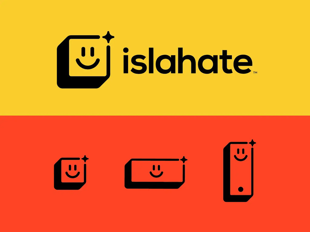
The process starts with the master logo, which is the most detailed version, usually used for print and large-format displays. From this, designers create scaled-down versions, each progressively simpler, yet still recognizable. For example, the mobile version might reduce the logo to its basic shapes and primary colors, omitting fine details that are invisible on smaller screens.
Another adaptation might be for social media icons, where the logo needs to be recognizable at even smaller sizes. This can involve using only a part of the logo or a single letter from a wordmark. In addition to size adaptations, responsive logos may also need variations in layout—horizontal, vertical, or square—to fit different spaces and contexts seamlessly.
These different versions ensure that the logo performs optimally in every environment, providing a consistent visual identity for the brand across all platforms. By planning for multiple logo versions in the design phase, brands can avoid potential display issues later, making their logos more versatile and user-friendly. This approach not only enhances brand visibility but also contributes to a cohesive brand experience.
The Impact of Minimalism
Minimalism in logo design not only enhances aesthetic appeal but also significantly bolsters the functionality of responsive logos. A minimalist approach focuses on simplicity and the elimination of superfluous elements, which makes the logo more adaptable across various platforms and devices. This design strategy involves using clean lines, limited color palettes, and clear, impactful shapes that make the logo instantly recognizable at any size.
The minimalistic design ensures that even when the logo is scaled down for small screens, its core features remain visible and distinct. This is crucial for maintaining brand identity in a digital world where a logo must perform well on everything from a smartwatch to a billboard. Additionally, minimalism facilitates quicker load times and better performance on digital platforms, enhancing user experience.
By focusing on the essentials, minimalism aids in creating a strong connection with the audience, as the simplicity of the design makes it easy for consumers to remember and identify the brand. This approach does not mean that the logo becomes bland; rather, it allows the brand's fundamental attributes to shine through more powerfully. Minimalism in responsive logo design is not just a trend but a practical technique that aligns with the demands of modern branding.

Source: Yosbrands, Responsive Logo, Dribbble, https://dribbble.com/shots/16215057-Responsive-logo
Importance of Vector Graphics
Vector graphics play a pivotal role in responsive logo design due to their scalability and resolution independence. Unlike raster graphics, which can pixelate or blur when resized, vector graphics maintain their clarity and sharpness at any size. This attribute is essential for responsive logos, which need to look impeccable on both large displays and tiny mobile screens.
Vectors are defined by paths based on mathematical expressions that allow them to be scaled up or down without losing quality. This makes them ideal for logos, which must be adaptable to various formats and sizes without degradation. Vector graphics ensure that every curve and line in the logo is preserved, no matter the scaling.
The use of vector graphics also simplifies the logo adaptation process for different devices. Designers can easily create variations of a logo for different screen resolutions and print sizes directly from the original vector file, ensuring consistency across all mediums. Moreover, vector files are typically smaller in file size than their raster counterparts, which contributes to faster web page loading times and improved performance.
Incorporating vector graphics into the design of a responsive logo not only enhances its versatility across diverse platforms but also guarantees that the logo always presents the brand in the best possible light. For designers aiming to create timeless, functional, and visually appealing logos, mastering vector graphics is indispensable.
Maintaining Brand Identity
In the realm of responsive logo design, maintaining brand identity across diverse platforms and devices is paramount. A responsive logo must consistently communicate the brand's core message and aesthetic, regardless of where or how it is viewed. This consistency strengthens brand recognition and fosters trust with the audience. Key to achieving this is the use of a coherent design language that includes consistent color schemes, typographic styles, and design motifs across all logo variations.
Designers must ensure that each adaptation of the logo, whether for large displays or tiny icons, carries the essence of the original design. This can be managed by defining a brand style guide that outlines how the logo should be used and adapted in different contexts. This guide serves as a blueprint for maintaining uniformity while allowing for the necessary flexibility of responsive design.
Furthermore, maintaining brand identity involves balancing logo simplicity with distinctive features that set the brand apart. Even the most scaled-down version of the logo should be identifiable, linking back to the larger brand identity. This requires a strategic design approach where every element of the logo is crafted with both aesthetics and functionality in mind, ensuring that the brand remains prominent and recognizable in every user interaction.
Logo Testing Across Platforms
Testing a logo across various platforms is a critical step in the design process of a responsive logo. This testing ensures that the logo performs well in different digital environments and maintains its integrity on various devices, such as desktops, tablets, and smartphones. It involves assessing the logo’s visibility, legibility, and impact on different screen sizes and resolutions.
The testing process typically includes simulating how the logo appears on different operating systems and browsers to identify any inconsistencies or scalability issues. Designers use specialized software tools to emulate various devices and screen conditions, allowing them to make necessary adjustments early in the design process.
Additionally, logo testing should include real-world scenarios to understand how the logo looks in different physical contexts, such as printed materials, merchandise, and large-format advertisements. This comprehensive approach helps ensure that the logo remains effective and appealing in all potential user encounters.
By rigorously testing the logo across multiple platforms, designers can guarantee that the logo not only looks great but also aligns perfectly with the brand’s identity and message in every context. This thorough vetting process is essential for a responsive logo that adapts seamlessly and upholds the brand’s reputation across all media.
Conclusion
Responsive logo design is not merely a trend but a fundamental approach to modern branding that addresses the dynamic range of digital platforms today. By emphasizing adaptability, scalability, and clarity, responsive logos ensure that a brand’s identity is consistently portrayed across all mediums. The strategies discussed, from leveraging minimalism to testing across platforms, are essential for any brand aiming to connect with a diverse audience in a digital-first world. Investing in a responsive logo is investing in the future of your brand, making it crucial for businesses aiming to maintain relevance and engagement in an ever-evolving market landscape.
Let Us Know What You Think!
Every information you read here are written and curated by Kreafolk's team, carefully pieced together with our creative community in mind. Did you enjoy our contents? Leave a comment below and share your thoughts. Cheers to more creative articles and inspirations!


Leave a Comment