Why Should You Use A Responsive Logo Design For Business

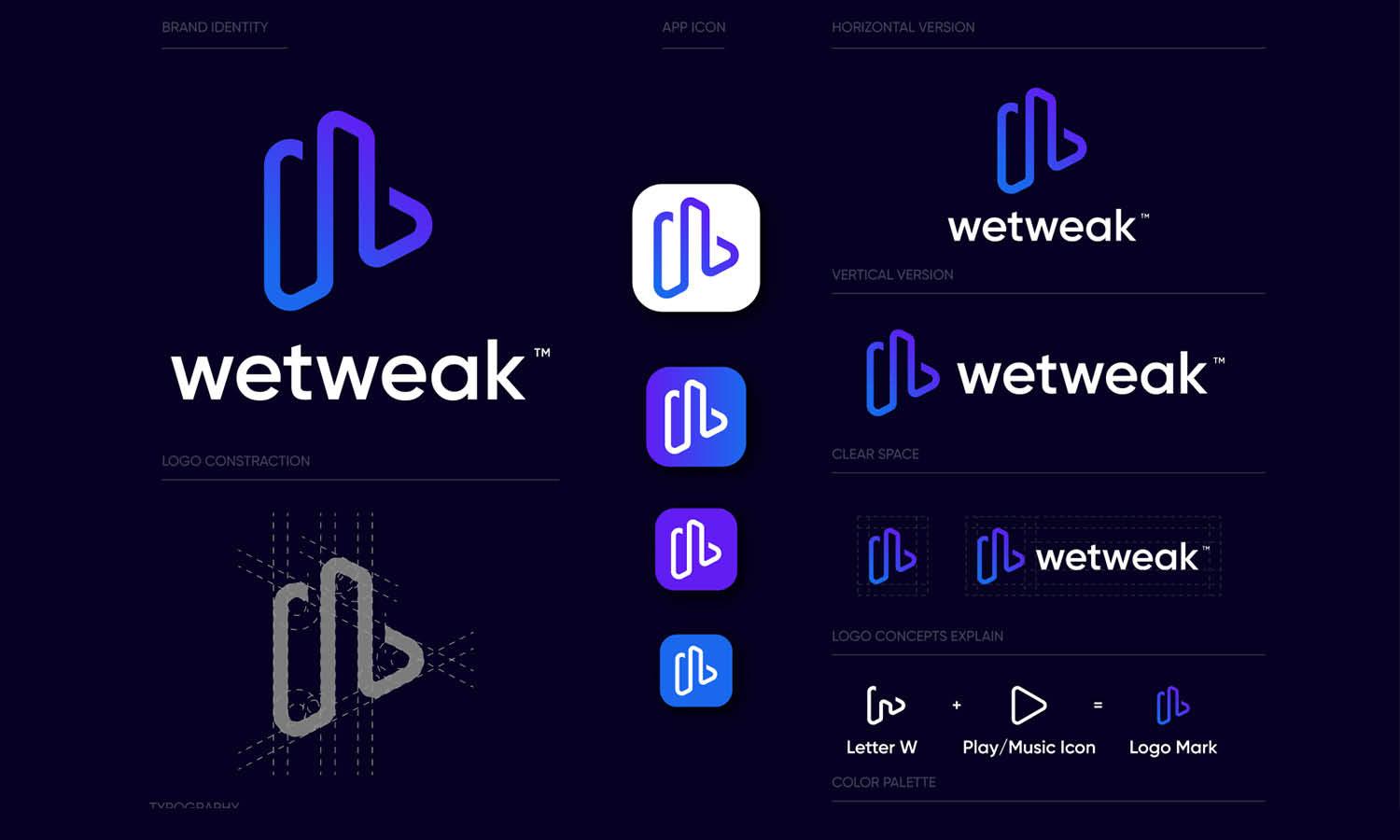
Source: Ramotion, Ninox Brand Identity, Behance, https://www.behance.net/gallery/120897261/Ninox-User-Interface-Design
Businesses are now accessed across a wide range of devices—smartphones, tablets, laptops, smartwatches, and even digital kiosks. With such variety in screen sizes and resolutions, maintaining visual consistency becomes a challenge. This is where responsive logo design plays a critical role.
A responsive logo design adapts to its environment without compromising the brand's identity. It can shrink, simplify, or reconfigure to fit different display spaces while remaining instantly recognizable. Whether it’s on a full-width website header or as a compact app icon, the logo must still reflect the essence of your brand.
More than just flexibility, responsive logos offer practical benefits. They enhance readability, improve user experience, and help your brand maintain a clean, professional image across all digital and physical touchpoints. This approach isn’t just for large corporations—it’s equally valuable for startups, small businesses, and freelancers seeking long-term growth.
By adopting a responsive logo design, businesses future-proof their branding strategy. It ensures they remain visually relevant, adaptable, and accessible in an increasingly multi-device world. In the sections ahead, we’ll explore the key reasons why responsive logo design is a smart choice for any business.
Enhances Brand Recognition
A responsive logo design plays a crucial role in enhancing brand recognition by ensuring that a business's logo maintains its identity and impact across all user interfaces. This adaptability means that whether a customer interacts with the brand through a mobile app, website, or social media, they receive a consistent visual experience. Such consistency is key to building trust and recognition, as repeated exposure to a unified brand image strengthens consumer memory. Furthermore, a responsive logo's ability to adjust elegantly to different formats and environments prevents any compromise in design quality, thereby upholding the brand's prestige and visibility.
As the digital landscape continues to expand, having a logo that is instantly recognizable in various contexts supports a brand's narrative and values, enhancing its presence in a competitive market. For businesses aiming to make a lasting impression, a responsive logo is not just an asset; it's a fundamental component of effective brand strategy, fostering recognition that transcends the boundaries of digital platforms.
Supports Marketing Flexibility
Responsive logo design significantly supports marketing flexibility, a critical advantage in today's dynamic market environments. By allowing for variations that fit different contexts without losing the essence of the brand, businesses can utilize their logos more effectively across a range of marketing materials. Whether it’s a large billboard or a small digital advertisement, the logo can be adapted to fit the space and medium optimally, ensuring it always looks its best. This flexibility enables marketers to tailor their strategies to specific platforms and target audiences without the need for multiple redesigns, thereby saving time and resources while increasing campaign efficiency.
Furthermore, a versatile responsive logo allows for creative marketing approaches, such as seasonal adaptations or special editions, that can engage customers and keep the brand fresh and relevant. By fostering a cohesive brand identity across various platforms and marketing efforts, a responsive logo not only strengthens brand recognition but also enhances the adaptability and impact of marketing campaigns. This strategic flexibility is invaluable as businesses navigate the complexities of global and digital marketplaces.
Ensures Brand Consistency Across Devices
In the realm of digital branding, maintaining a consistent identity across various platforms is crucial. A responsive logo design is instrumental in achieving this consistency, making it a vital strategy for businesses aiming to establish a strong and uniform brand presence. This design approach allows a logo to adapt effectively to different devices, from desktops to smartphones, ensuring that every representation of the brand retains the core elements of its visual identity. By doing so, a responsive logo upholds the business's image and values no matter the medium, fostering a sense of reliability and professionalism.
This consistency aids in reinforcing brand recognition, as customers encounter a coherent visual message across all digital touchpoints. As businesses continue to operate in an increasingly multi-device world, the ability to project a uniform brand image becomes not just beneficial but essential, ensuring that the brand's essence is communicated clearly and effectively in every interaction.

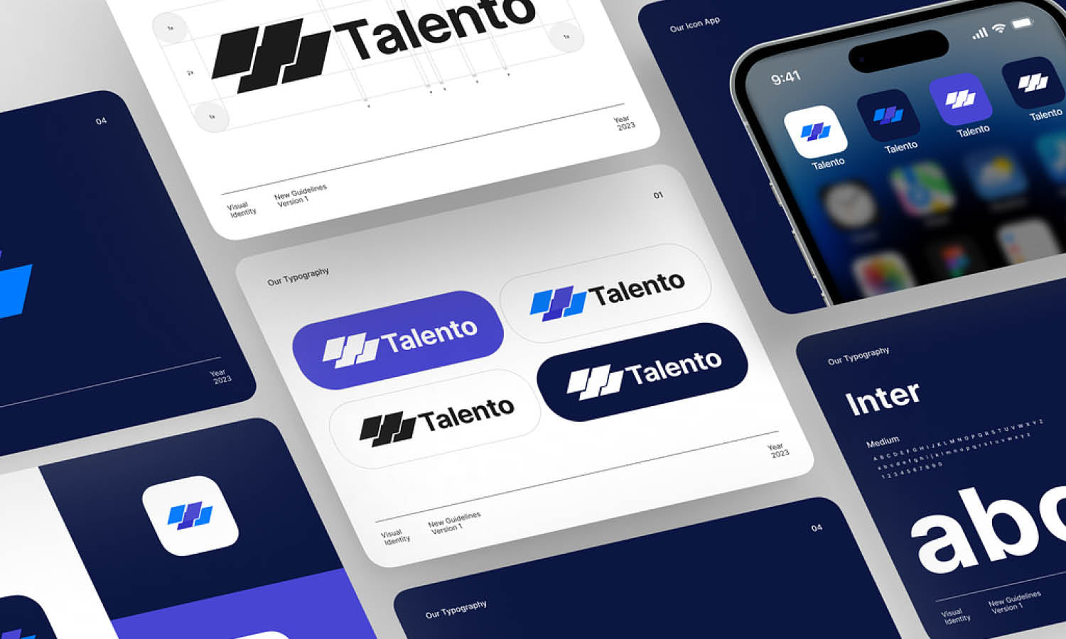
Source: Ramotion, Mobingi Branding, Behance, https://www.behance.net/gallery/60974125/Mobingi-Branding
Improves User Experience
A responsive logo design significantly enhances user experience by ensuring that the logo looks perfect on any device, contributing to a seamless visual presentation. This adaptability is particularly important in today’s mobile-centric world, where a logo must display well on devices with varying screen sizes and resolutions. By designing logos that are flexible in size and complexity, businesses can avoid graphic distortion and maintain legibility and aesthetic appeal across all platforms. This attention to detail in logo responsiveness directly affects how users perceive a brand, potentially increasing user engagement and satisfaction.
A well-executed responsive logo caters to the expectations of a diverse audience, making it easier for them to recognize and connect with the brand on multiple devices. Ultimately, this leads to a more intuitive and enjoyable interaction with the brand, fostering positive associations and loyalty among consumers. In the digital age, optimizing the user experience through responsive design practices is not just advantageous—it’s imperative for maintaining relevance and competitiveness in the business landscape.
Future-Proofs Your Brand
Adopting a responsive logo design is a strategic move that future-proofs your brand, preparing it for continued relevance as digital platforms evolve. In an era where new devices and screen sizes are constantly emerging, a logo that can adapt fluidly across all mediums ensures that your brand remains current and visible. Responsive design embodies flexibility and scalability, qualities essential for the longevity of your brand image in the digital landscape. This approach not only anticipates future technological changes but also adapts to them without compromising design integrity or brand identity.
By investing in a responsive logo, businesses safeguard their brand against the rapid pace of digital innovation, ensuring that their visual identity continues to resonate with audiences, regardless of how they access digital content. This foresight in design not only maintains brand consistency but also enhances competitive edge, keeping the brand visually coherent and professionally appealing in any future digital environment.
Saves Time and Resources
Implementing a responsive logo design significantly saves time and resources for businesses. By creating a logo that adapts to various formats and sizes, companies eliminate the need for multiple versions of their logo, reducing design efforts and associated costs. This efficiency extends beyond initial savings, as a versatile logo decreases the need for future redesigns or updates when expanding to new platforms or updating marketing strategies. Additionally, a responsive logo simplifies the brand management process, as it ensures consistency across all touchpoints without the need for continual adjustments or customizations for different uses.
This streamlined approach not only optimizes design and marketing workflows but also enhances brand cohesion, which is vital for building trust and recognition among consumers. Investing in a responsive logo design is a cost-effective strategy that not only meets current needs but also reduces long-term expenditures, making it a prudent choice for businesses looking to maximize their branding investments.
Boosts Professionalism
A responsive logo design inherently boosts the professionalism of a business by demonstrating a commitment to quality and attention to detail in every aspect of its branding. In the digital age, where first impressions are often formed online, having a logo that scales beautifully across devices and platforms is crucial. This adaptability not only shows that a company is tech-savvy and forward-thinking but also that it values the user experience. A responsive logo conveys a sense of reliability and seriousness, attributes that clients and partners value highly in any industry.
Moreover, this professional image is maintained consistently, regardless of how or where the logo is viewed, which enhances the brand’s credibility. The ability to present a polished and adaptable logo across all touchpoints speaks volumes about a company's operational excellence and its dedication to maintaining a seamless brand experience. Thus, investing in a responsive logo design is not just about aesthetic appeal but also about embedding professionalism into the very fabric of the brand’s identity.

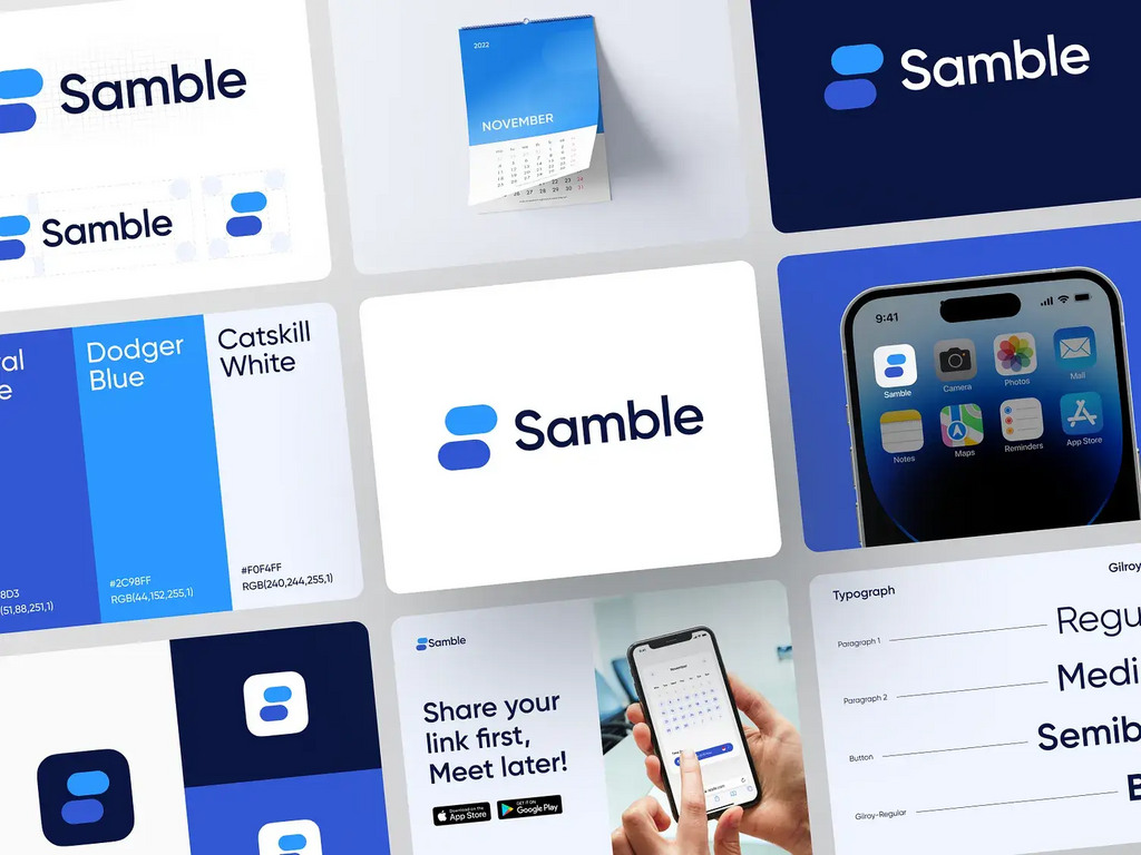
Source: Happy Milliarta, Samble - Logo, Brand Design, Dribbble, https://dribbble.com/shots/19847109-Samble-Logo-Brand-Design
Enhances Visibility in All Formats
Ensuring that a logo maintains its impact and visibility across various formats is essential for any business striving to build a strong brand presence. A responsive logo design excels in this by adapting to different sizes and contexts without losing its essence or becoming unrecognizable. Whether it's displayed on a giant billboard, a mobile app, or a tiny smartwatch screen, a responsive logo remains clear and distinct. This consistent visibility is crucial for marketing and branding efforts, as it ensures that the logo always performs its primary function: to be immediately identifiable.
This adaptability also prevents common issues like pixelation or awkward cropping, which can detract from the brand’s professional appearance and the user’s experience. By maintaining high visibility in all formats, a responsive logo serves as a powerful branding tool that supports recognition and maintains brand integrity across diverse media. This not only aids in building brand equity but also reinforces the brand’s identity in every interaction with the audience, making the logo a dependable anchor in all brand communications.
Supports Minimalism
In the world of branding, minimalism is not just a trend, but a strategic approach that enhances clarity and recall. Responsive logo design supports this minimalist approach by focusing on the essentials of the brand's visual identity. This design philosophy requires logos to be versatile enough to maintain their impact and legibility across various devices and resolutions. As a result, extraneous elements are pared down, and the logo is distilled to its most effective form.
This simplification helps in creating a clean, modern image that resonates well with contemporary audiences who value straightforward and uncluttered designs. Furthermore, a minimalist responsive logo is quicker to recognize and easier to remember, which is crucial for brand retention in a fast-paced digital landscape. By employing minimalism, businesses can ensure that their logo remains effective and attractive, no matter the medium, reinforcing the brand’s identity in a clear and concise manner.
Optimizes Space and Layout
A responsive logo design plays a crucial role in optimizing space and layout, ensuring that the logo not only fits but also enhances the environments in which it is placed. Whether it's a small corner of a mobile app or the expansive header of a website, a responsive logo adjusts in size and detail to meet the spatial requirements of the platform without losing its aesthetic appeal or brand significance. This adaptability prevents the logo from overpowering the content or being overshadowed by other design elements. It allows for a harmonious integration with the surrounding design, maintaining balance and enhancing the overall user interface.
Effective space optimization ensures that the logo contributes to a cohesive look and feel, which is essential for maintaining a professional and polished brand presentation across all touchpoints. This strategic use of space is not only visually appealing but also functional, improving the user's experience by making the brand presence strong yet non-intrusive.
Conclusion
Adopting a responsive logo design is a practical and forward-thinking decision for any business aiming to maintain brand consistency across various platforms. From ensuring clarity on small screens to enhancing usability in diverse contexts, a responsive logo reinforces your brand's professionalism and adaptability. It prepares your identity for modern marketing channels, digital applications, and emerging technologies. No matter the industry, investing in a flexible and scalable logo design helps maintain a cohesive visual presence everywhere your brand appears. In a multi-device world, a responsive logo design is not just an option—it’s a modern necessity for effective brand communication.
Let Us Know What You Think!
Every information you read here are written and curated by Kreafolk's team, carefully pieced together with our creative community in mind. Did you enjoy our contents? Leave a comment below and share your thoughts. Cheers to more creative articles and inspirations!


Leave a Comment