Logo Design Trend: Vibrant Color Palettes and Gradients

Created by Victor Murea | https://dribbble.com/shots/21736148-Tothem-logo-design-3D-Version
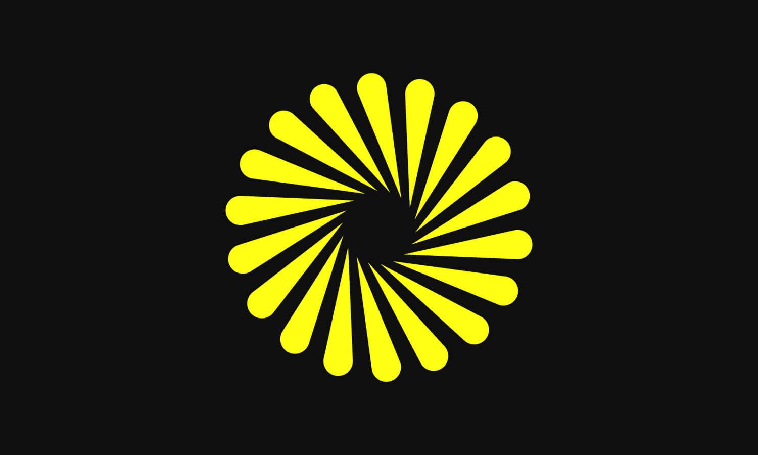
Logo design, an ever-evolving art form, is witnessing a significant shift in 2024. As we delve into this year's trends, it becomes clear that vibrant color palettes and gradients are taking center stage, revolutionizing how brands present themselves. This evolution in color trends is not just about aesthetics; it reflects deeper changes in consumer preferences and market dynamics.
The trend towards more vivid and dynamic colors in logo design signifies a departure from the muted and minimalist palettes of previous years. In today's fast-paced, digital-first world, companies are increasingly seeking ways to stand out and capture attention. Utilizing bold and bright colors is a powerful strategy to achieve this, making logos more memorable and engaging.
Moreover, the integration of gradients adds a layer of depth and sophistication, offering a fresh perspective on brand identity. This technique, blending multiple hues seamlessly, creates a sense of movement and vitality, essential in a landscape where digital interfaces dominate.
This article aims to explore the intricacies of these color trends in logo design. We will delve into how these vibrant colors and gradients are not just fleeting fancies but are grounded in psychological principles and market research. By understanding these trends, designers and brands can create logos that are not only visually striking but also resonate deeply with their target audience, ensuring a lasting impact in the competitive world of branding.
The Emergence of Vibrant Color Palettes
The landscape of logo design is witnessing a captivating evolution with the emergence of vibrant color palettes, a trend that is redefining the visual branding strategies of companies worldwide. This shift is not just a fleeting change; it's a reflection of a broader cultural and technological evolution that influences how brands connect with their audiences.
Traditionally, logo design has leaned towards conservative and monochromatic color schemes, emphasizing simplicity and elegance. However, the current trend is a bold move towards more lively, energetic hues. This shift is largely driven by the desire to stand out in an increasingly crowded digital marketplace. As consumers are bombarded with countless visual stimuli daily, logos with bright, distinctive colors are more likely to capture attention and leave a lasting impression.
The psychology behind color choices in logo design is profound. Colors evoke emotions and convey messages without words. Vibrant colors, in particular, are associated with positivity, energy, and innovation. They can make a brand appear more friendly, accessible, and forward-thinking. For example, a bright orange or lively green can communicate a sense of creativity and growth, respectively, making these colors popular choices for startups and tech companies.
In addition to emotional resonance, the selection of vibrant colors is also influenced by advancements in digital technology. Modern displays can reproduce a wider spectrum of colors with greater accuracy than ever before. This technological leap allows designers to experiment with bolder and more varied hues, pushing the boundaries of traditional logo design.
The impact of social media on color trends in logo design is undeniable. Platforms like Instagram and Pinterest, which are highly visual, have played a significant role in popularizing vibrant and eye-catching color schemes. Brands are increasingly aware that their logos must not only look good on physical products or signage but also perform well on digital screens, where most customer interactions occur.
Moreover, the rise of globalized markets has influenced the use of color in logo design. Vibrant colors are often used to create a universal appeal, transcending language and cultural barriers. A bright and colorful logo can be universally recognized and appreciated, making it an effective tool for brands looking to expand their reach internationally.
Sustainability is another factor shaping the trend towards vibrant color palettes in logo design. As consumers become more environmentally conscious, brands are adopting brighter, nature-inspired hues to reflect their commitment to sustainability. These colors not only appeal to eco-friendly consumers but also help brands position themselves as responsible and conscientious.
Despite the growing popularity of vibrant colors, it's crucial for designers to use them judiciously. The key is to balance boldness with harmony, ensuring that the colors chosen align with the brand's identity and message. Overuse of bright colors or improper combinations can lead to visual clutter, defeating the purpose of creating a memorable and effective logo.
The emergence of vibrant color palettes in logo design is a multifaceted trend influenced by psychological factors, technological advancements, social media, globalization, and sustainability concerns. As we move further into 2024, it's clear that these colorful logos are more than just visually appealing; they're a strategic tool for brands to communicate their values, stand out in the digital realm, and connect with a global audience. For designers and brands alike, understanding and harnessing this trend is essential to creating logos that are not only trendy but also timeless and effective.

Created by Matt Vancoillie | https://dribbble.com/shots/15656925--MidCourt
Understanding the Role of Color in Logo Design
Color is a fundamental element in logo design, wielding the power to influence perception, convey messages, and differentiate brands. In the realm of logo design, understanding the role of color is not just about choosing appealing hues but about harnessing their psychological and cultural significance to create a compelling brand identity. Here, we explore five crucial aspects of color in logo design.
Introductory Aspect: Color as a Communication Tool
Color is not merely a visual embellishment in logo design; it's a vital communication tool. It transcends linguistic barriers and conveys emotions and values at a glance. The choice of color in a logo can instantly impart an impression about the brand's personality and ethos. For example, blue often conveys trust and professionalism, making it a popular choice in corporate logos. Understanding this communicative power is essential for creating logos that accurately represent the brand's identity and resonate with the target audience.
Influence of Color Psychology
Each color elicits specific psychological responses and associations. Red can evoke feelings of excitement and urgency, often used by brands to capture attention and convey energy. Green, associated with nature and tranquility, is frequently used by eco-friendly and wellness brands. Understanding these psychological implications helps designers create logos that not only attract attention but also align with the brand’s desired emotional impact.
Cultural Significance and Global Appeal
Colors carry different meanings in different cultures. For instance, while white symbolizes purity and peace in many Western cultures, it's associated with mourning in some Eastern cultures. This cultural significance plays a crucial role in logo design, especially for brands operating in global markets. Designers must be culturally sensitive to ensure that the color choices in logos do not inadvertently convey unintended messages in different cultural contexts.
Trends in Color and Brand Relevance
While it's important to be aware of color trends in logo design, it's equally crucial to ensure that these trends align with the brand's identity. A trend might favor bold and vibrant colors, but if such a palette doesn't suit the brand's personality or industry, it may not be an appropriate choice. The key is to balance trendiness with authenticity, ensuring that the color choices remain relevant and true to the brand's core values.
Color and Brand Differentiation
In a crowded market, color can be a powerful tool for brand differentiation. A unique color palette can make a logo stand out and be easily recognizable. This is particularly important in industries where many competitors might use similar symbols or typography. A distinctive color scheme can make the difference between blending in and standing out.
Consistency Across Media
The chosen colors must maintain their integrity across various media and applications. A color that looks great on a digital screen might not translate well in print or on different materials. Testing color consistency across various platforms and materials is crucial for maintaining a cohesive brand image. This consistency ensures that the logo remains effective and recognizable, regardless of where it appears.
In summary, the role of color in logo design is multifaceted and crucial. It's not only about aesthetics but about communication, psychology, cultural sensitivity, trend awareness, brand differentiation, and consistency across media. By understanding and strategically applying these aspects of color, designers can create logos that are not only visually striking but also deeply resonant with their intended audiences.

Created by Kakha Kakhadzen | https://dribbble.com/shots/22555686-Colorful-Ampersand
Mastering Gradients in Logo Design
Gradients in logo design represent a sophisticated trend that brings a dynamic and modern feel to brand identities. As a design element, gradients offer a unique way to infuse logos with depth, dimension, and vitality. However, mastering the use of gradients in logo design requires understanding their nature, application, and impact. Here we explore five key aspects of effectively using gradients in logo design.
Introductory Aspect: The Art of Blending Colors
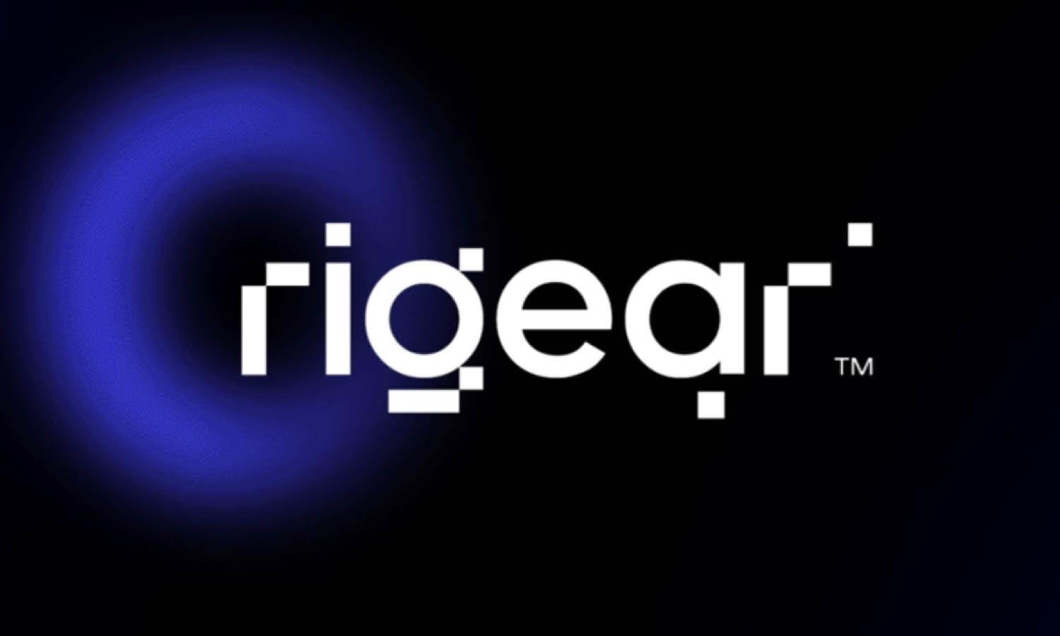
Gradients are essentially a smooth transition between two or more colors, offering a spectrum of hues blended seamlessly. In logo design, gradients can create a sense of movement, add depth, and make the logo more engaging and eye-catching. The art lies in choosing the right colors and ensuring a smooth transition that enhances the logo’s overall appeal without overpowering the design.
Understanding Color Harmony in Gradients
The success of a gradient in a logo largely depends on the harmony between the chosen colors. It's essential to understand color theory and relationships to create effective gradients. Complementary colors, analogous colors, or even a monochromatic scheme can be used to create gradients that are visually pleasing and coherent. The key is to ensure the colors in the gradient enhance each other and align with the brand's identity.
Technical Precision in Gradient Creation
Creating a gradient is more than just blending colors; it requires technical precision. This involves understanding the medium where the logo will be used most (digital or print) and adjusting the gradient accordingly. Digital mediums allow for more vibrant and diverse color transitions, while print mediums may require a more simplified approach due to color reproduction limitations. Additionally, the format of the gradient (linear, radial, etc.) can significantly impact the logo’s perception and must be chosen thoughtfully.
Balancing Trendiness with Timelessness
While gradients are trendy, it’s important to balance this trendiness with timelessness. A logo should not only look modern today but also stand the test of time. Therefore, when incorporating gradients, it’s crucial to ensure that they do not make the logo feel too tied to a particular era or fleeting trend. The goal is to use gradients in a way that adds to the logo's aesthetic value without making it appear outdated in a few years.
Applicability Across Different Platforms
A well-designed gradient logo should be versatile, meaning it should retain its effectiveness across various platforms and applications. This includes digital screens of different sizes and resolutions, print materials, and merchandise. Testing the gradient logo in various contexts ensures that its visual impact remains consistent and strong, regardless of where it's displayed.
Gradients and Brand Messaging
The use of gradients in a logo should align with the brand's messaging and positioning. Different gradient styles can convey different messages; for example, a subtle gradient might suggest sophistication and luxury, while a bold and vibrant gradient could indicate innovation and energy. The choice of gradient style should reinforce the brand’s message and appeal to the target audience.
In summary, mastering gradients in logo design is about understanding color harmony, maintaining technical precision, balancing modernity with timelessness, ensuring applicability across different platforms, and aligning with brand messaging. When used effectively, gradients can transform a logo from a simple graphic to a compelling and dynamic brand symbol that captures attention and communicates the brand's essence in a visually striking way.

Created by Jeroen van Eerden | https://dribbble.com/shots/22721992-Coinin-Logo-Design
Designing for Digital and Print: Color Considerations
In the realm of logo design, one of the key challenges is ensuring that the color scheme is effective across both digital and print mediums. This challenge stems from the different ways colors are rendered in these two formats. Understanding and navigating these differences is crucial for creating a versatile and cohesive brand identity.
Digital Color Considerations
In digital media, colors are displayed using the RGB (Red, Green, Blue) color model. This model mixes red, green, and blue light to create various colors, which is why it is ideal for screens that use light to display color. One of the advantages of the RGB model is its ability to produce a wide range of vibrant and intense colors. This is particularly beneficial when designing logos that need to stand out in the digital space, such as on websites, social media, and mobile apps. However, designers must be cautious about over-saturation and the potential for colors to look different on various screens, due to differences in display technology and settings.
Print Color Considerations
For print media, the CMYK (Cyan, Magenta, Yellow, Key/Black) color model is used. This model works by subtracting light from white background to create color, which is fundamentally different from how colors are rendered on screens. As a result, some of the vibrant colors achievable in RGB cannot be replicated in CMYK, leading them to appear more muted. This is a critical consideration when designing logos that will be used on business cards, letterheads, and other printed materials. It's essential to test colors in both RGB and CMYK formats to ensure that the brand's colors are consistently represented in all media.
Color Consistency Across Mediums
Achieving color consistency across digital and print mediums is a significant challenge in logo design. This is because the same color can appear differently in print and on a digital screen. To tackle this, designers often use color matching systems like Pantone, which provide a standardized color reproduction system. This allows for more accurate color matching across different mediums. It’s also advisable to create different versions of the logo specifically optimized for digital and print use, ensuring that the logo maintains its visual impact in each format.
Adapting to Medium Limitations
Every medium has its limitations, and understanding these is key to effective logo design. For digital use, considerations include screen size and resolution, as well as visibility against different backgrounds. For print, factors like paper quality, printing process, and ink limitations come into play. For instance, a logo might need to be simplified or its colors adjusted to ensure it is still effective when printed in small sizes or in black and white.
Future-Proofing Logo Designs
In a rapidly evolving digital world, future-proofing logo designs is essential. This means creating logos that are not only trendy and relevant today but also adaptable to future changes in technology and media formats. For color, this could involve choosing a palette that is versatile enough to look good in both current and emerging media formats, such as high-definition screens or various types of print media.
Designing logos for both digital and print mediums requires a deep understanding of color theory and the practical aspects of how colors are rendered in different media. By considering the distinct characteristics of RGB and CMYK, striving for color consistency, adapting to medium limitations, and future-proofing designs, designers can create logos that maintain their strength and integrity across all platforms. This approach ensures that a brand’s identity is effectively communicated, regardless of where its logo appears.

Created by Kakha Kakhadzen | https://dribbble.com/shots/21289661-WIP-2-Humanoid-AI
Conclusion
Logo design, particularly in 2024, is a dynamic field enriched by evolving trends and an ever-expanding palette of colors. This article has explored the significance of vibrant colors and gradients, underscoring their impact in both digital and print mediums. As trends continue to shape the landscape of logo design, it's imperative for designers to stay informed and adaptable. The interplay of color, trend, and design principles creates a tapestry of opportunities for innovative and effective branding. Ultimately, understanding and leveraging these elements are key to crafting logos that not only capture the essence of a brand but also resonate with a diverse and global audience.
Let Us Know What You Think!
These fantastic logo design articles are written and curated by Kreafolk's team. We hope you enjoy our information and remember to leave us a comment below. Cheers!







Leave a Comment