Reasons Why The Logo Design Are Usually on the Left

Created by Two Times Elliott | https://www.behance.net/gallery/37271795/Stileman
In the realm of brand identity, the strategic placement of a logo design is as crucial as the design itself. Observing various global brands and their logo placements reveals a common trend: the dominance of the logo on the left. This isn’t a mere coincidence but a thought-out, purposeful decision in the wider context of logo design and brand positioning.
The left-side placement of logos, a standard in numerous industries, is deeply rooted in how we perceive and interact with visual elements. It aligns with natural reading habits—most prominently in Western cultures, where the eye typically moves from left to right. Ensuring the logo is the first element seen, this placement taps into our subconscious recognition patterns, offering immediate brand recall. In the digital world, where attention spans are fleeting, securing this prime position on the left can be pivotal for brand recognition and user engagement.
Delving into why logo designs often favor the left side opens up a discussion that extends beyond aesthetics, encompassing aspects of psychology, marketing strategy, and user experience. Each facet combines to underscore why this specific placement is more than a design choice—it’s a strategic tool in the arsenal of impactful brand storytelling and recognition. As we explore the reasons behind this preference, it's evident that the details in logo design, such as positioning, profoundly influence consumer perception and interaction with the brand.
The Psychology Behind Left Placement in Logo Design
Understanding the psychology behind logo design, particularly why logos are often placed on the left, is crucial for designers and marketers aiming to create memorable and effective branding. This placement is not just a matter of tradition or aesthetics; it's deeply rooted in how our brains process visual information and the cultural context in which we interpret these symbols.
Firstly, it's essential to recognize the natural reading habits of a target audience. In cultures where reading starts from the left, like in English, Spanish, or Russian, placing a logo on the left ensures that it is among the first elements encountered. This aligns with the Western typographical flow of left-to-right, aiding in quicker recognition and recall. When a user opens a webpage or glances at a brochure, their eyes naturally drift to the top-left corner, making it an ideal location for logo design. This is especially true for digital interfaces where navigation menus and critical functionality are typically aligned to the left, further reinforcing the logo’s prominence.
Moreover, the left side of any visual field is associated with the right hemisphere of the brain, which is responsible for processing visual and spatial information, creativity, and intuition. When a logo is placed on the left, it's directly tapping into the brain's hemisphere that is better at processing non-verbal cues. This can make the logo design more impactful and emotionally resonant, which is a key aspect of successful branding.
Psychologists also refer to the "serial position effect" to explain this phenomenon. This effect suggests that when we encounter a series of visual elements, we tend to remember the first and last items best – a pattern known as the primacy and recency effects. By positioning a logo on the left, brands are leveraging the primacy effect, ensuring their logo is one of the first items seen and, thus, one of the most remembered.
Additionally, the left placement of logos can be linked to the concept of "spatial anchoring." Our minds tend to assign importance to items placed in familiar or dominant positions. In many societies, things that appear on the left are often perceived as more important or more stable. This is mirrored in various cultural contexts, from the placement of figures in fine art to the arrangement of items on a stage. For a logo, being on the left means it's positioned in a spot that many viewers unconsciously regard as a place of importance.
In the context of user experience (UX) design, placing the logo on the left also aligns with usability principles. It offers consistency, helping users to quickly locate the logo to return to the homepage on a website or app. This small detail in logo design can significantly enhance the overall user experience, contributing to the user's ease of navigation and the interface's intuitiveness.
Lastly, it’s important to consider that in the dynamic field of logo design, there's no one-size-fits-all solution. While left placement works for many, depending on the brand's message, audience, and medium, alternative placements can be equally effective. Recognizing the general psychological tendencies and cultural norms, however, can help designers make more informed decisions when it comes to the strategic placement of a logo.
Through an understanding of these psychological principles, it becomes evident why the left placement in logo design is not just a common practice but a strategic choice. This choice leverages deep-rooted perceptual and cognitive biases, ensuring the logo not only captures attention but also remains memorable in the minds of the audience.

Created by https://www.behance.net/gallery/183007605/Autotax | Berriel Brands
Visual Hierarchy and Its Role in Logo Design
In the world of logo design, understanding and applying the principles of visual hierarchy is pivotal in guiding viewers' attention and conveying the intended message effectively. The strategic placement of a logo, especially when positioned on the left, plays a crucial role within this hierarchy, impacting how a brand is perceived and remembered.
Visual hierarchy in design refers to the arrangement or presentation of elements in a way that implies importance. This hierarchy influences how the human eye perceives and processes information on a page, whether it's a print media, a digital interface, or a physical space. In logo design, visual hierarchy helps in organizing information, guiding the viewers' eyes through the content in order of relevance, with the most critical information, like the brand's logo, taking priority.
When a logo is placed on the left, it aligns with the natural direction of reading for many cultures—left to right. This placement instantly elevates the logo's importance within the visual hierarchy, ensuring it's the first thing that catches a viewer's attention. This is particularly critical in fast-paced environments or digital contexts where users skim content. A left-placed logo efficiently captures the viewer's attention, embedding the brand identity in the viewer's memory.
Beyond the initial engagement, the placement of the logo on the left also aids in brand recall. Since the logo is typically one of the first elements encountered, it becomes more memorable. In digital contexts, such as websites and mobile apps, users often expect to find the logo on the top-left corner, doubling as a navigation tool back to the homepage. This expectation and its consistent fulfillment create a user experience that is both intuitive and efficient, reflecting well on the brand's consideration for its audience.
Furthermore, the decision to place a logo on the left can be influenced by the Gestalt principles of perception, specifically the law of proximity and the law of similarity. These principles suggest that elements grouped together are perceived as more related than elements that are apart, and elements that are similar in nature—such as consistent logo placement across various platforms—tend to be seen as part of the same group. By consistently placing a logo on the left, brands can leverage these principles to enhance their identity's cohesion and recognition across different mediums.
Additionally, a logo's placement within the overall design structure can significantly affect the balance and aesthetics of the layout. A left-sided logo can create a visual anchor, bringing balance and focus to the overall design, especially in layouts where text and other elements are aligned or start from the left. This balance is not just a matter of aesthetics but also contributes to the viewer's sense of comfort and trust in the brand.
Incorporating the concept of visual weight, which refers to the perceived "heaviness" or "lightness" of a design element, is another reason logos often find their home on the left. A logo, particularly if it’s intricately designed or bold, carries visual weight. Placing such an element on the left helps in achieving a balanced, visually appealing composition, which is more likely to attract and retain the viewer’s attention.
The left placement of logos within the framework of visual hierarchy is not merely a trend but a strategic decision grounded in how humans interact with and process visual information. It acknowledges and leverages the ingrained patterns of perception and attention, ensuring that the logo—central to a brand's identity—is seen, recognized, and remembered. As logo design continues to evolve, understanding and applying the principles of visual hierarchy will remain a cornerstone in creating effective and impactful brand identities.

Created by Abdullah Sajol | https://www.behance.net/gallery/182746983/Logistic-Logo-Brand-Identity
Logo Design on the Left: Aligning with User Experience
In the multifaceted world of logo design, the placement of a logo goes beyond mere aesthetic consideration; it plays a vital role in enhancing user experience (UX). The habitual positioning of a logo on the left side is a strategic choice, deeply rooted in user-centric design principles. Understanding why this choice is so prevalent requires an exploration of human-computer interaction, cultural reading patterns, and the overall impact on UX.
Primarily, the positioning of a logo on the left side is tied to the natural reading habits in Western cultures, where the flow of reading is from left to right. When users open a webpage, their eyes instinctively move to the top-left corner, anticipating navigation cues or brand identification. This consistent behavior has been ingrained into users’ online experiences. Positioning a logo on the left side not only caters to this instinct but also helps in establishing an immediate visual connection with the brand. In a split second, the logo can convey the brand’s identity and values, setting the tone for the user’s journey on a digital platform.
From a UX design perspective, the left placement of the logo aligns with the concept of familiarity and efficiency. Users often expect to see the logo in the top-left corner, and meeting this expectation facilitates a smoother, more intuitive interaction with the website or application. It enhances usability by providing a consistent starting point for navigation. On most websites, clicking on the logo will redirect users back to the homepage, a navigational shortcut that is now almost a universal standard. This consistency across digital platforms fosters a sense of familiarity and ease of use, crucial elements in providing a positive user experience.
Moreover, placing the logo on the left also has implications in terms of visual hierarchy and balance, as discussed in previous sections. It helps create a visual anchor, giving a structured and balanced feel to the overall design of the webpage or application. A well-balanced layout, in turn, contributes to a more pleasant and less chaotic user experience. This strategic placement can make the interface appear more organized and approachable, encouraging longer and more meaningful engagement with the content.
In the realm of responsive and mobile-first design, the importance of left-sided logo design becomes even more pronounced. On smaller screens, space is at a premium, and the logo must compete with other elements like menus and call-to-action buttons for visibility. A left-aligned logo remains prominently visible even on smaller screens, ensuring brand recognition and consistency across devices. This visibility is critical in maintaining brand awareness and coherence, irrespective of how the user accesses the digital content.
Furthermore, for global brands catering to a diverse audience, considering the direction of text in different languages is vital. While placing the logo on the left works predominantly for languages written and read from left to right, this may need adaptation for languages with different reading flows. Customizing logo placement to align with the local language and culture can further enhance UX by resonating more closely with the user’s reading and navigation habits.
In summary, aligning the logo design on the left with user experience principles is not merely a trend but a considered strategy that taps into established patterns of user behavior. It respects the user’s needs for familiarity, efficiency, and intuitive navigation, thereby contributing positively to their overall experience. As brands continue to compete in an increasingly digital world, understanding and applying such UX principles in logo design becomes essential to creating memorable and user-friendly digital environments.
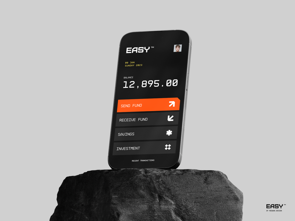
Created by Redwan | https://dribbble.com/shots/20301956-Easy-Mobile-App-Website-Branding
Branding Consistency and Left-Sided Logo Design
In the intricate sphere of branding and logo design, maintaining consistency is fundamental to establishing brand identity and recognition. One aspect of this consistency often overlooked is the positioning of the logo, particularly the trend of placing it on the left. This strategic placement plays a significant role in reinforcing brand consistency, a critical component in the ever-evolving dynamics of marketing and consumer perception.
Consistency in branding, especially through logo design, cultivates a sense of familiarity and trust among the audience. When a logo consistently appears in the same location, it becomes easier for consumers to recognize and recall the brand. This recognition is crucial in crowded marketplaces where brands vie for consumer attention. A left-sided logo design taps into the common Western habit of reading from left to right, making the logo instantly noticeable and placing it at the forefront of the brand's visual interactions.
The left placement of logos also aligns with historical precedence and the evolution of design layouts. Traditionally, important elements like headlines or starting points of texts were aligned to the left, setting a precedent for placing significant information in this position. Logos, being the graphical representation of a brand, naturally inherited this prime real estate. In the digital world, this tradition continues, with most websites and applications adhering to a left-aligned logo placement. This consistency across multiple platforms – from print to digital – helps in building a cohesive brand identity.
Moreover, in the context of cross-channel marketing, consistency in logo placement ensures a seamless brand experience. Whether a consumer interacts with a brand through a digital ad, a social media post, a website, or physical marketing materials, encountering the logo in the same position (on the left) across these varied touchpoints enhances brand recall. This strategic consistency aids in weaving a narrative around the brand, building a story that consumers can easily follow and engage with, irrespective of the medium.
The left-sided placement of a logo also contributes to the aesthetic harmony of the overall design. From a design standpoint, balancing elements in a composition is key to creating visually appealing layouts. The logo, often one of the heavier elements in terms of visual weight, can anchor the design when placed on the left, creating a sense of balance and symmetry. This placement ensures that the brand’s identity is not only consistently presented but also aesthetically integrated into various marketing materials.
Furthermore, the positioning of a logo influences branding strategies in global markets. While the left-aligned logo works well in left-to-right reading cultures, understanding and adapting to local customs and reading habits is vital in international markets. Tailoring the logo’s placement to fit different cultural contexts underlines a brand’s attention to detail and respect for its diverse audience, further reinforcing its commitment to consistency and personalization in its branding efforts.
In conclusion, the consistent left-sided placement of a logo is more than a design choice; it's a strategic decision that significantly influences branding consistency. It aligns with cultural reading habits, historical design precedents, and the need for balance in composition, enhancing brand recognition and recall across various platforms and touchpoints. By understanding and leveraging this aspect of logo design, brands can craft a more cohesive, recognizable, and memorable identity in the minds of their audience. This strategic approach to logo placement underscores the importance of thoughtful design decisions in building and maintaining a strong, consistent brand identity.

Created by Willian Gomes da Rosa | https://www.behance.net/gallery/184051417/Lolla
Impact of Left-Sided Logo Design in Digital Media
In the realm of digital media, where countless brands compete for attention, the positioning of a logo can be pivotal in capturing audience interest and conveying brand identity. The trend of placing a logo on the left is more than just a conventional choice; it holds substantial impact in digital contexts. This decision, intertwined with elements of user experience, visual hierarchy, and brand consistency, plays a vital role in effective digital communication.
The dominance of left-sided logo design in digital media can be attributed to its alignment with natural reading patterns in Western cultures. The eyes typically scan a page from top to left, making the left corner a strategic spot for maximum visibility. In the digital world, where users often skim through content rapidly, the placement of a logo on the left ensures that it is one of the first elements encountered. This immediate visibility is crucial for brand recognition, especially in an environment where user attention is fleeting and highly coveted.
In website design, the logo often doubles as a navigational tool, taking users back to the homepage when clicked. Placing this functional element on the left caters to usability conventions and enhances the overall user experience. This alignment with standard web navigation practices not only meets user expectations but also facilitates intuitive website navigation. A left-sided logo, therefore, not only serves an aesthetic purpose but also a practical one, enhancing user engagement and ease of use.
The impact of a left-sided logo extends beyond the initial visual contact. It also plays a role in the establishment and reinforcement of brand identity. As digital media becomes increasingly saturated, establishing a distinct and recognizable brand identity is vital. A consistently placed logo helps in building and reinforcing brand awareness. When users encounter the same placement of the logo across various digital platforms – be it on a website, social media, or mobile applications – it strengthens brand recall, creating a cohesive and memorable brand image.
Furthermore, the position of a logo on the left can influence the overall design layout of digital content. It sets the stage for the balance and flow of other elements on the webpage or application. This placement can help create a clean, organized, and harmonious layout, facilitating a better user experience. An aesthetically pleasing design, coupled with consistent branding, significantly increases the chances of retaining the user’s attention and engagement.
In responsive web design, where adapting to various screen sizes is crucial, the placement of the logo remains a key consideration. A left-sided logo is typically more adaptable to different layouts and devices. It remains visible and distinctive even on smaller screens, like smartphones or tablets, ensuring that the brand’s identity is prominently displayed across all viewing contexts. This consistency is important for maintaining a professional and reliable brand image in a mobile-first digital landscape.
Moreover, the decision to place a logo on the left in digital media can also be influenced by cultural factors. For global brands targeting audiences in different regions, considering the cultural norms, including reading and scanning patterns, is essential. While the left-sided logo aligns with Western reading habits, adapting logo positions to suit other cultures can enhance user engagement and brand perception in those markets.
The strategic placement of a logo on the left in digital media is a deliberate and influential choice. It aligns with natural reading patterns, navigational conventions, and the principles of responsive design, playing a critical role in building brand recognition and user engagement. In the fast-paced digital landscape, where capturing and retaining user attention is challenging, a well-placed logo can be a key differentiator, making the left-sided logo design a significant element in digital branding and marketing strategies.
Conclusion
In sum, the preference for left-sided logo design in branding and digital media isn't just a trend, but a thoughtful strategy. It capitalizes on cultural norms, enhances user experience, and bolsters brand consistency. This article underscores the importance of considering the placement of a logo, particularly on the left, as a significant factor in logo design strategy. By understanding the rationale behind this common practice, designers and brands can make informed decisions that effectively marry aesthetics with functionality. Ultimately, in the vast, competitive space of digital and print media, a well-positioned logo is a key component of a successful brand identity.
Let Us Know What You Think!
These fantastic logo design articles are written and curated by Kreafolk's team. We hope you enjoy our information and remember to leave us a comment below. Cheers!







Leave a Comment