The Essential Guide to Logo Design Size & Dimension

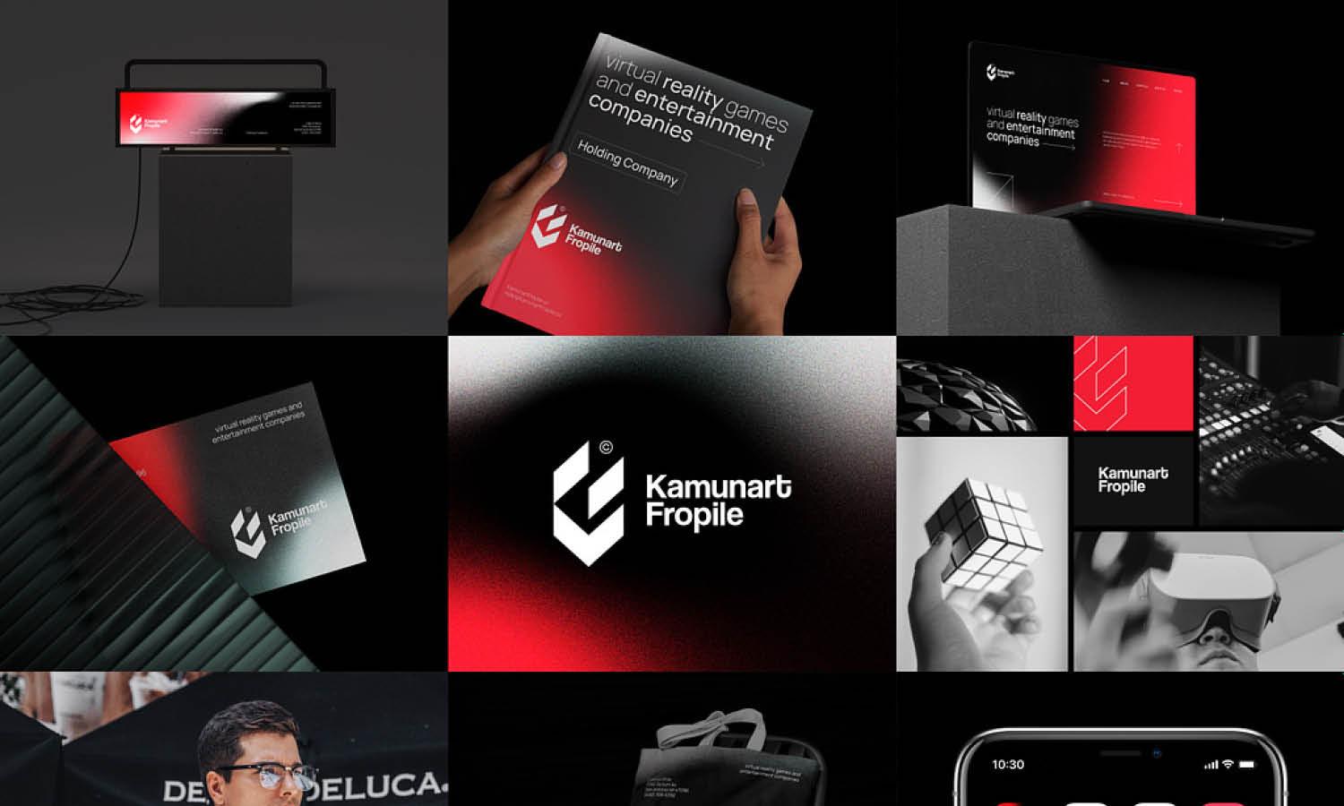
Created by Shakuro Branding | https://dribbble.com/shots/15638290-Branding-For-New-Shtetl
In the dynamic world of branding and visual identity, logo design remains a critical cornerstone. It's not just about crafting an aesthetically pleasing symbol; the size and dimension of a logo play pivotal roles in how a brand is perceived and recognized. Understanding the intricacies of logo design, especially concerning size and dimension, is essential for any business looking to establish a strong, memorable presence in the marketplace.
The significance of getting the size and dimension right in logo design cannot be overstated. These aspects affect not only the logo’s visibility and legibility across various mediums but also its adaptability and impact. A logo must maintain its integrity whether it's on a tiny business card or a massive billboard, resonating with the audience at every scale. This guide aims to delve deep into the fundamentals of logo design, focusing on the optimal size and dimension to ensure your logo stands out, delivers its intended message, and adapts seamlessly across different platforms and devices.
Whether you're a budding designer, a seasoned professional, or a business owner aiming for the perfect branding, understanding the nuances of logo size and dimension is vital. By the end of this guide, you’ll have a clearer picture of how these elements come together to create a cohesive, impactful brand identity.
Key Principles of Logo Sizing
When diving into the world of logo design, size and dimension are more than mere measurements; they are foundational elements that influence the effectiveness and versatility of a logo. Understanding and applying the key principles of logo sizing can significantly enhance the impact and recognition of a brand.
Balance and Proportion
One of the first principles in logo design size is maintaining balance and proportion. A well-proportioned logo ensures that all elements of the design are in harmonious balance, regardless of the scale at which the logo is displayed. This balance is crucial because a logo must often transition smoothly between various sizes - from the small dimensions of a favicon on a website to the larger scales used in signage or billboards.
Scalability
Scalability is paramount in logo design. A great logo must retain its clarity and impact whether it’s scaled up or down. This principle dictates that a logo's design should be simple enough to be recognizable at a glance when minimized but detailed enough to maintain interest when viewed on a larger scale. Avoiding overly intricate designs ensures your logo remains effective and legible across all mediums, an essential consideration in today's multi-platform marketing world.
Versatility
Connected closely with scalability is versatility. A logo's size and dimension should be adaptable to a variety of formats and backgrounds. This adaptability means considering how the logo appears not only in different sizes but also against different colors and textures. A versatile logo design transcends mere size considerations, embodying flexibility in different contexts, which is essential for consistent brand identity.
Context-Aware Design
Understanding the context in which the logo will be primarily used can greatly influence the sizing decisions. For instance, a logo intended for digital use, such as on social media or websites, might require different size considerations compared to one primarily used for print. Digital platforms often demand clear, concise logos that are identifiable even at smaller dimensions due to screen size limitations.
Attention to Detail at All Sizes
A common mistake in logo design is not paying attention to how details render at different sizes. Fine lines and small text that look crisp and clear at a larger size might lose clarity and become illegible when the logo is reduced. Ensuring that every element of your logo design is legible and clear at various sizes is crucial for maintaining its functionality.
Responsive Logo Design
In the era of digital media, responsive logo design has become increasingly important. This concept involves creating adaptable logo versions that maintain brand consistency across different devices and screen sizes. For example, a logo might feature more details when viewed on a desktop but switch to a simpler, more icon-like version for mobile screens.
Testing Across Multiple Platforms
Lastly, rigorous testing of the logo across multiple platforms and at various sizes is essential. This testing helps identify any issues with legibility or impact that might not be apparent in the design stage. A logo must be versatile enough to maintain its essence across business cards, letterheads, websites, and social media profiles, ensuring a coherent brand identity.
The size and dimension of a logo are not just aesthetic choices but strategic decisions that influence the overall effectiveness of the logo. A well-designed logo, mindful of these key sizing principles, ensures that a brand's visual identity remains strong, cohesive, and memorable, irrespective of where and how the logo is displayed. These considerations are integral to creating a logo that not only looks good but also fulfills its primary role: embodying and promoting a brand's identity in every conceivable context.

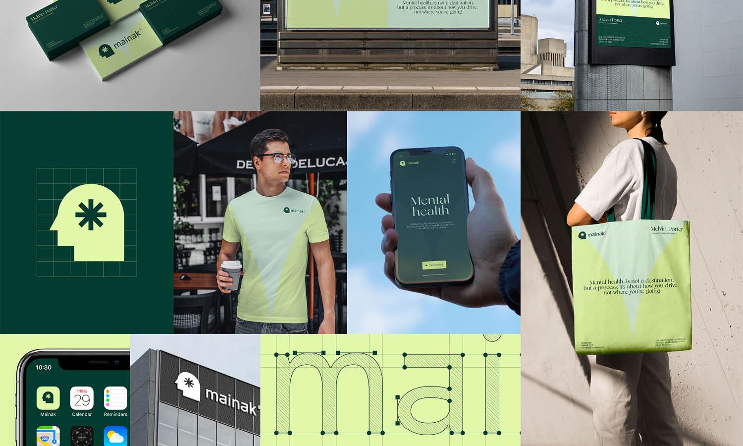
Created by Yosbrands | https://dribbble.com/shots/19057518-TamraCapital-Final-Logo
Determining the Right Dimensions for Your Logo
Selecting the right dimensions for your logo in the design process is a crucial step that can define your brand's impact and recognition. Unlike other aspects of logo design such as color or style, the size and dimension of a logo directly influence its adaptability and visibility across various platforms. Understanding how to determine these dimensions ensures your logo not only fits aesthetically but also functions effectively in different contexts.
Start with a Vector Format
Before delving into specific measurements, it’s important to begin your logo design in a vector format. Unlike raster images, vector graphics can be scaled to any size without losing clarity. This scalability is essential in logo design as it allows your logo to be resized for different applications without any distortion or pixelation.
Consider the Standard Logo Sizes
While there is no one-size-fits-all when it comes to logo design, there are commonly used dimensions that can serve as a starting point. For example, a standard size for a web logo might be around 250 x 150 pixels, while for social media profile images, 180 x 180 pixels is typical. However, these are just guidelines; the nature of your brand and the context of your logo may call for deviations from these standards.
Balance and Symmetry
Balance and symmetry play a vital role in determining the size and shape of a logo. A logo should be balanced not just visually but also in terms of its dimensions. Symmetrical logos are often perceived as more professional and reliable. However, depending on your brand's personality, an asymmetrical design might be more fitting. The key is to ensure that the dimensions you choose align with the overall balance of the design.
Customizing Dimensions to Fit Brand Needs
Customization of logo dimensions should be based on where and how the logo will be used. For instance, a detailed, rectangular logo might work well on a website header but could be less effective on a square-oriented platform like Instagram. Understanding the typical environments where your logo will be displayed helps in determining the most effective dimensions for each use case.
The Role of Negative Space
Negative space – the area around and between the elements of a logo – is just as important as the logo itself. The dimensions of your logo should allow for sufficient negative space so that it doesn’t become cluttered or lose its impact, especially when scaled down for smaller applications like mobile apps or favicons.
Legibility at Different Sizes
Legibility at different sizes is a key factor in deciding on the dimensions of your logo. A complex logo with fine details might look impressive at a larger scale but can lose clarity when reduced. A logo should maintain its legibility and distinctiveness whether it's on a tiny mobile screen or a large billboard.
Testing Across Multiple Platforms
Once you have a set of dimensions in mind, test the logo across various platforms and media. This real-world testing can reveal practical issues with size and legibility that might not be apparent in the design phase. Pay particular attention to how the logo appears in context – on mobile devices, in print, on merchandise, etc. – and adjust the dimensions accordingly.
Responsive Design Approach
In today’s multi-platform landscape, adopting a responsive design approach for your logo is beneficial. This means having a flexible logo that can change in size, complexity, or even format depending on where it’s displayed. For example, you might have a full-size logo for desktop use and a simplified, smaller version for mobile devices.
Determining the right dimensions for your logo is an intricate balance of practicality, visibility, and brand identity. By starting with a scalable vector format, considering standard sizes, and then customizing for your specific brand needs while ensuring balance, legibility, and adaptability, you can establish a logo that not only represents your brand but also thrives across diverse applications and platforms. The right size and dimension of your logo are critical in achieving a strong, recognizable, and versatile brand identity, central to successful logo design.

Created by Shakuro Branding | https://dribbble.com/shots/16309751-Lonely-Walls-Branding-Guide
Common Mistakes in Logo Sizing and How to Avoid Them
Logo design is a key element in shaping a brand's identity. However, errors in sizing and dimension can significantly detract from a logo's effectiveness. Awareness of common mistakes in logo sizing and strategic steps to avoid them is crucial in creating a logo that successfully embodies and promotes a brand.
Overcomplicating the Design
One of the most frequent mistakes in logo design is overcomplication. A logo crammed with excessive details can become unrecognizable when resized, especially for smaller applications like mobile icons or favicons. To avoid this: Focus on simplicity. A minimalist approach with fewer, bolder elements often translates better across varying sizes and remains more memorable.
Ignoring the Need for Scalability
Failing to consider scalability can result in a logo that looks good only at a specific size but loses clarity and impact when enlarged or reduced. This issue is particularly evident when a logo is used on large formats like billboards or small items like pens. To avoid this: Always design in vector format. This allows the logo to be scaled to any size without losing quality.
Not Testing on Multiple Platforms
Often, designers do not test logos across different platforms and devices. A logo might appear perfect on a desktop screen but completely unreadable on a smartphone. To avoid this: Test the logo across various media – digital screens, print, and merchandise. Check its appearance in different environments to ensure it maintains its integrity.
Neglecting Context and Usage
Another common mistake is neglecting the context in which the logo will be used. A logo that works well on a website header might not be suitable for a social media profile picture or an app icon due to different size and dimension requirements. To avoid this: Consider the primary applications of the logo right from the start. Design with versatility in mind, understanding that it might need to adapt to various contexts.
Using Inappropriate Typography
Typography in a logo needs to be legible and well-proportioned to the logo's imagery. Small, intricate fonts might become unreadable at lower sizes, while overly bold fonts can overwhelm the design at larger sizes. To avoid this: Choose typefaces that are clear and readable at any size. Test how the typography scales and adjust the weight or style if necessary.
Failing to Create a Balanced Composition
Lack of balance in a logo's composition can lead to a design that feels awkward or unsettling. An imbalanced logo can distract the audience, especially when the size of the logo changes. To avoid this: Strive for a balanced composition in your logo design. Ensure that the logo’s elements are proportionate and harmonious in both large and small formats.
Underestimating the Importance of Negative Space
Ignoring the negative space – the empty area around and between elements of a logo – is a common oversight. Insufficient negative space can cause elements to blend into each other when the logo is reduced in size. To avoid this: Make deliberate use of negative space. Ensure there's ample space around logo elements to enhance readability and impact at any size.
By being mindful of these common sizing mistakes and adopting practices to avoid them, designers can ensure their logo remains effective, functional, and visually appealing across all platforms and sizes. The goal is to create a logo that is not only aesthetically pleasing but also versatile and adaptive to different media and environments, a true testament to thoughtful and strategic logo design.

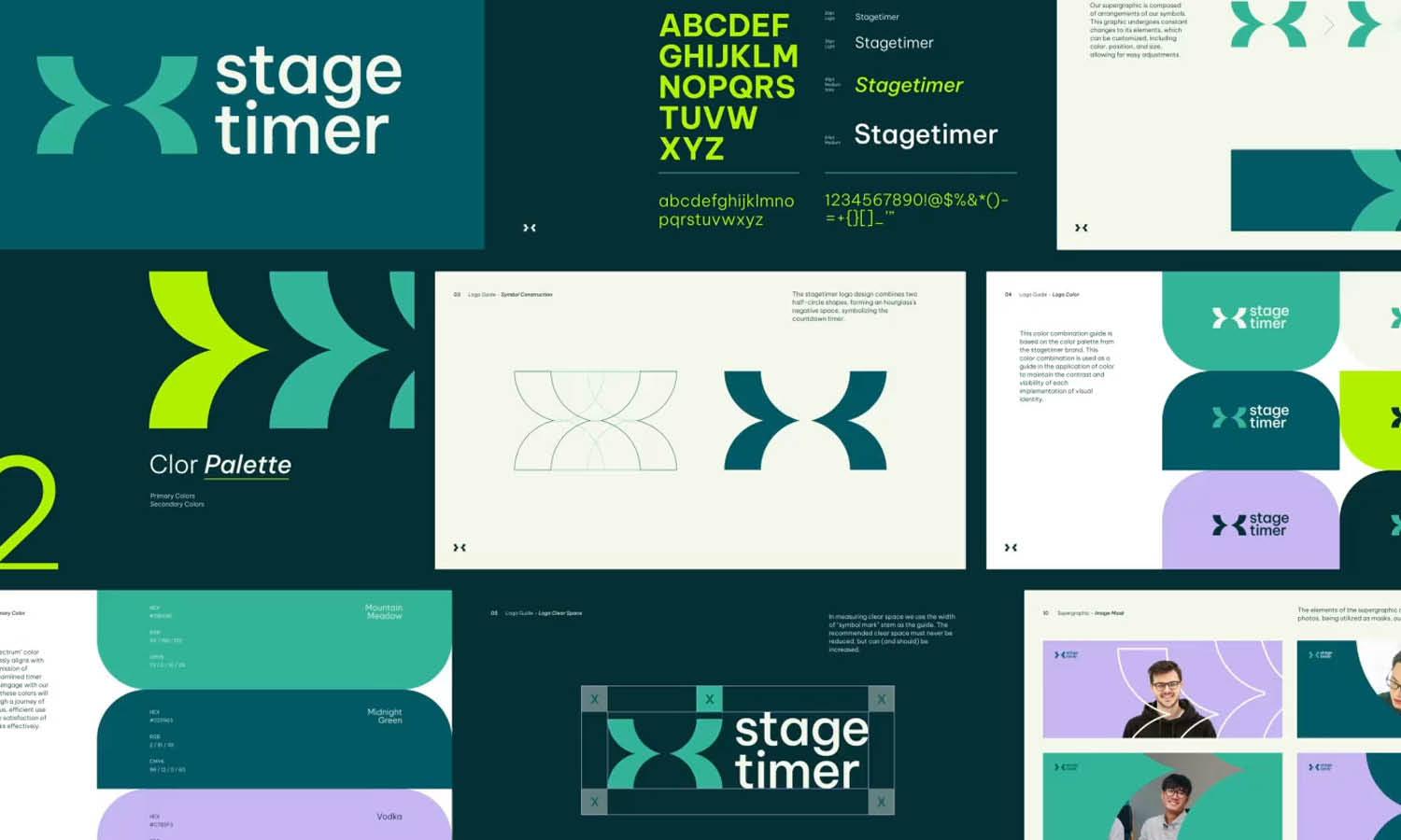
Created by Teguh Irvan Ariyanto | https://dribbble.com/shots/19023789-Columbus-Brand-Guidelines
Responsive Logo Design: Adapting to Multiple Devices
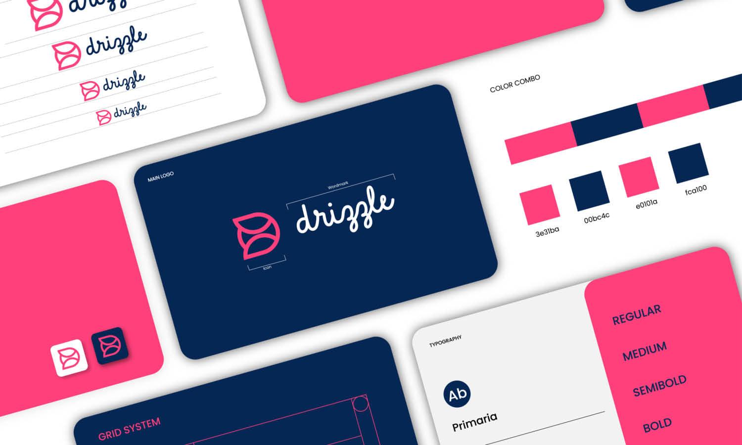
In the digital age, where a brand's visibility spans across various devices and platforms, the concept of responsive logo design becomes crucial. Responsive logo design ensures that your logo effectively adapts to different sizes, dimensions, and resolutions, maintaining its integrity and recognizability across all devices. This approach to logo design takes into account the evolving nature of how we interact with brands in a digitally dominated world.
Understanding Responsive Logo Design
Responsive logo design is the process of creating multiple logo variations to suit different digital mediums. Each variation should be optimized for specific screen sizes and platforms while maintaining the brand's core visual elements. This practice ensures that your logo remains legible, visually appealing, and consistent across devices, from large desktop monitors to compact smartphones.
The Need for a Flexible Logo
As screen sizes shrink, details in a logo can become indiscernible. In responsive design, the logo must be simplified as the display size decreases. This doesn’t mean a complete redesign; rather, it involves creating scaled-down versions that retain the most distinctive elements of the original logo. For instance, you might have a full logo with the brand name and tagline for desktops, and a simplified icon or monogram for mobile devices.
Creating Variations While Maintaining Brand Identity
The challenge in responsive logo design is to produce variations that, despite their differences in size and complexity, are unmistakably part of the same brand. This coherence can be achieved through consistent use of color, style, and other core elements. The goal is for the audience to recognize the brand regardless of which version of the logo they see.
Scalability and Vector Graphics
Vector graphics play a pivotal role in responsive logo design. Unlike raster images, vectors are not made up of pixels and therefore can be scaled up or down without losing quality. This quality makes vector graphics ideal for creating different logo versions that are clear and crisp at any size.
Testing Across Devices
An essential step in responsive logo design is thorough testing across multiple devices. This process helps identify any issues with logo readability or aesthetics on different screens. Testing should not be limited to digital displays; consider how the logo appears in print, on merchandise, and other physical mediums.
Simplicity Is Key
At its heart, responsive logo design relies on simplicity. Complex logos can lose their impact when reduced to smaller sizes. Simplifying a logo to its most basic elements ensures it stays effective and recognizable, even on the smallest of screens. Elements like color, shape, and font should be simplified while still capturing the essence of the brand.
Prioritizing Function Over Form
While aesthetics are important, the functionality of a logo in responsive design takes precedence. Every version of the logo must be functional in its respective context, whether it's providing brand recognition on an app icon or conveying the company's ethos on a website banner. The logo's design should not just be about looking good; it should also fulfill its fundamental role of brand representation across different platforms.
Responsive logo design is not just a trend but a fundamental shift in how logos are conceived and created. In an era where digital presence is scattered across a multitude of devices and platforms, the ability of a logo to adapt its size and dimension while maintaining its core identity is indispensable. A responsive logo speaks of a brand that is modern, adaptable, and attuned to the needs and habits of its audience. It’s an essential strategy for any brand looking to thrive in the dynamic digital landscape, where flexibility and visibility are key to creating a lasting impression.

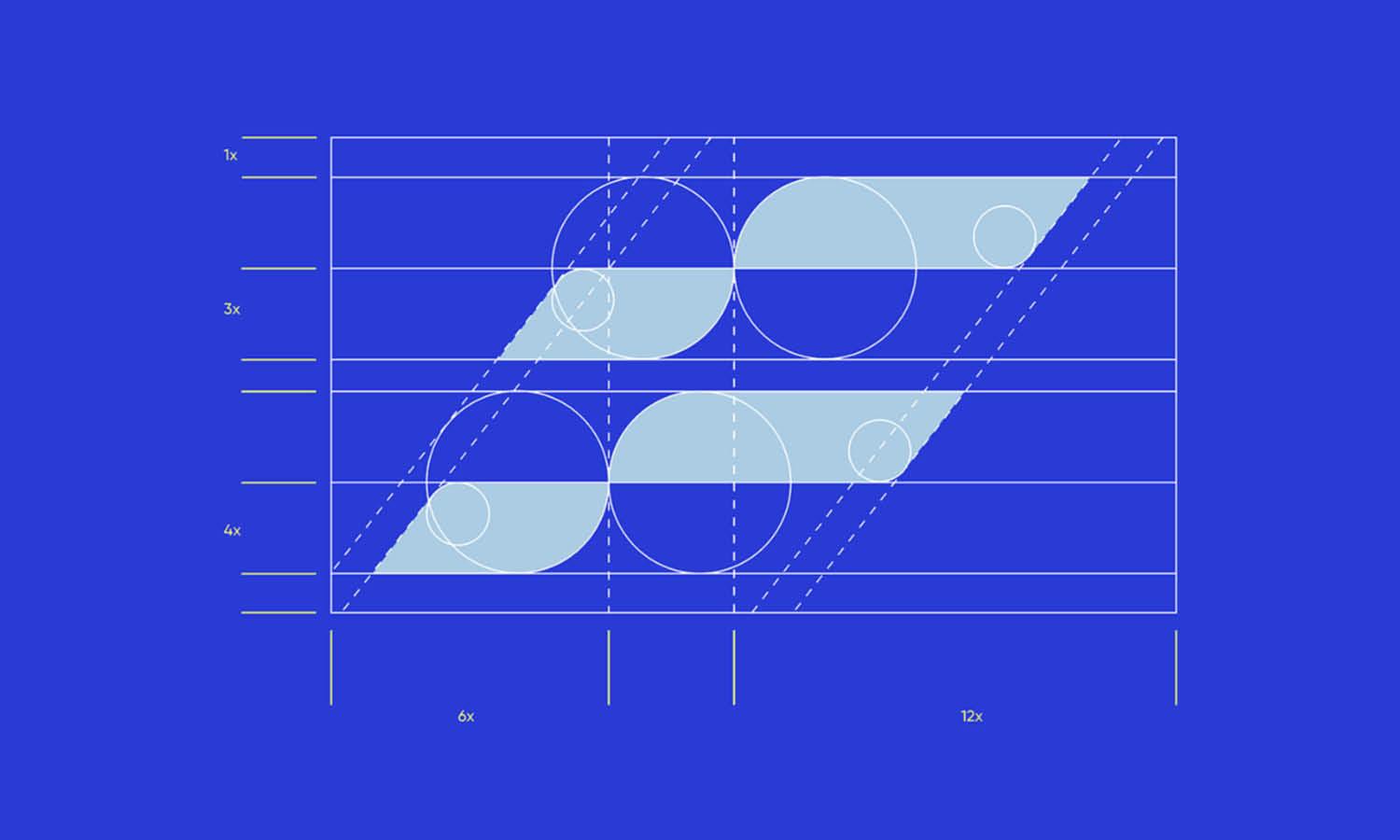
Created by VORONOI | https://dribbble.com/shots/3979176-Guideline
Tools and Software for Perfect Logo Sizing
In the pursuit of achieving the perfect logo design, size, and dimension, leveraging the right tools and software is essential. These tools not only streamline the design process but also ensure precision and efficiency in sizing your logo for various applications. Whether you are a seasoned designer or just starting out, understanding and utilizing these tools can significantly enhance your logo design workflow.
Adobe Illustrator
Adobe Illustrator is a cornerstone in the world of graphic design, particularly for logo creation. Renowned for its sophisticated vector graphic capabilities, Illustrator enables designers to create logos that are scalable to any size without losing quality. This feature is vital when working with different dimensions, ensuring that your logo retains its clarity and crispness whether it's on a small business card or a large billboard. Illustrator’s user-friendly interface, combined with powerful tools like the Artboard for managing different logo sizes and the Pen tool for precision shaping, makes it a top choice for professional logo design.
CorelDRAW
CorelDRAW is another vector graphic editor that's highly favored for logo design. It stands out with its intuitive interface and robust toolset that includes powerful typography controls, professional photo-editing capabilities, and versatile page layout functions. Its ability to manage complex layouts and render graphics at any size makes it a strong contender for designing responsive logos that need to adapt to various dimensions.
Sketch
Sketch is a vector-based tool predominantly used for web and interface design, but it’s also very effective for creating and resizing logos. Its lightweight framework and simple grid system make it ideal for designing logos that need to be consistent across different digital platforms. The ability to export logos in multiple resolutions and formats directly from the software enhances its utility in responsive logo design.
Inkscape
Inkscape is a free, open-source vector graphic software that serves as an excellent alternative to paid software. It offers a range of features such as object creation, object manipulation, fill, and stroke tools, ideal for crafting and sizing logos. Its capabilities to scale logos without losing quality and its user-friendly interface make it accessible for beginners and professionals alike.
Affinity Designer
Affinity Designer is gaining popularity for its precision in handling vector graphics. It provides an impressive array of tools specifically tailored for professional logo design, including advanced color and lighting manipulation, dynamic symbols, and responsive alignment tools. The software’s ability to work in both vector and raster workspaces is particularly beneficial for designers looking to fine-tune the dimensions and appearance of their logos across various mediums.
Online Logo Makers
For those seeking a more straightforward approach, online logo makers like Canva, Looka, or Hatchful offer simplified tools for creating logos with predefined templates and dimensions. These platforms are user-friendly and often come with a library of icons, fonts, and color palettes, making them suitable for quick logo designs or for small businesses looking to develop their branding without delving deeply into complex design software.
Responsive Logo Design Tools
Finally, specific tools focus on responsive logo design, like Logo Rank, which helps analyze and optimize logos based on size and dimension. Responsive logo design tools often come equipped with features to test how your logo looks across different devices and platforms, ensuring it adapts well in various environments.
Selecting the right tool or software for your logo design project is critical in achieving the desired size, dimension, and overall effectiveness of the logo. From vector-based applications like Adobe Illustrator and CorelDRAW to more simplified online platforms, each tool offers unique features and functionalities catering to different aspects of logo sizing. Understanding and utilizing these tools can significantly contribute to creating a logo that is not only aesthetically pleasing but also versatile and adaptable across different mediums.
Conclusion
In conclusion, understanding the intricacies of logo design, particularly in terms of size and dimension, is crucial for creating a powerful and lasting brand identity. The right sizing ensures that your logo is adaptable, recognizable, and impactful across all mediums. Remember, a well-designed logo transcends mere aesthetics; it encapsulates your brand's essence and communicates it effectively to your audience. Therefore, paying meticulous attention to the size and dimension in your logo design process is not just about visual appeal but about crafting a cohesive and resonant brand image. Embrace the principles, avoid common pitfalls, and utilize the best tools to ensure your logo stands out in a crowded marketplace.
Let Us Know What You Think!
These fantastic logo design articles are written and curated by Kreafolk's team. We hope you enjoy our information and remember to leave us a comment below. Cheers!
Related Articles
- How To Increase The Resolution Of A Logo Design
- Complete Guide: Perfect Logo Design Size For Websites
- Complete Guide: Perfect Logo Design Size For Prints





Leave a Comment