
30 Best Futuristic Logo Design Ideas You Should Check

Source: Vask®️ Studio, Seventy Studios®, Dribbble, https://dribbble.com/shots/19039361-Seventy-Studios
Futuristic logos are not limited to chrome effects, neon colors, or obvious science-fiction imagery. The most effective designs suggest progress through shape, typography, movement, structure, and visual experimentation. For brands connected to technology, gaming, digital products, creative industries, or innovation, the right futuristic identity can communicate a forward-looking personality before a single word is read. The futuristic logo design ideas below cover several distinct directions, from restrained geometric marks to expressive digital and space-inspired concepts. Some rely on minimal forms, while others use depth, distortion, or unconventional lettering. The goal is not to copy a visual trend, but to understand which design language best matches the character of a brand and can remain recognizable across real-world applications.
Futuristic Logo Design Ideas

Source: Logotypely, Nuworld, Dribbble, https://dribbble.com/shots/25896489-Nuworld-Futuristic-Logo-Desig-for-AI-Powered-Advertising-Brand

Source: Vask®️ Studio, Neltar™, Dribbble, https://dribbble.com/shots/15970572-NELTAR

Source: VASK®️ Studio, Harone®️, Dribbble, https://dribbble.com/shots/17424102-Harone-Visual-Identity

Source: Gonza Moreira, Flipando.ai®, Dribbble, https://dribbble.com/shots/20428143-Flipando-ai-Branding-Exploration

Source: Imtiaz Hossain Naim, Viamotive, Dribbble, https://dribbble.com/shots/19931690-Viamotive-electro-vehicle-company-branding

Source: Imtiaz Hossain Naim, Devise Real Estate, Dribbble, https://dribbble.com/shots/19043321-Devise-Real-Estate-Logo-Brand-Identity-Design

Source: Eugene MT, Solearica, Dribbble, https://dribbble.com/shots/20544623-Solearica-Approved-Logo-Design

Source: MD AI Amin, Diras, Dribbble, https://dribbble.com/shots/27361447-Diras-Minimal-Futuristic-Logo-Design

Source: Alen Pavlovic, R1ng, Dribbble, https://dribbble.com/shots/19959645-R1NG-Wordmark

Source: Imtiaz Hossain Naim, Devise Real Estate, Behance, https://www.behance.net/gallery/150032051/Devise-Real-Estate-Logo-Brand-Identity-Design

Source: Vask®️ Studio, Blend®, Dribbble, https://dribbble.com/shots/20468539-BLEND-Brand-Identity

Source: Md Al Amin, Orbitals, Dribbble, https://dribbble.com/shots/19272262-O-Logo-Orbitals

Source: Mehedi, Stride, Behance, https://www.behance.net/gallery/228791167/Stride-Logo-Modern-Tech-Branding

Source: Khabib Khandakar, Web3 Platform Lgoo Design, Dribbble, https://dribbble.com/shots/26737372-Web3-Platform-Logo-Design-For-Sale

Source: Vask®️ Studio, North®, Dribbble, https://dribbble.com/shots/16118271-NORTH

Source: Vask®️ Studio, Dullop®, Dribbble, https://dribbble.com/shots/16561458-dullop-Visual-identity

Source: Vadim Carazan, Star for sale, Dribbble, https://dribbble.com/shots/17430816-Star-for-sale

Source: Imtiaz Hossain Naim, Visix VR, Dribbble, https://dribbble.com/shots/20284534-Visix-VR-Icon

Source: Vask®️ Studio, Cetan®, Dribbble, https://dribbble.com/shots/16513001-CETAN-Logo-design

Source: Ahmed, Marschfa Logo Design, Dribbble, https://dribbble.com/shots/25070106-Marschfa-Logo-Design

Source: Pixtocraft, Digiteck, Dribbble, https://dribbble.com/shots/16840802-D-tech-logo-futuristic-technology

Source: Ilham Albab, Echoes, Dribbble, https://dribbble.com/shots/14619354-ECHOES

Source: Vask®️ Studio, Netro®, Dribbble, https://dribbble.com/shots/16438363-netro-Visual-identity

Source: Alen Pavlovic, Hype, Dribbble, https://dribbble.com/shots/19583957-Hype

Source: Riya Moni, Blockfi, Dribbble, https://dribbble.com/shots/20647656-logo-design-brand-identity-Blockf

Source: Babu Ahmed, Finta, Dribbble, https://dribbble.com/shots/19435746-Finta-letter-F-tech-logo

Source: Vask®️ Studio, Sonde®, Dribbble, https://dribbble.com/shots/19958698-sonde-Brand-Identity

Source: Khabib, Mao, Dribbble, https://dribbble.com/shots/19488325-MAO-A-Blockchain-service-company

Source: Amit, Howel, Dribbble, https://dribbble.com/shots/20632207-H-letter-Howel-branding-modern-logo

Source: Vask®️ Studio, Seventy Studios®, Dribbble, https://dribbble.com/shots/19039361-Seventy-Studios
Visual Elements That Give Futuristic Logos Their Character
A logo often feels futuristic because familiar elements are treated in unfamiliar ways. Sharp geometry can suggest precision, while rounded forms may feel more fluid and advanced. Abstract symbols create room for interpretation, and unusual typography can make even a simple wordmark look distinctive. Negative space, gradients, transparent layers, modular structures, and implied motion can also strengthen the effect. The key is control. A logo does not become more futuristic simply because it contains more digital effects. Strong concepts usually have one clear visual idea supported by deliberate spacing, proportion, and contrast. This balance helps the identity feel experimental without becoming difficult to recognize or reproduce.
Minimal and Geometric Futuristic Logo Design Ideas
Clean geometry is one of the most versatile ways to create a forward-looking identity. These concepts use structure, repetition, symmetry, and abstraction to suggest precision without relying on heavy decoration.
Interlocking Geometric Forms
Connected triangles, circles, or angular shapes can form compact symbols that feel engineered and intelligent. Overlapping parts can also suggest collaboration, systems, or connected technology.
Abstract Polygon Symbols
Polygon-based marks work well when a brand wants a sharp, technical appearance. Irregular angles can add energy, while controlled symmetry keeps the symbol visually stable.
Modular Grid Marks
Repeated squares, lines, or blocks arranged on a grid can create a system-driven logo. This approach feels especially suitable for digital platforms, architecture, data, and software brands.
Negative-Space Technology Symbols
A hidden letter, arrow, circuit path, or secondary form can make a minimal logo more memorable. Negative space adds visual depth without requiring extra detail.
Circular Orbit Emblems
Rings, arcs, and orbit-like paths naturally imply movement and connection. They can reference networks, exploration, communication, or continuous innovation without showing literal planets.
Fragmented Geometry
Breaking a solid symbol into controlled segments creates a sense of digital construction or transformation. The gaps should feel intentional rather than making the mark appear incomplete.
Symmetrical Tech Symbols
Mirrored shapes create a precise, controlled appearance that suits brands emphasizing engineering or advanced systems. Small asymmetrical details can prevent the result from feeling overly rigid.
Continuous-Line Futuristic Marks
A single uninterrupted line can form letters, icons, or abstract symbols with a sleek visual rhythm. This technique works best when the path remains easy to follow at small sizes.
Isometric Logo Forms
Isometric angles give flat graphics subtle dimensionality. Cubes, blocks, and connected planes can suggest digital spaces, platforms, or technical structures without requiring realistic 3D rendering.
Minimal Abstract Letterforms
Initials can be reduced into unusual geometric shapes that function as standalone symbols. Strategic cuts, extensions, and overlaps can give familiar letters a distinctly futuristic personality.
Digital and Dimensional Futuristic Logo Ideas
Some futuristic identities benefit from a stronger sense of light, depth, and motion. These directions borrow from screens, interfaces, virtual environments, and digital media while keeping the main mark recognizable.
Neon Gradient Logos
Bright transitions between electric hues can give simple symbols a luminous digital presence. Gradients are most effective when the underlying shape remains strong enough to work without color.
Holographic-Style Marks
Iridescent surfaces and shifting color effects can suggest advanced materials or virtual interfaces. A restrained holographic treatment often feels more sophisticated than applying it across every element.
Glitch-Inspired Logos
Controlled distortion, displaced sections, and interrupted edges can create a sense of digital interference. Keeping the original silhouette readable prevents the effect from turning into visual noise.
Pixel-Based Symbols
Blocks and pixel fragments reference screens, code, and digital construction. They can be arranged into letters, icons, or abstract forms while retaining a clear overall silhouette.
Layered Transparent Forms
Overlapping translucent shapes create visual depth through intersection rather than shadow. The approach works especially well for brands that want a clean identity with a subtle technological character.
Three-Dimensional Monograms
Letters can be constructed as folded planes, extruded forms, or sculptural blocks. A dimensional monogram feels strongest when it remains recognizable even in a simplified flat version.
Light-Trail Symbols
Curved or angular lines that resemble moving light can suggest speed, energy, or data flow. Their direction should reinforce the composition instead of surrounding the logo decoratively.
Digital Wave Logos
Waveforms can reference signals, sound, communication, or information exchange. Smooth curves feel fluid and intelligent, while sharper wave patterns can create a more technical impression.
Portal-Inspired Emblems
Concentric frames, openings, and receding forms can create the illusion of entering another space. This visual device suits brands connected to gaming, virtual experiences, or immersive technology.
Motion-Driven Abstract Marks
Forms that appear to rotate, stretch, split, or accelerate can make a static logo feel active. Implied movement is often enough; the design does not need actual animation to communicate momentum.
Sci-Fi and Experimental Futuristic Logo Ideas
More expressive concepts can borrow visual cues from science fiction, artificial intelligence, space exploration, and speculative technology. The strongest results reinterpret these references rather than illustrating them literally.
Spacecraft-Inspired Symbols
Aerodynamic angles and tapered forms can suggest speed and exploration without drawing an actual rocket. Abstracting the silhouette keeps the identity versatile.
Planetary Ring Logos
Circular forms crossed by rings or arcs create a familiar space reference that can still feel modern. Simplified construction helps prevent the concept from becoming overly illustrative.
Artificial Intelligence Symbols
Nodes, connected pathways, and neural patterns can represent computational intelligence. Simplifying the network into a distinctive arrangement avoids the generic “tech icon” appearance.
Cybernetic Eye Marks
Combining an eye shape with geometric lines, digital apertures, or mechanical details can suggest awareness, scanning, or intelligent systems. A restrained composition usually feels more credible.
Robotic Letterforms
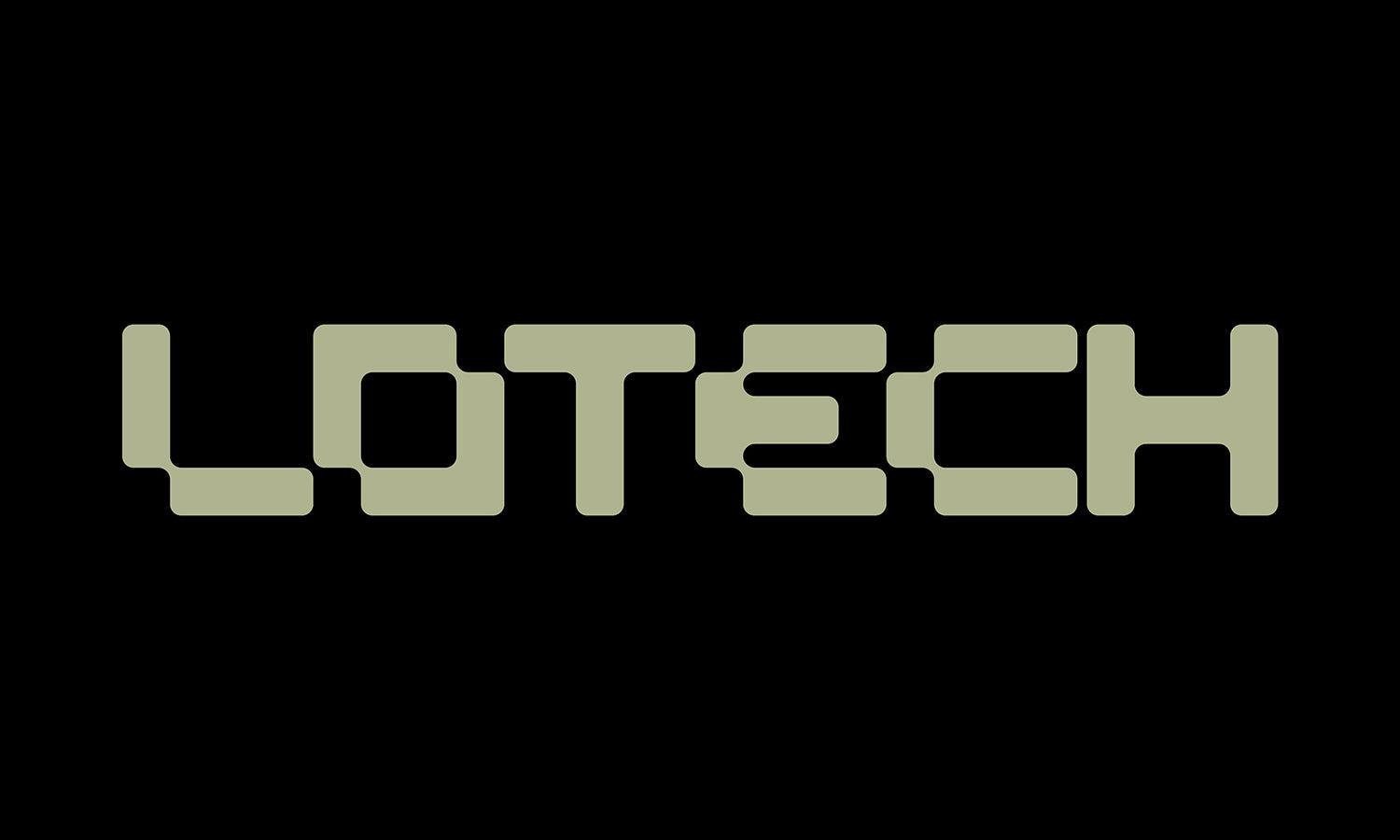
Custom letters with segmented strokes, mechanical joints, or angular cuts can give a wordmark an engineered personality. Legibility should remain stronger than the decorative modifications.
Circuit-Inspired Monograms
Circuit paths can be integrated into initials through small branches and terminals. Limiting the number of connections prevents the monogram from becoming too intricate at reduced sizes.
Futuristic Shield Emblems
A traditional shield can be transformed using sharper proportions, cut corners, or segmented construction. The result can communicate security and strength without looking historical or heraldic.
Alien-Inspired Abstract Symbols
Unfamiliar shapes can create a sense of mystery and otherworldly intelligence. Symmetry, repetition, or consistent geometry helps these experimental marks still feel intentional.
Quantum and Particle Marks
Small dots, orbital paths, and connected points can reference microscopic systems or advanced science. The concept works best when the arrangement forms a clear and memorable silhouette.
Experimental Custom Typography
A wordmark can become futuristic through stretched proportions, missing strokes, connected characters, or unexpected spacing. Custom typography is especially useful when a brand wants originality without using a separate icon.
Choosing a Futuristic Direction That Fits the Brand
A futuristic identity should reflect the brand’s personality rather than a designer’s collection of effects. A software company focused on precision may benefit from modular geometry, while a gaming brand could support a more expressive dimensional mark. A premium technology brand may need a restrained wordmark instead of glowing gradients or glitch textures. Start with a few characteristics the brand should communicate, such as intelligent, disruptive, fast, experimental, secure, or refined. Those traits can guide choices in shape, typography, and visual intensity. Test the concept in monochrome, at small sizes, and across common applications such as app icons, websites, packaging, signage, and social profiles. If the logo only feels futuristic when an effect is applied, the underlying idea may need more development.
Frequently Asked Questions
What Colors Work Well for Futuristic Logo Designs?
Electric blues, violets, cyan, metallic neutrals, black, and gradient combinations are frequently associated with futuristic visuals. However, the strongest palette is the one that suits the brand. A monochrome identity can feel just as advanced when the forms, spacing, and typography communicate the right character.
Which Fonts Give a Logo a Futuristic Appearance?
Geometric sans serifs, extended letterforms, squared characters, and custom display typography can all create a forward-looking impression. Rather than choosing an exaggerated sci-fi font, designers can modify a cleaner typeface through cuts, spacing, ligatures, or altered proportions to create something more distinctive.
Can a Futuristic Logo Still Be Minimal?
Yes. Minimalism can strengthen a futuristic logo because precise geometry, negative space, and unusual proportions become easier to notice when decoration is limited. A simple mark may also adapt more effectively to app icons, interfaces, small labels, and other applications where complex visual effects would disappear.
How Can Futuristic Logos Avoid Looking Outdated?
Build the identity around a strong shape or wordmark first, then treat gradients, glow, metallic finishes, and distortion as optional layers. Trends in digital effects can change quickly, while distinctive construction and typography tend to remain usable for longer. A flexible core mark gives the brand room to evolve.
Conclusion
The most compelling futuristic logos often begin with one unusual visual decision rather than a pile of high-tech effects. A cut in a letter, an unexpected geometric relationship, a sense of motion, or a carefully controlled dimensional form can be enough to make an identity feel ahead of its time. Use these directions as starting points for experimentation, then refine the chosen concept until it feels specific to the brand. A futuristic logo works best when its originality comes from the idea itself, giving the identity a recognizable character that can survive beyond the visual trend that first inspired it.
Let Us Know What You Think!
Every information you read here are written and curated by Kreafolk's team, carefully pieced together with our creative community in mind. Did you enjoy our contents? Leave a comment below and share your thoughts. Cheers to more creative articles and inspirations!
Related Articles









Leave a Comment