30 Best Flat Logo Design Ideas You Should Check

Source: Gennady Savinov, Moore Museum, Dribbble, https://dribbble.com/shots/16488087-Moore-Museum-Logo
Flat logo design has become one of the most stylish and versatile approaches in the branding world. Its clean, simple aesthetic makes it both modern and timeless, ensuring that logos look great on everything from websites and apps to business cards and billboards. By stripping away unnecessary details, flat logo design highlights bold colors, strong typography, and clever shapes that instantly capture attention. The beauty of this style is that it balances minimalism with creativity, allowing businesses to communicate their identity in a sleek, straightforward way.
This article is going to showcase some of the best flat logo design ideas to check, whether you’re an entrepreneur, a creative agency, or a designer looking for fresh inspiration. From playful geometric icons to bold lettermarks and subtle monochrome treatments, flat design can adapt to nearly any industry. It works especially well in the digital space, where clarity and scalability are crucial. With the right approach, a flat logo can feel dynamic, approachable, and highly professional. If you’re ready to rethink how simplicity can be powerful, these ideas will show you just how effective flat logo design can be in today’s competitive visual landscape.
Flat Logo Design Ideas

Source: Konstantin Reshetnikov, Guard, Dribbble, https://dribbble.com/shots/15511319-Guard

Source: MD Mahfuj, Medisquare, Dribbble, https://dribbble.com/shots/16334224-Logo-Design-for-medisquare

Source: Ikram H Sakib, FRT, Dribbble, https://dribbble.com/shots/16275079-Secret-Garden

Source: Konstantin Reshetnikov, Secret Garden, Dribbble, https://dribbble.com/shots/16275079-Secret-Garden

Source: Vask, Leroty, Dribbble, https://dribbble.com/shots/16347916-Leroty-Logo-design

Source: Sumon Yousuf, Satr, Dribbble, https://dribbble.com/shots/18295281-Satr-Logo-Design

Source: Charlie Isslander, Forest.io, Dribbble, https://dribbble.com/shots/16821343-Forest-io-Brand-Direction-Website

Source: Vask, Dineup, Dribbble, https://dribbble.com/shots/17055474-Dineup-Logo-design

Source: Milos Bojkovic, Blocksy, Dribbble, https://dribbble.com/shots/14473494-Blocksy-logo

Source: Mparvej, Xevisn, Dribbble, https://dribbble.com/shots/17041251-Xevisn-Logo-Design

Source: Sergio Joseph, Bluprnt, Dribbble, https://dribbble.com/shots/17534501-Bluprnt

Source: Gennady Savinov, Molecula, Dribbble, https://dribbble.com/shots/16519600-Molecula-Logo

Source: Nikoloz Narsia, FastForward, Dribbble, https://dribbble.com/shots/15655248-FastForward

Source: Dylan Menke, Star, Dribbble, https://dribbble.com/shots/16414849-Star-Logo

Source: Ahmed Creatives, Dorek, Dribbble, https://dribbble.com/shots/17594967-Dorek

Source: Konstantin Reshetnikov, Bison, Dribbble, https://dribbble.com/shots/15234500-Bison

Source: Tornike Uchava, Dribbble, https://dribbble.com/shots/18090829-an-abstract-logo

Source: Nahid Parvez, Behance, https://www.behance.net/gallery/235295501/Logo-design-with-76

Source: Salyh Berdiyev, Behance, https://www.behance.net/gallery/119547245/Logos

Source: Tornike Uchava, Dribbble, https://dribbble.com/shots/18100106-Abstract-sun-symbol

Source: Logo Love, Vint, Dribbble, https://dribbble.com/shots/17876556-Typography-logo-creative-modern-colorful

Source: Vask, Neon, Dribbble, https://dribbble.com/shots/16726899-NEON-Logo-design

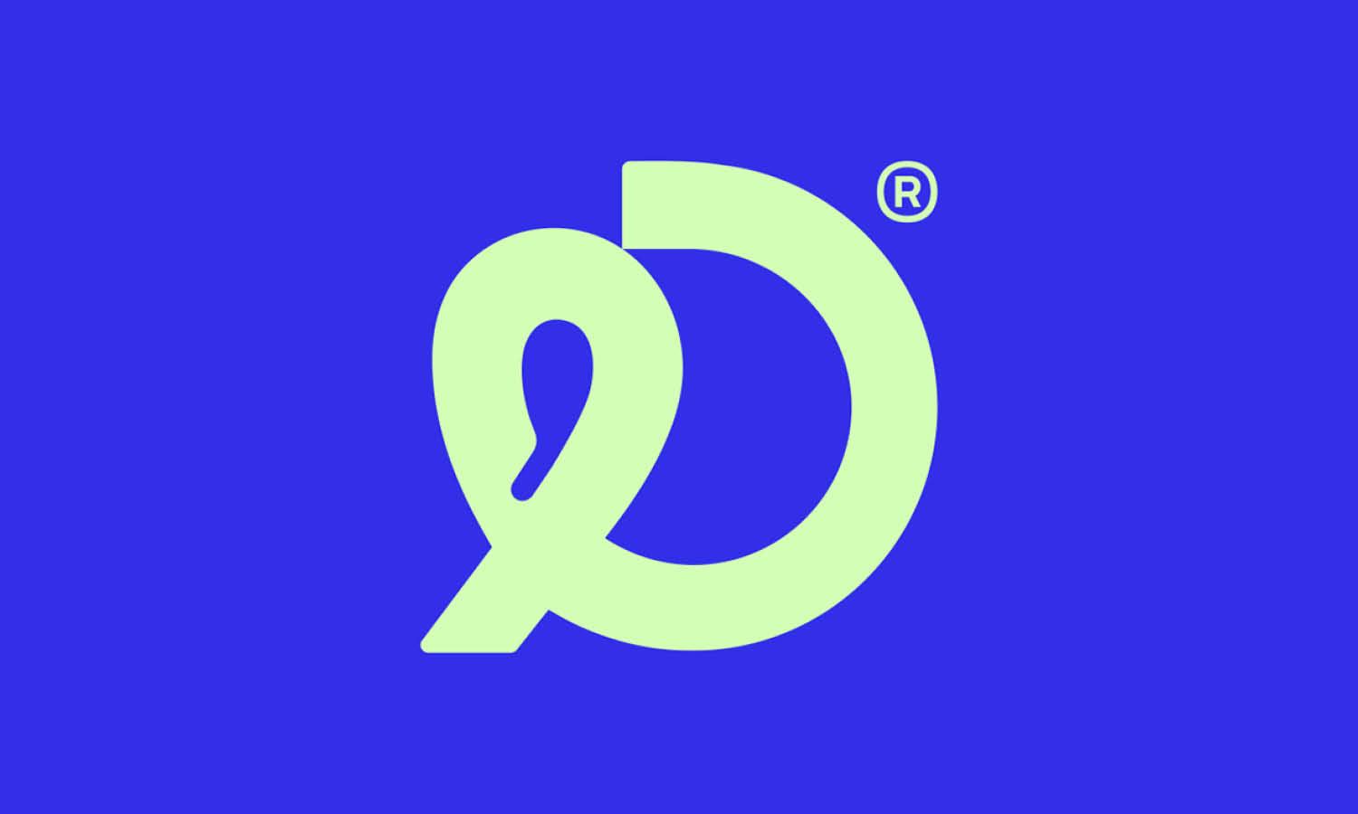
Source: Fokhrul Islam, Behance, https://www.behance.net/gallery/212101705/Letter-D-Business-Modern-Logo-Design-%28Unused%29

Source: Wesley Marc Bancroft, Finish, Dribbble, https://dribbble.com/shots/16592138-Finish-Brand

Source: Milos Bojkovic, Decipad, Dribbble, https://dribbble.com/shots/17095770-Decipad-identity

Source: Stefano Iorio, Exposito, Behance, https://www.behance.net/gallery/98417139/Exposito

Source: Gabriel Hernandez, Bru Coffee Roasters, Dribbble, https://dribbble.com/shots/18160244-Bru-Coffee-Roasters

Source: Vect Plus, Behance, https://www.behance.net/gallery/160864095/Modern-minimalist-home-logo

Source: Gennady Savinov, Doublex, Dribbble, https://dribbble.com/shots/16528655-Doublex-Logo

Source: Gennady Savinov, Moore Museum, Dribbble, https://dribbble.com/shots/16488087-Moore-Museum-Logo
What Are the Core Principles of Flat Logo Design?
Diving into the world of flat logo design is like stepping into a clean, uncluttered room—it’s refreshing, it’s inviting, and it makes you want to stay a while. Flat logo design has become a favorite among designers and brands for its striking simplicity and high adaptability. Let’s break down the core principles that make flat logos not just pretty pictures, but powerful tools for branding.
Simplicity Is Key
At the heart of flat logo design lies the principle of simplicity. This design philosophy is all about stripping away unnecessary elements that could clutter a logo’s look. Flat logos thrive on minimalism, using only essential shapes and elements to convey the brand’s message. This not only makes the logo more recognizable but also ensures it’s easily memorable. Think of it as the brand’s elevator pitch in visual form—short, sweet, and to the point.
Vibrant Color Schemes
Color plays a pivotal role in flat design. Because the shapes and elements are simplified, the colors need to do a lot of heavy lifting. Flat logos often feature bright, bold color palettes that attract the eye without the support of gradients or shadows. These vibrant colors help in setting the tone of the brand and making the logo pop against various backgrounds.
Clean Typography
Typography in flat logo design is all about readability and harmony with the logo’s visual elements. Sans-serif fonts are a popular choice because they’re clean, modern, and display well at any size. The idea is to ensure that the text is as approachable and straightforward as the symbols used in the logo.
Focus on Usability
A core principle of flat design is usability. This means that a flat logo must be versatile and scalable, maintaining its integrity and impact across different mediums and devices. Whether it's displayed on a giant billboard or a small smartphone screen, a flat logo remains crisp and distinct without losing any detail.
Emphasis on Geometry
Flat logo design often leans heavily on geometric shapes—circles, squares, triangles, and the like. These shapes are not just chosen for their aesthetic value; they help in creating a sense of balance and order in the logo. Geometric forms are easily recognizable and provide a clean, organized look, which enhances the logo’s ability to communicate quickly and effectively.
By adhering to these principles, flat logo design achieves a balance between beauty and functionality, making it a powerful tool for brands in today’s digital landscape. The straightforwardness of flat design doesn’t just capture attention—it holds it, making sure that the brand’s message is clear and memorable. So, when thinking about creating a flat logo, remember: keep it simple, make it vibrant, choose clean fonts, prioritize usability, and play with geometry.
What Shapes Work Best in Flat Logo Design?
When it comes to flat logo design, it’s all about getting back to the basics with shapes that pack a punch! In the minimalist universe of flat design, the shapes you choose are not just elements; they’re the backbone of your visual identity. Opting for the right shapes can elevate your logo from just okay to oh-wow! Let’s explore five shapes that are not only effective but also incredibly fun to play with in flat logo design.
Circles
Circles are the universal symbol of unity, wholeness, and infinity. In flat logo design, circles can convey a sense of harmony and protection. They are smooth, which makes them pleasing to the eye and easy to recognize. Brands looking to project a friendly, inclusive, and approachable image can benefit immensely from incorporating circular shapes in their logos.
Squares and Rectangles
Squares and rectangles represent stability, trustworthiness, and balance. These shapes are often used in flat logo design to convey strength and reliability. A square’s straight lines and right angles imply order and efficiency, making it ideal for businesses that want to project professionalism and robustness.
Triangles
Triangles are dynamic shapes that can evoke a sense of action and direction, depending on how they’re oriented. Pointing upwards, a triangle can symbolize growth and aspiration; when directed downwards, it suggests stability and grounding. They are perfect for companies that want to express movement and progression or for those that wish to highlight a grounded, solid foundation.
Organic Shapes
While geometric shapes are a staple in flat design, organic shapes, which are typically asymmetrical and complex, can add a touch of softness and uniqueness to a logo. These shapes are inspired by nature—think leaves, clouds, or water droplets. Organic shapes can make a logo feel more human and personal, suitable for brands that want to appear friendly, natural, or innovative.
Lines and Stripes
Lines and stripes can bring a sense of motion and texture to a flat logo. Horizontal lines often imply tranquility and calm, while vertical lines suggest strength and boldness. Diagonal lines, on the other hand, are all about dynamism and speed. Lines can be used to craft minimalist logos that are not only memorable but also visually striking.
Using these shapes in your flat logo design can help communicate your brand’s story in a simple yet effective way. The key is to choose shapes that resonate with your brand’s personality and values, creating a logo that’s not just visually appealing but also full of meaning. Remember, in the world of flat design, less is more.
What Colors Work Best In Flat Logo Design?
When it comes to flat logo design, color isn’t just decoration—it’s the heartbeat of the brand. Without flashy shadows, textures, or 3D effects, color takes center stage, setting the mood and personality of the logo instantly. Choosing the right palette can make the difference between a logo that pops off the screen and one that blends into the background. Here are five fun and unique ways to think about color in flat logo design:
Bold and Vibrant Hues
Flat logo design thrives on strong, unapologetic colors that grab attention in an instant. Think of bold reds, electric blues, or sunshine yellows. These shades bring life and energy to logos, making them memorable and dynamic. Bold colors also help establish a strong identity—perfect for brands that want to stand out in crowded digital spaces.
Monochrome Magic
Sometimes, less is more. A flat logo design in monochrome—using just black, white, or grayscale—can feel sleek, professional, and timeless. It’s a powerful option for brands aiming for sophistication and minimalism. A monochrome palette also ensures versatility, working seamlessly across all backgrounds and media.
Pastel Playfulness
For brands with a softer personality, pastel tones are a flat logo design gem. Gentle shades of mint green, lavender, peach, or baby blue can instantly communicate friendliness, creativity, and calmness. These colors work especially well for businesses in lifestyle, fashion, or creative industries that want an approachable vibe.
Contrasting Combos
Flat logo design is all about visual impact, and contrasting colors deliver just that. Pairing complementary hues like orange and teal, or purple and yellow, can create logos that are eye-catching without being overwhelming. High contrast makes designs readable and visually exciting, especially on digital platforms where visibility matters most.
Neutral and Earthy Tones
Not every flat logo needs to scream for attention—sometimes a whisper is more powerful. Earthy palettes like warm browns, olive greens, or sandy beige can bring a grounded, organic feel. Neutral tones also add elegance and balance, making them ideal for eco-friendly brands, wellness companies, or businesses seeking authenticity.
The best colors for flat logo design depend on the brand’s personality, target audience, and message. Whether you choose bold vibrancy, clean monochrome, playful pastels, striking contrasts, or grounded neutrals, the secret lies in letting color carry the story of the logo. Flat design strips away distractions, so the palette becomes the star of the show—making your brand unforgettable in its simplest form.
What Fonts Work Best with Flat Logo Design?
When it comes to flat logo design, picking the right font is like choosing the perfect accessory for your favorite outfit—it can make or break your look! In the sleek world of flat design, where every curve and line matters, the font you select is crucial. It needs to resonate with the logo’s vibe while ensuring it stays legible, scalable, and, most importantly, stylish. Let’s explore five fonts that play wonderfully with the ethos of flat logo design, making them excellent choices for anyone looking to make their brand pop!
Futura
Let’s start with a classic! Futura is a geometric sans-serif font that feels like it was tailor-made for flat design. Its clean, crisp lines and perfect circles speak the language of minimalism fluently. This font is a popular choice among designers who want to give their logos a modern, forward-thinking appearance. Its versatility means it can be bold and commanding or subtle and understated, depending on the weight you choose.
Gotham
If you’re aiming for that no-nonsense, direct-hit kind of vibe, Gotham is your go-to. This sans-serif typeface is famously straightforward, which makes it a fantastic match for any flat design logo. Gotham is incredibly versatile, readable, and carries a geometric structure that ensures it remains balanced and beautiful at any size.
Montserrat
Montserrat is like the cool kid of the typography world—fun, approachable, and always stylish. This font has the simplicity required for flat design but adds just enough character to keep things interesting. Its rounded letters provide a soft, friendly feel, making it perfect for brands that want to appear accessible and modern.
Roboto
Roboto is the Swiss Army knife of digital fonts. Designed specifically for clarity on digital screens, it’s a natural fit for logos that need to look great both online and off. With a mechanical skeleton and largely geometric forms, Roboto bridges the gap between accessibility and aesthetic appeal, making it a smart choice for any tech-savvy brand.
Proxima Nova
Combining the best qualities of a geometric font with humanist warmth, Proxima Nova strides the line between friendly and professional with unparalleled grace. It’s a hybrid that works incredibly well in flat design logos because it communicates clearly without sacrificing style. Proxima Nova is especially effective for startups and tech companies that need to project innovation with a human touch.
Choosing the right font for your flat logo design is about finding a balance between function and flair. These fonts not only ensure your logo is legible and scalable but also help convey your brand’s personality at a glance. The best font for your logo will resonate with your brand’s voice and values, creating a cohesive identity that speaks to your audience.
Conclusion
Flat logo design continues to be a powerful choice for brands that value clarity, versatility, and creativity. Its strength lies in reducing visuals to their purest form while still making a bold statement. By using smart shapes, playful typography, clever negative space, and impactful colors, flat logos remain both timeless and modern. They adapt seamlessly across platforms, from digital screens to print materials, without losing impact. For businesses seeking a clean yet memorable identity, flat logo design offers endless creative possibilities. It proves that simplicity is not a limitation but a design advantage that communicates professionalism and originality.
Let Us Know What You Think!
Every information you read here are written and curated by Kreafolk's team, carefully pieced together with our creative community in mind. Did you enjoy our contents? Leave a comment below and share your thoughts. Cheers to more creative articles and inspirations!


Leave a Comment