
30 Best Luxurious Logo Design Ideas You Should Check

Source: Toni Hukkanen, Nordic Topline, Behance, https://www.behance.net/gallery/98630251/Nordic-Topline-Branding-Packaging-Design
Luxury logo design works best when it communicates confidence without excess. Precise typography, balanced spacing, distinctive symbols, and controlled styling often feel more premium than elaborate decoration. For fashion, beauty, jewelry, hospitality, interiors, and other upscale brands, the goal is to look refined, memorable, and appropriate for the audience. The luxurious logo design ideas below range from elegant wordmarks and monograms to organic symbols, geometric marks, and sophisticated color treatments. The strongest direction depends on whether the brand should feel classic, modern, artistic, or understated.
Luxurious Logo Design Ideas

Source: Pixeldy, Luxury Logo Design, Dribbble, https://dribbble.com/shots/25954776-Luxury-Logo-design

Source: ThinkBold, Skibbereen Eagle, Behance, https://www.behance.net/gallery/28150581/Skibbereen-Eagle

Source: Artur Zingoni, Vogel Gin, Behance, https://www.behance.net/gallery/102845553/Vogel-Gin

Source: AR Harun, Cavelle, Behance, https://www.behance.net/gallery/209362571/CAVELLE-Logo-Design

Source: Ruku Moni, Luxury Logo Design, Dribbble, https://dribbble.com/shots/19106528-Luxury-Logo-Design

Source: Jubayer Ahmad, High-end branding luxury logo design, Dribbble, https://dribbble.com/shots/25940371-High-end-branding-luxury-logo-design

Source: Cansu Merdamert, Melie Jewelry, Behance, https://www.behance.net/gallery/144765361/Melie-Jewelry

Source: Kwangsu Shin, Montefortuna, Behance, https://www.behance.net/gallery/67210055/Montefortuna-Premium-Cuban-Cigars-Club

Source: Ahmed, Viman, Dribbble, https://dribbble.com/shots/24835672-Viman-Logo-Design

Source: Miki Grujic, Calypso, Behance, https://www.behance.net/gallery/137320645/Calypso-Clothing-Brand

Source: Bhaskaruni Harshita, Luxurious Logo Design, Dribbble, https://dribbble.com/shots/27591521-Luxurious-Logo-Design

Source: Baianat, Madenia, Behance, https://www.behance.net/gallery/131992813/Madenia-brand-design

Source: Violaine & Jeremy, Louie, Behance, https://www.behance.net/gallery/126747981/Louie-Restaurant

Source: Md Sayem, Luxurious Monogram Logo Design, Dribbble, https://dribbble.com/shots/26509785-Luxurious-Monogram-Logo-Design-Minimalist-Elegant-word-logo

Source: Graphéine, Léonie Paris, Behance, https://www.behance.net/gallery/117491405/Lonie-Paris-Storytelling-brand-design-Packaging

Source: Filip Panov, Wujhat, Dribbble, https://dribbble.com/shots/27371824-Wujhat-Brand-Identity

Source: Shaka Studio, Palazzo, Behance, https://www.behance.net/gallery/129874747/Palazzo-Branding-for-a-Luxury-Property-Development

Source: José Augusto Hykavy, Dr. Herbert Lewis, Behance, https://www.behance.net/gallery/95386801/Dr-Herbert-Lewis

Source: Asís, Snob Hôtel, Behance, https://www.behance.net/gallery/54900175/Snob-Hotel

Source: Alina Petukhova, Vina Del Sol, Behance, https://www.behance.net/gallery/215440021/Vina-Del-Sol-Private-winery-Brand-identiti

Source: Vinco Studio, Casa d'Arcã, Behance, https://www.behance.net/gallery/124865023/Casa-dArca

Source: Firma Design, Bleu la Soie, Behance, https://www.behance.net/gallery/115317465/Bleu-la-Soie-Brand-Identity

Source: Hardy Branding, Ferrari Carano, Behance, https://www.behance.net/gallery/137895183/Ferrari-Carano-Branding-Design-Concept

Source: Insigniada, Tranquil Luxury Villas, Behance, https://www.behance.net/gallery/106334257/Tranquil-Luxury-Villas-Brand-Strategy-Identity

Source: Metehan Dalgılıç, Lucas Hotel, Behance, https://www.behance.net/gallery/126605821/Lucas-Branding

Source: Michael Knapek, The Horse & Elephant, Behance, https://www.behance.net/gallery/104877747/Luxury-Bar-Restaurant-Branding-The-Horse-Elephant

Source: Carlos Mello, Castanea, Behance, https://www.behance.net/gallery/120011461/Castanea

Source: Coric Design, House of Gleason, Dribbble, https://dribbble.com/shots/24961533-House-of-Gleason-Logo-System

Source: Kieran Reilly, One Hyndland Avenue, Behance, https://www.behance.net/gallery/89060413/One-Hyndland-Avenue

Source: Toni Hukkanen, Nordic Topline, Behance, https://www.behance.net/gallery/98630251/Nordic-Topline-Branding-Packaging-Design
Elegant Typography-Based Luxury Logo Ideas
Typography can carry an entire luxury identity when the letterforms feel intentional. Small decisions involving stroke contrast, spacing, capitalization, and customization often determine whether a wordmark feels ordinary or polished.
High-Contrast Serif Wordmarks
High-contrast serifs combine thin hairlines with heavier strokes, creating an elegant rhythm for fashion, cosmetics, publishing, and premium retail. Generous spacing can make a simple brand name feel editorial and established.
Refined Didone Typography
Didone-inspired lettering suits sophisticated fashion and beauty branding. Its sharp serifs and dramatic contrast feel formal without decorative symbols, especially when surrounding elements remain minimal.
Wide-Letter-Spaced Wordmarks
Extra spacing gives a logo breathing room and quiet confidence. It works especially well with uppercase lettering and restrained layouts, helping the brand feel composed rather than crowded.
Custom-Lettered Brand Names
A customized wordmark can make familiar typography feel proprietary. Adjusting a terminal, joining letters, reshaping a crossbar, or modifying proportions creates subtle distinction while preserving polished simplicity.
Elegant Lowercase Typography
Lowercase lettering can create a softer, contemporary form of luxury. Clean curves, careful spacing, and distinctive details keep it approachable yet refined.
Luxurious Monogram Logo Design Ideas
Monograms compress a brand identity into a compact symbol, making them useful for packaging, labels, social avatars, and embossed details. Their character can feel historic or modern depending on construction.
Interlocking Initials
Overlapping initials suggest craftsmanship and tradition. Clear geometry keeps the letters readable while forming a unified symbol.
Minimal Single-Letter Monograms
A single initial can become a strong luxury mark when its shape is distinctive. A custom serif, unusual cut, or elegant stroke can turn one letter into a recognizable signature.
Geometric Monogram Construction
Building initials with grids, repeated angles, or modular shapes creates an architectural appearance. It suits contemporary luxury brands that favor precision over ornament.
Circular Monogram Emblems
Placing initials within a circle gives the logo a seal-like quality without feeling overly traditional. The frame also works well for labels, stamps, hardware, and digital uses.
Negative-Space Monograms
Negative space can hide a second letter or shape inside a primary form. The result adds visual intelligence without increasing complexity.
Refined Symbol-Based Luxurious Logo Ideas
Symbols allow luxury brands to communicate character beyond the name itself. The strongest designs simplify familiar references into distinctive forms instead of relying on literal, heavily detailed illustrations.
Minimal Crown Symbols
Crowns naturally suggest prestige, but ornate versions can feel predictable. Reducing the crown to a few elegant lines or geometric points creates a cleaner, more contemporary expression of status.
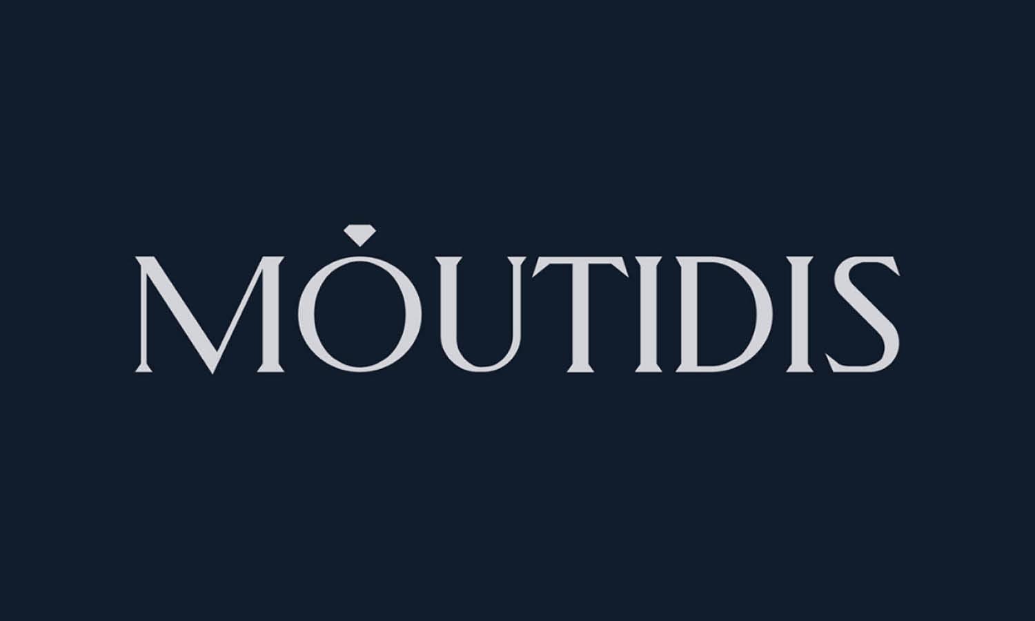
Elegant Diamond Icons
Diamond shapes communicate precision, rarity, and value. A simplified faceted form can work particularly well for jewelry, beauty, fashion, or premium service brands seeking a crisp and upscale visual cue.
Laurel-Inspired Marks
Laurel motifs can suggest distinction and heritage. Keeping the leaves sparse and symmetrical prevents the design from feeling ceremonial or old-fashioned while retaining its classic sense of accomplishment.
Abstract Jewel Forms
Instead of drawing a literal gemstone, a designer can use angled facets, mirrored planes, or crystalline geometry to create an original emblem. This makes the identity feel premium without becoming tied to one obvious symbol.
Architectural Symbols
Arches, columns, gates, and balanced structural forms can communicate permanence and quality. These motifs are especially effective for luxury interiors, hospitality, property, and heritage-inspired brands.
Organic and Artistic Luxury Logo Ideas
Not every luxurious identity needs sharp geometry or formal typography. Organic and artistic motifs can create softness, elegance, and personality while still maintaining a premium appearance.
Fine-Line Botanical Marks
Delicate branches, leaves, and floral forms can work beautifully for beauty, wellness, fragrance, hospitality, and lifestyle brands. Keeping line weight controlled and detail selective helps the illustration remain refined.
Minimal Swan Symbols
The curved neck and graceful silhouette of a swan naturally lend themselves to elegant logo design. Simplifying the form into a few flowing shapes can create a memorable mark without relying on excessive detail.
Elegant Horse Motifs
Equestrian imagery often suggests heritage, movement, and craftsmanship. A restrained horse profile, head, or abstracted motion line can feel prestigious when paired with sophisticated typography.
Flowing Ribbon Symbols
Ribbon-like forms can suggest silk, movement, wrapping, or fluid craftsmanship. Smooth curves and controlled overlaps give these marks a polished, tactile quality that suits fashion and premium product branding.
Artistic Floral Emblems
Floral emblems can feel luxurious when they are composed with discipline. Instead of dense bouquets, use selected petals, balanced symmetry, or stylized botanical shapes to create elegance without visual clutter.
Modern Minimalist Luxury Logo Ideas
Contemporary luxury often relies on reduction. Minimalist marks can feel premium because they appear deliberate, confident, and free from unnecessary visual noise.
Ultra-Minimal Wordmarks
A simple wordmark can become distinctive through proportion, spacing, and one carefully altered detail. This approach is useful when the brand wants sophistication without relying on familiar luxury symbols.
Thin-Line Geometric Symbols
Circles, diamonds, squares, and intersecting lines can form elegant abstract marks. Fine line work creates lightness, while precise construction keeps the result feeling intentional rather than generic.
Abstract Initial Symbols
Initials can be reduced into simplified shapes that are only partially letter-like. This creates a stronger sense of originality and can make the identity feel more contemporary than a traditional monogram.
Symmetrical Luxury Marks
Symmetry communicates balance, control, and order. Mirrored shapes, centered compositions, and repeated forms can create a calm visual presence that works particularly well for premium brands.
Minimal Badge Designs
A restrained badge can combine a small symbol, short wordmark, or initials inside a compact frame. Keeping the internal elements spacious prevents the badge from feeling busy and preserves its upscale character.
Color and Finish Ideas for Luxury Logos
Color and finishing can strengthen a luxury identity, but they should support rather than rescue the design. A strong logo should still remain recognizable in a simple single-color version.
Black-and-Gold Combinations
Black and gold remain popular because the contrast feels dramatic and polished. Gold works best as an accent rather than covering every element, allowing the overall identity to retain restraint.
Ivory and Deep Neutral Palettes
Ivory paired with charcoal, espresso, navy, or deep brown creates a quieter kind of luxury. These palettes feel warm and sophisticated without depending on metallic effects.
Metallic Foil Logo Treatments
Foil stamping can make packaging, stationery, and labels feel tactile and premium. Champagne gold, silver, copper, or soft bronze can add richness when applied selectively to a well-designed mark.
Monochrome Luxury Identities
A single-color logo can look exceptionally refined because it depends entirely on form and proportion. Monochrome systems also translate easily across packaging, embroidery, embossing, signage, and digital applications.
Deep Jewel-Tone Branding
Emerald, burgundy, sapphire, plum, and other deep hues can give a luxury logo more personality than standard black and gold. These colors work especially well when the brand wants richness without appearing conventional.
Refining a Luxurious Logo Direction
The best luxurious logo design ideas become convincing through disciplined execution. A premium appearance is usually the result of well-resolved details rather than a collection of expensive-looking effects. Start by matching the design direction to the brand’s actual personality. A heritage hotel may benefit from a monogram or architectural symbol, while a modern fragrance label may feel stronger with minimal typography and restrained spacing. Pay close attention to proportions, alignment, kerning, and line weight, because small inconsistencies are highly visible in simple designs. Decorative elements should remain selective. Test the logo in black and white, at small sizes, and across realistic applications before relying on foil, gradients, or special printing. If the mark still feels distinctive and balanced without those enhancements, the foundation is likely strong.
Frequently Asked Questions
What Makes a Logo Look Luxurious?
A luxurious logo usually feels controlled, balanced, and intentional. Refined typography, generous spacing, strong proportions, and carefully simplified symbols often create a more premium impression than elaborate decoration. Consistency also matters, since a polished identity should feel equally convincing on packaging, websites, signage, and small-format applications.
Which Fonts Work Best for Luxurious Logo Designs?
High-contrast serifs, elegant modern serifs, refined sans serifs, and custom lettering can all work well. The best choice depends on the brand personality rather than one specific font category. Fashion brands may suit dramatic serifs, while contemporary hospitality or beauty brands may benefit from cleaner, more restrained typography.
Does a Luxury Logo Need to Use Gold?
No. Gold can reinforce a premium impression, but it is not essential. Black, ivory, deep neutrals, jewel tones, and monochrome palettes can look equally sophisticated. A strong luxury logo should communicate quality through its design first, with color acting as a supporting element rather than the main source of prestige.
How Simple Should a Luxurious Logo Be?
A luxury logo should be simple enough to remain clear and versatile, but not so stripped back that it becomes generic. Distinctive proportions, custom lettering, subtle symbolism, or an unusual composition can create individuality. The goal is controlled simplicity, where every visible element contributes to the identity.
Conclusion
Luxury can be expressed through many visual languages, from classical monograms and graceful botanical marks to sharp geometry and understated wordmarks. The strongest direction is the one that gives the brand a recognizable character rather than merely copying familiar premium cues. By focusing on precision, proportion, originality, and appropriate restraint, designers can turn simple visual elements into identities that feel polished, credible, and genuinely distinctive.
Let Us Know What You Think!
Every information you read here are written and curated by Kreafolk's team, carefully pieced together with our creative community in mind. Did you enjoy our contents? Leave a comment below and share your thoughts. Cheers to more creative articles and inspirations!
Related Articles








Leave a Comment