30 Best Monotone Logo Design Ideas You Should Check

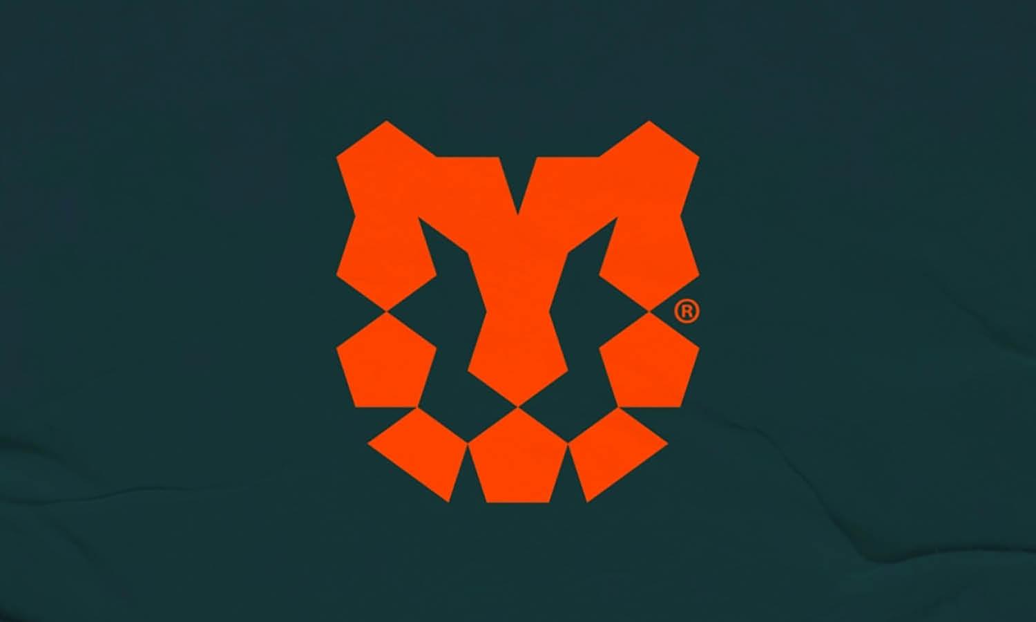
Source: Ethan Fender, Chicken, Dribbble, https://dribbble.com/shots/19623207-Chicken
Monotone logo design has become a timeless favorite among brands that crave simplicity with a bold edge. By sticking to one color, these designs create a strong impression without unnecessary distractions. The beauty of monotone lies in its ability to highlight form, typography, and balance—turning a seemingly simple concept into something unforgettable. Whether it’s sleek black-and-white logos or single-color variations that match brand identity, monotone works wonders across industries.
This article will showcase some of the best monotone logo design ideas worth checking out. You’ll find inspiration that proves minimal color can still spark maximum creativity. From luxury fashion houses that rely on a clean palette to modern startups that want crisp, digital-friendly designs, monotone logos remain powerful symbols of clarity and confidence. Their adaptability makes them stand out equally well on business cards, product packaging, or large-scale billboards.
What makes monotone logo design especially appealing is how versatile it is. A single tone can feel professional, edgy, playful, or elegant, depending on the shapes and fonts paired with it. If you’re ready to explore clever and striking ideas that show off the magic of simplicity, the following selections will keep your creative gears turning.
Monotone Logo Design Ideas

Source: Steve Wolf, The World Theatre, Dribbble, https://dribbble.com/shots/16455731-The-World-Theatre

Source: Nebojsa Matkovic, Goodies, Dribbble, https://dribbble.com/shots/20588083-Goodies-logo-set

Source: Iqbal Hakim Boo, Badted, Dribbble, https://dribbble.com/shots/20386793-BADTED

Source: Coric Design, Moloko Grove, Dribbble, https://dribbble.com/shots/19538016-Moloko-Grove

Source: Coric Design, Anchor Haus, Dribbble, https://dribbble.com/shots/20248401-Anchor-Haus

Source: Coric Design, Personal Branding, Dribbble, https://dribbble.com/shots/20508558-Personal-Branding

Source: Patkos, Hot Chix, Dribbble, https://dribbble.com/shots/16235247-Hot-chix

Source: Joshua Diaz, Home in the City, Dribbble, https://dribbble.com/shots/17805468-Home-in-the-City

Source: Travis Pietsch, WorkHorse, Dribbble, https://dribbble.com/shots/15483423-WorkHorse-Designs-2-3

Source: Mark Mounts, Self Portrait, Dribbble, https://dribbble.com/shots/17971898-Self-Portrait

Source: Jeremy Vessey, Castor Brewing Co., Dribbble, https://dribbble.com/shots/19573942-Castor-Brewing-Co-Typeface-Used-Leatherbound

Source: Jeremy Vessey, Acreage, Dribbble, https://dribbble.com/shots/14983294-Acreage-A-Modern-Display-Typeface

Source: Jason K Yun, The Brazen Bull, Dribbble, https://dribbble.com/shots/17312021-The-Brazen-Bull

Source: Logan Hall, Classic Hikes of the Smokies, Dribbble, https://dribbble.com/shots/18159554-Classic-Hikes-of-the-Smokies

Source: Hossain H, Logo Design & Branding, Behance, https://www.behance.net/gallery/234436801/Logo-design-modern-logo-Branding

Source: Sample, Lang Beer Co, Dribbble, https://dribbble.com/shots/17022301-Lang-Beer-Co

Source: Dusan Sol, Copper Rose Distillery, Dribbble, https://dribbble.com/shots/20100849-Copper-Rose-Distillery

Source: Bortoletto ® Studio, Peixôu, Behance, https://www.behance.net/gallery/229470025/Peixou

Source: Fatema Nasren, Arabic Logo, Behance, https://www.behance.net/gallery/213829771/Arabic-logo

Source: Coric Design, Cornelia Hofstetter Ceramics, Dribbble, https://dribbble.com/shots/19270290-Cornelia-Hofstetter-Ceramics

Source: Tatiana Saburova, Sinto Studio, Behance, https://www.behance.net/gallery/228241257/Sinto-Studio-brand-identity-for-pilates-studio

Source: Coric Handcrafted Design, Personal Branding, Dribbble, https://dribbble.com/shots/20509047-Personal-Branding

Source: The Permana Atelier, Moxi Marketing, Dribbble, https://dribbble.com/shots/18397578-Moxi-Marketing

Source: Muhammad Akfa, Elboa Coffee, Behance, https://www.behance.net/gallery/234804675/Elboa-Coffee

Source: Joshua Diaz, Fenton Dog Co., Dribbble, https://dribbble.com/shots/17804540-Fenton-Dog-Co

Source: Marina Nolen, Enjoy Your Days in the Sun, Dribbble, https://dribbble.com/shots/20116455-Enjoy-Your-Days-in-the-Sun

Source: Cmpt_rules, Steeltown Garage Co, Dribbble, https://dribbble.com/shots/16262907-Steeltown-Garage-Co

Source: Dusan Sol, Chequessett Chocolate, Dribbble, https://dribbble.com/shots/19305796-Chequessett-Chocolate

Source: Karol Gadzala, Nockscan, Behance, https://www.behance.net/gallery/233415813/Nockscan-Branding

Source: Ethan Fender, Chicken, Dribbble, https://dribbble.com/shots/19623207-Chicken
What Are The Main Benefits Of Monotone Logo Design?
Monotone logo design may seem simple on the surface, but it packs a powerful punch when it comes to branding. By stripping away excess color and focusing on a single tone, brands can unlock a whole new world of creativity and impact. Let’s take a look at the five main benefits of monotone logo design that make it a favorite choice among designers and businesses alike.
Timeless And Professional Appeal
One of the biggest perks of monotone logo design is its timeless nature. Colors can fall in and out of fashion, but a logo built on simplicity never really ages. A single-tone palette gives off an air of professionalism and authority, making it perfect for brands that want to appear confident and reliable. This style doesn’t chase trends—it outlives them.
Maximum Versatility Across Platforms
A monotone logo design adapts seamlessly to different mediums, whether it’s a digital app icon, a billboard, or product packaging. Because it relies on form and contrast rather than flashy colors, the logo stays clear and impactful no matter where it’s placed. Businesses love this flexibility because it ensures their branding looks consistent from a smartphone screen to a shop window.
Strong Focus On Shape And Typography
With color taking a backseat, the spotlight shifts to the actual structure of the logo. This means shapes, fonts, and spacing become the real heroes. Monotone logo design forces designers to refine these elements, resulting in crisp, bold visuals that stand out. The lack of color variety actually pushes creativity further, leading to designs that are striking in their clarity.
Budget-Friendly And Easy To Reproduce
Printing logos in multiple colors can quickly rack up costs, especially for small businesses. Monotone logo design offers a cost-effective solution since it only requires one ink or tone to reproduce. From T-shirts and mugs to signage and stationery, this simplicity makes branding affordable without sacrificing style. It also ensures that the logo remains consistent even in low-cost printing options.
Memorable And Impactful Branding
Simplicity is powerful, and monotone logos prove it. A design built with one tone becomes easier to remember because the audience isn’t distracted by multiple color variations. Think of iconic brands that use monotone logos—their visual identity feels bold, confident, and instantly recognizable. This approach helps brands leave a lasting mark in the minds of their customers.
Monotone logo design may be minimal in appearance, but its benefits are far from small. From timeless style and adaptability to cost-effectiveness and memorability, it’s a design strategy that brings out the pure essence of branding. By focusing on clarity and confidence, monotone logos prove that less truly can be more.
What Are the Psychological Impacts of Monotone Logos?
When we talk about the psychological impacts of monotone logo design, we're diving into a world where simplicity meets sophistication. Monotone logos, those crafted with a single hue, wield a unique power in branding, affecting consumer perception and behavior in subtle yet profound ways. Here are five key psychological impacts of employing a monotone logo design that brands should consider:
Clarity and Recognition
A monotone logo design thrives on the principle of ‘less is more’. By using just one color, these logos cut through the clutter, making them easier to recognize and remember. The human brain can process simple images more quickly than those with multiple colors or complex patterns. This ease of recognition boosts brand recall and helps establish a stronger mental image of the brand in consumers’ minds.
Emotional Connection
Colors are not just seen; they're felt. Each color in the spectrum evokes specific emotions and feelings. For instance, blue can invoke a sense of calm and trust, red can energize and signal urgency, while green often represents growth and tranquility. By choosing a specific color for a monotone logo, brands can tap into these inherent associations to forge a deeper emotional connection with their audience. This emotional resonance is critical in building brand loyalty.
Perceived Value and Professionalism
Monotone logos often carry an air of sophistication and modernity. They suggest a minimalist approach that is currently trendy across various industries. This perceived value can elevate a brand’s status, making it appear more professional and polished. High-end brands, in particular, benefit from this as consumers often associate single-color logos with luxury and premium quality.
Versatility and Adaptability
One might think that using a single color could limit a logo’s versatility, but it’s quite the opposite. Monotone logos are incredibly flexible and can adapt seamlessly across different mediums and applications, from digital spaces to physical products. This adaptability ensures that the logo always appears optimal, maintaining brand consistency and integrity across all platforms.
Cultural Resonance
Color perception can vary significantly across different cultures. What is considered calming in one culture might be seen as sad or passive in another. By opting for a monotone logo, brands can choose a color that aligns with the cultural values and sentiments of their target market, making the logo not just a visual mark but a culturally resonant symbol.
The simplicity of a single-color logo doesn’t just capture the eye; it captures the heart and mind, making a lasting impression that goes beyond the visual to stir genuine emotional engagement. So, next time you see a monotone logo, take a moment to feel its impact, because in the world of marketing, feeling is believing!
What Elements Work Best In Monotone Logo Design?
Monotone logo design thrives on simplicity, but that doesn’t mean it has to be boring. In fact, it’s the very lack of multiple colors that gives designers the chance to focus on the most important building blocks of branding. The secret lies in selecting and balancing the right elements so the design feels powerful, memorable, and visually sharp. Here are five elements that work best in monotone logo design to make it shine.
Bold Typography That Speaks Volumes
In monotone logo design, typography often takes center stage. A strong font can communicate a brand’s character without needing color to do the heavy lifting. Sleek sans-serifs bring out modern and minimal vibes, while elegant serifs can add sophistication and heritage. Playful handwritten or script fonts also work beautifully when balanced with the monotone palette. Since there’s no distraction from color, the typeface becomes a clear reflection of personality.
Clean And Recognizable Shapes
Shapes are the backbone of monotone logo design. Simple, bold outlines and geometric structures are especially effective because they remain impactful even without color gradients. Circles, squares, and triangles can carry symbolic meaning while staying versatile. Clean shapes not only enhance recognition but also ensure the logo looks sharp on everything from business cards to massive billboards.
Smart Use Of Negative Space
Monotone logo design and negative space are a match made in creative heaven. With only one tone at play, designers often use clever cutouts or spacing tricks to form hidden images or double meanings. This not only adds depth but also surprises the viewer, making the logo more memorable. It’s like a secret design wink—subtle, clever, and unforgettable.
Contrast And Line Weight
When working with a single color, contrast becomes the designer’s best friend. Varying line thickness, bold strokes, and dynamic spacing all help bring energy to the design. By playing with heavy and light lines, you can create depth and hierarchy without relying on multiple shades. In monotone logo design, line weight becomes the paintbrush that defines character and emphasis.
Iconography With Strong Identity
Icons shine in monotone because they can be reduced to their purest form without losing meaning. Think of animals, abstract marks, or industry-related symbols stripped down to a single tone—they remain powerful and universally recognizable. Monotone logo design thrives on this simplicity, ensuring icons are easy to recall and instantly tied to the brand.
Monotone logo design is proof that minimalism doesn’t mean plain. By focusing on typography, shapes, negative space, contrast, and icons, a single-tone palette can deliver branding that’s bold, versatile, and unforgettable. It’s all about letting the essential elements do the talking—because sometimes one tone says it all.
What Are Some Creative Techniques in Monotone Logo Design?
Diving into the world of monotone logo design is like entering a minimalist's dream—where less is definitely more and creativity flourishes within constraints. A single color might seem limiting at first, but it’s actually a playground for creative expression. Here are five innovative techniques that can help your monotone logo design stand out in a saturated market:
Negative Space Magic
One of the cleverest tricks in the monotone logo design book is the use of negative space. This technique involves integrating the background color into the design in such a way that it forms an integral part of the overall image, often revealing hidden meanings or secondary images. The famous FedEx logo and its hidden arrow is a prime example of negative space at work. In a monotone setting, this technique not only adds depth to the design but also engages the viewer's imagination, making your logo memorable.
Dynamic Shapes and Geometry
Utilizing dynamic shapes or interesting geometric patterns can transform a simple monotone logo into a striking visual statement. The key here is to use shapes that convey your brand’s personality—circular forms for softness and approachability, sharp angles for precision and efficiency, or irregular patterns for creativity and innovation. These shapes, when used cleverly, can create a strong visual impact even with a single color.
Subtle Textures and Patterns
Who says monotone has to be flat? Adding texture or a pattern within the logo can provide a tactile element that enhances visual interest without needing additional colors. Whether it’s a grainy effect, a metallic sheen, or a subtle emboss, these details can make your logo feel alive and add a layer of sophistication that sets your brand apart.
Clever Typography
Often, in monotone logo designs, typography isn't just a way to display the brand name; it's part of the brand’s story. Choosing or designing a unique font can make a big difference. You can alter letterforms to include icons or motifs that relate to your brand, or play with letter spacing and alignment to create balance and harmony. The right typeface in the right style can communicate your brand’s values and tone effectively, even in a single hue.
Scale and Proportion
Playing with scale and proportion can dramatically change the perception of a monotone logo. Oversizing a particular element can draw attention, while downsizing can create a sense of subtlety and finesse. The contrast between large and small elements can also guide the viewer’s eye in a specific direction, adding movement and flow to the design.
Monotone logo design is not just about choosing a color and sticking to it—it’s about exploring all the nuances that one color can offer. By leveraging these creative techniques, designers can craft logos that are not only visually stunning but also deeply connected to the brand’s identity.
What Are the Best Colors for Monotone Logo Design?
Choosing the right color for a monotone logo design can be akin to selecting the perfect outfit for a high-stakes interview—you want to make the best impression and stand out for all the right reasons. In the realm of monotone logos, color is not just an aesthetic choice; it's a strategic tool that can significantly influence brand perception and appeal. Here are five colors that shine particularly bright in monotone logo designs, each bringing its unique flavor to the branding table:
Classic Black
When in doubt, go black. It's not just the color of elegance and sophistication; it's a powerhouse in the world of design. Black works fantastically across all sectors, offering unmatched versatility and a timeless quality. It communicates authority, professionalism, and strength, making it a go-to for corporate entities, luxury brands, and anyone looking to make a bold, classic statement.
Vibrant Red
If you want your brand to pop with energy and excitement, red is your hue. Known for its ability to grab attention, red is associated with passion, action, and urgency. It's a fantastic choice for brands that aim to stand out from the crowd and evoke strong emotions. Whether it’s the food industry, entertainment, or sports, red can convey a sense of dynamism like no other.
Cool Blue
Blue is the world's favorite color and for good reason. It evokes feelings of trust, stability, and calmness, making it ideal for financial institutions, healthcare companies, and technological enterprises. From corporate to casual, blue is incredibly flexible and can be adapted to various shades that either soothe or energize, depending on the chosen tint or shade.
Earthy Green
For brands that want to project growth, freshness, or a connection to nature, green is the way to go. It’s perfect for organic products, environmental initiatives, and companies that want to highlight their commitment to sustainability. Green can also have a calming effect, making it suitable for spas, health services, and educational institutions.
Warm Yellow
Nothing says friendly and accessible like yellow. This color radiates optimism and creativity, making it a superb choice for startups, creative agencies, and educational platforms. Yellow can catch the eye quicker than many other colors, which helps in younger, more dynamic markets where companies need to make an immediate impact.
When selecting a color for your monotone logo design, it's essential to consider not only the emotional impact but also the practical applications. How will the color look on different backgrounds? Is it easily recognizable in various sizes? Does it resonate with the cultural context of your target audience? Answering these questions can guide you to the right color choice, ensuring that your logo not only looks stunning but also communicates your brand's core values effectively.
Conclusion
A well-crafted monotone logo design shows that simplicity can be incredibly powerful. By focusing on essential elements such as typography, shapes, contrast, negative space, and icons, brands can achieve clarity and impact without relying on multiple colors. This approach ensures consistency across all platforms, from digital screens to printed merchandise, while maintaining a professional and timeless feel. Monotone logo design not only highlights the strength of form and structure but also creates a lasting impression that audiences can easily recognize. In a world of visual noise, this style proves that one tone is often more than enough.
Let Us Know What You Think!
Every information you read here are written and curated by Kreafolk's team, carefully pieced together with our creative community in mind. Did you enjoy our contents? Leave a comment below and share your thoughts. Cheers to more creative articles and inspirations!


Leave a Comment