30 Best Nautical Logo Design Ideas You Should Check

Source: Nicole Sgroi, Atlantis Hard Seltzer, Dribbble, https://dribbble.com/shots/17371124-Atlantis-Hard-Seltzer-Branding-2022
Sailing across the world of branding often calls for timeless symbols, and nothing captures that better than a nautical logo design. With its strong ties to adventure, exploration, and the open sea, this style brings a sense of tradition and wanderlust to any brand. From anchors and compasses to sails and waves, nautical elements carry a sense of trust, direction, and stability—qualities that every business can benefit from. Whether you run a coastal café, a marine supply company, or even a modern lifestyle brand, nautical themes add a bold yet classic touch to your visual identity.
The best nautical logo design ideas go beyond the obvious anchor silhouette. They can incorporate rope textures for rustic charm, ship wheels for heritage, or minimalist line art for a sleek and contemporary vibe. You’ll also find clever uses of navy blues, sandy neutrals, and bold reds to echo maritime traditions while keeping designs stylish and versatile. What makes nautical logos especially fun is their adaptability—perfect for vintage aesthetics, modern minimalism, or even playful coastal branding.
Nautical Logo Design Ideas

Source: Ben Kocinski, The Fouled Anchor, Dribbble, https://dribbble.com/shots/2333049-The-Fouled-Anchor

Source: Kayla Gourlay, The Salty Sailor, Behance, https://www.behance.net/gallery/20286351/The-Salty-Sailor

Source: Kenny Paradiso, S.S. Triple Play, Behance, https://www.behance.net/gallery/112723185/SS-Triple-Play

Source: Yulia Malinovskaya, Lighthouse, Dribbble, https://dribbble.com/shots/20786680-Lighthouse-emblem

Source: Michael Penda, The Narwhal, Dribbble, https://dribbble.com/shots/15240519-Brandimals-pt-14-Narwhal

Source: Anggi Std, Costa Da Morte, Behance, https://www.behance.net/gallery/169897897/Costa-da-morte-for-tshirt-klien

Source: Jaime Deptula, Skipjack Pool Bar, Behance, https://www.behance.net/gallery/151149649/Skipjack-Pool-Bar

Source: Artifact Bazaar, Gone Coastal, Dribbble, https://dribbble.com/shots/4259209-Gone-Coastal

Source: Rachel Gillespie, Sea People, Dribbble, https://dribbble.com/shots/20397636-Sea-People-Design-Kit

Source: Gaga_Vastard, This Viking Boat, Dribbble, https://dribbble.com/shots/15096160-viking-boat-sail-playful-logo

Source: Tim Evans, The Dock, Dribbble, https://dribbble.com/shots/13998202-The-Dock-Oakland-CA

Source: Jonathan Schubert, Bellerophon, Dribbble, https://dribbble.com/shots/2226970-Bellerophon-Marks

Source: Ella Blaisdell, Boaters Republic, Behance, https://www.behance.net/gallery/113330133/Boaters-Republic-Brand-Refresh

Source: Steve Wolf, Puddle Pirate, Dribbble, https://dribbble.com/shots/2108583-Puddle-Pirate-Clothing

Source: Corey Reifinger, Johnny Cupcakes Martha’s Vineyard, Dribbble, https://dribbble.com/shots/13397231-Mermaid

Source: Lauren Carns Reed, Katie Whitcomb Photography, Dribbble, https://dribbble.com/shots/4285210-Katie-Whitcomb-Photography-Logo

Source: Brooke DeLage, Safe Harbor, Behance, https://www.behance.net/gallery/122047053/Safe-Harbor-Logo-Design

Source: Jake Warrilow, Departing Seas Band, Behance, https://www.behance.net/gallery/52613473/Departing-Seas-Band-Logo

Source: Matt Vergotis, Harbour Master Brewing Co, Dribbble, https://dribbble.com/shots/15047271-Harbour-Master-Brewing-Co

Source: Nicole Sgroi, Newport Rhode Island, Dribbble, https://dribbble.com/shots/17712126-Newport-Rhode-Island-Badge-2022

Source: DGIM Studio, Born To Conquer The Ocean, Dribbble, https://dribbble.com/shots/9782255-Nautical-emblem

Source: Lexi Axelsen, Dry Dock Brewery, Dribbble, https://dribbble.com/shots/11398699-Dry-Dock-Brewery-Rebrand

Source: Coric Design, Anchored Life Oyster Farms, Dribbble, https://dribbble.com/shots/18937758-Anchored-Life-Oyster-Farms

Source: Nick Budrewicz, Redcar Strollers Walking Football Club, Dribbble, https://dribbble.com/shots/6146545-Redcar-Strollers-Walking-Football-Club

Source: Jeremy Martinez, McLoons, Dribbble, https://dribbble.com/shots/16640463-McLoons-No-6

Source: Michael Adams, Bexar Goods Co, Dribbble, https://dribbble.com/shots/3277175-Octopus-and-Trident-Design

Source: Brian Butler, Great Lakes, Dribbble, https://dribbble.com/shots/11313836-Great-Lakes

Source: Darren Pollock, Broadside Trading Co., Dribbble, https://dribbble.com/shots/6409841-Broadside-Trading-Co-Branding

Source: Luis Alvaro, Tall Ship Apparel, Dribbble, https://dribbble.com/shots/4219948-Tall-Ship-Apparel-Logo

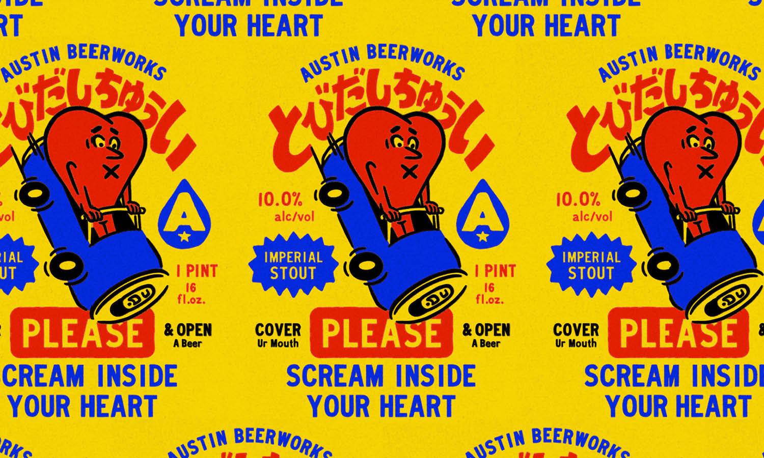
Source: Nicole Sgroi, Atlantis Hard Seltzer, Dribbble, https://dribbble.com/shots/17371124-Atlantis-Hard-Seltzer-Branding-2022
What Are The Key Elements Of A Nautical Logo Design?
Creating a nautical logo design is like navigating the seas: it requires the perfect blend of creativity, symbolism, and attention to detail. Whether your brand is deeply tied to maritime themes or simply wants to evoke the adventurous spirit of the ocean, nailing the key elements of a nautical logo design is essential. Let’s dive into the five critical components that bring a nautical logo to life and make it stand out.
Ocean-Inspired Color Palette
The colors in a nautical logo design play a significant role in setting the mood. Typically, you’ll see shades of deep navy blue, crisp white, and bold red dominating these designs. These colors evoke the sea, maritime uniforms, and the classic aesthetics of nautical flags. Depending on the brand’s personality, you can also incorporate softer hues like turquoise or sandy beige for a more relaxed coastal vibe. The right color palette helps your logo instantly convey its maritime connection.
Timeless Nautical Symbols
Symbols are the backbone of any nautical logo design, instantly tying it to the sea. Popular elements include anchors, ships, lighthouses, compasses, and waves. Each of these symbols carries its own meaning—anchors represent stability, compasses signify guidance, and waves symbolize the ever-changing nature of life. Mixing and matching these elements, while keeping the design clean and focused, allows your logo to capture the essence of your brand in a single glance.
Typography That Speaks the Language of the Sea
Typography is a subtle yet impactful element in nautical logo design. Fonts that mimic old maritime maps or ship signage often work beautifully, adding a touch of authenticity and nostalgia. Serif fonts can convey tradition and reliability, while sans-serif options can give a fresh, modern feel. Some designers even incorporate rope-like or wave-inspired textures into the typography for an extra touch of nautical charm.
Balanced Simplicity
Nautical logo designs often thrive on clean, minimal layouts. While it’s tempting to include every possible maritime element, simplicity ensures the design remains versatile and memorable. A well-balanced logo won’t overwhelm the viewer but will effectively communicate the brand’s identity. Focus on a central symbol and complement it with subtle details, ensuring the design looks great across various platforms, from business cards to ship hulls.
Authentic Coastal Details
The charm of a nautical logo lies in the details. Adding subtle coastal touches like ropes, nautical stars, or even maritime flags can make your logo feel authentic and unique. These smaller details shouldn’t overpower the primary elements but instead enhance the overall design. The key is to incorporate details that resonate with your brand’s story and audience, ensuring every element feels purposeful and connected.
By combining these key elements—ocean-inspired colors, timeless symbols, maritime typography, simplicity, and authentic details—you can craft a nautical logo design that sails smoothly into the hearts of your audience. Whether your brand represents adventure, relaxation, or reliability, these components will help anchor your logo in the timeless appeal of the sea.
Which Symbols Work Best In Nautical Logo Design?
When it comes to nautical logo design, symbols play a powerful role in creating a strong identity that instantly connects with themes of the sea, exploration, and adventure. The right elements can tell a story, evoke emotions, and give your brand a timeless presence. Below are five of the best symbols that bring a nautical logo design to life:
Anchors for Stability and Strength
The anchor is perhaps the most iconic symbol in nautical logo design. It represents grounding, security, and strength—qualities that many businesses want to project. Whether used in bold, vintage detail or simplified into a modern silhouette, the anchor instantly communicates reliability. It’s also highly versatile, working well with both corporate and lifestyle brands.
Compasses for Direction and Guidance
A compass in nautical logo design communicates exploration, guidance, and a clear sense of direction. This symbol resonates with companies that want to position themselves as leaders or navigators in their field. Its circular design also adds balance and harmony, making it a natural fit for logos that need to be compact and symmetrical.
Ship Wheels for Heritage and Adventure
The ship wheel symbolizes control, leadership, and tradition. It works beautifully in nautical logo design for businesses that want to highlight a sense of heritage or mastery over their craft. Detailed illustrations of ship wheels give logos a vintage, classic feel, while simplified versions can create a sleek, modern aesthetic.
Waves for Energy and Motion
Waves bring a sense of fluidity, movement, and energy to nautical logo design. They can symbolize the ups and downs of life, adventure on the seas, or the refreshing nature of coastal experiences. Waves are also highly adaptable—you can make them playful for a surf brand, bold for a shipping company, or elegant for a spa or resort.
Sailboats for Exploration and Freedom
Sailboats add an adventurous and aspirational tone to nautical logo design. They represent freedom, travel, and the thrill of venturing into the unknown. A sailboat logo works especially well for businesses in tourism, lifestyle, or even education—brands that want to encourage growth and exploration. Simplified sailboat designs also bring a contemporary edge to traditional nautical themes.
Symbols in nautical logo design are more than decorative—they’re meaningful emblems that reflect stability, direction, adventure, and freedom. Whether you lean toward anchors, compasses, ship wheels, waves, or sailboats, each element tells its own story while connecting to the rich tradition of the sea. Choosing the right symbol allows your logo to stand out while giving your brand a strong and memorable identity.
What Fonts Are Best For A Nautical Logo Design?
Choosing the right font for a nautical logo design is like selecting the perfect sail for your boat—it sets the course for how your brand is perceived. The right typeface can anchor your design with authenticity and evoke the timeless allure of the sea. Let’s explore five types of fonts that are perfect for creating an unforgettable nautical logo design.
Classic Serif Fonts
Serif fonts bring a touch of tradition and elegance to a nautical logo design. Their timeless appeal often reflects the long history of maritime trade and exploration. Fonts like Times New Roman or Baskerville exude sophistication, making them ideal for brands tied to luxury yachts, fine dining by the sea, or upscale coastal resorts. To enhance the nautical feel, look for serif fonts with a slightly weathered or vintage aesthetic.
Bold Slab Serifs
Slab serif fonts, with their thick, blocky letters, are perfect for making a strong statement. These fonts combine the charm of traditional typography with a bold and modern edge. Their sturdiness mirrors the resilience of maritime adventures, making them a great choice for fishing companies, marine equipment brands, or coastal sports businesses. Rockwell and Clarendon are popular examples that can add a solid and grounded look to your logo.
Nautical Script Fonts
Script fonts can add a playful or elegant flair to your nautical logo design, depending on the style you choose. Cursive fonts with wave-like strokes or rope-inspired textures can subtly tie your design to the sea. They’re perfect for brands aiming for a more casual or whimsical vibe, such as seaside cafes, beachwear lines, or surf schools. Fonts like Pacifico or Lobster have a flowing, oceanic charm that works beautifully in these contexts.
Rustic and Distressed Fonts
To capture the rugged charm of old fishing villages or weathered ship logs, distressed fonts are an excellent choice. These fonts have a worn, textured look that evokes the raw beauty of the sea. Rustic fonts are ideal for brands looking to emphasize authenticity and heritage, such as coastal breweries or hand-crafted goods. Examples like Sea Dog or Sailor’s Tattoo can bring that windswept, vintage feel to your nautical logo design.
Sans-Serif Fonts With Nautical Details
If your brand leans toward modern and minimalist design, sans-serif fonts are a fantastic choice. Their clean, straightforward lines exude professionalism and adaptability. For a nautical touch, choose sans-serif fonts with subtle coastal details, like rounded edges that mimic buoy shapes or slight wave-like curves in the lettering. Fonts like Gill Sans or Proxima Nova work well when paired with classic nautical symbols, creating a balance between simplicity and theme.
The right font is the unsung hero of any nautical logo design. By selecting a typeface that aligns with your brand’s personality—whether it’s bold and adventurous, refined and elegant, or casual and fun—you can create a logo that truly resonates. With so many font options that complement the maritime theme, you’re sure to find the perfect one to sail your brand to success!
What Are The Best Color Palettes For Nautical Logo Design?
Colors set the mood of any design, and in nautical logo design, they instantly bring the sea, sky, and adventure to life. The right palette can capture tradition, modern style, or playful energy, depending on how it’s used. Below are five of the best color palettes that make nautical logos stand out while keeping their maritime spirit intact.
Classic Navy And White
Navy blue and white are the most traditional choices for nautical logo design. Navy represents trust, authority, and the deep ocean, while white adds clarity and simplicity. Together, they give a timeless and professional look that works beautifully for shipping companies, luxury resorts, or lifestyle brands. This clean palette also creates strong contrast, ensuring the logo is instantly recognizable.
Bold Red, White, And Blue
The combination of red, white, and blue instantly evokes a maritime spirit while adding energy and boldness. Red brings vibrancy and attention, complementing the trustworthiness of blue and the clarity of white. This palette is perfect for nautical logo design when you want something patriotic, dynamic, or adventurous. It’s especially effective for sports clubs, sailing teams, or brands that want a spirited, energetic look.
Sandy Beige And Ocean Teal
For a softer and more modern nautical logo design, sandy beige paired with ocean teal creates a calm yet stylish palette. Beige reflects the warmth of the shore, while teal captures the cool tones of seawater. This duo works especially well for beach cafés, coastal boutiques, or wellness brands that want a relaxed and inviting aesthetic. It’s subtle but still carries a strong nautical connection.
Gold And Deep Navy
Gold and navy together radiate elegance, making this palette ideal for premium or luxury brands. In nautical logo design, gold symbolizes prestige and success, while navy ensures the logo stays grounded and professional. This palette often appeals to yacht clubs, high-end resorts, or exclusive maritime services. It creates a sophisticated identity while staying true to nautical tradition.
Coral And Turquoise
For a more playful twist on nautical logo design, coral and turquoise bring energy and brightness. Coral adds warmth and excitement, while turquoise reflects tropical waters and coastal charm. This palette is great for surf shops, casual seaside restaurants, or brands targeting younger audiences. It keeps the nautical theme light, fresh, and fun—perfect for businesses that thrive on creativity and approachability.
The best color palettes in nautical logo design capture the balance between tradition and creativity. Whether you choose navy and white for timeless charm, red and blue for energy, sandy and teal for relaxation, gold and navy for luxury, or coral and turquoise for fun, each palette adds a unique mood. The right colors will ensure your nautical logo feels authentic, memorable, and perfectly aligned with your brand’s spirit.
What Are Some Creative Styles For Nautical Logo Design?
Designing a nautical logo design offers a sea of opportunities to flex your creative muscles. From classic motifs to modern twists, there are countless ways to infuse maritime charm into your brand. Whether you’re crafting a logo for a beachside café, a maritime organization, or a coastal clothing line, the style you choose can make all the difference. Let’s dive into five creative styles that can elevate your nautical logo design to the next level.
Vintage Maritime Style
A vintage nautical logo design never goes out of style. This approach channels old-world charm with weathered textures, intricate details, and a sense of nostalgia. Think antique compasses, hand-drawn ships, or anchors wrapped in ropes. The fonts often resemble classic serif or typewriter styles, giving the design an aged, authentic feel. Perfect for seafood restaurants, marine supply stores, or brands with a rich history, this style exudes timeless appeal and authenticity.
Minimalist Coastal Chic
For a modern take, the minimalist style is making waves in nautical logo design. This approach strips down traditional maritime symbols—like anchors, waves, or lighthouses—into clean, geometric shapes. A pared-down color palette, often featuring shades of blue, white, and gray, adds to the sleek and contemporary vibe. Minimalist logos are versatile and work exceptionally well for travel agencies, coastal resorts, or ocean-focused tech startups looking to keep things simple yet impactful.
Playful and Whimsical
If your brand has a fun and approachable personality, a playful nautical logo design could be the perfect fit. This style often incorporates cartoonish illustrations, bold colors, and imaginative elements like smiling whales, quirky sea creatures, or winking sailors. Rounded fonts or script typography add to the casual, friendly aesthetic. This style is ideal for children’s swim schools, beach-themed cafés, or surf shops that want to create a lively, memorable identity.
Rustic and Textured
For a rugged, adventurous vibe, consider a rustic nautical logo design. This style features rough textures, distressed fonts, and natural elements like driftwood, rope, or weathered sails. Colors like deep browns, navy blues, and muted greens bring a sense of authenticity and earthiness. Rustic designs are great for brands tied to fishing, boating, or outdoor coastal activities, as they evoke the untamed beauty of life by the sea.
Elegant Nautical Luxe
For brands that want to exude sophistication, an elegant nautical logo design is the way to go. This style uses refined fonts, delicate line work, and luxurious accents like gold foil or embossing. Popular elements include intricately detailed compasses, elegant sailboats, or stylized waves. The color palette often combines deep navy with metallics like gold or silver for a high-end look. This style works beautifully for luxury yacht charters, fine dining establishments, or upscale beach resorts.
Each of these styles offers a unique way to craft a nautical logo design that aligns with your brand’s identity and appeals to your audience. Whether you opt for vintage charm, modern minimalism, or playful whimsy, the key is to anchor your design in creativity and maritime flair. So, set sail with these styles and let your logo make waves!
Conclusion
Nautical logo design thrives on colors that echo the spirit of the sea and coastline. From the stability of navy and white to the vibrancy of coral and turquoise, each palette tells a different story. Businesses can choose deep, classic tones for professionalism or brighter hues for a playful and modern edge. Whether it’s luxury, adventure, or relaxation, the right color combinations make a nautical identity more memorable. By thoughtfully selecting palettes that reflect trust, energy, or coastal charm, nautical logo design becomes a powerful tool to anchor a brand’s presence and capture its maritime essence.
Let Us Know What You Think!
Every information you read here are written and curated by Kreafolk's team, carefully pieced together with our creative community in mind. Did you enjoy our contents? Leave a comment below and share your thoughts. Cheers to more creative articles and inspirations!





Leave a Comment