
30 Best Feminine Logo Design Ideas You Should Check

Source: Jessica Strelioff, Carina, Dribbble, https://dribbble.com/shots/18331766-Carina-Packaging
Feminine logo design can take many forms, from delicate and romantic to bold, modern, artistic, or luxurious. The strongest feminine logo design ideas do more than rely on soft colors or decorative fonts. They use typography, symbols, spacing, and composition to express a clear personality that suits the brand. A beauty label may favor refined linework, while a creative studio may feel more distinctive with playful lettering or abstract forms. The ideas below explore 30 different directions, giving you practical inspiration without treating femininity as one fixed visual style.
Feminine Logo Design Ideas

Source: Wiktoria Kamińska, Mona, Behance, https://www.behance.net/gallery/154976811/Mona-Brand-Identity

Source: Whitney Zimmermann, Evelyn Florals, Behance, https://www.behance.net/gallery/158382119/Feminine-Serif-and-Script-Brand-Design-Template

Source: Viktoria Vardanyan, Motea, Behance, https://www.behance.net/gallery/164172033/MOTEA-Smokeless-Incense

Source: Marina Nolen, Wisdom Aesthetics, Dribbble, https://dribbble.com/shots/19511510-Wisdom-Aesthetics

Source: Titus Smith, Randa's Handmade Soaps, Dribbble, https://dribbble.com/shots/16786622-Randa-s-Handmade-Soaps

Source: Monira Akter, Letter A Luxurious Feminine Logo,Dribbble, https://dribbble.com/shots/24869422-Letter-A-Luxurious-Feminine-Logo

Source: Daud Hasan, Gléina - Elegant Luxury Logo for a Feminine Fashion Brand, Dribbble, https://dribbble.com/shots/26008103-Gl-ina-Elegant-Luxury-Logo-for-a-Feminine-Fashion-Brand

Source: Neil V Fernando, Luman, Dribbble, https://dribbble.com/shots/16222125-Luman

Source: Dmytro Krutko, S-Syrenka Logo Design, Dribbble, https://dribbble.com/shots/19951280-S-Syrenka-Logo-Design

Source: Emir Kudic, Heighten, BeMain Studio, https://bemainstudio.com/

Source: Alexandra Necula, Ayoola, Dribbble, https://dribbble.com/shots/20006201-Ayoola-Custom-Wordmark

Source: Victoriqa Gasanova, CF Monogram, Dribbble, https://dribbble.com/shots/26431678-CF-Monogram

Source: Ahmed Creatives, Blossom, Dribbble, https://dribbble.com/shots/18588794-Blossom

Source: Ross Bruggink, Glory, Dribbble, https://dribbble.com/shots/16686861-Glory-Logotype

Source: Maryna Katson, Mona Lisa Beauty Lounge, Behance, https://www.behance.net/gallery/231495783/Mona-Lisa-Beauty-Lounge-Branding-Packaging-Design

Source: Yuri Kartashev, Beauty Nature, Dribbble, https://dribbble.com/shots/14595956-beauty-nature

Source: Rifnat Jahan, ELLES, Dribbble, https://dribbble.com/shots/27317373-ELLES-Luxury-Women-s-Clothing-Brand-Logo

Source: Koen, Dribbble, https://dribbble.com/shots/19566800-Goddess-Logo-Design

Source: Zain Ur Raouf, Callie Elegant Beauty & Skincare Brand Identity, Dribbble https://dribbble.com/shots/27431181-Callie-Elegant-Beauty-Skincare-Brand-Identity

Source: Tessa Portuese, Sophia's Lover, Dribbble, https://dribbble.com/shots/20170729-Sophia-s-Lover

Source: Studio Le_M, Peep, Behance, https://www.behance.net/gallery/92143841/peep-Package-Concept-Design

Source: Coric Design, Unscripted Beauty, Dribbble, https://dribbble.com/shots/19538111-Unscripted-Beauty

Source: Amanda Ström, Girl Culture Brewing Co, Behance, https://www.behance.net/gallery/214154643/Girl-Culture-Brewing-Co

Source: Nikita Maslov, Solentra Garden, Dribbble, https://dribbble.com/shots/12296740-Solentra-Garden

Source: Marka Collective, Gentle & Rose, Behance, https://www.behance.net/gallery/126462795/Gentle-Rose

Source: Studiobressi, Instagram, https://www.instagram.com/p/CfjrVdIsFLE/

Source: Anna Bressi, One & Only, Behance, https://www.behance.net/gallery/164490335/Minimalist-and-Edgy-Logo-Design

Source: Alexandra Necula, SB Monogram, Dribbble, https://dribbble.com/shots/16823288-SB-Monogram

Source: Miki Grujic, Titania, Behance, https://www.behance.net/gallery/147867193/Titania-Skincare-Brand

Source: Jessica Strelioff, Carina, Dribbble, https://dribbble.com/shots/18331766-Carina-Packaging
Defining a Feminine Logo Style
A feminine logo often communicates elegance, warmth, grace, creativity, or softness, but those qualities can be expressed in very different ways. Some identities use flowing type and floral details, while others depend on sharp serif lettering, geometric forms, or confident minimalism. The key is consistency. Every visual choice should support the intended brand character rather than simply adding traditionally feminine details for decoration.
Elegant and Refined Feminine Logo Ideas
Refined feminine logos work especially well for brands that want to feel polished, premium, or timeless. These approaches focus on controlled typography, restrained detail, and balanced spacing rather than excessive ornament.
Delicate Serif Wordmarks
A slender serif typeface can create a graceful, editorial look. Generous letter spacing and carefully adjusted proportions make the wordmark feel sophisticated without becoming fragile or difficult to read.
Fine-Line Monograms
Interlocking initials drawn with thin strokes can give a brand a personal, elevated identity. Keep the structure simple enough to remain recognizable on small packaging, tags, and social icons.
Elegant Script Lettering
Custom script lettering adds movement and personality, especially for beauty, fashion, event, or lifestyle brands. A restrained script usually feels more refined than highly elaborate calligraphy with too many flourishes.
Minimalist Initial Logos
A single initial can become a memorable mark when its shape is customized. Small cuts, curves, or unexpected spacing can make a simple letter feel distinctive while preserving a clean appearance.
High-Contrast Typography
Pairing thick and thin letterforms creates visual drama without requiring an illustration. This direction feels particularly polished when the layout remains spacious and the type is allowed to become the main feature.
Floral and Nature-Inspired Feminine Logo Ideas
Nature-inspired imagery brings an organic quality to feminine branding. The best results usually simplify natural forms instead of reproducing them literally, helping the logo stay versatile and recognizable.
Botanical Line Art
Fine outlines of stems, herbs, or foliage can frame a name or form a standalone icon. Uneven hand-drawn details can add warmth without making the logo feel overly rustic.
Delicate Flower Illustrations
A single flower can communicate beauty and softness more effectively than a crowded bouquet. Choosing an unusual bloom or simplifying its silhouette can make the identity more individual.
Leaf and Branch Motifs
Leaves and branches create a calm, natural impression that works well for wellness, skincare, floral, and handmade brands. Curved arrangements can also help guide attention toward the brand name.
Wildflower Emblems
Loose wildflower arrangements feel less formal than symmetrical botanical marks. They can give a feminine identity a relaxed, artisanal character while still looking polished when the linework is controlled.
Celestial and Botanical Combinations
Combining moons, stars, or suns with botanical shapes creates a dreamy, symbolic direction. Keep the number of elements limited so the mark stays clear rather than turning into a detailed illustration.
Soft and Minimal Feminine Logo Ideas
Minimal feminine logos prove that softness does not require decoration. Simple shapes, subtle curves, and careful negative space can create an identity that feels light, modern, and highly adaptable.
Single-Line Symbols
A symbol drawn with one continuous line can feel fluid and elegant. Faces, flowers, hands, or abstract forms work particularly well when the silhouette remains easy to recognize.
Simple Geometric Marks
Circles, arches, ovals, and balanced grids can create a clean feminine identity. Softer proportions and rounded edges often make geometric forms feel approachable rather than rigid.
Negative-Space Logos
Hidden shapes formed through negative space add intelligence and restraint. This technique works best when the secondary image appears naturally instead of feeling like a visual trick.
Thin Circular Frames
A fine circular border can organize a wordmark, monogram, or small symbol into a neat badge. It adds structure while keeping the overall composition light and controlled.
Abstract Organic Shapes
Irregular curves and soft blobs can give a logo a contemporary artistic feel. This direction works well for brands that want femininity to feel expressive rather than traditionally decorative.
Romantic and Decorative Feminine Logo Ideas
More decorative feminine logo design ideas can create charm, nostalgia, or intimacy. The goal is to use ornament with intention so the identity feels expressive without becoming visually crowded.
Hand-Drawn Script Logos
Hand-drawn lettering creates a personal, human quality. Slight imperfections can make the logo feel warm and authentic, especially for boutique, stationery, bakery, or creative brands.
Vintage Floral Badges
A floral emblem inspired by vintage labels can suggest craftsmanship and heritage. Limiting the number of decorative details helps prevent the design from looking overly old-fashioned.
Ribbon and Bow Motifs
Ribbons and bows introduce elegance, celebration, and softness. Simplified outlines or geometric interpretations often feel fresher than realistic drawings and are easier to reproduce at small sizes.
Ornamental Frames
Decorative frames can surround a brand name with graceful curves, flourishes, or symmetrical details. They work best when the frame supports the typography rather than competing with it.
Decorative Initial Crests
A crest built around one or two initials can feel personal and luxurious. Floral accents, stars, or small ornamental strokes can add character while keeping the central letterforms dominant.
Modern and Bold Feminine Logo Ideas
Feminine branding can also feel confident, graphic, and contemporary. Strong shapes and typography create a different kind of femininity—one based on presence and individuality rather than delicacy.
Bold Serif Wordmarks
Heavy serif lettering can feel fashionable and authoritative. Choosing elegant proportions or unusual terminals keeps the type expressive while maintaining a strong visual presence.
Contemporary Monograms
Modern monograms can overlap, crop, rotate, or simplify letters into almost abstract forms. This creates a fashion-forward identity that feels distinctive without relying on decorative symbolism.
Geometric Floral Symbols
Flowers built from circles, diamonds, or repeated geometric petals balance softness with structure. The result can feel modern, polished, and suitable for both digital and printed applications.
Strong Typographic Logos
Oversized letterforms, compact spacing, or unusual alignment can make typography feel bold and memorable. This approach is useful when a brand wants a feminine identity without obvious illustrative cues.
Abstract Feminine Forms
Curved silhouettes inspired by movement, the body, or natural forms can suggest femininity indirectly. Keeping the shape ambiguous allows the logo to feel artistic rather than literal.
Playful and Creative Feminine Logo Ideas
Some brands need a lighter, more expressive identity. Playful approaches can make feminine branding feel approachable, youthful, artistic, or unexpected while still maintaining a clear visual system.
Handwritten Lettering
Casual handwritten type can make a logo feel spontaneous and friendly. A custom letterform or unusual stroke can prevent the result from looking like ordinary handwriting.
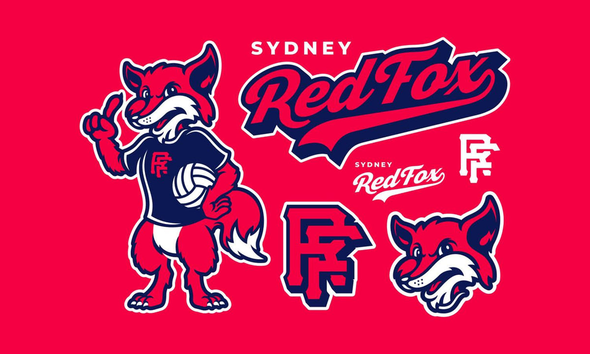
Illustrated Mascot Marks
A small character, face, animal, or object can give the brand personality. Simplified mascot illustrations are easier to recognize and adapt across stickers, packaging, and social content.
Heart-Inspired Symbols
Hearts can feel fresh when they are abstracted, combined with initials, or built from unexpected shapes. Avoid overly familiar forms if the brand needs a more distinctive identity.
Whimsical Star and Sparkle Motifs
Stars, sparkles, and small celestial accents add energy and charm. They work best as supporting details rather than filling every available space in the composition.
Freeform Doodle Logos
Loose doodles can give a logo an artistic, carefree quality. Simple flowers, faces, swirls, or abstract marks are especially effective for creative brands with a relaxed personality.
Choosing Details That Strengthen a Feminine Logo
A successful feminine logo starts with the brand’s personality, not a preset collection of symbols. Decide whether the identity should feel refined, romantic, playful, natural, bold, or minimal, then choose typography and imagery that reinforce that direction. Color should also be intentional; pink is only one possibility among neutrals, earth tones, jewel shades, monochrome palettes, and unexpected combinations. Test the design at small sizes, and check it on packaging, labels, signage, websites, and profile images. If delicate lines disappear or decorative elements become messy, simplify them before finalizing the mark.
FAQ About Feminine Logo Design Ideas
Which Colors Work Well for Feminine Logos?
Feminine logos are not limited to pink or pastel palettes. Cream, burgundy, sage, lavender, black, warm neutrals, muted blue, and deep jewel tones can all work well. The most effective palette depends on the brand’s personality, audience, and the feeling the identity needs to communicate.
Do Feminine Logos Always Need Script Fonts?
No. Script fonts can create elegance or softness, but serif, sans-serif, handwritten, and custom lettering can work just as effectively. Typography feels feminine through proportion, rhythm, spacing, contrast, and styling, not simply because the letters are curved or decorative.
Can a Feminine Logo Still Look Bold and Modern?
Absolutely. Strong serif fonts, oversized typography, geometric symbols, dramatic contrast, and simplified abstract marks can all create a feminine identity with confidence. A bold approach is especially useful for brands that want to avoid the delicate or romantic visual conventions often associated with feminine branding.
Which Symbols Are Common in Feminine Logo Design?
Flowers, leaves, stars, moons, hearts, ribbons, monograms, abstract curves, and line-art figures are frequently used. However, familiar symbols become more distinctive when they are simplified, combined, or interpreted in an unexpected way rather than copied in their most obvious form.
Conclusion
The most memorable feminine identities usually come from restraint. Once a promising concept emerges, remove anything that does not strengthen recognition, legibility, or personality. A well-resolved mark should still feel intentional when reduced to a tiny profile image, printed in one color, or placed on simple packaging. Treat femininity as a flexible design language rather than a checklist, and the final logo has more room to feel original, relevant, and unmistakably connected to the brand.
Let Us Know What You Think!
Every information you read here are written and curated by Kreafolk's team, carefully pieced together with our creative community in mind. Did you enjoy our contents? Leave a comment below and share your thoughts. Cheers to more creative articles and inspirations!
Related Articles










Leave a Comment