30 Best Illustration Logo Design Ideas You Should Check

Source: Cansu Merdamert, Lime Alaçati, Behance, https://www.behance.net/gallery/120063647/Lime-Alacat
A logo isn’t just a symbol—it’s the heartbeat of a brand’s identity. And when it comes to making that heartbeat feel alive, nothing quite matches the creativity and personality of illustration logo design. Unlike standard text-based or minimal icons, illustration brings a playful, artistic, and often storytelling element to branding. From whimsical characters to bold hand-drawn elements, illustrated logos have a way of standing out while capturing the essence of what a brand is all about.
The best part about illustration logo design is its flexibility. Whether you’re a coffee shop wanting a quirky mascot, a boutique needing a detailed vintage sketch, or a tech company aiming for a modern yet approachable look, illustration adapts beautifully. It allows designers to break free from rigid shapes and explore more organic, dynamic visuals that feel both personal and memorable.
In this article, we’ll showcase some of the best illustration logo design ideas worth checking. Each idea demonstrates how brands can use illustration to add charm, uniqueness, and a sense of artistry to their visual identity. If you’re looking to refresh your branding or simply get inspired, these creative examples will give you plenty of ideas to spark your imagination.
Illustration Logo Design Ideas

Source: Vladimir Enciso, La Jugosita Pulpas de Fruta, Behance, https://www.behance.net/gallery/114628935/La-Jugosita-Pulpas-de-Fruta

Source: Chichi & Stung, Đô Hô Savon, Behance, https://www.behance.net/gallery/234323057/DO-HO-SAVON-Branding-Packaging

Source: Username, AmaVI Seafood & Cocktails, Behance, https://www.behance.net/gallery/136970417/AMAV-SEAFOOD-COCKTAILS

Source: Kato Design Studio, Kato, Behance, https://www.behance.net/gallery/142601851/Kato-Brand-Revamp

Source: Aurg Studio, Fafa Bread, Behance, https://www.behance.net/gallery/130102495/FAFA-BREAD-Brand-Identity-Character-Design

Source: Avi Naim, Turkey & Sharkey, Behance, https://www.behance.net/gallery/110511131/Turkey-Sharkey

Source: Artsem Pakanechny, Bearloga, Behance, https://www.behance.net/gallery/235217505/BEARLOGA-fast-casual-cafe-branding

Source: Sydney Michuda, Hayes Street Market, Behance, https://www.behance.net/gallery/137384759/Hayes-Street-Market-Branding

Source: Helen Reveur, Catpuccino Cafe, Behance, https://www.behance.net/gallery/224323613/Catpuccino-Cafe-Brand-Identity

Source: Brittannia Dias, Terra Jewellery, Behance, https://www.behance.net/gallery/234090153/Terra-Jewellery-Logo-Presentation

Source: Stella Bonici, Caco, Behance, https://www.behance.net/gallery/232343043/Caco

Source: Cynthia Torrez, Mezcal, Dribbble, https://dribbble.com/shots/14669636-Mezcal-Illustration-Logo

Source: Charlie Stopford, Siren's Catch, Behance, https://www.behance.net/gallery/198568085/Sirens-Catch-Seafood-Restaurant-Brand-Design

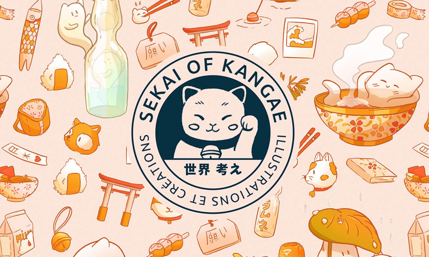
Source: Sekai of Kangae, Behance, https://www.behance.net/gallery/140890015/Sekai-of-Kangae-Branding-v3

Source: Monga Design, Baked Baam, Behance, https://www.behance.net/gallery/115907073/Baked-Baam-Visual-Identity

Source: Analaura Fuentes, Sistole Coffee Roasters, Behance, https://www.behance.net/gallery/135300323/Sistole-Coffee-Roasters

Source: Cynthia Kittler, Artida Oud, Behance, https://www.behance.net/gallery/104271481/Artida-Oud-Branding-Identity-Illustrations

Source: Jitterbug Design, El Weirdo, Behance, https://www.behance.net/gallery/120920703/El-Weirdo

Source: Masho Nartkoshvili, Top The Shaker, Behance, https://www.behance.net/gallery/113172417/Top-the-Shaker-Vegan-Aesthetics

Source: Whales Branding, Packaging for a CBD brand, Dribbble, https://dribbble.com/shots/26477057-Packaging-for-a-CBD-brand

Source: Therese Stoppiello, LA Logotype Illustration Exploration, Dribbble, https://dribbble.com/shots/24777596-LA-Logotype-Illustration-Exploration

Source: Vladimir Enciso, Leche Studio, Behance, https://www.behance.net/gallery/117369767/Leche-Studio-Branding

Source: Wndr Std™, Bandido Cereal Bar, Behance, https://www.behance.net/gallery/143863771/BANDIDO-CEREAL-BAR

Source: Sapogara, Vintage Hand Drawn Horse Logo Illustration, Dribbble, https://dribbble.com/shots/26009402-Vintage-Hand-Drawn-Horse-Logo-Illustration

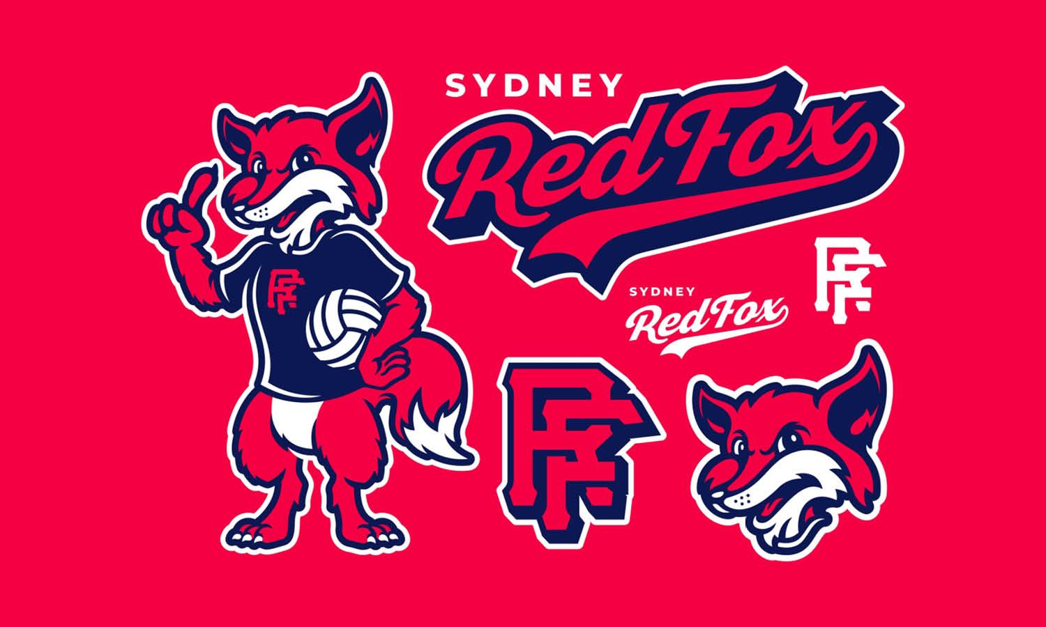
Source: The Cooper Studio, The Docks, Dribbble, https://dribbble.com/shots/22936825-The-Docks-Logo

Source: Nahuel Bardi, Anima Festival, Behance, https://www.behance.net/gallery/85012921/ANIMA-Festival

Source: Oscar Bastidas, SPK, Behance, https://www.behance.net/gallery/82572679/SPK

Source: Carlos Andrés Buitrago, Velotrack, Behance, https://www.behance.net/gallery/139437433/Visual-identity-for-Velotrack

Source: Savia Brands, Hacienda Zamná, Behance, https://www.behance.net/gallery/182068515/Hacienda-Zamna

Source: Cansu Merdamert, Lime Alaçati, Behance, https://www.behance.net/gallery/120063647/Lime-Alacat
What Makes a Good Illustration Logo Design?
A good illustration logo design is like the perfect handshake—it’s memorable, confident, and leaves a lasting impression. But crafting one isn’t just about sketching something pretty; it’s about blending artistry with strategy. Here are five key ingredients that make a good illustration logo design stand out from the crowd.
Clarity: Communicate Without Confusion
The first hallmark of a good illustration logo design is clarity. Your logo should tell a story at a glance—no riddles or head-scratching required. A clean, well-thought-out illustration ensures that your audience instantly understands your brand’s message. While intricate designs can be visually stunning, they should never sacrifice clarity for complexity. Every line, shape, and color should serve a purpose, making your logo easy to recognize and interpret no matter where it appears.
Relevance: Reflect Your Brand’s Personality
A good illustration logo design feels like a natural extension of your brand. It should align seamlessly with your company’s personality, values, and industry. For example, a quirky, hand-drawn illustration might be perfect for a boutique bakery, while a bold, modern design might better suit a tech startup. The goal is to create a logo that feels authentic and relevant to your audience, making them feel an instant connection with your brand.
Memorability: Stick in Their Minds
The best logos are the ones you can sketch from memory. A good illustration logo design should leave an imprint in your audience’s mind long after they’ve seen it. This is achieved through unique imagery, an eye-catching color palette, and a dash of creativity that sets your logo apart from the rest. The more distinctive and thoughtfully crafted your logo, the more likely it is to become synonymous with your brand.
Versatility: Fit Every Format
A great illustration logo design looks amazing on everything—from a tiny social media avatar to a massive billboard. Versatility means designing with adaptability in mind. Your logo should be scalable, maintain its impact in black-and-white or color, and translate well across different mediums. Whether it’s on a smartphone screen or a storefront sign, your logo should consistently represent your brand without losing its essence.
Timelessness: Design Beyond Trends
While it’s tempting to chase the latest design trends, a good illustration logo design should stand the test of time. Think of iconic logos like Apple or Coca-Cola—they’re instantly recognizable decades after their creation. A timeless design avoids being overly trendy and instead focuses on classic elements that ensure your logo remains relevant and effective for years to come.
Creating a good illustration logo design is about finding the sweet spot where art meets strategy. It’s more than just a drawing; it’s a brand ambassador, a storyteller, and a visual signature all rolled into one. By focusing on clarity, relevance, memorability, versatility, and timelessness, you’ll craft a logo that not only turns heads but also builds a lasting connection with your audience.
How Can I Make Sure My Illustration Logo Design Stands Out From the Competition?
In a world where logos are everywhere, making your illustration logo design stand out is like being the star performer in a packed talent show. You need creativity, strategy, and a touch of flair to shine brighter than the rest. Here are five key steps to ensure your illustration logo design steals the spotlight and leaves your competitors in the dust.
Embrace Uniqueness: Dare to Be Different
The first rule of standing out is to break away from the norm. Research your competitors’ logos and identify overused trends or themes in your industry. Then, take a bold step in the opposite direction. Whether it’s a quirky character, an unexpected color palette, or an abstract style, your illustration logo design should have a personality that’s unmistakably yours. Dare to take risks—it’s often the unconventional designs that capture attention.
Prioritize Storytelling: Tell a Visual Tale
A logo isn’t just a pretty picture; it’s a visual story. Use your illustration logo design to tell the story of your brand—its mission, values, and personality. For instance, if you’re a travel agency, incorporate adventurous elements like maps, compasses, or mythical creatures to evoke a sense of wanderlust. A strong narrative not only sets your logo apart but also makes it memorable and meaningful to your audience.
Use a Distinctive Style: Be Recognizably You
Choosing the right illustration style is crucial to making your logo unforgettable. Whether it’s hand-drawn, geometric, retro, or minimalist, your style should align with your brand’s personality while being distinctive enough to stand out. For example, a hand-drawn style might work beautifully for a boutique bakery, while sleek geometric designs might suit a tech startup. Whatever you choose, make it unmistakably yours.
Perfect the Details: Polish Your Craft
Attention to detail can elevate a good logo into a masterpiece. Ensure that every line, curve, and element in your illustration logo design is intentional and well-executed. Pay close attention to typography, balance, and spacing to create a harmonious design. Even the smallest tweaks can make a big difference in how polished and professional your logo looks. A meticulously crafted logo shows that you’re serious about your brand and leaves a lasting impression.
Test and Iterate: Listen to Feedback
To truly stand out, your logo must resonate with your audience. Once you’ve created a draft, test it with your target demographic. Gather feedback on what they love, what confuses them, and what stands out. Use this feedback to refine and improve your design. Don’t be afraid to iterate until you strike the perfect balance between creativity and clarity. A logo that connects emotionally with its audience is one that will rise above the competition.
Creating an illustration logo design that stands out takes equal parts creativity, strategy, and persistence. By embracing uniqueness, prioritizing storytelling, choosing a distinctive style, perfecting details, and refining through feedback, you’ll craft a logo that not only outshines the competition but also becomes an unforgettable representation of your brand.
What Are The Best Inspirations For Illustration Logo Design?
When it comes to building a logo that feels alive, nothing captures attention like illustration logo design. The fun lies in its versatility—it can be playful, bold, elegant, or downright quirky depending on how it’s drawn. If you’re wondering where to pull fresh ideas from, inspirations are everywhere. From nature’s charm to cultural traditions, illustrated logos thrive on personality. Below are five inspiring sources that can help spark creativity and push your design beyond the ordinary.
Nature And The Outdoors
Mother Nature is the ultimate sketchbook for illustration logo design. Think of leaves, mountains, rivers, or even tiny insects transformed into charming motifs. A floral illustration can add elegance to a boutique brand, while rugged mountains work perfectly for an adventure company. Nature-inspired designs bring an organic, timeless feel that resonates with audiences looking for authenticity.
Pop Culture And Characters
Pop culture is a playground for illustrative concepts. Mascots, cartoons, and hand-drawn characters can instantly give brands a recognizable personality. A cheerful illustrated character can connect with younger audiences, while retro comic styles appeal to nostalgia-driven markets. Using pop culture vibes in illustration logo design adds vibrancy and makes the brand memorable.
Historical And Vintage Aesthetics
Old-school pen-and-ink styles, medieval crests, or classic engravings can bring sophistication into a modern business identity. Vintage illustration logo design often uses ornate linework and intricate detailing, making it a go-to for breweries, coffee shops, or artisanal brands. Drawing inspiration from history gives logos an established, timeless feel that builds instant trust.
Cultural And Folk Art
Every culture has its own artistic style—be it tribal patterns, calligraphy, or folk motifs. These elements add uniqueness and depth to illustration logo design. For example, Japanese wave patterns, Mexican papel picado designs, or African geometric shapes can instantly tie a brand to cultural storytelling. This inspiration works beautifully for businesses that want to celebrate heritage and authenticity.
Everyday Objects And Whimsy
Sometimes, the best ideas are right in front of you. Coffee mugs, bicycles, books, or even a simple pencil can become the centerpiece of an illustrated logo. By adding exaggeration or playful twists, everyday items become fun design icons. This approach makes the brand approachable, lighthearted, and relatable. It’s a reminder that illustration logo design doesn’t have to be complex—it just has to tell a story.
In short, the best inspirations for illustration logo design come from tapping into what feels genuine and exciting—whether that’s nature, culture, or everyday life. When you allow inspiration to flow from meaningful sources, your designs naturally shine with creativity and personality.
What Shapes Work Best In Illustration Logo Design?
Shapes are the building blocks of every great illustration logo design. They set the mood, define the style, and often carry hidden symbolism that makes a logo more memorable. Unlike flat icons or rigid graphics, illustrated logos have the freedom to play with shapes in creative, dynamic ways. Whether you’re designing a whimsical mascot or an elegant crest, the shapes you choose will shape (literally!) the brand’s personality. Here are five shapes that work wonderfully in illustration logo design, each bringing its own character to the table.
Circles For Wholeness And Approachability
Circles are the friendliest shapes you can use in illustration logo design. They represent unity, community, and timelessness. Illustrated circles often frame characters, objects, or detailed drawings, creating a badge-like effect that feels complete. A bakery logo with a hand-drawn cupcake inside a circle, for example, instantly feels warm and inviting. Circles make designs approachable while giving them a sense of balance.
Triangles For Energy And Movement
Triangles inject energy into illustrated logos. With their sharp angles and dynamic lines, they naturally suggest direction, progress, and strength. An outdoor brand might use illustrated mountains shaped as triangles to capture adventure and resilience. By combining hand-drawn details with triangular compositions, you can build logos that feel powerful yet artistic. Triangles are perfect when you want to add momentum or boldness.
Squares And Rectangles For Stability
Squares and rectangles communicate trust, professionalism, and reliability. In illustration logo design, they often appear as frames, banners, or even stylized building blocks. Think of a hand-sketched bookshop logo framed in a rectangle or a brewery logo drawn on a vintage square banner. These shapes give structure to intricate illustrations, making sure the design feels anchored and dependable without losing its artistic flair.
Organic And Freeform Shapes For Playfulness
One of the joys of illustration logo design is breaking away from rigid geometry. Freeform shapes inspired by doodles, splashes, or natural curves add spontaneity and creativity. A children’s brand might use a playful blob-like shape with a cute illustrated character, while an eco-friendly business could feature flowing leaves or waves. These irregular forms spark curiosity and allow designers to craft logos with charm and individuality.
Geometric Combinations For Complexity
Sometimes, the best logos come from mixing shapes together. Circles combined with triangles, or rectangles layered with curves, give illustration logo design more depth and storytelling potential. A coffee brand could have an illustrated mug (a rectangle with a curved handle) sitting inside a circular frame, blending stability with friendliness. Using multiple shapes creates visual interest and helps capture a brand’s unique essence.
The best shapes in illustration logo design depend on the emotion and personality you want to convey. Circles bring warmth, triangles bring energy, squares bring trust, freeform shapes bring creativity, and combinations bring storytelling. By thoughtfully choosing and blending these shapes, you can craft illustrated logos that not only look stunning but also resonate deeply with audiences.
What Fonts Pair Well With Illustration Logo Design?
Typography is the sidekick that can make or break an illustration logo design. While the artwork brings the personality, the font adds the voice. Choosing the right typeface ensures that the illustrated elements feel complete, balanced, and easy to recognize. Fonts can emphasize playfulness, elegance, or modernity depending on the brand’s story. Let’s explore five font styles that pair beautifully with illustration logo design and help your artwork shine even brighter.
Handwritten Fonts For Authenticity
Handwritten fonts are the perfect companions for illustration logo design because they echo the charm of hand-drawn art. Whether it’s whimsical loops, sketchy lines, or brush-stroke lettering, handwritten fonts make logos feel personal and approachable. A café with a doodled coffee cup paired with a brush-script font instantly feels cozy and inviting. These fonts are great for brands that want to emphasize warmth and individuality.
Serif Fonts For Classic Elegance
Serif fonts bring timeless sophistication to illustrated logos. Their decorative strokes complement detailed illustrations without overpowering them. A boutique clothing brand might use an intricate floral illustration alongside a refined serif, giving the logo a stylish, polished look. Serifs are especially effective when the goal is to balance the artistic flair of illustration with a sense of heritage and trust.
Sans Serif Fonts For Modern Simplicity
Sans serif fonts are clean, minimal, and versatile, making them a fantastic match for illustration logo design. Their simplicity allows the illustrated artwork to take center stage while still keeping the text crisp and professional. For example, a bold sans serif next to a colorful illustrated mascot feels contemporary and easy to read. This pairing works especially well for tech startups, lifestyle brands, or businesses aiming for a fresh, uncluttered aesthetic.
Display Fonts For Bold Character
Sometimes, an illustration logo design calls for a font that’s just as playful as the art itself. That’s where display fonts shine. These fonts are expressive, often quirky, and full of personality. Imagine a candy shop logo with a whimsical illustrated lollipop paired with chunky, bubbly lettering—it’s an instant visual treat. Display fonts ensure the typography matches the vibrancy of the artwork, making the overall design unforgettable.
Vintage And Retro Fonts For Nostalgia
Illustration often thrives on nostalgia, and pairing it with retro or vintage-inspired fonts enhances the effect. Fonts that mimic old signage, typewriter text, or retro posters work perfectly with hand-drawn illustrations. Think of a brewery logo featuring a vintage woodcut illustration alongside a bold retro typeface. This pairing not only feels authentic but also taps into a sense of history and craftsmanship.
In short, fonts and illustrations are like dance partners—when paired thoughtfully, they move in harmony. Handwritten fonts add warmth, serifs add elegance, sans serifs add clarity, display fonts add excitement, and vintage fonts add storytelling. By experimenting with these styles, your illustration logo design will achieve a perfect blend of artistry and readability.
Conclusion
A well-chosen font can elevate the creativity of an illustration logo design by giving it balance, clarity, and character. The right typeface ensures the artwork communicates effectively, whether through playful handwritten scripts, elegant serifs, or modern sans serifs. Fonts not only enhance readability but also reinforce the brand’s identity, making the logo more impactful and memorable. By pairing typography thoughtfully with illustrative elements, designers can create logos that feel complete, professional, and unique. In the end, the harmony between font and illustration defines the success of an illustration logo design and its ability to connect with audiences.
Let Us Know What You Think!
Every information you read here are written and curated by Kreafolk's team, carefully pieced together with our creative community in mind. Did you enjoy our contents? Leave a comment below and share your thoughts. Cheers to more creative articles and inspirations!


Leave a Comment