
10 Tips To Create A Good Illustration Logo Design

Source: Sekai of Kangae, Behance, https://www.behance.net/gallery/140890015/Sekai-of-Kangae-Branding-v3
An illustration logo design combines artistic drawing techniques with brand identity to create a logo that feels distinctive, expressive, and memorable. Unlike simple symbols or text-based logos, illustrated logos often tell a story, showcase personality, and create a stronger emotional connection with an audience. They can range from minimalist line drawings to detailed custom artwork, depending on the brand's goals and style. Because illustration logos rely heavily on visual creativity, they require careful planning to remain effective as branding tools. A beautiful drawing alone is not enough. The logo must communicate clearly, scale well, and support long-term brand recognition. The following tips will help you balance creativity and functionality throughout the design process.
Understand The Brand Before Drawing Anything
A successful illustration logo design starts long before the first sketch is created. Understanding the brand's identity, audience, values, and goals provides the foundation for every design decision that follows. The illustration should visually communicate what the brand stands for rather than simply showcase artistic skill. Taking time to research the business helps ensure the final logo feels authentic, relevant, and aligned with the brand's personality.
Define The Brand Personality
Before sketching ideas, spend time understanding the brand itself. Every successful illustration logo design begins with a clear understanding of what the business represents. Is the brand playful, sophisticated, adventurous, nostalgic, or innovative? The answers influence every visual decision that follows.
Match The Illustration Style To The Brand
Different illustration styles communicate different messages. A hand-drawn mascot may suit a family-friendly business, while a refined line illustration may better support a luxury brand. The illustration should reinforce the brand's voice rather than contradict it.
Avoid Designing Based On Personal Preference
Designers often have favorite styles, but the most effective logo is the one that serves the brand. Focus on audience expectations and business goals rather than creating artwork solely based on personal artistic preferences.
Keep The Main Concept Simple And Memorable
Simplicity is one of the most important qualities of an effective illustration logo design. While detailed artwork can be visually appealing, logos perform best when built around a single clear idea that people can understand quickly. A focused concept improves recognition, strengthens recall, and allows the logo to remain effective across different sizes and applications.
Focus On One Strong Visual Idea
Many illustration logos fail because they attempt to communicate too much at once. Strong logo concepts usually revolve around one central idea that viewers can understand immediately. A clear concept improves recognition and helps the logo stay memorable.
Remove Unnecessary Details
Illustrations naturally invite additional details, but logos require restraint. Every shape, line, and decorative element should support the main concept. If a detail does not strengthen the message, consider removing it.
Test Instant Recognition
A good illustration logo design should communicate its primary idea within seconds. When viewers quickly recognize the subject or message, the logo becomes easier to remember and more effective across different branding materials.
Choose An Illustration Style That Supports Long-Term Use
The illustration style you choose can significantly influence how a brand is perceived over time. Some styles may look fashionable today but feel outdated within a few years, while others maintain their appeal much longer. Selecting a style that aligns with the brand's identity and future goals helps create a logo that remains relevant as the business evolves.
Avoid Overly Trend-Driven Artwork
Design trends can provide inspiration, but relying too heavily on current trends may cause a logo to feel outdated within a few years. Brands benefit more from illustration styles that maintain relevance over time.
Create A Consistent Visual Language
Consistency improves professionalism. Similar line weights, shapes, proportions, and drawing techniques help create a cohesive appearance that feels intentional and polished.
Think Beyond Current Marketing Campaigns
Your logo should work beyond a single product launch or promotional event. Consider how the illustration will represent the brand years into the future. Long-term thinking often leads to stronger design decisions.

Source: Sydney Michuda, Behance, https://www.behance.net/gallery/137384759/Hayes-Street-Market-Branding
Prioritize Scalability From The Beginning
An illustration logo design must perform well at both large and small sizes. What looks impressive on a presentation slide may become difficult to read on a website icon or product label. Designing with scalability in mind helps preserve clarity and recognition regardless of where the logo appears.
Design For Small Sizes First
One of the biggest challenges in illustration logo design is maintaining clarity when the logo is reduced. A logo may look impressive on a poster but become unreadable on a website header or social media profile image.
Simplify Fine Details
Tiny textures, intricate shading, and complex decorative elements often disappear when scaled down. Simplifying these details improves flexibility without sacrificing personality.
Create Multiple Size Variations
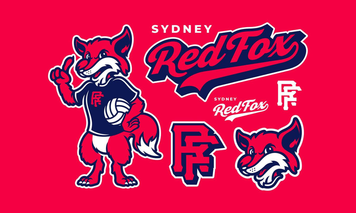
Many brands benefit from having simplified versions of their illustrated logo. A primary logo may include additional details, while smaller applications can use a streamlined variation that preserves recognition.
Build Strong And Balanced Composition
Composition determines how viewers experience an illustration logo design. A well-balanced arrangement helps guide attention naturally, making the logo easier to understand and remember. Every element should contribute to a cohesive visual structure rather than competing for attention.
Guide The Eye Naturally
Composition influences how viewers process visual information. The arrangement of elements should guide attention smoothly through the design rather than creating confusion.
Maintain Visual Balance
Balanced logos feel stable and professional. This does not always require perfect symmetry, but visual weight should be distributed carefully so no area feels unnecessarily heavy or distracting.
Create A Clear Focal Point
Every illustration logo design needs a primary focal point. Whether it is a character, object, animal, or symbolic element, viewers should immediately understand where their attention belongs.
Use Colors Strategically Rather Than Decoratively
Color is a powerful communication tool in illustration logo design. Beyond making a logo visually attractive, color choices influence perception, emotion, and brand recognition. Strategic color selection helps reinforce the brand's personality while improving consistency across marketing materials.
Support Brand Messaging
Color choices should reinforce the personality and positioning of the brand. Warm colors often communicate energy and friendliness, while cooler colors can suggest trust, professionalism, or calmness.
Limit The Color Palette
A controlled palette often creates stronger brand recognition than excessive color variety. Fewer colors also improve consistency across digital and print applications.
Check Black-And-White Performance
An effective logo should remain recognizable even without color. Testing the design in black and white helps reveal whether the underlying illustration remains strong on its own.
Make Typography Work With The Illustration
Typography and illustration should function as a unified visual system rather than separate design elements. The style, weight, and personality of the type should complement the illustrated artwork to create a cohesive brand identity. When these components work together effectively, the logo feels polished and intentional.
Create Harmony Between Text And Artwork
Typography and illustration should feel like parts of the same system. A playful illustration paired with a rigid corporate typeface may create visual conflict rather than cohesion.
Avoid Competing Visual Elements
When typography and illustration both demand equal attention, the logo can feel overwhelming. Establish a clear hierarchy so viewers understand how the elements work together.
Test Different Layout Relationships
Experiment with horizontal arrangements, stacked configurations, and integrated layouts. Small adjustments to positioning can significantly improve overall balance and readability.

Source: Nahuel Bardi, Behance, https://www.behance.net/gallery/85012921/ANIMA-Festival
Preserve Unique Character Without Overcomplicating The Artwork
One of the greatest strengths of an illustration logo design is its ability to express personality and originality. However, uniqueness should not come at the expense of clarity. Adding too many decorative features can make a logo difficult to reproduce, recognize, or scale effectively.
Add Distinctive Details Purposefully
Unique features help separate a logo from competitors. These details might include custom shapes, clever visual references, or stylized illustration techniques that reinforce brand identity.
Avoid Excessive Ornamentation
Adding decorative elements simply because they look attractive often weakens logo performance. Every visual component should contribute meaningfully to the design.
Balance Creativity And Practicality
Illustration logos thrive on creativity, but practical considerations remain important. The strongest designs maintain individuality while staying clear, adaptable, and easy to recognize.
Design For Versatility Across Different Applications
A logo rarely appears in just one place. It may be used on websites, packaging, signage, social media profiles, promotional materials, and merchandise. Because of this, versatility should be considered throughout the design process.
Consider Digital And Print Usage
A logo appears in many environments, including websites, packaging, business cards, advertisements, social media graphics, and merchandise. Each application introduces different visual requirements.
Prepare Alternate Versions
Creating horizontal, vertical, icon-only, and simplified variations improves flexibility. These alternatives help maintain consistency regardless of layout constraints.
Test On Real-World Mockups
Mockups reveal issues that may not appear on a design canvas. Testing the logo across realistic applications helps identify scaling, spacing, and visibility challenges before launch.
Refine, Test, And Improve Before Finalizing
The strongest logos are rarely perfect after the first draft. Refinement is an essential part of the design process that helps improve clarity, balance, and overall effectiveness. Testing the logo in realistic situations can reveal issues that may not be obvious during development.
Review The Logo At Multiple Sizes
Zooming in during the design process can hide problems. Regularly viewing the logo at realistic sizes helps confirm that important details remain visible and recognizable.
Gather Constructive Feedback
Fresh perspectives often uncover issues that designers may overlook. Feedback from clients, team members, or representative audience members can provide valuable insight.
Make Final Adjustments Thoughtfully
Refinement should strengthen the concept rather than transform it completely. Small improvements to spacing, proportions, typography, and illustration details can dramatically enhance the final result.
Frequently Asked Questions
What File Formats Should an Illustration Logo Include?
A complete logo package should include editable vector files such as AI, EPS, or SVG, along with PNG and JPG versions for everyday use. Request color, black-and-white, transparent-background, and simplified variations so the logo can be reproduced consistently across websites, packaging, signage, and printed materials.
How Can You Protect the Originality of an Illustration Logo?
Begin with original sketches and avoid copying recognizable characters, stock graphics, or another brand’s visual style. Conduct a trademark search before launch and keep dated concept files that document the creative process. For formal protection, consult a qualified intellectual property professional about registering the finished logo.
When Is an Illustration Logo Better Than a Simple Symbol?
An illustration logo is especially effective when a brand relies on storytelling, character, craftsmanship, or emotional appeal. Restaurants, creative studios, children’s brands, and specialty products often benefit from this approach. A simpler symbol may be more suitable when speed, neutrality, or highly compact digital use is the priority.
How Often Should an Illustration Logo Be Updated?
An illustration logo should be updated when it no longer reflects the brand, performs poorly in modern applications, or appears visually dated. A thoughtful refresh may simplify details, adjust typography, or refine colors while preserving familiar elements. Frequent redesigns should be avoided because consistency supports recognition and audience trust.
Conclusion
Understanding the brand, simplifying the concept, building strong composition, choosing purposeful colors, and creating versatile applications all contribute to a stronger final result. The most effective illustration logos are not simply beautiful drawings. They are carefully crafted brand assets designed to communicate clearly across countless touchpoints. By focusing on clarity, consistency, and long-term usability, you can create an illustration logo design that remains memorable, distinctive, and valuable for years to come.
Let Us Know What You Think!
Every information you read here are written and curated by Kreafolk's team, carefully pieced together with our creative community in mind. Did you enjoy our contents? Leave a comment below and share your thoughts. Cheers to more creative articles and inspirations!
Related Articles










Leave a Comment