
Guide & Tips: Create A Perfect Hand-Drawn Logo Design

Created by Rob Clarke, Dribbble, https://dribbble.com/shots/14644802-Kleenex-Logo
A hand-drawn logo design offers something many modern logos struggle to achieve: genuine personality. While digital tools have made logo creation faster and more precise, hand-drawn elements introduce warmth, originality, and a sense of craftsmanship that feels uniquely human. This approach can help brands appear more approachable, creative, authentic, or artistic depending on how the design is executed. The challenge is that creating a successful hand-drawn logo design requires more than sketching attractive artwork. The logo must still communicate the brand clearly, remain recognizable at different sizes, and work across various applications. A beautiful drawing alone is not enough. The strongest hand-drawn logos balance creativity with strategy, combining artistic expression with practical branding principles. By understanding the right process, designers can create logos that feel personal while maintaining the professionalism expected from a modern brand identity.
Understanding What Makes A Hand-Drawn Logo Design Effective
Not every sketch automatically becomes a successful logo. An effective hand-drawn logo design combines artistic character with clear communication. The goal is to create a mark that feels handcrafted while still functioning as a recognizable brand asset.
Balancing Creativity And Readability
Creative details can make a logo memorable, but readability should never be sacrificed. If viewers struggle to identify the company name or understand the symbol, the logo loses much of its value. Hand-drawn lettering should remain clear even when unique flourishes or decorative details are introduced. A good approach is to focus on simplicity first and personality second. Once the basic structure is easy to understand, creative touches can enhance the design without creating confusion.
Preserving Personality Without Losing Professionalism
The charm of hand-drawn work often comes from slight imperfections. Uneven strokes, organic shapes, and natural movement can make a logo feel more authentic. However, excessive inconsistency can make the design appear unfinished. Professional hand-drawn logos carefully control imperfections. They feel human without looking careless. This balance allows the logo to maintain credibility while preserving its artistic character.
Choosing The Right Brand Personality Before Sketching
Before creating a single sketch, it is important to understand the personality the logo should communicate. Every line, shape, and illustration choice should support the brand's identity.
Matching Illustration Style To Brand Character
Different drawing styles create different emotional responses. Loose, playful sketches may work well for children's products or creative businesses. Vintage-inspired illustrations often suit artisan brands, cafés, or handmade goods. Clean, elegant linework may support luxury products while still maintaining a handcrafted appearance. Choosing the wrong illustration style can create confusion. A logo should feel connected to the brand's overall voice and audience expectations.
Defining The Core Message
Strong logos communicate one clear idea rather than several competing messages. Before sketching, identify the primary impression the brand should leave behind. It may be creativity, craftsmanship, tradition, friendliness, sustainability, or expertise. Having a defined message helps guide design decisions throughout the entire creative process. It also prevents random visual elements from entering the logo without purpose.
Essential Preparation Before Creating A Hand-Drawn Logo Design
Preparation often determines the quality of the final result. Taking time to gather ideas and organize creative direction can significantly improve the effectiveness of a hand-drawn logo design.
Gathering Visual Inspiration
Research helps designers understand visual opportunities before drawing begins. Inspiration can come from illustration books, packaging, signage, historical artwork, typography collections, or competitor branding. Creating a mood board allows promising ideas to be collected in one place. The goal is not to copy existing work but to identify styles, textures, shapes, and visual themes that support the project's objectives.
Selecting Drawing Tools And Materials
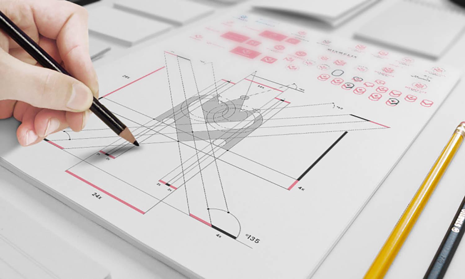
Different tools create different visual characteristics. Soft pencils allow quick exploration and revision. Ink pens create confident, permanent lines. Brush pens introduce expressive variation in stroke thickness. Some designers prefer traditional sketchbooks, while others use digital tablets that simulate hand-drawn techniques. Neither approach is automatically better. The best choice depends on the designer's workflow and comfort level.

Created by Dalibor Momcilovic, Dribbble, https://dribbble.com/shots/19969527-Alejandro-Antonio-Art-Studio/
Sketching Strong Logo Concepts From Scratch
The sketching phase is where ideas begin to take shape. Rather than searching for perfection immediately, focus on generating multiple possibilities.
Starting With Quick Thumbnail Sketches
Thumbnail sketches are small, fast drawings used to explore concepts rapidly. They encourage experimentation because each sketch requires only a few minutes. Many successful logo concepts emerge after dozens of rough ideas have been tested. Exploring multiple directions increases the chances of discovering unique visual solutions that may not appear during a more cautious process.
Exploring Symbols, Letterforms, And Shapes
A hand-drawn logo design may be based on custom typography, symbolic imagery, illustrated elements, or a combination of these approaches. During sketching, experiment with different structures and arrangements. Letterforms can be modified to reflect brand personality. Symbols can represent products, values, or industry connections. Shapes can influence the logo's overall mood and visual balance. The objective is to explore possibilities before committing to a final direction.
Avoiding Overcomplicated Details
One of the most common mistakes during sketching is adding too much detail too early. Fine decorative elements may look appealing on paper but often disappear when the logo is scaled down. Strong logos rely on recognizable forms rather than excessive ornamentation. If a concept works in a simple sketch, it is more likely to remain effective across different applications.
Refining And Improving Your Hand-Drawn Logo Design
Once promising concepts have been identified, refinement begins. This stage transforms rough sketches into polished logo candidates.
Identifying The Strongest Elements
Review sketches critically and look for the most effective qualities. A particular letter style, illustration detail, or composition may stand out more than the rest. Rather than selecting an entire sketch unchanged, many designers combine the strongest aspects from several concepts. This approach often produces a more refined final direction.
Cleaning Up Lines And Composition
Refinement focuses on improving consistency, spacing, balance, and visual harmony. Lines should feel intentional. Shapes should relate well to one another. The overall composition should remain stable and easy to understand. At the same time, avoid removing all organic characteristics. The handcrafted quality is what makes the design distinctive. Refinement should strengthen the drawing rather than eliminate its personality.
Digitizing A Hand-Drawn Logo Design The Right Way
Most logos eventually require digital production for printing, websites, packaging, and marketing materials. Proper digitization preserves the strengths of the original artwork.
Scanning Or Photographing Artwork
The first step is capturing a clean version of the drawing. High-resolution scans generally provide the best results. If scanning is unavailable, photographs can work when taken under even lighting with minimal distortion. Clear source images reduce cleanup time and improve overall accuracy during digital refinement.
Vectorizing And Refining Digitally
Vector software allows the logo to scale without losing quality. During vectorization, designers can adjust curves, improve alignment, and enhance consistency while preserving the hand-drawn appearance. The goal is not to create a perfectly mechanical version of the artwork. Instead, digital refinement should support usability while retaining the original character that made the concept appealing in the first place.
Common Mistakes That Weaken A Hand-Drawn Logo Design
Even talented designers can make decisions that reduce a logo's effectiveness. Recognizing common mistakes helps avoid unnecessary revisions.
Adding Too Many Decorative Elements
Excessive flourishes, textures, and embellishments can distract from the primary message. A logo should communicate quickly. Too much decoration often makes identification more difficult.
Ignoring Logo Scalability
A logo may look excellent on a large sketch page but perform poorly when reduced for social media profiles, labels, or business cards. Testing different sizes helps reveal potential issues before finalization.
Prioritizing Style Over Brand Relevance
A visually impressive drawing does not automatically make an effective logo. Every artistic decision should support the brand's identity and objectives. Style becomes valuable when it strengthens communication rather than simply attracting attention.

Created by Andrea Binski, Dribbble, https://dribbble.com/shots/11007630-Tasty-Custom-Typography
Tips For Creating A More Memorable Hand Drawn Logo Design
Small improvements can significantly increase the impact of a logo. These practical tips help strengthen recognition and usability.
Focus On One Distinctive Feature
The most memorable logos usually have a defining characteristic. It may be a custom letter, unusual illustration technique, unique line treatment, or recognizable symbol. Instead of trying to make every part of the logo special, concentrate on creating one feature that viewers are likely to remember.
Test The Logo Across Different Applications
Place the logo on packaging, websites, apparel, signage, and social media graphics. Seeing the design in realistic situations reveals strengths and weaknesses that may not be obvious during development. Testing also helps confirm that the hand-drawn style remains effective across various contexts.
Keep Refining Through Feedback
Constructive feedback can reveal issues designers overlook. Gather opinions from clients, colleagues, or target audience members when appropriate. Not every suggestion should be accepted, but thoughtful feedback often highlights opportunities for improvement while keeping the design aligned with its original goals.
Conclusion
A successful hand-drawn logo design combines artistic creativity with strategic thinking. The process begins with understanding the brand, continues through research and sketching, and evolves through careful refinement and digitization. Every stage contributes to creating a logo that feels authentic while remaining functional and professional. The strongest hand-drawn logos are not simply attractive illustrations. They communicate a clear message, support brand recognition, and maintain their effectiveness across different applications. By focusing on clarity, purpose, and craftsmanship throughout the design process, you can create a hand-drawn logo design that captures attention while building a lasting connection with its audience.
Let Us Know What You Think!
Every information you read here are written and curated by Kreafolk's team, carefully pieced together with our creative community in mind. Did you enjoy our contents? Leave a comment below and share your thoughts. Cheers to more creative articles and inspirations!
Related Articles







1 comment
This article is so very inspirational for me as I embark on redesigning our non-profit’s logo by hand. Thank you so much.
Maryanne
Leave a Comment