How To Create A Good Typographic Logo Design

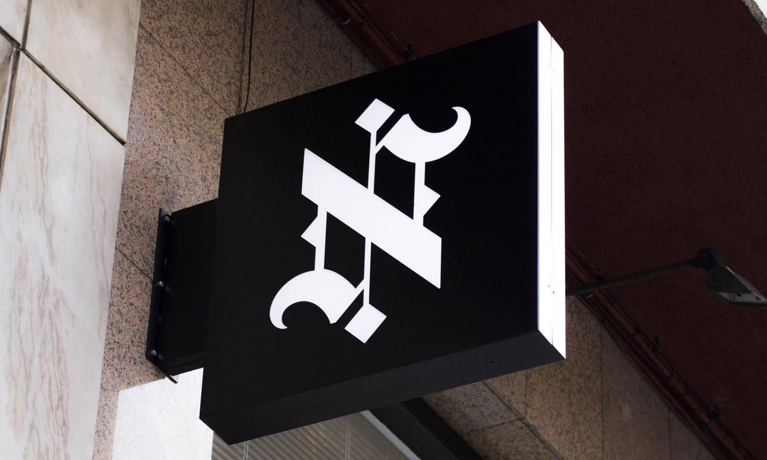
Created by Abby Haddican | https://www.behance.net/gallery/107552341/Moodys
A typographic logo design is one of the most powerful ways to communicate a brand’s identity using only letters and typography. Instead of relying on symbols or illustrations, this style focuses on carefully crafted letterforms that represent the personality and values of a business. When designed well, a typographic logo design can be simple, memorable, and highly recognizable.
Many of the world’s most famous brands rely on typographic logo design because it offers clarity and strong brand recognition. By using custom typography, thoughtful spacing, and balanced composition, designers can transform ordinary text into a distinctive visual mark. The success of this type of logo depends on choosing the right typeface, refining letter shapes, and ensuring the design works across many different platforms.
Creating a strong typographic logo design requires both creativity and attention to detail. Designers must consider readability, proportion, alignment, and overall visual harmony. Even small adjustments to letter spacing or stroke thickness can dramatically improve the final result.
In this article, we will explore practical tips that can help you create a good typographic logo design. From selecting the right typeface to refining letterforms and testing your design in real applications, these guidelines will help you build a logo that is professional, timeless, and effective.
Understand The Basics Of Typographic Logo Design
Before creating a strong brand mark, it is important to understand the fundamentals of typographic logo design. This type of logo focuses entirely on typography, using carefully designed letters to represent a brand. Unlike symbol-based logos, a typographic logo design relies on the visual power of words, letterforms, and spacing to communicate identity and personality.
A well-crafted typographic logo design transforms simple text into a distinctive visual mark. Designers achieve this by selecting appropriate typefaces, refining letter shapes, and adjusting spacing to create harmony. Even small design decisions, such as the thickness of strokes or the curve of a letter, can influence how a brand is perceived.
Another key aspect of typographic logo design is readability. Since the logo is built around letters, it must remain clear and legible in different sizes and contexts. Whether it appears on a website header, a product label, or a business card, the text should always be easy to recognize.
Understanding typography principles such as hierarchy, alignment, and balance also plays a major role in the success of a typographic logo design. These principles help designers organize letters in a way that looks visually appealing while maintaining clarity.
By learning the basics of typographic logo design, designers can build a strong foundation for creating logos that are simple, memorable, and effective. With thoughtful typography and careful attention to detail, a typographic logo design can become a timeless visual identity for any brand.
Choose The Right Typeface For Your Brand Personality
Choosing the right typeface is one of the most important steps in creating a successful typographic logo design. The typeface you select will strongly influence how people perceive a brand. Each typeface carries its own personality, mood, and visual tone, making it essential to choose one that aligns with the brand’s identity.
For example, serif typefaces often communicate tradition, reliability, and sophistication. Sans-serif typefaces usually feel modern, clean, and approachable. Script or handwritten styles may convey creativity, elegance, or personal expression. When designing a typographic logo design, selecting the right style helps ensure that the brand message is communicated effectively.
Designers should also consider how the typeface performs in different environments. A good typographic logo design must work across multiple applications such as websites, packaging, signage, and marketing materials. The typeface should remain readable and visually balanced at both large and small sizes.
In many cases, designers modify or customize the chosen typeface to create a more distinctive typographic logo design. Adjusting letter shapes, altering stroke weights, or refining curves can help turn a standard font into a unique brand mark.
By carefully selecting and refining a typeface, designers can create a typographic logo design that reflects the brand’s personality while remaining clear, memorable, and visually appealing.
Focus On Readability In Typographic Logo Design
Readability is one of the most important elements of a successful typographic logo design. Since this type of logo relies entirely on letters rather than symbols, the text must remain clear and easy to recognize. If people cannot quickly read the name in the logo, the design may lose its effectiveness as a brand identifier.
When creating a typographic logo design, designers should carefully evaluate how the letters interact with one another. Some fonts may look attractive at first glance but become difficult to read when used in a logo format. Thin strokes, overly decorative characters, or complex script styles can reduce clarity, especially when the logo is displayed at smaller sizes.
Spacing also plays a major role in readability. Proper kerning, which refers to the space between individual letters, ensures that the text appears balanced and natural. If letters are placed too closely together or too far apart, the typographic logo design can look awkward or confusing.
Another helpful technique is to test the logo at multiple sizes and in different environments. A good typographic logo design should remain readable on everything from digital screens to printed materials. Designers often preview their work in small sizes to ensure the letters remain clear.
By prioritizing readability, designers create a typographic logo design that communicates the brand name effectively while maintaining a clean and professional appearance. Clear typography allows the audience to instantly recognize the brand and strengthens the overall visual identity.

Created by VASK®️ Studio | https://dribbble.com/shots/16949535-Moovle-Logo-design/
Customize Letterforms To Create A Unique Identity
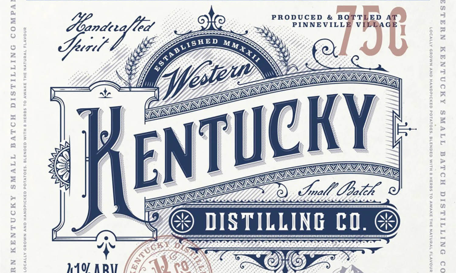
One of the most effective ways to make a typographic logo design stand out is by customizing the letterforms. While selecting a good typeface is important, modifying the characters can transform a standard font into a distinctive brand mark. This process allows designers to create a unique visual identity that cannot easily be replicated.
Customizing letters in a typographic logo design may involve adjusting shapes, extending strokes, connecting characters, or refining curves. Small changes can significantly improve the personality of the logo. For example, extending the tail of a letter or merging two characters together can add originality while keeping the design simple.
Designers should approach customization carefully to maintain readability and balance. The goal is not to make the letters overly complex but to enhance them in a subtle and meaningful way. A well-executed typographic logo design often includes small details that make the lettering feel special and memorable.
Consistency is also essential when modifying letterforms. Each letter should feel like it belongs to the same visual system. Stroke thickness, angles, and proportions should remain harmonious throughout the typographic logo design.
By refining and personalizing letterforms, designers can create a typographic logo design that feels unique, professional, and strongly connected to the brand’s identity. These thoughtful adjustments often turn a simple wordmark into a powerful visual signature.
Maintain Proper Spacing And Kerning
Spacing plays a crucial role in the success of a typographic logo design. Even if the typeface is well chosen, poor spacing between letters can make the logo look unbalanced or difficult to read. Proper kerning, which refers to the adjustment of space between individual letters, helps create a visually harmonious composition.
In typographic logo design, designers should avoid relying only on default font spacing. Many typefaces are created for general text use, not specifically for logos. Because of this, the automatic spacing may not look perfect when the text becomes the central visual element of a brand identity. Manual adjustments are often necessary to ensure that every letter feels evenly positioned.
When reviewing spacing, designers should pay attention to how letters interact with each other. Certain letter combinations, such as “A” next to “V” or “T” next to “O,” may create awkward gaps if not corrected. Adjusting these spaces improves the overall flow and visual balance of the typographic logo design.
Consistency is also important. The spacing between letters should appear visually equal rather than mathematically equal. Designers often rely on their eye to judge balance rather than measuring exact distances. This approach ensures that the typographic logo design looks natural and refined.
By carefully managing kerning and spacing, designers can elevate a simple wordmark into a polished typographic logo design. Well-balanced lettering not only improves readability but also strengthens the professional appearance of the brand.
Keep The Typographic Logo Design Simple And Clean
Simplicity is one of the most important principles in creating an effective typographic logo design. A clean and straightforward logo is easier for audiences to recognize, remember, and understand. When the design focuses on clarity rather than unnecessary decoration, the brand name becomes the central visual element.
In typographic logo design, simplicity often comes from limiting the number of design elements. Using one strong typeface, balanced spacing, and minimal styling can produce a powerful visual identity. Adding too many effects, such as excessive outlines, shadows, or complex shapes, can distract from the typography itself.
A simple typographic logo design also improves versatility. The logo should work across many platforms, including websites, social media, packaging, and printed materials. When the design is clean and uncluttered, it remains effective even at small sizes or when reproduced in different formats.
Designers should also consider how quickly the logo communicates the brand name. If viewers need too much time to read or interpret the letters, the design may be overly complicated. A clear typographic logo design allows the audience to instantly recognize the brand.
By prioritizing simplicity and clarity, designers can create a typographic logo design that feels timeless and professional. Clean typography not only enhances readability but also helps the logo maintain its effectiveness across a wide range of real-world applications.
Use Contrast To Enhance Visual Impact
Contrast is a powerful design principle that can greatly improve a typographic logo design. In typography, contrast refers to the visual difference between elements such as size, weight, spacing, or style. When used thoughtfully, contrast helps highlight important parts of the logo and creates a more dynamic and engaging appearance.
One common way to introduce contrast in typographic logo design is by combining different font weights. For example, a brand name might feature a bold primary word paired with a lighter secondary word. This approach adds visual hierarchy and helps guide the viewer’s attention to the most important part of the brand identity.
Designers can also create contrast by adjusting letter size, capitalization, or alignment. For instance, mixing uppercase and lowercase letters or varying the size of certain characters can give the typographic logo design a distinctive structure. However, these techniques should be applied carefully to maintain readability and balance.
Another form of contrast involves spacing and composition. Tight letter spacing in one section paired with more open spacing in another can create visual rhythm. These subtle variations add character while keeping the design clean and professional.
When used effectively, contrast makes a typographic logo design more visually appealing and memorable. It allows designers to emphasize key elements without adding unnecessary graphics or decoration. By carefully balancing contrast within the typography, a logo can achieve both clarity and strong visual impact.

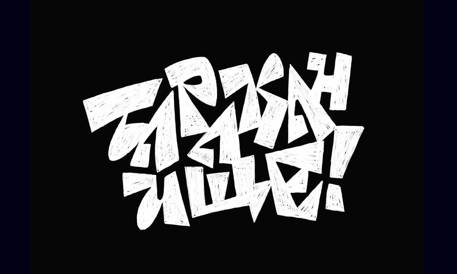
Created by Wells Collins | https://dribbble.com/shots/18837443-Night-Falls-Title-Concept-Sketches
Balance Typography With Negative Space
Negative space plays an important role in creating a well-balanced typographic logo design. Negative space refers to the empty or unused areas around and between letters. Although it may seem like a minor detail, this space helps the typography breathe and prevents the design from feeling crowded.
In typographic logo design, proper use of negative space improves readability and visual clarity. When letters are surrounded by sufficient space, each character becomes easier to distinguish. This makes the logo more legible across different sizes and platforms.
Negative space can also enhance the overall composition of the typographic logo design. Designers often use spacing around the text to create balance between the letters and the surrounding layout. This ensures the logo feels stable and visually comfortable rather than cramped or overwhelming.
In some cases, negative space can even become a creative design feature. Clever arrangements of letters may reveal hidden shapes or visual patterns within the empty space. These subtle details can make a typographic logo design more interesting while maintaining simplicity.
By carefully managing negative space, designers can achieve a harmonious typographic logo design that feels clean, balanced, and professional. Thoughtful spacing around the letters allows the typography to stand out clearly while reinforcing the overall strength of the brand identity.
Ensure Scalability Across Different Sizes
Scalability is a crucial factor in creating an effective typographic logo design. A logo must maintain its clarity and visual strength whether it appears on a large billboard or a small mobile screen. Because typographic logo design relies entirely on lettering, designers must ensure that every letter remains readable and balanced at different sizes.
One of the best ways to achieve scalability is by keeping the typography clean and well-proportioned. Extremely thin strokes, overly detailed letterforms, or complex decorative styles may look attractive in large formats but can become difficult to read when scaled down. A strong typographic logo design uses clear shapes and well-defined spacing so that the letters remain recognizable in any size.
Testing the logo in multiple environments is also an important step. Designers should preview the typographic logo design on websites, social media icons, product packaging, and printed materials. This process helps reveal whether the logo maintains its readability and balance across different applications.
Another helpful practice is creating simplified versions of the typographic logo design for smaller spaces. Sometimes a compact version or shortened wordmark can help maintain clarity in limited areas without losing the brand identity.
By ensuring scalability, designers create a typographic logo design that works consistently across digital and physical platforms. A scalable logo strengthens brand recognition because audiences can easily identify it no matter where or how it appears.
Test Your Typographic Logo Design In Real Applications
After completing the design process, it is important to test the typographic logo design in real-world applications. While a logo may look perfect on a design canvas, its true effectiveness becomes clear only when it is placed in practical environments such as websites, packaging, signage, or marketing materials.
Testing allows designers to evaluate how the typographic logo design interacts with different backgrounds, layouts, and sizes. For example, the logo might appear strong on a white background but lose clarity when placed on darker surfaces. Reviewing these variations helps ensure the logo remains versatile and visually consistent.
Another benefit of testing is identifying potential readability issues. When the typographic logo design is applied to small spaces such as social media icons or mobile interfaces, certain details may become less visible. Designers can then refine the typography, adjust spacing, or simplify elements to improve clarity.
Real-world testing also helps evaluate the emotional impact of the typographic logo design. Seeing the logo on business cards, product labels, or advertisements allows designers and stakeholders to understand how the design represents the brand in everyday situations.
By carefully reviewing the typographic logo design in practical applications, designers can make final adjustments that improve performance and consistency. This final step ensures the logo works effectively across multiple platforms while maintaining a strong and professional brand identity.
Conclusion
A well-crafted typographic logo design can become a powerful visual identity for any brand. By focusing on the fundamentals of typography, choosing the right typeface, refining letterforms, and maintaining proper spacing, designers can transform simple text into a memorable logo. Elements such as contrast, negative space, simplicity, and scalability also play important roles in building a balanced and professional design. When thoughtfully developed and tested across real applications, a typographic logo design can communicate brand personality clearly while remaining timeless, versatile, and easy for audiences to recognize.







Leave a Comment