30 Best Ambigram Logo Design Ideas You Should Check

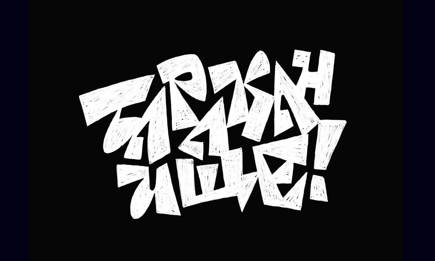
Source: Martin Schmetzer, Notre Tattoo, Dribbble, https://dribbble.com/shots/9006080-N
Ambigram logo design is where creativity takes a thrilling twist—literally. These clever logos are crafted so they can be read the same way upside down, mirrored, or reversed, making them a true visual puzzle for the eyes. It’s the kind of design that wows both designers and audiences alike because it combines artistry, symmetry, and meaning all in one elegant package. Whether you’re creating a logo for a modern brand, a tech company, or a personal project, ambigrams give your visual identity a mysterious and intellectual edge.
In this article, we’ll explore some of the most inspiring ambigram logo design ideas that stand out for their innovation and style. From bold typographic illusions to minimalist geometric compositions, these examples show how letters can become dynamic visual forms. Each idea highlights how ambigrams balance readability with aesthetic surprise, making them perfect for brands that value originality and clever design thinking. If you love the magic of seeing words transform without losing their meaning, get ready—these designs will flip your perspective on what a logo can be.
Ambigram Logo Design Ideas

Source: Shane, DG Ambigram, Dribbble, https://dribbble.com/shots/3838247-DG-Ambigram

Source: Arda Design Studio, Knd-Qnd, Dribbble, https://dribbble.com/shots/15484678-KND-QND-ambigram-logo

Source: Sean Brice, Brice, Dribbble, https://dribbble.com/shots/14787286-Ambigram-name-mark-personal-brand

Source: Josué Delazeri, Fialho, Dribbble, https://dribbble.com/shots/1604114-Ambigram-logo

Source: Saifuddin Mahmud, Potpod Cast, Behance, https://www.behance.net/gallery/238240443/potpod-cast-Ambigram-Logo

Source: Creaziz, HNS, Dribbble, https://dribbble.com/shots/18220643-HNS-Ambigram-Logo

Source: Jabir J3, Awesome, Dribbble, https://dribbble.com/shots/3858054-Awesome-Ambigram

Source: Tyler Anthony, TA, Dribbble, https://dribbble.com/shots/14869007-TA-monogram-ambigram

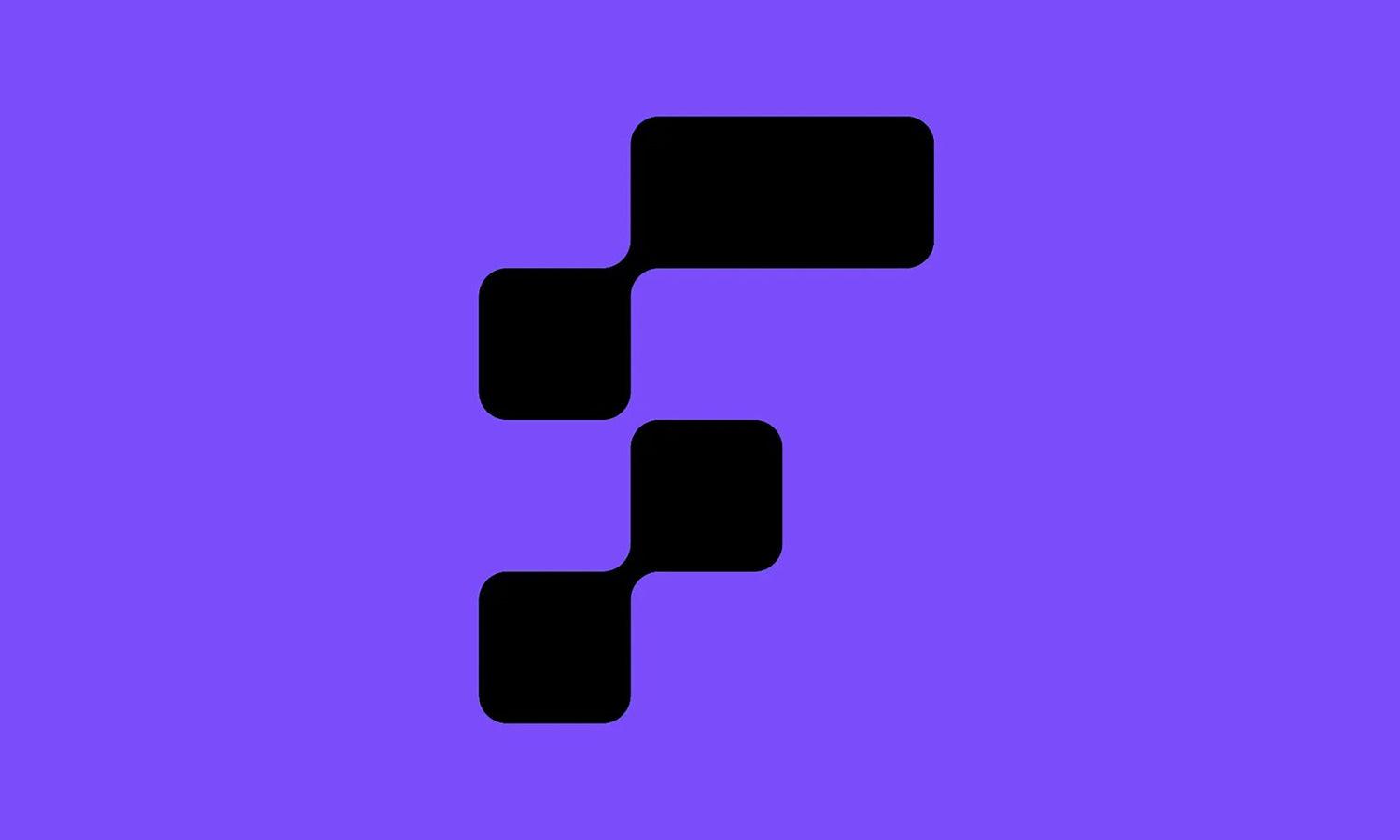
Source: Kakha Kakhadzen, Kakha Kakhadzen, Dribbble, https://dribbble.com/shots/2661422-N-Grid

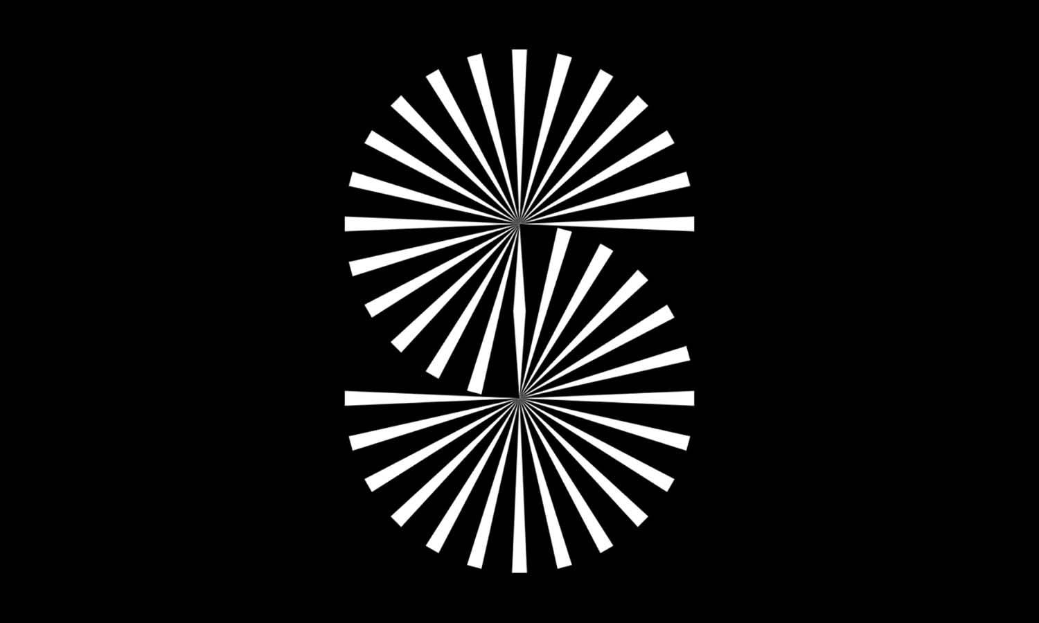
Source: George Bokhua, George Bokhua, Dribbble, https://dribbble.com/shots/18476718-S-letterform

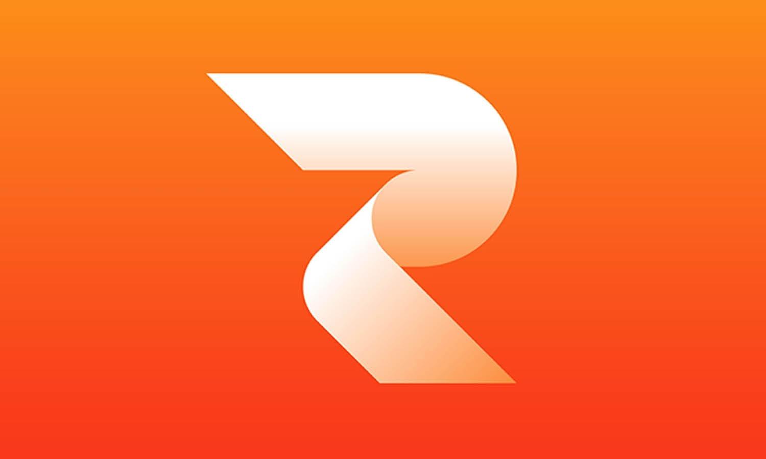
Source: Zaki F Atmazaini, Rhaya Flicks, Behance, https://www.behance.net/gallery/239196333/Rhaya-Flicks-Logo

Source: Rayyan Design, ASV, Behance, https://www.behance.net/gallery/199228319/ASV-ambigram-logo

Source: Afifudin Zuhri, Sysderma, Dribbble, https://dribbble.com/shots/17073641-Sysderma-Logo

Source: Awoga Ranger, Shark Ambigram, Dribbble, https://dribbble.com/shots/19688051-Shark-Ambigram-Line-Art-Logo

Source: Antoine Goulet, Tatin, Behance, https://www.behance.net/gallery/184438689/Tatin

Source: Sadan Genta, Tipsy, Behance, https://www.behance.net/gallery/164248107/Tipsy-Ambigram-Logo

Source: Igor Borisenko, Ayos & Kartlos, Dribbble, https://dribbble.com/shots/3964610-Ayos-Kartlos

Source: Farzana Mim, Decimal, Behance, https://www.behance.net/gallery/235917887/Decimal-An-ambigram-design

Source: Jake Dunham, Grim, Dribbble, https://dribbble.com/shots/3716562-Grim-Ambigram

Source: Farzana Mim, The Loop, Behance, https://www.behance.net/gallery/236139973/The-Loop-An-ambigram-design

Source: Szymon Golis, 23, Dribbble, https://dribbble.com/shots/2271216-23-Logo

Source: Chintak Shah, WM, Dribbble, https://dribbble.com/shots/5394432-WM-Ambigram

Source: Mark Farris, USA, Dribbble, https://dribbble.com/shots/3715368-USA-Ambigram

Source: Lucas Fields, Maximum World, Dribbble, https://dribbble.com/shots/20898827-Maximum-World-Logo-Design

Source: Kakha Kakhadzen, Kakha Kakhadzen, Dribbble, https://dribbble.com/shots/18266045-N

Source: MisterShot, Noir, Dribbble, https://dribbble.com/shots/5886426-Noir-Ambigram

Source: Omnium, Omnium, Dribbble, https://dribbble.com/shots/15695481-S-Ambigram

Source: Jeroen van Eerden, NT, Dribbble, https://dribbble.com/shots/14610446-NT-Ambigram

Source: Kakha Kakhadzen, 39 Ambigram, Dribbble, https://dribbble.com/shots/8812312-39-Ambigram

Source: Martin Schmetzer, Notre Tattoo, Dribbble, https://dribbble.com/shots/9006080-N
What Makes Ambigram Logo Design Visually Appealing?
Ambigram logo design is a true playground for creative minds—where symmetry, imagination, and clever typography come together to bend visual perception. What makes it so appealing is its ability to transform ordinary letters into artistic illusions that hold meaning no matter how you look at them. Here are five key reasons why ambigram logo design continues to captivate audiences and designers alike.
The Magic Of Symmetry
At the heart of every great ambigram logo design lies symmetry—the perfect balance between beauty and logic. When a word looks identical upside down or reversed, it instantly feels satisfying to the eye. This harmony triggers a sense of visual pleasure because our brains love order and balance. It’s like a puzzle that solves itself right before your eyes, giving viewers that delightful “aha” moment. Symmetry doesn’t just make the design beautiful—it makes it memorable.
The Element Of Surprise
Ambigram logo design thrives on surprise. It turns something familiar into something unexpected, giving the viewer a sense of discovery. When you realize that the logo reads the same in two directions, it sparks curiosity and admiration. This hidden twist adds depth and intrigue, making people look twice. The surprise factor transforms the logo from mere decoration into an experience—one that leaves a lasting impression long after the first glance.
The Blend Of Art And Intelligence
Few design styles blend creativity and intellect quite like ambigram logo design. It challenges designers to think beyond aesthetics and explore how form and function can merge in letter construction. Every curve and line must serve a dual purpose—maintaining both readability and artistic balance. The result is a visual puzzle that reflects thoughtfulness and craftsmanship, appealing to those who appreciate smart, meaningful design.
The Playful Interaction With Viewers
Ambigram logo design isn’t just something you look at—it’s something you interact with. It invites viewers to rotate, flip, or mirror the design, creating a fun, engaging experience. This element of playfulness fosters emotional connection and makes the design feel alive. Brands that use ambigrams often benefit from this interactive charm because it encourages audiences to spend more time exploring the design, deepening brand recall in the process.
The Timeless Beauty Of Duality
Finally, what makes ambigram logo design truly special is its dual nature. It symbolizes versatility, transformation, and unity—all timeless qualities that resonate across cultures and industries. Whether it’s representing two ideas, two names, or simply a brand’s creative spirit, ambigrams visually capture balance and adaptability. This sense of duality reflects the power of perspective—reminding us that beauty can exist from more than one angle.
In essence, ambigram logo design stands out because it merges visual poetry with optical precision. It’s not just a logo—it’s an art form that invites curiosity, rewards attention, and celebrates the joy of design that thinks in two directions.
What Fonts Work Best for Ambigram Logo Design?
When it comes to ambigram logo design, choosing the right font is like selecting the perfect spice for a gourmet meal—it can completely transform the flavor! Ambigram logos, with their delightful visual trickery, require fonts that enhance readability and aesthetic appeal when viewed from multiple angles. So, if you’re ready to create a mind-bending, eye-catching ambigram logo, here are five types of fonts that can help you spell success in a fun and unique way.
Script Fonts
Script fonts are often a go-to choice for ambigram designers due to their fluid and continuous strokes, which facilitate the creation of symmetrical designs. These fonts mimic the flow of handwriting, allowing for a seamless integration of characters when flipped or rotated. Fonts like Edwardian Script or Snell Roundhand offer elegance and flexibility, making them ideal for ambigrams that need a touch of sophistication and a smooth visual connection between letters.
Sans Serif Fonts
For a clean, modern look, sans serif fonts are a fantastic option. Their clear and simple structure makes them highly legible, which is crucial for ambigrams. The absence of serifs means fewer distractions, allowing the viewer to focus on the cleverness of the design. Fonts like Futura or Avant Garde provide strong, uniform lines that can be easily manipulated to look appealing from various perspectives.
Blackletter Fonts
If you’re aiming for a dramatic and ornate ambigram, blackletter fonts can provide the intricate details and bold strokes that make your design pop. These fonts, reminiscent of medieval manuscripts, lend a sense of tradition and complexity, ideal for brands that want to project an image of heritage or craftsmanship. However, use them wisely—blackletter fonts require careful handling to maintain readability in an ambigram format.
Monospaced Fonts
Monospaced fonts, where each character occupies the same amount of horizontal space, offer a unique advantage for ambigrams because of their uniformity and balance. This consistency can help maintain symmetry and make the design process slightly less complicated. Fonts like Courier or Consolas are excellent choices when you want to ensure that the ambigram maintains its form and structure from all viewing angles.
Custom Hand-Drawn Fonts
Sometimes, the best font for your ambigram logo is one that doesn’t exist yet! Creating a custom hand-drawn font allows you to tailor the specifics of each character to perfectly suit the ambigram’s requirements. This approach provides maximum control over the design, enabling you to tweak little details that pre-designed fonts cannot offer. Custom fonts are perfect for those who want a truly unique and personalized ambigram logo.
Choosing the right font for your ambigram logo design isn’t just about aesthetics; it’s about finding the perfect balance between form and function, ensuring that your design is as legible as it is beautiful. So, let your creativity flow and pick a font that turns your ambigram into a stunning work of art!
What Colors Are Most Effective for Ambigram Logos?
Diving into the vibrant world of ambigram logo design, colors play more than just a supporting role—they're the lead actors! Choosing the right colors for your ambigram logo can elevate it from good to unforgettable. But not all hues are created equal when it comes to this unique style of logo design. Let’s explore five color choices that work wonders for ambigrams, ensuring they catch the eye and captivate the imagination.
Black and White
Classic, timeless, and incredibly powerful, the black and white color scheme is a popular choice for ambigram logos. This duo excels in offering stark contrast, which enhances readability and makes the ambigram stand out in any context. Whether printed on business cards or displayed on digital platforms, a black and white ambigram remains crisp and visible. Plus, this color combination evokes a sense of sophistication and elegance that never goes out of style.
Red
If you want your ambigram logo to pop with energy and passion, red is your go-to color. Known for its ability to grab attention quickly, red can make your logo more memorable. This color is particularly effective for brands that want to convey excitement, strength, or a daring personality. When used in ambigram designs, red should be balanced carefully with neutral backgrounds to ensure the design remains legible and impactful.
Blue
Blue is the darling of the corporate world, and for good reason. It evokes feelings of trust, dependability, and calmness—traits that any brand would want to be associated with. Using various shades of blue can add depth to your ambigram logo while maintaining a professional look. Lighter blues can be soothing and friendly, whereas darker blues signify strength and reliability. This versatility makes blue a superb choice for ambigram logos, especially for businesses in the technology, healthcare, and financial sectors.
Green
Green stands for growth, freshness, and harmony—making it a perfect pick for brands that align with health, sustainability, or nature. In ambigram logos, green can be used to promote a sense of balance and renewal. It’s especially effective for companies that wish to underscore their commitment to eco-friendly practices or organic products. Green’s wide palette, from vibrant lime to deep forest, offers numerous possibilities for creative and meaningful ambigram designs.
Gradient Colors
Embracing a gradient color scheme can add a modern twist to your ambigram logo. Gradients can simulate lighting effects, depth, and even movement, giving a dynamic appearance to the static nature of ambigrams. By blending two or more colors, you can achieve a look that stands out in digital media and catches the eye in printed forms. Whether it’s a cool blend of blues and purples or a warm sunrise effect with reds and oranges, gradients bring a contemporary vibe to traditional ambigram designs.
When selecting colors for your ambigram logo, think about the emotions you want to evoke and the story you’re telling with your brand. The right color not only enhances the design but also reinforces the brand message you wish to communicate. With these tips in mind, go ahead and color your ambigram in ways that best reflect your brand's spirit and vision!
What Are Some Creative Ideas For Ambigram Logo Design?
Ambigram logo design is where typography meets optical illusion, turning words into a game of perception and art. It’s not just about designing letters—it’s about designing moments of discovery. When done right, an ambigram makes people pause, rotate, and smile as they realize the hidden magic within your logo. Here are five creative ideas to spark your imagination and push your ambigram logo design to the next level.
Blend Opposites In Harmony
One of the most fascinating creative tricks in ambigram logo design is combining two contrasting words that share a visual rhythm. Imagine blending “light” and “dark” or “love” and “hate” into a single mirrored identity. This concept challenges you to find harmony in visual opposites, representing balance, duality, or transformation. It’s perfect for brands that thrive on contrast—like day and night, innovation and tradition, or strength and softness.
Experiment With Mirror Ambigrams
Mirror ambigrams are all about reflection—literally. When viewed in a mirror, the logo reveals the same or another word. This type of ambigram logo design works wonders for companies emphasizing reflection, symmetry, or dual perspective. For example, a wellness brand might use this technique to represent inner balance, while a luxury label could evoke sophistication and timelessness through sleek mirrored elegance.
Add A Twist With Rotational Designs
Rotational ambigrams spin creativity—literally 180 degrees. These designs look identical (or reveal another word) when flipped upside down. This approach adds a sense of motion and playfulness to your ambigram logo design. Think of it as an emblem that rewards curiosity. A gaming studio, for instance, could use this concept to symbolize dynamism and versatility, while a tech company might express innovation through motion-inspired symmetry.
Combine Symbols And Letters
Another creative idea is merging typography with imagery to form hybrid ambigrams. Here, letters morph into shapes, icons, or even brand symbols that contribute to the overall illusion. For instance, the letter “O” could become an infinity loop or a yin-yang symbol. This technique gives your ambigram logo design a storytelling dimension—where each element carries both literal and symbolic meaning, creating depth that resonates with viewers.
Play With Negative Space
Negative space is the designer’s secret playground. In ambigram logo design, it can be used to craft hidden words, mirror reflections, or secondary shapes that appear only upon closer inspection. This layered design approach engages the viewer, encouraging them to interact visually and mentally with the logo. A fashion label or art collective could use this trick to express mystery, creativity, and refined simplicity.
In essence, ambigram logo design invites you to think beyond static visuals. It’s about creating a living logo that flips, reflects, or transforms—offering surprise, cleverness, and visual delight in every turn. When executed thoughtfully, an ambigram becomes more than a mark; it becomes a conversation starter and a testament to the endless possibilities of design ingenuity.
What Tools Are Best For Creating Ambigram Logo Design?
Creating an ambigram logo design is like solving a visual puzzle—each curve, angle, and symmetry must flow perfectly whether viewed upright or upside down. To bring this clever illusion to life, designers rely on tools that blend precision, creativity, and flexibility. From digital design software to specialized ambigram generators, these tools make it easier to experiment, refine, and perfect your letterforms. Here are five of the best tools for crafting a striking ambigram logo design.
Adobe Illustrator
Adobe Illustrator is the go-to powerhouse for professional designers working on ambigram logo design. Its vector-based environment allows precise control over typography, curves, and symmetry. You can easily flip, rotate, and manipulate letterforms while maintaining crisp quality at any scale. Illustrator’s mirror and reflect tools make it effortless to test your ambigram from multiple angles. Whether you’re refining geometric forms or sculpting elegant calligraphy, Illustrator gives you the freedom to experiment endlessly with structure and flow.
CorelDRAW
CorelDRAW is another favorite for creating ambigram logo design because of its intuitive interface and strong typographic controls. The software’s symmetry tools make it a natural fit for designing ambigrams that require mirrored accuracy. It also allows for node editing, which helps you shape letters smoothly while maintaining balance. CorelDRAW’s real-time preview feature lets you see how your design looks when rotated or reflected, turning the creation process into a fun and engaging exploration of form.
Inkscape
For those seeking a free and open-source option, Inkscape is a hidden gem for ambigram logo design. It offers powerful vector editing tools comparable to paid software, with flexible path manipulation and text-to-path conversion. Its ability to duplicate and flip designs helps in crafting symmetrical letter combinations. The customizable grid and snapping features make aligning complex forms easier, ensuring precision even in the most experimental designs. Inkscape proves that you don’t need an expensive setup to create professional-level ambigrams.
Ambimatic And FlipScript Generators
If you’re looking for a quick and playful way to explore concepts, online ambigram generators like Ambimatic and FlipScript are fantastic starting points. These tools instantly convert words into ambigram-style layouts, offering inspiration for further manual refinement. While they may not deliver perfect professional results, they provide a fun spark of creativity—especially when testing how different letter combinations might align or rotate. They’re ideal for beginners or designers brainstorming early concepts before moving into detailed vector work.
Procreate
For hand-lettering enthusiasts, Procreate brings an artistic edge to ambigram logo design. Using the symmetry and drawing assist tools, you can sketch mirrored compositions with ease. It’s perfect for experimenting with organic, calligraphic styles that feel personal and fluid. The tactile experience of drawing directly on a tablet encourages free-flowing exploration—often leading to unexpected and delightful results that digital precision alone can’t replicate.
In the end, the best tool for ambigram logo design is the one that suits your creative process. Whether you prefer digital precision or hand-drawn spontaneity, these tools help turn imagination into a mesmerizing work of visual symmetry.
Conclusion
Ambigram logo design is a captivating blend of creativity, precision, and visual intelligence. It challenges designers to think beyond conventional forms and embrace balance, symmetry, and surprise. Whether crafted using professional tools like Adobe Illustrator or explored through freehand sketches, the result is always a logo that invites interaction and curiosity. Ambigram logo design stands out because it turns words into experiences—clever, memorable, and full of character. For brands seeking originality and meaning, it offers a timeless way to express identity from every angle, quite literally transforming design into visual poetry.
Let Us Know What You Think!
Every information you read here are written and curated by Kreafolk's team, carefully pieced together with our creative community in mind. Did you enjoy our contents? Leave a comment below and share your thoughts. Cheers to more creative articles and inspirations!
Article Meta Description
Flip your perspective with stunning ambigram logo design ideas. Discover clever, symmetrical creations that transform words into unforgettable visual art.



Leave a Comment