10 Tips To Create A Good 2 Letters Logo Design
Here are some tips you can follow to create a fantastic two-letter logo design!

Logos, in general, are not only limited to marketing and branding. Many aspects include working with these elements, including the web design. Due to the vast influence of design and logo, the styling and ideation of the creation are kept on growing. Among them, one of the popular ideations for the imagery is using 2 letters.
In the creative industry related to logos, the use of 2 letters in logo design is considered the easiest type to remember and try. It is also used in various famous brands out in the market, signifying the popularity, simplicity, and effectiveness of the style. The letter logo is also known for having an endless way to make the design more memorable and unique.
With so many design possibilities, there are chances that the creator or company is indecisive in picking the best 2 letters logo. Sometimes, the model appears to be lacking. But there are also chances that the work is simply too much for a simple double character combination. To help ease the condition, here are some tips and techniques to learn.

Why Use 2 Letters for Logos?
The principle of logo design should be about making an identity that fully functions as a branding, remembrance, and identifier of a certain brand or product. With that in mind, the design should be easier to remember, simple, and direct. To give that feature, the idea of providing the 2 letters model comes as one of the best options.
The design style is known for its simplicity and easy approach for designers. Even beginners can try the logo style and make a high-quality product. One thing that should be noted is that the limited element helps bring more creative ideation to the table. Creators or designers can make fantastic 2 letters by blending and combination for the idea.

The use of initiative is also a great way to introduce and remind the audience of the brand identity. Thus, prodding a better remembrance for better marketing. It signifies that the 2 letters logo design or also known as the letter mark, still has its superiority on the market. You can see it from the varying techniques and companies that are not afraid to use the style for their branding.
Another good reason for using the 2 letters lettermark is the underlining design idea of using a simple and minimalistic technique. Most of the techniques and tips mentioned will highlight that the creation tends to use the most fundamental design technique. It also incorporates fewer attributes, such as color or imagery. Thus, making the logo design easier to adapt.

10 Tips To Create A Good 2 Letters Logo Design
- Start From Sketches
- Use Grids To Help
- Try Connecting The 2 Letters
- Inserting Elements Between The 2 Letters
- Maybe Try Removing, Cropping, And Blending The 2 Letters
- Try Rotating Some Letters
- Consider Using A Handwritten Font Style
- Developing & Incorporate Symbols
- Try To Create A Visual Illusions
- Use Negative Space
1. Start From Sketches
The lack of elements in the 2 letters design comes as one of the advantages of making a more compelling idea. One of them is the idea to combine and share the stroke of the 2 letters, bringing more personality and styling to the imagery. For a design, this is one of the logo's creations hacks and the easiest idea to adopt.
To make it simple, the idea is to find or use 2 letters that share similar stroke lines. It is easier to virtualize the stroke movement on the character with manual drawing. For example, the letter H and F, N and D, or something similar. If the 2 letters have similar vertical strokes, it is easier to make a variation by blending that part.

For the idea, you can share similar strokes for both upper and lower case, and it is also possible to blend the lower and uppercase letter mix. The key is to blend nearly half of the letter alphabet vertical stroke. Remember to use a similar stroke, or else the design will fall apart. In that case, the solution to not finding a similar style is by using a mix of lower and uppercase.
Despite being seen as a poor grammar design, sharing the strokes on lower and uppercase mix make a particular unique logo design. For this style, there are times that the creator needs to bend the rules a bit to fully grasp the design functionality. After joining the similar strokes, the creator can also add additional design ideas with color or gradation to signify the 2 letters.

2. Use Grids To Help
Aside from blending some vertical strokes, the 2 letters' logo design can also be made with straight and angled strokes. Using this idea helps blend the inconvenient character strokes that hardly can go together. It also makes a sophisticated design since the blend of angled and straight strokes of the logo makes a unique visual.
For this idea, it is best to also consider how the letters can combine. The key is to avoid forcing the blend and merger, instead going with the flow of the stroke. The best example should be the blend of A&H or V&B. The A and H characters are pretty different, but the 2 letters can blend by aligning the A to the vertical stroke of H.

In many cases, the idea tends to force the creator to cut half the letter before combining it with the others. Take an example of A that blends to the H. It is bound to merge slightly. It is similar to the Villabound logo design by Chris Richardson that fully blends the V with B, with the B slightly assimilated with the V's shape. It is a stunning combination with a minimalist look.
Another good idea is to blend the curved and the straight stroke. The idea is pretty unique, considering the blend will likely create a new shape and styling. However, cropping some part of the curved letter or the straight stroke before combining it can turn into a magnifying style. The key takeaway is to stay and make the 2 letters readable.

3. Try Connecting The 2 Letters
When the strokes do not show any possibility of blending, the best solution to make a 2 letters logo design is by adding a crossbar. It is a simple element added to the design, which can create a unique styling or a sense of connection. Crossbars also come in varying models, including lower or top crossbars.
For the top or lower crossbar design, designers can simply create a simple bar that connects the ligatures. It is easier to do when working with a serif font, in which the creator can simply stretch out the end and make an illusion of continuous letters. It can also adapt to the 2 letters with curves. The trick is to flat the curve and make the crossbar connect.
There are also the middle crossbars that connect the 2 letters using the middle strokes, such as what the A & H has. The middle crossbars are simple, and it also allows other alternation on the character's shaping. Another good 2 letters logo design is the crossbar at different levels, where the connection can mix middle, upper, or lower strokes.

4. Inserting Elements Between The 2 Letters
Similar to the crossbar is a bridge. While the crossbar helps connect the strokes, the bridge adds another element that bridges the 2 characters with an additional illustration. In other words, the bridges can appear as arrows, curves, unique lines, or other illustrations as a visual connector. If a visual connector is impossible, big curved strokes to connect cursive fonts are also possible.

5. Maybe Try Removing, Cropping, And Blending The 2 Letters
When the letters made for the logo design are too much or too hard to combine, it is better to remove and crop some strokes. Being a lettermark can include removing some strokes which allow the two to flawlessly blend at the point of connection. As long as the logo is still readable after removing the strokes, the design is still considered valid.
Sometimes, deforming the letters without disrupting the readability can always be the next solution. In this case, the idea is simply to make the 2 letters blend by removing an entire section of a stroke. Sometimes it includes adding smaller breaks, such as the overhanging arms, and combining them to an overlapping point.
At one point, cropping both of the letters can turn into a complete visual style in the logo design. As long as the 2 letters' logo designs still maintain their readability, cropping can turn into a mischief-looking visual. It only shows part of the character, hiding the other parts but still maintaining visual weight with the same cropping strokes, ligatures, or arm.

6. Try Rotating Some Letters
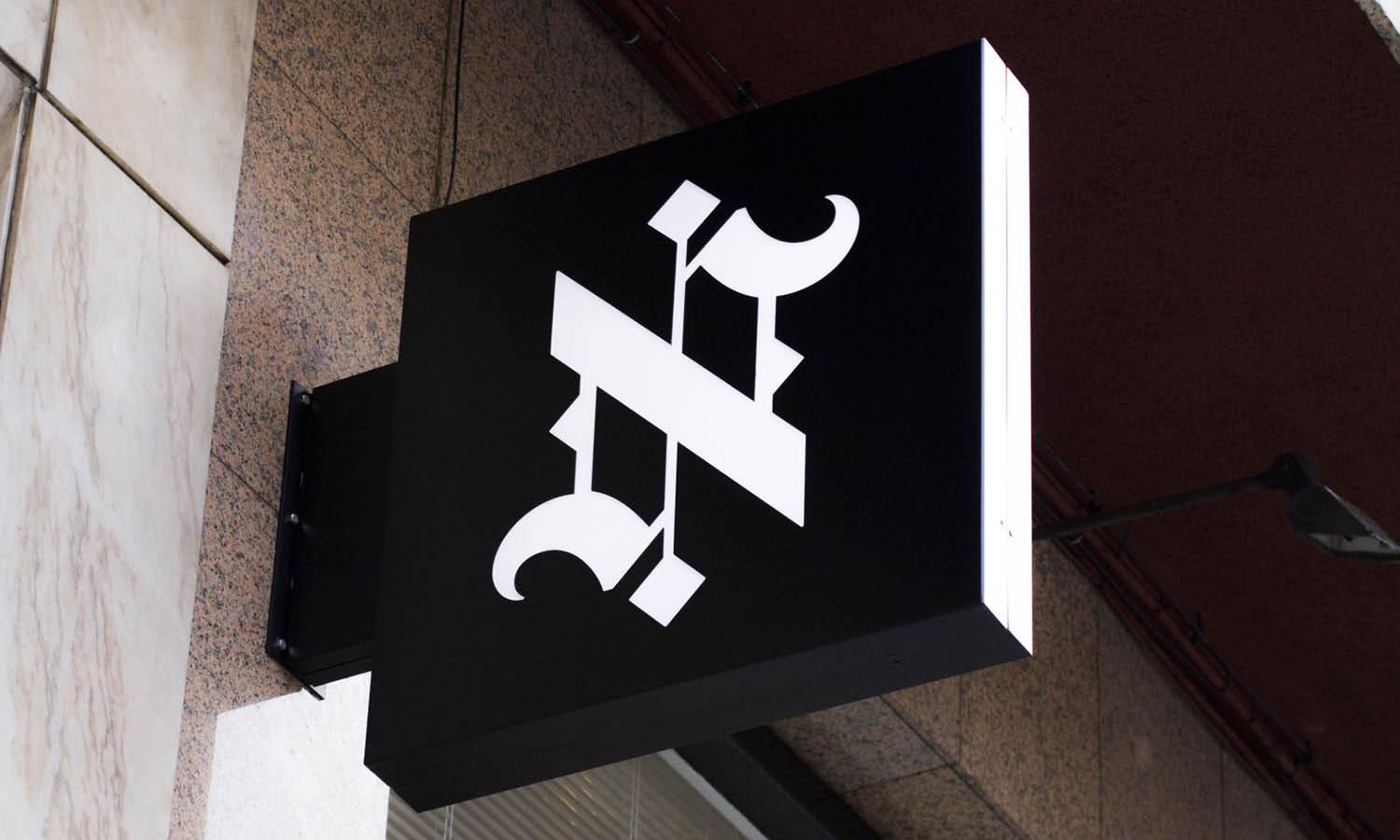
Another unique tip in creating a beautiful 2 letters design is by rotating the characters. The logo might look simple, but the use of an angle or turning the character upside down can add an exceptional visual style. In this case, the composition and position are the keys. You can take an example of a logo made out of M & A.
Using the capital M with upside-down A makes a simple rendition of the brand. It is simple, direct, but also recognizable. It is also thanks to the 2 letters that have similar shapes. But when the characters do not share comparable strokes, angling them can work. The design and technique simply lead the curved character to touch the straight one, making a unified line.
In one way to another, the 2 letters' logo designs can also appear classy with a good composition. To make a proper and memorable design without ruining the logo readability, it is best to angle or turn it upside down with natural looks. Doing too much only makes the models look unnatural. Even more, it can appear messy.

7. Consider Using A Handwritten Font Style
Using handwriting style should be one of the solutions when everything fails to fulfill the idea. It is a pretty common logo design hack, considering every human's handwriting is not the same. Typography is also a very in-depth knowledge, with variants and styling to use. It can be a great input to make a logo design with 2 letters.
For handwriting style, there are chances that the creator needs to invent a new letters model. With handwritten fonts, it is easier to achieve. Some logos out there use their unique font and typeface; Coca-Cola is an example. But for a logo with 2 letters design, it is best to start with the existing font and start building from it to get more inspiration.

8. Developing & Incorporate Symbols
Developing symbols as imagery of the characters used in the logo is one step toward skill. In this case, there are times that the creator needs to make a groundbreaking design that can encompass the model of the 2 letters while still helping the audience associate with the logo. It is a pretty complex technique but can create a very creative design in the market.
In this technique, one of the best ideas is to add symbols as part of the negative space of the 2 letters' logo design. The idea uses a relevant symbol to fill the gap or to be part of the letter mark. The design tends to be less complex since the logo needs to associate the symbol and the initial or the letters used on the work.

One of the easiest uses is to add a mascot or symbol on the negative space inside the C, A, or O. When used properly; the symbol is not only beautifying the logo but also adds another element to the design. It opens up a huge creative possibility in the making; that is why the 2 letters design idea is pretty popular to showcase a personality.
Another symbol-related design is by replacing the 2 letters with symbols. In this case, the design can be a bit complex since the creator needs to make a symbol or imagery that fits the letters, the brand, and the company product. However, there are many ideas that society already has in store.
You can see how many logo design associates and replace the O with a heart shape or the fish bone to replace E. The imagery should relate to the brand while the style is paying attention to readability. Symbols and objects can also make the 2 letters logo design more memorable and deliver a message better.

9. Try To Create A Visual Illusions
If the design comes with 2 letters sharing a similar style or appearance, there are two possibilities. The first thing to use is the mirror letters style. It is where similar letters such as d&b or M&W form the logo. In this case, the mirroring effect can turn into a highlight of the design. You can add a visual connection between them by showcasing the similarities.
If the mirroring design is impossible, there is also an idea to blend similar strokes into one logo. M&N or the V&W is a great example. In this case, Volkswagen blended the V&W into one, making a unique rendition of the combination. It takes a bit of technique despite its alteration of strokes, composition, or lines.

10. Use Negative Space
Adding negative space to blend the 2 letters are put into example by a logo design by Camille Myers. The creator uses one of the letters as negative space, and the other is the main design. It mostly works as a smart way of color and shapes since the technique puts one letter into another and cuts the other to make a clear negative space on it.
There is also a 2 letters logo design model loved by the company, the technique to manipulate the existing negative space. In this technique, the idea is to put one of the letters in the existing negative space, such as B, inside D. It looks pretty simple to do, but it does need some good balance to ensure the logo and its design maintain their readability.

Final Words
The idea of working with a logo goes back to the creative rendition of the creator's mind. There are many ways to make the logo design and incorporate various styles. However, using the 2 letters style can be one of the best tricks to make more memorable imagery while still highlighting the brand's identity.
The 2 letters style itself is also considered one of the popular logo styles, incorporating unique symbols, drawing techniques, and lettering aspects. In one way to another, the key to successfully pulling off the style is by playing around with some techniques. It is doable with strokes, lettering, lines, compositions, and some edits.

It is possible to create a compelling 2 letters logo design by blending the two strokes, adding bridges, connecting the two letters, adding some rotation, using handwriting style, presenting illusion, and working with symbols or negative space. The key is to keep the letters visible and keep a unique presentation on the logo design.
Those are some tips and ideas on the technique of creating logos with only 2 letters in the design. They highlight some styling and ideas to blend or incorporate the two characters. Other than that, the result goes back to the creator's creativity and ability to make a unique representation of the brand's identity or vibe.


Leave a Comment