30 Best Lettering Logo Design Ideas You Should Check

Source: Scott Biersack, Graggs, Dribbble, https://dribbble.com/shots/19725257-Graggs-Logotype
Dive into the vibrant world of lettering logo design, where typography isn't just a detail—it's the star of the show! As a designer, imagine harnessing the power of each stroke to convey your brand's ethos directly through the art of lettering. Whether you’re a startup itching to make a bold statement or an established brand looking to refresh your identity, the right lettering can make your logo unforgettable.
In this article, we'll explore some of the most creative and inspiring lettering logo designs that are setting trends and turning heads. From sleek and minimalist to wildly whimsical, each design offers a unique blend of artistry and functionality. Get ready to be inspired by designs that perfectly marry form and message, proving that sometimes, the best way to a customer's heart is through captivating calligraphy! So, let your creativity flow and discover how these lettering logos can elevate your brand identity to new heights.
Lettering Logo Design Ideas

Source: Wells Collins, Tinyspace, Dribbble, https://dribbble.com/shots/19699790-Tinyspace-Wordmark

Source: Wouter de Bres, Bres, Dribbble, https://dribbble.com/shots/20455313-Bres-Logo

Source: Ilham Herry, Unionwell Lettering, Dribbble, https://dribbble.com/shots/15753904-Unionwell-Lettering

Source: Kevin Kroneberger, Guapo Taco, Dribbble, https://dribbble.com/shots/19739874-Guapo-Taco-Logotype

Source: Sergey Shapiro, Streamz, Dribbble, https://dribbble.com/shots/14637875-Streamz

Source: Steve Wolf, Kearney, Dribbble, https://dribbble.com/shots/15657021-Kearney

Source: Matheus Mendes, Matilha, Behance, https://www.behance.net/gallery/225201461/Matilha

Source: Alex Aperios, Roller Records, Dribbble, https://dribbble.com/shots/17483239-Roller-Records-Monoline-lettering

Source: Wells Collins, Trapeze, Dribbble, https://dribbble.com/shots/19509962-Trapeze-Wordmark-Final

Source: Paprika Design, Café Notman, Behance, https://www.behance.net/gallery/173241691/Caf-Notman

Source: Sasha Cko, Focus And Stay True, Dribbble, https://dribbble.com/shots/20949040-Focus-And-Stay-True

Source: Riska Arbi, Cestro, Behance, https://www.behance.net/gallery/238268281/Cestro-Logotype-Concept

Source: Sergey Shapiro, Allusion Design, Dribbble, https://dribbble.com/shots/14796908-Allusion-Design

Source: Rich Stromwall, Funk, Dribbble, https://dribbble.com/shots/19749451-Funk

Source: Alfonsus Abimatha, Kalamakara Coffee Roastery, Behance, https://www.behance.net/gallery/214091157/Kalamakara-Coffee-Roastery-Logo-Lettering

Source: Uliana Babenko, Behance, https://www.behance.net/gallery/188340737/Advertising-posters-with-lettering-and-illustrations

Source: Dalibor Momcilovic, Sourkrauts, Dribbble, https://dribbble.com/shots/15828885-Sourkrauts

Source: Laura Eden, Bloodlines, Dribbble, https://dribbble.com/shots/17198207-Bloodlines-Logotype

Source: Chaz Russo, Papa Danno's Backyard Pizza, Dribbble, https://dribbble.com/shots/19118646-Papa-Danno-s-Backyard-Pizza

Source: Forsureletters, Foals, Dribbble, https://dribbble.com/shots/20529169-Foals-process

Source: Jerry Okolo, Question Everything, Dribbble, https://dribbble.com/shots/20640964-Question-Everything

Source: Alexandra Necula, NL, Dribbble, https://dribbble.com/shots/17939052-NL-Monogram

Source: Lance, Panchos, Dribbble, https://dribbble.com/shots/10813646-Panchos-Custom-Logotype

Source: Oleg Kulik, Thre3®, Dribbble, https://dribbble.com/shots/19948257--thre3-Branding-Identity

Source: Patkos, DB, Dribbble, https://dribbble.com/shots/19803085-DB

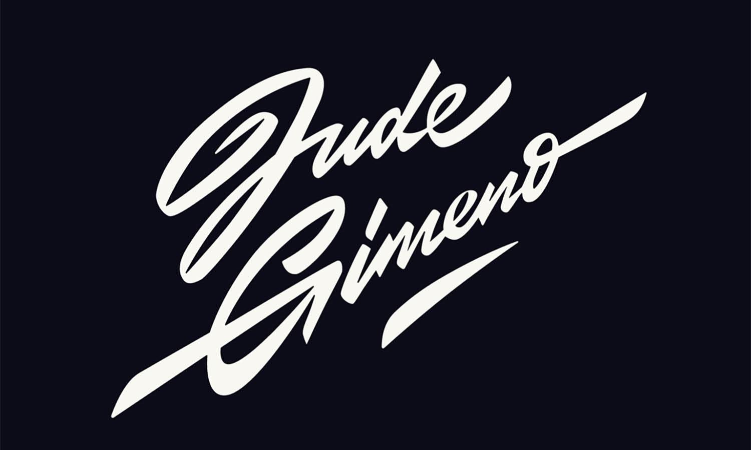
Source: ForSureLetters, Jude Gimeno, Dribbble, https://dribbble.com/shots/19391726-Jude-Gimeno

Source: Laura Dillema, Detroit Motor City, Dribbble, https://dribbble.com/shots/17414441-Detroit-Motor-City

Source: Paul von Excite, Detail.co, Dribbble, https://dribbble.com/shots/20240366-Detail-co

Source: Patkos, Gargoyle, Dribbble, https://dribbble.com/shots/19698894-Gargoyle

Source: Scott Biersack, Graggs, Dribbble, https://dribbble.com/shots/19725257-Graggs-Logotype
What Are the Key Elements of a Successful Lettering Logo Design?
A great lettering logo design is more than just fancy typography—it’s a work of art that embodies a brand’s identity, personality, and uniqueness. When done right, it creates a lasting impression and helps a business stand out in a crowded market. So, what makes a lettering logo design truly successful? Here are five key elements that make all the difference.
A Distinctive and Readable Typeface
The foundation of any lettering logo design is its typeface. Whether you opt for a custom script, bold block letters, or an elegant serif font, it needs to be legible and unique. A great logo should be easy to recognize even at a glance. Overly intricate or hard-to-read fonts can confuse viewers and weaken the logo’s impact. The key is to strike the perfect balance between style and clarity—a logo that looks stunning while still communicating effectively.
A Cohesive Style That Matches the Brand
A lettering logo design should reflect the brand’s identity and values. Is the brand modern and innovative? Then a sleek, sans-serif typeface might be ideal. Is it playful and fun? A hand-drawn, quirky lettering style could be the best fit. The logo’s overall feel should seamlessly match the brand’s message and industry. The wrong style can send mixed signals, while the right one creates instant brand recognition and trust.
Strategic Use of Letter Spacing and Alignment
Spacing and alignment may seem like small details, but in lettering logo design, they play a huge role in visual harmony. Letters that are too close together can look cluttered, while letters that are too far apart may lose their connection. Proper kerning (adjusting space between characters) ensures that the logo looks balanced and professional. Additionally, the right alignment—whether centered, staggered, or curved—can add personality and make the logo more engaging.
A Unique and Memorable Flow
A successful lettering logo design isn’t just about letters sitting next to each other—it’s about flow and movement. The way the letters connect, transition, or interact with each other can evoke emotions and create a strong visual impact. Some logos use fluid, cursive-like strokes to bring an elegant, organic feel, while others use bold and sharp lines for a powerful and modern look. The goal is to create a design that feels natural, cohesive, and instantly recognizable.
Scalability and Versatility
No matter how beautiful a lettering logo design is, it needs to work everywhere—on websites, social media, business cards, packaging, and even billboards. A successful design must maintain its legibility and impact at any size. It should look just as stunning when shrunk to a tiny favicon as it does when blown up on a massive storefront sign. Simple tweaks like reducing excessive details and ensuring good contrast can keep the logo versatile and effective in any medium.
A powerful lettering logo design isn’t just about picking a cool font—it’s about creating a visual identity that speaks volumes. By focusing on distinctiveness, cohesion, spacing, flow, and versatility, you can craft a logo that leaves a lasting impression. Whether you’re designing for a bold startup or a timeless luxury brand, these elements will help ensure that your lettering logo design stands out and remains unforgettable!
What Are the Best Color Schemes for Lettering Logo Design?
Color is more than just decoration—it’s a secret weapon in lettering logo design that shapes perception, creates emotional connections, and ensures brand recognition. A well-chosen color scheme can make a logo bold and attention-grabbing or elegant and timeless. But with endless color options out there, how do you pick the perfect palette? Let’s break it down with five of the best color schemes that elevate lettering logo design to the next level.
Classic Black and White – Timeless and Versatile
Black and white may seem simple, but in lettering logo design, it’s the ultimate power move. This classic combination exudes elegance, professionalism, and clarity. It works exceptionally well for luxury brands, high-end fashion, and minimalistic logos. The contrast ensures readability across all mediums, making it a go-to choice for brands that want to stay timeless. Plus, black and white logos can easily adapt to color variations for different marketing materials, keeping things fresh yet consistent.
Bold Monochrome – Strong and Focused
A monochrome palette, where different shades of a single color are used, creates a cohesive and sophisticated look. Think deep blues for trust and reliability, fiery reds for passion and energy, or earthy greens for an organic, natural feel. Using various shades within the same color family allows for subtle depth and dimension in the lettering without overwhelming the viewer. Monochrome logos are especially effective for modern brands, tech companies, and personal brands looking for a strong visual identity.
High-Contrast Duotones – Modern and Eye-Catching
Duotone color schemes bring energy and modern flair to lettering logo design. This style involves pairing two strong contrasting colors, such as yellow and navy, red and white, or purple and teal. The trick is to choose colors that complement each other while creating enough contrast to make the lettering pop. Duotones work incredibly well for creative agencies, startups, and brands that want a contemporary, dynamic aesthetic. When done right, this color scheme ensures instant memorability and brand impact.
Muted Pastels – Soft and Friendly
Pastels might be soft, but they’re far from weak when used in lettering logo design. Shades like dusty rose, soft mint, lavender, or warm peach create a welcoming and approachable vibe. This palette is perfect for beauty brands, wellness businesses, and artisanal companies that want to radiate warmth, calm, and authenticity. Pastels also pair beautifully with hand-lettered or script fonts, adding a personal touch that makes a brand feel relatable and inviting.
Metallic Accents – Luxurious and Premium
Want to make your lettering logo design feel high-end and sophisticated? Metallic hues like gold, silver, bronze, and rose gold instantly elevate the design. These colors symbolize prestige, exclusivity, and success, making them ideal for luxury brands, premium services, and high-fashion labels. While metallics can be tricky to display digitally, they shine when used in print materials, embossing, and packaging, giving the logo a rich, tactile experience.
Choosing the right color scheme for a lettering logo design isn’t just about aesthetics—it’s about making a statement. Whether you go for the boldness of black and white, the modern energy of duotones, or the soft elegance of pastels, your colors should align with the brand’s personality and audience. So, don’t be afraid to experiment, mix, and match—because when it comes to lettering logo design, the right colors can turn a good logo into an iconic one!
What Are the Best Styles in Lettering Logo Designs?
A lettering logo design is more than just a name in a fancy font—it’s a visual identity that tells a brand’s story, sets the tone, and makes a lasting impression. But with so many styles to choose from, how do you know which one best represents a brand’s personality? From sleek and modern to bold and playful, here are five of the best styles in lettering logo design that are guaranteed to leave an impact.
Handwritten Script – Elegant and Personal
If you’re looking for a logo that feels authentic, artistic, and full of personality, a handwritten script style is the way to go. This style mimics natural handwriting, making it feel warm and inviting. Whether it’s a flowing cursive, a casual brushstroke, or a vintage calligraphy look, handwritten scripts add a personal touch to brands. This style works exceptionally well for luxury brands, fashion boutiques, creative businesses, and personal brands that want to feel approachable yet sophisticated.
Bold and Blocky – Strong and Powerful
Not all logos need to be delicate—sometimes, big, bold lettering does the trick! This style features thick, geometric letters that demand attention and communicate strength, confidence, and reliability. Think about sports brands, construction companies, or tech startups—these businesses need logos that look solid and unshakable. Bold lettering logos often use uppercase, sans-serif typefaces with clean lines, making them easy to read and impactful at any size.
Vintage and Retro – Nostalgic and Timeless
A lettering logo design with a vintage or retro style brings back the charm of past decades while adding a modern twist. Whether it’s inspired by classic signage, old-school typography, or 1950s diner aesthetics, this style carries a sense of nostalgia and authenticity. Vintage lettering often includes ornate details, decorative flourishes, and a textured, worn-out effect, making it perfect for artisanal brands, barbershops, coffee houses, and craft breweries. A retro lettering logo makes people feel like they’ve discovered something classic and full of character.
Minimalist and Modern – Clean and Sophisticated
In a world where simplicity is key, a minimalist lettering logo design cuts through the noise. This style embraces clean lines, negative space, and subtle details, making it perfect for brands that want to exude professionalism and clarity. Often using sans-serif fonts or subtle custom tweaks, minimalist logos work well for tech companies, luxury brands, and contemporary businesses. This style proves that less is more, offering an effortlessly chic and timeless appeal.
Playful and Quirky – Fun and Unique
Some brands thrive on creativity and fun, and that’s where playful, quirky lettering logos shine. This style breaks the traditional rules of typography, using bouncy letters, irregular shapes, and unexpected color combinations to create a logo that feels alive and full of personality. It’s an excellent choice for children’s brands, creative agencies, and lifestyle businesses that want to come across as fun, energetic, and imaginative. A playful lettering logo ensures that the brand feels approachable and instantly recognizable.
A lettering logo design is an opportunity to bring a brand’s personality to life. Whether you go for elegant script, bold block letters, nostalgic vintage styles, sleek minimalism, or playful creativity, the key is to choose a style that aligns with the brand’s message. Each lettering style carries its own unique energy, so pick the one that speaks the loudest—because when done right, a lettering logo becomes iconic and unforgettable!
What Are Some Creative Ideas for Lettering Logo Designs?
In the boundless universe of lettering logo design, creativity is the rocket fuel that propels brands into the stratosphere of recognition and memorability. As we embark on this journey of discovery, let’s explore some cosmic creative ideas that can elevate your lettering logo from the sea of sameness to the peaks of uniqueness. These ideas are not just designs; they’re invitations to stories, experiences, and connections. So, buckle up! We’re about to take off into the galaxy of creativity where the stars are the limit.
Blend Lettering with Symbols
Imagine a logo where letters and symbols unite in a beautiful dance, each step perfectly choreographed to tell a story. This approach merges typographic design with imagery, creating a dual-purpose visual that's both a name and a symbol. For instance, embedding the silhouette of a mountain within the letter "A" for an adventure brand, or a spoon tucked into the loop of an "e" for a culinary business. This method adds layers of meaning, making your logo a riddle that invites viewers to delve deeper.
Play with Negative Space
Negative space is like the silent music of design; it’s not about what you see, but what you don’t. Crafting a lettering logo that cleverly uses negative space can reveal hidden gems within the letters themselves. Think of the FedEx logo and its famous hidden arrow. Your logo could similarly incorporate a hidden element within the lettering, offering a delightful surprise that enchants and engages your audience. This technique not only adds intrigue but also sophistication to your design.
Experiment with Letter Stacking
Who says letters need to be in a straight line? Letter stacking is a playful and dynamic approach to lettering logo design. By arranging the letters of a word or brand vertically or in an unconventional layout, you can create a compact, impactful design that stands out. This format is particularly effective for short names or acronyms, offering a fresh perspective and a memorable visual footprint. Just remember, readability is key, so keep it clear and compelling.
Infuse Personality with Hand-Drawn Letters
There’s something irresistibly authentic about hand-drawn lettering. It’s like the brand is speaking directly to you in its own handwriting. This style can range from whimsical and quirky to elegant and sophisticated, depending on the brand's voice. Hand-drawn lettering logos exude personality and charm, offering a human touch in a digital world. They tell your audience that behind the brand is a heart and a story, inviting a personal connection that’s rare and precious.
Integrate Cultural or Historical Elements
Drawing inspiration from cultural or historical typography can give your lettering logo a timeless allure. Whether it’s the calligraphic elegance of traditional scripts or the retro vibe of vintage neon signs, incorporating such elements can infuse your logo with depth and character. This approach not only distinguishes your brand but also pays homage to the roots or values it represents, creating a bridge between the past and the present.
Embarking on the creation of a lettering logo design is a voyage into the unknown, where bravery meets creativity. Let these creative ideas be your guide as you navigate the cosmos of lettering logo design, crafting a visual identity that’s truly out of this world.
What Are Some Creative Ways to Add Symbols in Lettering Logo Design?
A lettering logo design doesn’t have to be just about the letters—it can be elevated with clever symbols that reinforce a brand’s message and add a unique visual twist. Whether you want to make your logo more iconic, memorable, or just plain cool, integrating symbols creatively can take it to the next level. But how do you seamlessly blend symbols into your lettering without overpowering the design? Here are five fun and inventive ways to do just that!
Transform Letters Into Symbols
Why add a separate icon when you can turn a letter itself into a symbol? This technique is perfect for creating a design that feels cohesive and clever. For example, a bakery logo could turn the letter "O" into a donut, or a travel brand could modify the letter "A" to resemble a mountain peak. By incorporating meaningful imagery into the lettering itself, the logo stays clean while subtly reinforcing what the brand is all about.
Use Negative Space for Hidden Elements
Negative space is the secret weapon of genius logo designs. Instead of adding a symbol outright, you can carve it out within the letters, creating a hidden yet striking visual. A great example of this is the FedEx logo, where the space between the "E" and "X" forms an arrow, symbolizing speed and movement. In a lettering logo design, this technique can be used to sneak in a symbol that adds an extra layer of meaning while keeping the design sleek and minimal.
Replace a Letter With a Symbol
Swapping out a letter for a symbol is a playful way to make your lettering logo design more dynamic. For instance, a camera brand could replace the letter “O” with a camera lens, or a music company could turn the “I” into a microphone. This approach ensures that the brand’s identity is communicated instantly while keeping the logo fun and visually engaging. The key is to choose a symbol that blends effortlessly with the lettering style so it feels like a natural part of the design.
Integrate Symbols as Decorative Flourishes
Sometimes, a subtle decorative touch can make all the difference. Instead of making a symbol the focal point, you can use it as a supporting detail that enhances the lettering. Think of flourishes, swashes, or small design elements like stars, leaves, or waves that wrap around or extend from the letters. This works especially well for hand-lettered or script-style logos, where embellishments can add personality without overwhelming the design.
Blend Symbols Into the Letter Structure
For a truly seamless fusion, try embedding symbols within the stroke of a letter itself. For example, a coffee shop logo could incorporate steam rising from the top of a letter, or a sports brand could create a swoosh-like motion within the strokes of its typography. This approach ensures that the symbol doesn’t feel separate from the lettering but rather an integral part of the design, making the logo feel unified and polished.
A lettering logo design doesn’t have to rely solely on typography—when symbols are added creatively, they can turn a simple logo into something memorable, meaningful, and eye-catching. Whether you morph letters into symbols, play with negative space, or integrate subtle embellishments, the goal is to create a design that tells a story while remaining visually stunning. So go ahead—experiment, mix things up, and let the symbols bring your lettering logo to life!
Conclusion.
A well-crafted lettering logo design is more than just stylish typography—it’s a powerful branding tool that communicates identity, personality, and professionalism. By integrating creative symbols, designers can make a logo more distinctive and memorable. Whether it’s through negative space, decorative flourishes, or transforming letters into symbols, these techniques add depth and meaning to a design. The key is to ensure that the symbols blend seamlessly with the lettering, maintaining clarity and impact. When done right, a lettering logo design becomes not only visually appealing but also a strong representation of a brand’s message and values.
Let Us Know What You Think!
Every information you read here are written and curated by Kreafolk's team, carefully pieced together with our creative community in mind. Did you enjoy our contents? Leave a comment below and share your thoughts. Cheers to more creative articles and inspirations!



Leave a Comment