30 Best Serif Logo Design Ideas You Should Check

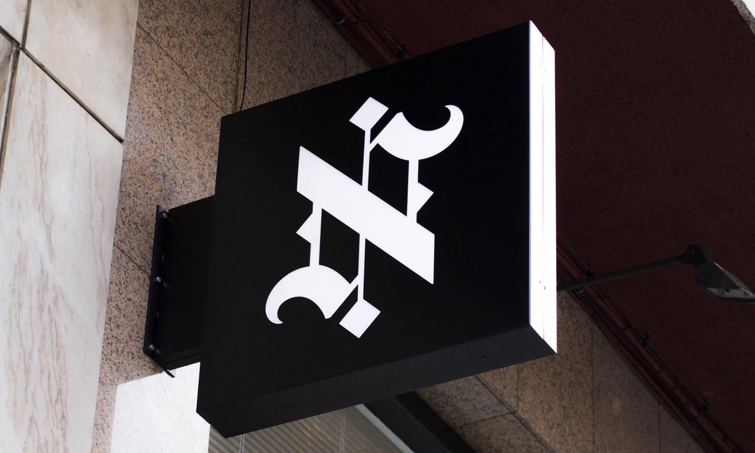
Source: Paola Medina, Apakani Haras, Behance, https://www.behance.net/gallery/230132319/APAKANI-HARAS
Welcome to the splendid world of serif logo design, where elegance meets timeless charm! If you're on the hunt for a logo that stands out with a touch of classic sophistication, you’ve just hit the jackpot. Serif fonts, known for their decorative feet at the ends of their letters, have been a go-to choice for brands looking to exude reliability and respectability. From bold and robust to delicate and refined, the range of serif typefaces offers a palette of styles that can transform a simple logo into a striking brand identity.
In this article, we'll explore some of the most creative and impactful serif logo designs that have captivated audiences and carved niches in various industries. Whether you're rebranding or starting fresh, these ideas will spark your creativity and help you design a logo that resonates with your brand’s ethos. Get ready to be inspired by designs that perfectly blend traditional aesthetics with modern flair, making them unforgettable in the bustling market!
Serif Logo Design Ideas

Source: Peter Giuffria, Louisiana Family Law Firm, Dribbble, https://dribbble.com/shots/7048770-Louisiana-Family-Law-Firm

Source: Fonts, Flinger, Dribbble, https://dribbble.com/shots/14083696-Glitten-Ligature-Serif-Font

Source: Felixto Brandworks, Elysian Hotel, Behance, https://www.behance.net/gallery/216983461/Elysian-Hotel-Logo-Visual-Identity-Design

Source: Adel Sibul, Behance, https://www.behance.net/gallery/236357939/LOGO-DESIGN-FOR-CLOTHING-ATELIER

Source: Hatim Khouired, Sea Breeze Hotel, Behance, https://www.behance.net/gallery/195630205/Luxury-Branding-for-Sea-Breeze-Hotel

Source: Lauren Leggatt, Rustic Slumber, Dribbble, https://dribbble.com/shots/6609997-Rustic-Slumber-Logo

Source: Mohammad Anis, Ecoluxe Atelier, Behance, https://www.behance.net/gallery/237484699/Ecoluxe-Atelier-Luxury-Fashion-with-a-Conscience

Source: Yashi Jain, House Of Senses, Behance, https://www.behance.net/gallery/240422969/House-Of-Senses

Source: Marina Homenchuk, Delia Floral Atelier, Behance, https://www.behance.net/gallery/206949785/DELIA-FLORAL-ATELIER-Logo-Design

Source: Paul Rover, Tetz & Pallant, Dribbble, https://dribbble.com/shots/10732146-Accounting-logo

Source: Lisa Jacobs, Graham & Hales Accountant Firm, Dribbble, https://dribbble.com/shots/8271372-Graham-Hales-Accountant-Firm-Logo

Source: Jessica Strelioff, Carina, Dribbble, https://dribbble.com/shots/18331766-Carina-Packaging

Source: Bailey Zelena, The Mare Atelier, Behance, https://www.behance.net/gallery/240050863/The-Mare-Atelier-Branding

Source: Faikar, Mind Wellness, Dribbble, https://dribbble.com/shots/17112641-Mind-Wellness-Logo-Concept

Source: QLO Agency, Inter Padel Club, Behance, https://www.behance.net/gallery/209239465/Inter-Padel-Club

Source: Jesús Jaimes Obé, La Cocina Pickleball Club, Behance, https://www.behance.net/gallery/239727567/La-Cocina-Pickleball-Club-Brand-Identity-Design

Source: Zahra S. Babazade, Goygol, Behance, https://www.behance.net/gallery/221550789/Resort-Spa-Brand-Identify-GOYGOL

Source: Flávia Jackeline, Balusi Horse, Behance, https://www.behance.net/gallery/225759581/Balusi-Horse

Source: Keeks G, Behance, https://www.behance.net/gallery/220237415/Premium-Brand-Identity-for-Equestrian-Accessories

Source: Matt Dawson, Three Arm Ranchwear, Dribbble, https://dribbble.com/shots/14605939-Three-Arm-Ranchwear

Source: Mustafa Akülker, Odeur, Dribbble, https://dribbble.com/shots/18263847-Branding-Packaging-Design-for-Odeur

Source: Maycon Prasniewski, Vedic Tiger, Dribbble, https://dribbble.com/shots/18452773-Vedic-Tiger-Ayurvedic-Care

Source: Jeremy Vessey, Fordgrove & Sons, Dribbble, https://dribbble.com/shots/14983294-Acreage-A-Modern-Display-Typeface

Source: Dusan Sol, Goody Vegan Bakery Cafe, Dribbble, https://dribbble.com/shots/20747778-Goody-Vegan-bakery-cafe

Source: Ceren Burcu Turkan, Foundry No8, Dribbble, https://dribbble.com/shots/3646710-Foundry-No8

Source: Pavement Design, Mureta & Co., Behance, https://www.behance.net/gallery/220330989/Mureta-Co

Source: Lindsey Naylor, The Crones' Nest, Dribbble, https://dribbble.com/shots/10745245-The-Crones-Nest-Logo

Source: Swarnika Priya, Elynore-Skincare, Behance, https://www.behance.net/gallery/238923133/Elynore-Skincare-Branding

Source: Kehinde Lagunju, Solivere, Behance, https://www.behance.net/gallery/235468163/Solivere-Skincare-Brand-Identity-and-Packaging

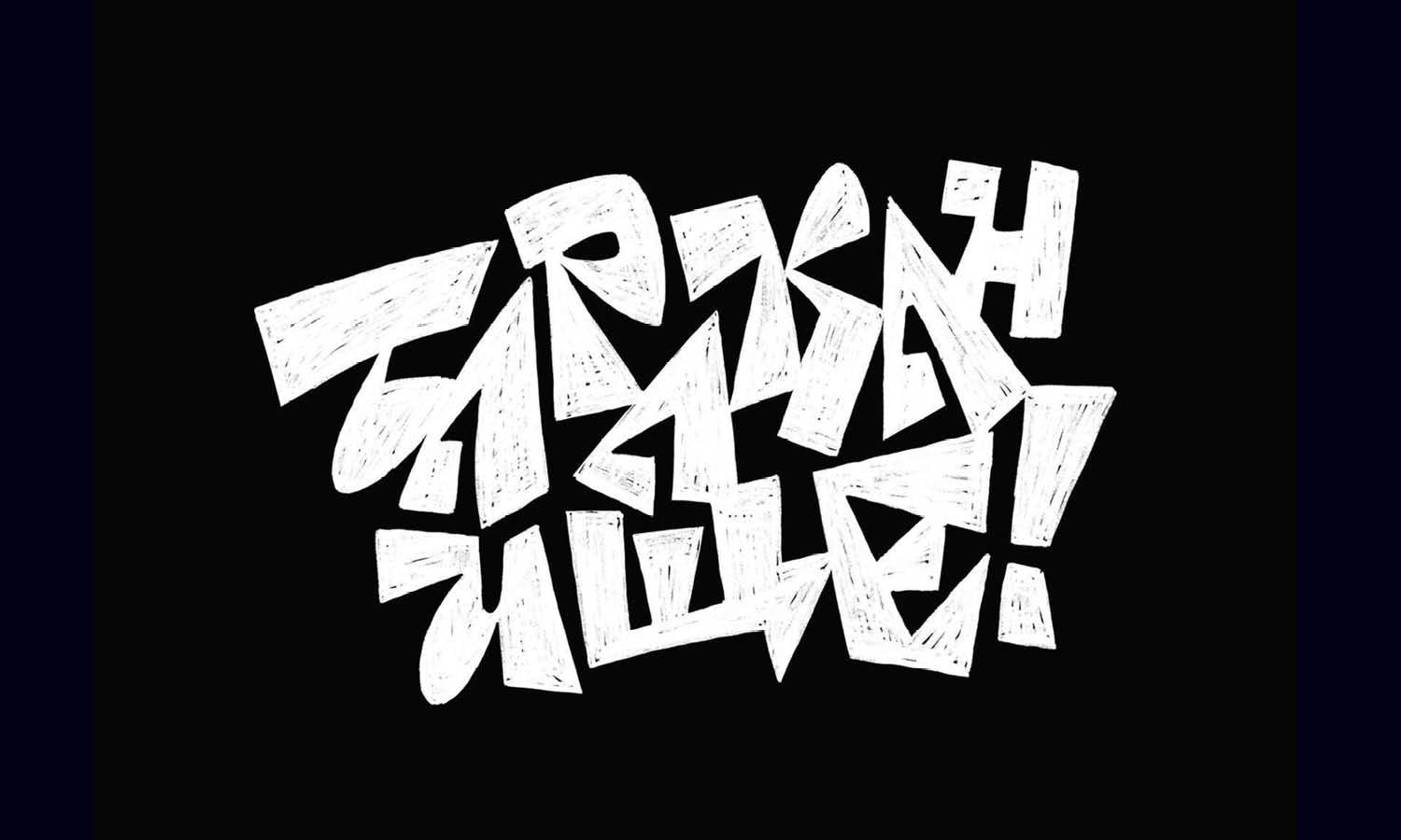
Source: Paola Medina, Apakani Haras, Behance, https://www.behance.net/gallery/230132319/APAKANI-HARAS
What Are the Key Elements of a Successful Serif Logo?
Diving into the realm of serif logo design is like stepping into a grand hall of typography where every font has a story to tell. A successful serif logo isn't just about picking a fancy font and running with it; it's an artful blend of design elements that create a memorable and effective brand identity. Here are five key elements that can make a serif logo go from good to unforgettable:
Choice of Typeface
The foundation of any great serif logo design lies in the choice of typeface. Serif fonts are known for their decorative features, including small lines or strokes regularly attached to the end of a larger stroke in a letter or symbol. But not all serif fonts are created equal. The key is to choose a typeface that reflects the brand’s personality, whether it’s traditional, trustworthy, elegant, or bold. Each serif typeface carries its own vibe and energy, so selecting one that aligns with the brand’s core values is crucial.
Scalability
A mark of a well-designed logo is its scalability. Your serif logo should be visually effective at any size, whether it's on a giant billboard or a small business card. This means it must maintain its distinctiveness and readability when scaled down, ensuring that those stylish serifs don’t turn into indistinct blobs.
Color Scheme
Color plays a pivotal role in logo design. With serif logos, where elegance and sophistication are often the goals, choosing the right color scheme becomes even more essential. Classic colors like black, navy, or dark green can convey professionalism and stability, while more vibrant hues might highlight creativity and innovation. Remember, the color should enhance the typeface, helping to form a cohesive and attractive design that speaks to the audience.
Simplicity and Clarity
While serifs are beautiful for their intricate details, a successful logo should not be overly complicated. The best serif logos are simple yet powerful, with clear, easy-to-recognize letters. This clarity ensures that the logo remains versatile across various mediums and is easy for the audience to remember. After all, in the world of logo design, sometimes less is more!
Contextual Harmony
A logo doesn’t exist in a vacuum; it must align harmoniously with where it's going to be used. For serif logos, this means considering the context—whether it’s an upscale brand, a traditional publishing house, or a modern startup wanting a touch of the classics. The design should be sympathetic to its surroundings and intended audience, ensuring it resonates well and fulfills its role as the face of the brand.
Creating a successful serif logo design means balancing these key elements to craft a design that not only looks good but also feels right for the brand. It’s about making sure that every swoop and line in the typeface contributes to a story that’s as compelling as it is visually striking. So, let your creative spirits soar and your serifs be the wings that elevate your brand to the skies of success!
What Types of Brands or Industries Are Suitable for Using Serif Logo Designs?
When it comes to crafting a brand identity that stands the test of time, the serif logo design emerges as a knight in shining armor for various brands and industries. With its roots buried deep in the annals of typographic history, the serif font brings with it an air of sophistication, reliability, and tradition. But don't be fooled into thinking it's all about old-world charm; serifs have been strutting down the modern design runway, flaunting their versatility and timeless elegance across a spectrum of industries. Let's dive into the top five sectors where serif logo designs not only fit like a glove but also raise the style stakes.
Luxury Brands: Where Elegance Meets Typeface
Imagine walking down the glittering streets of Paris, where luxury boutiques line the pavements like jewels. Here, serif logo designs are the lingua franca of luxury brands. They whisper tales of exclusivity, heritage, and sophistication. From haute couture fashion houses to high-end jewelers, serif fonts add that quintessential touch of elegance, making consumers feel like they're not just buying a product, they're inheriting a legacy.
Legal and Financial Institutions: The Trustworthiness Typeface
In the realm of law firms and financial institutions, trust is the currency, and serif logo designs are the mint. These industries lean heavily on the perceived integrity, stability, and professionalism that serif typefaces exude. After all, when it comes to matters of legal advice or financial investments, a logo that communicates reliability and a storied history can make all the difference in attracting clients.
Publishing and Media: The Storytellers’ Choice
From the hallowed halls of publishing houses to the bustling newsrooms of media conglomerates, the serif font is the protagonist in the narrative. It speaks of authority, credibility, and a respect for the written word. Serif logo designs in this sector echo the time-honored tradition of storytelling, inviting readers into worlds crafted from words, whether printed on paper or displayed on a digital screen.
Academic Institutions and Cultural Establishments
The ivy-covered walls of universities and the hallowed spaces of museums and cultural institutions often bear logos that feature serif typefaces. Here, the serif speaks of heritage, wisdom, and a deep respect for knowledge and culture. These logos are badges of honor, evoking a sense of prestige, history, and academic excellence, guiding the next generation of thinkers and leaders.
Food and Beverage: A Taste of Tradition
In the bustling world of food and beverage, serif logo designs serve up a dish of tradition with a side of comfort. Think of classic wineries, artisanal bakeries, and fine dining establishments where every detail matters, from the plating to the logo. The serif typeface in these logos whispers tales of time-honored recipes, craftsmanship, and a celebration of the finer things in life.
In the kaleidoscope of industries, serif logo designs stand out, not as relics of a bygone era but as beacons of elegance, trustworthiness, and tradition. They remind us that in a fast-paced world, there's beauty in the details and strength in the stories that have stood the test of time. Whether you're donning the robe of luxury, wielding the gavel of justice, spinning tales in media, cultivating minds in academia, or toasting to tradition in food and beverage, a serif logo design might just be your brand's perfect fit.
What Famous Brands Are Using Serif Logo Designs?
The world of serif logos is rich and diverse, a testament to their enduring appeal across industries. From luxury to publishing, these tiny feet at the ends of letters have helped some of the world's most famous brands stand tall and proud. Let's embark on a fun and unique exploration of five famous brands that have embraced serif logo designs, showcasing their ability to blend tradition with modernity in a way that is both captivating and memorable.
Vogue
When you think of serif logo design, Vogue immediately springs to mind. This iconic fashion magazine's logo is the epitome of elegance and sophistication. The thin, elongated serifs convey a sense of high fashion and exclusivity, making it instantly recognizable. It’s a classic example of how a well-designed serif logo can become synonymous with style and luxury.
The New York Times
In the world of publishing, The New York Times' logo stands as a beacon of trustworthiness and authority. The serif typeface used in its logo evokes a sense of tradition and reliability, important qualities for a newspaper that has been a source of information for over a century. This logo demonstrates how serif designs can instill confidence and credibility in a brand.
Tiffany & Co.
Luxury brands and serif logos often go hand in hand, and Tiffany & Co. is no exception. The jewelry brand's logo, with its clean and classic serifs, embodies elegance and sophistication. It speaks to the brand's heritage and quality, proving that a well-crafted serif logo can be a powerful symbol of luxury and refinement.
While not traditionally associated with serif fonts, Google's logo redesign in 2015 introduced a custom, geometric serif typeface called Google Serif. This move was a refreshing surprise, blending the brand's innovative spirit with the classic appeal of serifs. It shows how even tech giants can harness the charm of serifs to appear more approachable and friendly.
Prada
Prada’s logo is another testament to the allure of serif logo designs in the fashion industry. The bold, uppercase letters adorned with subtle serifs speak to the brand's authority and sophistication in the fashion world. It is a masterclass in how serifs can convey luxury and prestige, making it a perfect fit for a high-end fashion house.
These brands illustrate the versatility and timeless appeal of serif logo designs. As we continue to witness the evolution of brand identities, it's clear that the classic serif logo design holds a special place in the hearts of both designers and brands, proving that sometimes, the best way to move forward is to stand on the shoulders of typographic giants.
What Are Some Creative Ideas for Serif Logo Designs?
Embarking on the journey of creating a serif logo design is akin to entering a grand ballroom filled with potential and elegance. It's where the classic meets the cutting-edge, and the results can be utterly enchanting. If you're gearing up to design a serif logo that stands out in the crowded marketplace, buckle up! We're about to dive into a world where tradition waltzes with innovation, bringing you five creative ideas that will make your serif logo designs not just seen but remembered.
Blend Tradition with Modernity
Imagine a serif that has danced through time, picking up a contemporary beat. Start with a classic serif font and introduce a twist—perhaps a letter with an unexpected curve or a cutout that adds a modern flair. This approach marries the reliability and sophistication of traditional serifs with the excitement of modern design trends, creating a logo that is both timeless and forward-thinking. It’s like serving a vintage wine in a sleek, modern glass; the contrast is delightful and memorable.
Incorporate Symbolic Elements
Who says letters are just letters? With a dash of creativity, the serifs on your letters can morph into meaningful symbols. For instance, a wine brand could have its “I” adorned with a tiny, serifed grapevine, or a bookshop logo could feature an “E” whose serif subtly forms a book. This method not only makes the logo unique but also embeds a layer of storytelling into the design, offering viewers a glimpse into the brand's world at just a glance.
Play with Negative Space
The magic of negative space—where the space around and between the subjects of an image forms an interesting or artistically relevant shape—can turn a simple serif logo into a visual puzzle. Imagine a logo where the serifs form a hidden message or an iconic shape related to the brand. This technique not only catches the eye but also engages the mind, making your logo a conversation starter.
Experiment with Textures and Patterns
Who says serifs need to be smooth and sleek? Experimenting with textured serifs or incorporating patterns within the logo letters can add depth and character to your design. Think of a luxury brand whose serifs are adorned with a subtle, gold leaf texture, or a tech company whose letters are patterned with digital pixels. These details can elevate the visual experience, making your logo not just a name but a piece of art.
Use Color with Purpose
In the world of serif logo designs, color can be a powerful storyteller. Rather than sticking with monochrome, consider using color strategically to highlight certain letters or serifs, adding layers of meaning or emphasis. For example, a brand emphasizing sustainability might use green to accentuate the serifs, subtly reinforcing its commitment to the environment. Color can evoke emotions, convey messages, and make your logo pop in a sea of sameness.
Crafting a serif logo design that stands out requires a blend of creativity, strategy, and a touch of whimsy. By blending tradition with modernity, incorporating symbolic elements, playing with negative space, experimenting with textures and patterns, and using color with purpose, you can create a logo that's not just a visual identifier but a memorable masterpiece.
What Color Schemes Work Best With Serif Logo Design?
When it comes to creating a serif logo design, choosing the right color scheme is like selecting the perfect outfit for a grand debut. You want colors that complement the style, enhance the personality, and make the logo pop! Serif fonts, with their classic and sophisticated flairs, can be dressed up in a variety of color palettes to suit any brand’s vibe. Here are five color schemes that really turn up the charm when paired with serif logo designs:
Classic Black and White
You can never go wrong with the timeless elegance of black and white. This color scheme brings out the serif’s traditional strength, making it ideal for brands that want to convey authority, reliability, and classic sophistication. It’s perfect for legal firms, luxury brands, and any business that prides itself on a longstanding heritage. The stark contrast ensures high readability and fantastic versatility across all media.
Earth Tones
Think warm browns, deep greens, and muted golds. Earth tones resonate with feelings of stability, growth, and nature. They are incredibly effective for brands that want to communicate their grounded, eco-friendly, or artisanal values. When used with serif logos, these colors enhance the perceived value and quality of the brand, evoking a sense of trust and reliability.
Jewel Tones
Rich purples, bold emeralds, and deep blues make up the palette of jewel tones. These hues are excellent for injecting a sense of luxury and exclusivity into your serif logo design. They work well for high-end service brands, luxurious products, or any business that wants to portray elegance and affluence. Jewel tones are naturally captivating and can make your logo feel like a crown jewel.
Soft Neutrals
Soft neutrals like light grays, pastel pinks, and sandy beiges offer a modern twist to the classic appeal of serif fonts. These colors are subtle yet sophisticated, providing a clean and fresh look that’s perfect for contemporary businesses that aim to maintain a connection with tradition. This scheme works wonders for brands in the beauty, health, or baby products industries, where softness and subtlety are key.
Monochromatic Shades
Using different shades of a single color can create a visually striking effect that’s both cohesive and dynamic. This approach allows the logo to maintain simplicity and focus while still offering visual depth and interest. A monochromatic color scheme is versatile and can adapt to various branding needs, whether the goal is to be playful, serious, or anywhere in between.
Selecting the right color scheme for your serif logo design is crucial, as it can significantly influence how your brand is perceived. Whether you opt for bold and bright or soft and subtle, the colors should align with your brand’s identity and the message you want to convey. The best palette is one that fits your brand like a glove—stylish, suitable, and splendidly serif!
Conclusion
The right color scheme can elevate your serif logo design, transforming it into a powerful brand emblem. Whether you choose the stark contrast of black and white, the warmth of earth tones, the luxury of jewel tones, the subtlety of soft neutrals, or the depth of monochromatic shades, each palette plays a critical role in branding. Carefully selected colors ensure that your serif logo not only captures attention but also communicates your brand’s values and ethos effectively. Embrace the versatility and timeless elegance of serif logo designs to create a visual identity that resonates with your audience and stands the test of time.
Let Us Know What You Think!
Every information you read here are written and curated by Kreafolk's team, carefully pieced together with our creative community in mind. Did you enjoy our contents? Leave a comment below and share your thoughts. Cheers to more creative articles and inspirations!



Leave a Comment