The Essential Guide for a Seamless Logo Redesign Process

Source: Ahmed Rumon, Metaverse Infinity Logo - Web 3 Logo, Dribbble, https://dribbble.com/shots/19253273-Metaverse-Infinity-logo-Virtual-Reality-Logo-Web3-Logo
A logo is more than just a visual mark; it is the face of a brand, the symbol that customers recognize and associate with a company’s identity. However, as businesses grow and evolve, their logos may need to adapt to new trends, audiences, or brand visions. This is where the logo redesign process comes into play. A well-executed redesign not only modernizes a brand’s appearance but also reinforces its values and mission.
The logo redesign process is more than just updating colors or fonts. It requires strategic thinking, creativity, and a deep understanding of the brand’s identity. From evaluating the existing logo to choosing the right design style, every step plays a crucial role in ensuring a seamless transition. It is about maintaining brand recognition while introducing fresh elements that resonate with today’s consumers.
This guide will walk you through a comprehensive logo redesign process, offering practical insights and actionable steps. Whether you are a designer, a business owner, or a marketing professional, this guide will help you navigate the complexities of redesigning a logo with confidence and purpose. By following this structured approach, you can achieve a logo that not only looks great but also strengthens your brand’s identity.
Understand the Reason for Redesign
In the logo redesign process, understanding the reason for the redesign is the first and most crucial step. A logo is not just a visual element; it is a representation of a brand’s identity, values, and mission. Therefore, the decision to redesign should be backed by clear and strategic reasons. Whether it is to modernize an outdated look, align with a new brand vision, or reach a different target audience, the purpose of the redesign defines the direction of the entire process.
A common reason for initiating a logo redesign process is brand evolution. As businesses grow, their values, offerings, and audiences may change. A redesign can help reflect these changes and maintain brand relevance. Another reason might be to stand out in a competitive market by adopting a more contemporary and distinctive look. Additionally, logos are sometimes redesigned to enhance versatility across various digital and print platforms.
Identifying the reasons behind the redesign not only clarifies the objectives but also helps in communicating the changes to stakeholders and customers. It builds a foundation for making informed design decisions that resonate with the brand’s goals. By understanding the motivation behind the redesign, the entire process becomes more focused and purposeful.
Evaluate the Existing Logo
An essential step in the logo redesign process is evaluating the existing logo. This evaluation helps in identifying the elements that work well and the aspects that need improvement. By critically analyzing the current design, you can retain valuable brand equity while enhancing its overall appeal.
Start by assessing the logo’s relevance to the brand’s identity. Does it accurately represent the company’s mission, vision, and values? If the logo feels outdated or disconnected from the brand’s personality, it may be time for a refresh. Additionally, evaluate the logo’s visual appeal. Is it aesthetically pleasing and memorable? A good logo should leave a lasting impression and be easily recognizable.
Another crucial factor is functionality. A logo must be versatile and scalable, maintaining clarity and impact across different mediums such as websites, social media, business cards, and billboards. If the existing design struggles with adaptability, it indicates a need for improvement.
Consider customer perception and feedback. How does the audience perceive the current logo? Understanding customer sentiment can provide valuable insights into what should be retained or changed. By thoroughly evaluating the existing logo, you can build a strong foundation for a more effective and strategic logo redesign process.
Conduct Competitor Analysis
During the logo redesign process, conducting a thorough competitor analysis is essential for creating a logo that stands out while staying relevant in the industry. This step involves researching competitors’ logos to understand current design trends, common elements, and branding strategies within the market. By analyzing what works and what doesn’t, you can make informed design choices that differentiate your brand from the competition.
Start by identifying your direct and indirect competitors. Observe their logos’ color schemes, typography, symbols, and overall design style. Are they using bold and modern designs or opting for a more classic and elegant look? Understanding these patterns helps you decide whether to align with industry norms or take a unique approach.
Additionally, pay attention to how competitors use their logos across different platforms, such as websites, social media, and print materials. Versatility and consistency in logo usage are crucial for brand recognition. By studying their strategies, you can ensure your redesigned logo maintains a cohesive presence across all touchpoints.
Competitor analysis also helps in avoiding similarities that could lead to brand confusion or legal issues. It allows you to carve out a unique identity that resonates with your target audience. By strategically analyzing the competition, the logo redesign process becomes more focused, effective, and competitive.

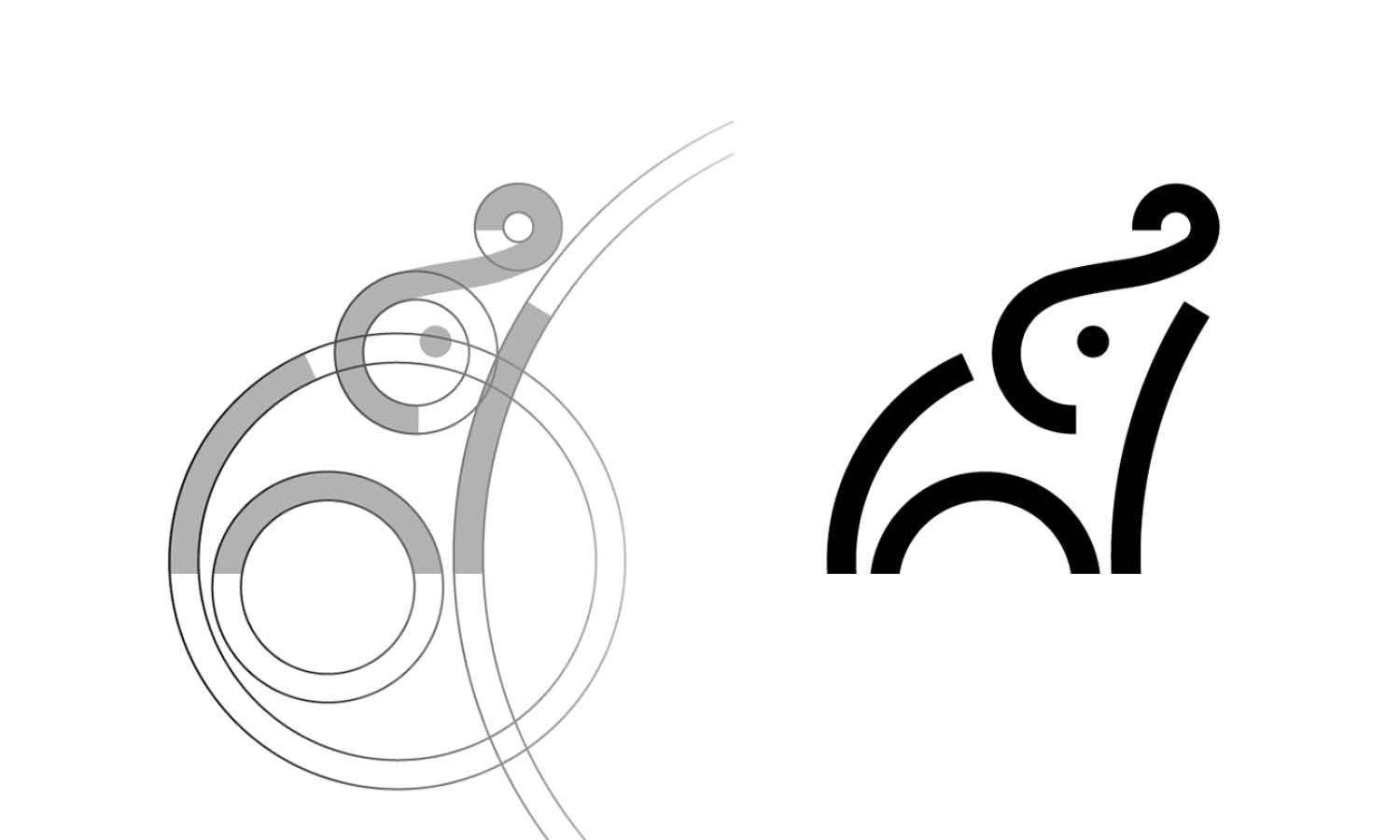
Source: Josh Warren, Array Labs, Dribbble, https://dribbble.com/shots/17433899-Array-Labs
Define Brand Identity and Values
Defining brand identity and values is a pivotal step in the logo redesign process. A logo is more than just a visual symbol; it represents a brand’s mission, vision, and personality. Therefore, before creating any design concepts, it is crucial to clearly understand and define the brand’s identity and core values.
Start by asking fundamental questions: What does the brand stand for? Who is the target audience? What emotions and messages should the logo convey? Defining these elements provides a solid foundation for a logo that resonates with the brand’s audience while maintaining authenticity.
Brand identity encompasses the tone, voice, and overall personality of a business. Whether the brand is bold and innovative, playful and friendly, or sophisticated and elegant, the logo should reflect this identity through its design elements, including color, typography, and symbols.
Equally important are the brand’s values, which represent its purpose and principles. For example, if sustainability is a core value, the logo design could incorporate earthy colors or natural symbols. By aligning the design with the brand’s values, the logo gains a deeper meaning and emotional connection with the audience.
A well-defined brand identity and value system guide the creative direction and ensure consistency throughout the logo redesign process. This strategic approach leads to a cohesive and impactful logo that effectively communicates the brand’s story.
Gather Inspiration and Ideas
During the logo redesign process, gathering inspiration and ideas is a vital step that fuels creativity and innovation. This phase involves exploring various sources to understand current design trends, experiment with different styles, and visualize unique concepts. By collecting diverse ideas, you can create a logo that is modern, relevant, and memorable.
Start by researching design galleries, online portfolios, and social media platforms like Behance, Dribbble, and Pinterest. These platforms showcase a vast array of logo designs across different industries and styles, sparking creative inspiration. Additionally, exploring branding case studies and logo redesign success stories helps understand how other brands have evolved while maintaining their identity.
It is also beneficial to look beyond your industry for inspiration. Sometimes, ideas from unrelated fields provide fresh perspectives and innovative solutions. For example, a minimalist design trend in tech logos might inspire a clean and contemporary look for a retail brand.
While gathering ideas, it is essential to take notes, create mood boards, and sketch rough concepts. This helps in organizing thoughts and identifying common patterns or themes that align with the brand’s identity.
Choose the Right Design Style
Choosing the right design style is a crucial decision in the logo redesign process, as it sets the tone for the entire brand’s visual identity. The design style reflects the brand’s personality, values, and target audience, making it essential to select one that resonates with the brand’s identity.
There are various design styles to choose from, including minimalist, vintage, playful, modern, or even hand-drawn. Each style conveys a different emotion and message. For example, a minimalist style communicates sophistication and simplicity, while a playful style evokes a sense of fun and approachability.
When choosing a design style, consider the brand’s industry and target audience. A tech startup may benefit from a modern, sleek design, whereas a children’s clothing brand might require a playful and colorful style. Additionally, ensure that the style complements the brand’s values. A sustainable brand, for instance, may opt for an earthy and organic design.
It is also crucial to balance creativity with practicality. The chosen style should be versatile and adaptable to different mediums, including digital platforms, print materials, and merchandise.
Focus on Versatility and Scalability
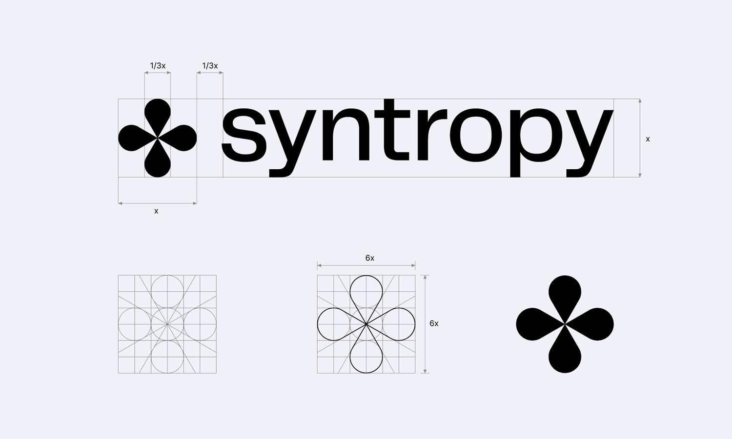
In the logo redesign process, focusing on versatility and scalability is essential for maintaining brand consistency and impact across all platforms. A well-designed logo should look professional and clear, whether displayed on a large billboard or a small social media icon. This adaptability ensures that the logo remains recognizable and effective, regardless of size or application.
To achieve versatility, start by designing the logo in a vector format. Vector graphics allow for resizing without losing quality, ensuring the logo remains crisp and sharp on both digital and print media. Additionally, consider designing different versions of the logo, such as horizontal, vertical, and icon-only variations. These alternatives provide flexibility in layout and positioning while maintaining brand integrity.
Scalability is equally crucial, as the logo must be legible and impactful at all sizes. Test the logo by resizing it to different dimensions, from tiny favicons to large posters. It should retain its clarity and essence without becoming cluttered or losing details.
Also, ensure the logo is adaptable to different color schemes, including monochrome and inverted versions, for diverse background applications.

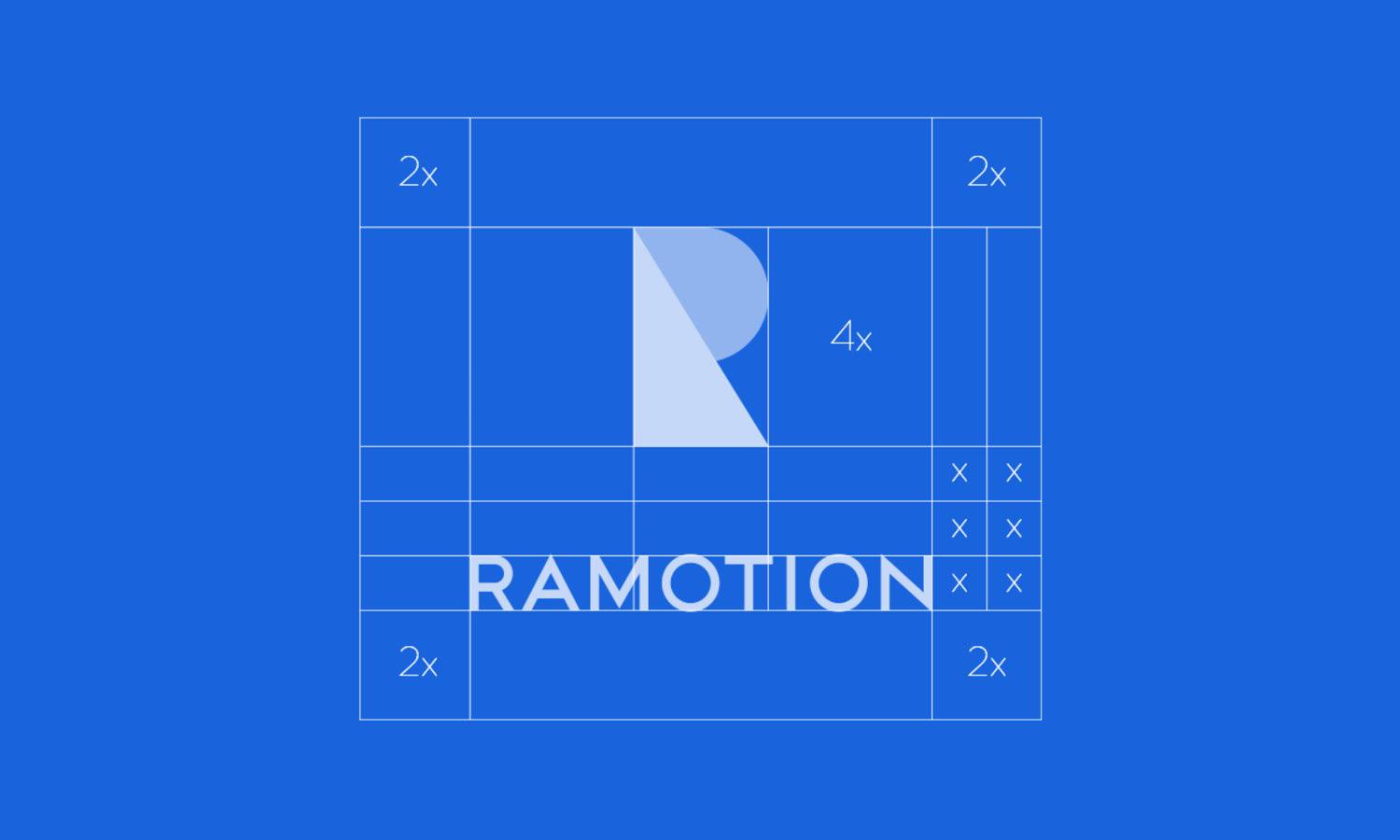
Source: Dmitry Zmiy, Sperta, Dribbble, https://dribbble.com/shots/16640219-Sperta
Select the Appropriate Color Palette
Selecting the appropriate color palette is a strategic step in the logo redesign process, as colors significantly influence brand perception and emotional connection. A well-chosen color scheme not only enhances the logo’s visual appeal but also communicates the brand’s personality and values.
Begin by understanding color psychology and its impact on consumer behavior. Each color evokes specific emotions and associations. For instance, blue conveys trust and professionalism, while red signifies energy and excitement. Choose colors that align with the brand’s identity and resonate with the target audience.
It is essential to maintain a balanced and harmonious color palette. Typically, a logo uses one primary color that represents the brand’s core identity, accompanied by one or two complementary accent colors. This combination creates visual interest without overwhelming the viewer.
Additionally, consider the cultural context of colors, especially if the brand operates in multiple regions. A color that is positive in one culture might have a different connotation in another.
Versatility is also key when selecting colors. Ensure the logo maintains its impact and legibility in black and white, grayscale, and inverted versions. By thoughtfully selecting the appropriate color palette, the logo redesign process enhances brand recognition and emotional engagement.
Prioritize Typography and Legibility
In the logo redesign process, prioritizing typography and legibility is crucial for creating a clear and impactful brand identity. The choice of fonts and how they are used can significantly influence the perception of the brand, making typography an essential element of logo design.
Begin by selecting fonts that align with the brand’s personality and tone. For instance, serif fonts convey elegance and tradition, while sans-serif fonts evoke a modern and minimalistic feel. Script fonts add a personal and creative touch but should be used cautiously to maintain legibility. Ensure that the typography style reflects the brand’s values and resonates with the target audience.
Legibility is a non-negotiable aspect of effective logo design. The text should be easily readable at all sizes, from large billboards to small social media icons. Test the logo’s visibility by scaling it to different dimensions and observing its clarity from various distances. Avoid overly decorative or complex fonts that compromise readability.
Consider the spacing between letters (kerning) and the alignment of text elements to create a balanced and visually pleasing composition. Additionally, ensure the typography maintains its impact and legibility when used in monochrome or on different background colors. By prioritizing typography and legibility, the logo redesign process enhances brand recognition and communication.
Create Multiple Design Concepts
Creating multiple design concepts is a strategic step in the logo redesign process, enabling the exploration of diverse creative directions. By generating several concepts, designers can compare ideas, refine elements, and select the best option that effectively represents the brand’s identity and values.
Begin by sketching rough drafts or creating digital mockups of different logo variations. Experiment with various design elements, including typography, color palettes, symbols, and layout arrangements. Each concept should offer a unique perspective while staying aligned with the brand’s identity and target audience.
Presenting multiple concepts allows stakeholders to visualize different approaches and provide constructive feedback. It also encourages open discussions about the brand’s vision, ensuring the final design resonates with all decision-makers. This collaborative approach reduces the risk of subjective biases and leads to a more strategic and informed choice.
Additionally, creating multiple design concepts provides flexibility in the decision-making process. If one design is not well-received, alternative options are readily available, saving time and resources.
Conclusion
A successful logo redesign process requires strategic planning, creativity, and attention to detail. By understanding the reasons for redesign, evaluating the existing logo, and defining brand identity, you lay a solid foundation. Focusing on versatility, scalability, and appropriate design elements ensures that the new logo is impactful and memorable. Collaborating with stakeholders and creating multiple design concepts encourages a more informed and strategic decision. By following a structured approach, the logo redesign process becomes seamless and effective, ultimately leading to a refreshed brand identity that resonates with the target audience.
Let Us Know What You Think!
Every information you read here are written and curated by Kreafolk's team, carefully pieced together with our creative community in mind. Did you enjoy our contents? Leave a comment below and share your thoughts. Cheers to more creative articles and inspirations!


Leave a Comment