Basic Rules To Create A Good Logo Design

Source: Nikoloz Narsia, Elephant Logo, Dribble, https://dribbble.com/shots/18348908-Elephant-Logo
A logo is one of the most important visual elements of a brand. It represents a company’s identity, communicates its values, and helps people recognize the brand quickly. Because of this, creating an effective logo requires more than just creativity. Designers must understand certain fundamental rules that guide the logo design process.
Following the right rules in logo design helps ensure that a logo is clear, meaningful, and easy to remember. Many successful brands use simple yet powerful logos that follow basic design principles. These rules help designers create logos that look professional, balanced, and suitable for different uses such as websites, packaging, social media, and printed materials.
Another important reason to understand logo design rules is consistency. A well-designed logo should work in many sizes, colors, and backgrounds without losing its impact. By applying the right principles, designers can avoid common mistakes like overcomplicated shapes, poor typography choices, or unbalanced layouts.
In this article, we will explore the basic rules to create a good logo design. These guidelines will help designers, business owners, and creatives understand what makes a logo effective and visually appealing. Whether you are designing your first logo or improving your skills, learning these logo design rules can help you create stronger and more professional brand identities.
Keep The Logo Design Simple
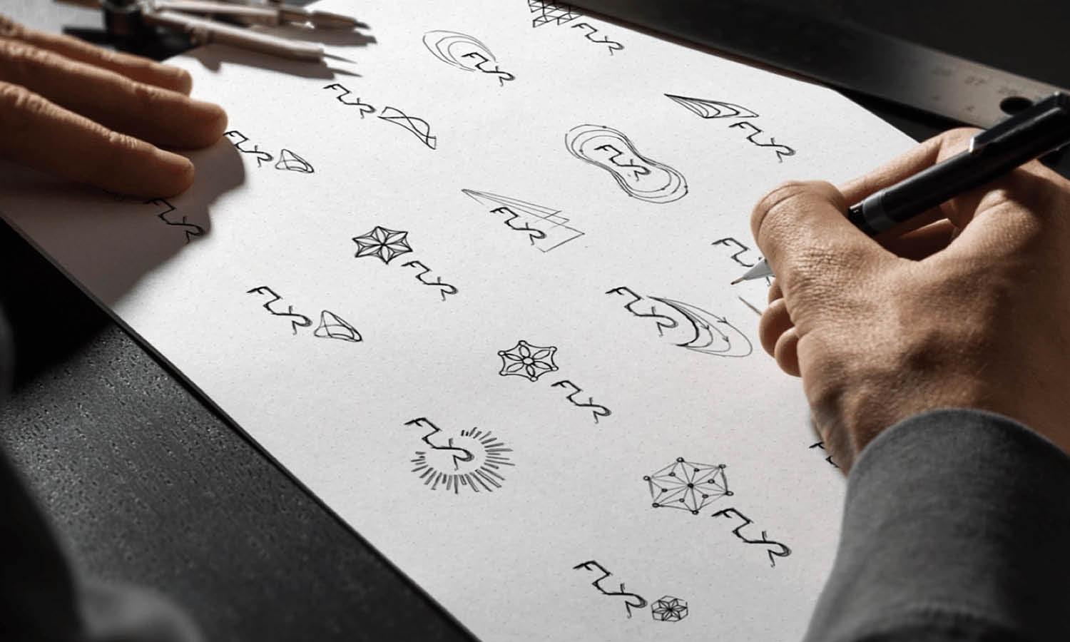
One of the most important rules in logo design is simplicity. A simple logo is easier for people to recognize, remember, and understand. When a logo design contains too many shapes, colors, or decorative elements, it can become confusing and difficult to identify. Keeping the design clean and straightforward helps the brand communicate its message more effectively.
Many well-known brands follow this rule in logo design. Think about famous logos that use basic shapes, minimal colors, and clear typography. These logos remain memorable because they avoid unnecessary complexity. A simple logo design also allows the viewer to quickly recognize the brand, even when they only see it for a few seconds.
Another advantage of simplicity is versatility. A clean logo design works better across different mediums such as websites, mobile apps, packaging, signage, and printed materials. Complex logos may lose details when resized or displayed on smaller screens, while simple designs remain clear and recognizable.
Designers can apply this rule by focusing on the core idea behind the brand. Instead of adding many decorative elements, it is better to highlight one strong concept. Using clean lines, limited colors, and balanced shapes helps create a professional logo design that stands the test of time.
By following this basic rule, designers can create logos that are visually appealing, practical, and memorable. Simplicity helps ensure that a logo design communicates the brand identity clearly and leaves a lasting impression on the audience.
Make The Logo Design Memorable
Another important rule in logo design is memorability. A good logo should stay in the viewer’s mind even after a short glance. When people can easily remember a logo, they are more likely to recognize the brand in the future. This makes memorability one of the key rules that every designer should consider during the logo design process.
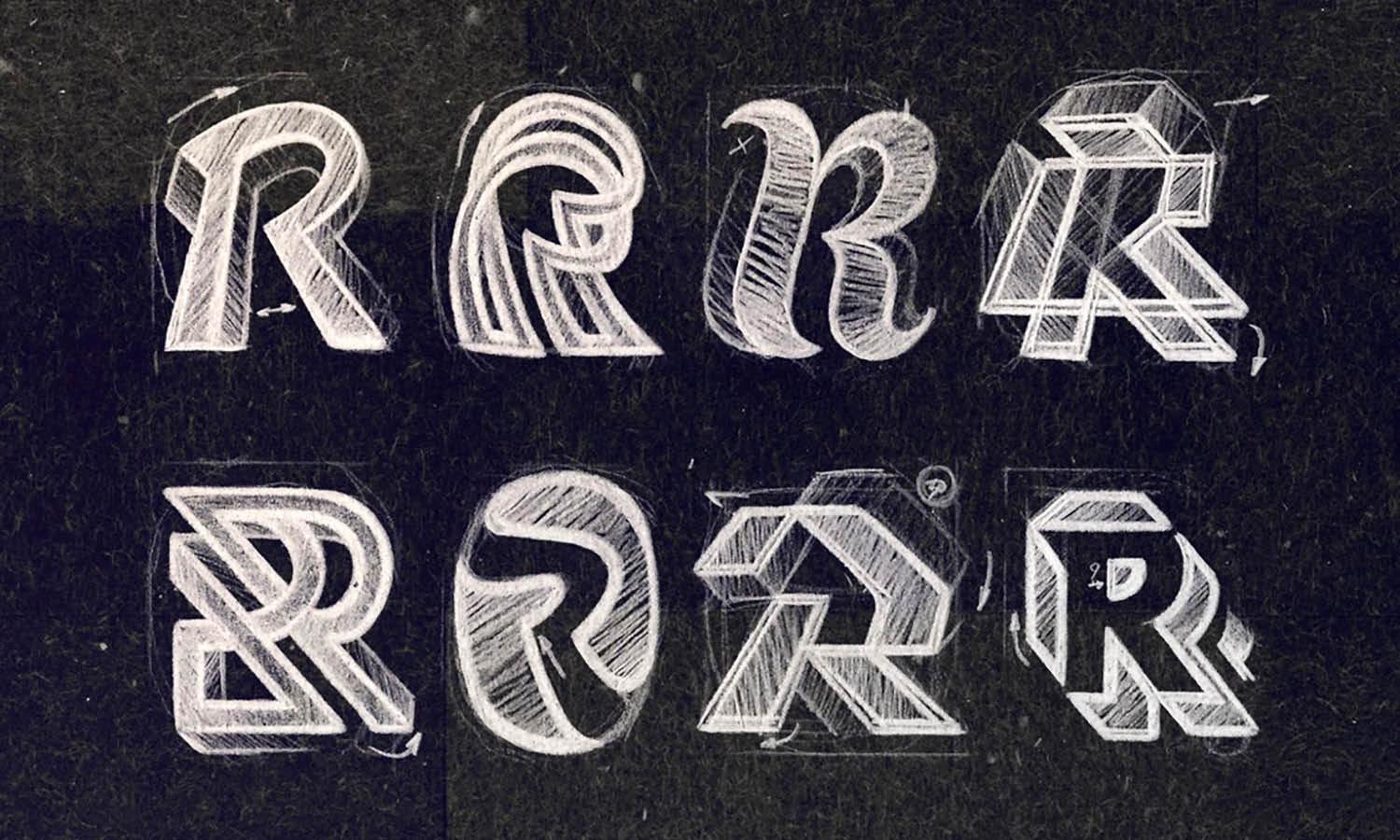
A memorable logo design usually combines simplicity with a unique visual idea. Instead of copying common symbols or overused styles, designers should aim to create something distinctive. A small creative twist, a clever symbol, or a unique letterform can make a logo stand out from competitors.
Memorability also comes from clarity. If a logo design is too complex, people may struggle to remember its details. Simple shapes, clear typography, and a focused concept help the audience recall the logo more easily. This is why many successful brands use minimal but recognizable elements in their logos.
Another useful approach is to connect the logo design with the brand’s story or purpose. When the visual concept reflects the brand identity, the logo becomes more meaningful. This connection helps the audience associate the design with the brand more quickly.
By following this rule in logo design, designers can create logos that leave a strong impression. A memorable logo not only attracts attention but also strengthens brand recognition over time, helping businesses build a lasting visual identity.
Ensure The Logo Design Is Versatile
Versatility is one of the most practical rules in logo design. A good logo should work well in many different situations, from digital platforms to printed materials. Businesses often use their logo on websites, social media profiles, packaging, advertisements, and merchandise. Because of this, a logo design must remain clear and recognizable in a variety of formats.
One important aspect of versatility in logo design is adaptability. The logo should look good whether it is displayed in full color, black and white, or grayscale. Sometimes logos appear on different backgrounds, so designers should ensure the design remains visible and balanced in various color environments.
Another factor to consider is layout flexibility. Many brands create different versions of their logo design, such as horizontal, vertical, or icon-only formats. These variations allow the logo to fit different spaces without losing its identity. Following this rule helps maintain visual consistency across different brand materials.
Designers can improve versatility by keeping the structure of the logo design clean and balanced. Overly complex shapes or too many color gradients may limit where the logo can be used effectively. Simple structures and thoughtful spacing make it easier for the logo to adapt to different platforms.
By following this rule in logo design, designers ensure that the logo remains effective wherever it appears. A versatile logo helps brands maintain a consistent identity while adapting smoothly to different design environments.

Source: VASK® Studio, Seventy® Studios, Dribble https://dribbble.com/shots/18906485-Seventy-Studios
Choose Colors Carefully In Logo Design
Color selection is another important rule in logo design. Colors play a powerful role in shaping how people perceive a brand. Different colors can communicate different emotions, meanings, and personalities. Because of this, choosing the right color palette is a critical step when creating a logo design.
One of the key rules designers follow is to keep the color palette limited. Using too many colors can make the logo design look cluttered and difficult to reproduce. Most successful logos rely on two or three colors that work well together and support the brand identity.
Another important factor is color meaning. For example, blue is often associated with trust and professionalism, while green may represent nature or growth. Designers should consider the brand’s values and industry when selecting colors for a logo design. The chosen colors should reflect the brand’s message clearly.
Color contrast also plays a role in readability and visibility. A good logo design should remain easy to see on both light and dark backgrounds. Strong contrast helps the logo stand out while maintaining visual balance.
By carefully choosing colors and following these rules in logo design, designers can create logos that feel intentional and visually appealing. A thoughtful color palette helps strengthen brand recognition and ensures the logo communicates the right impression to the audience.
Use Appropriate Typography In Logo Design
Typography plays a major role in creating a successful logo. One of the important rules in logo design is choosing typography that matches the personality and message of the brand. The style of the letters can communicate professionalism, creativity, elegance, or friendliness. Because of this, designers should carefully select fonts that represent the brand clearly.
A good logo design uses typography that is easy to read and visually balanced. Decorative or overly complex fonts may look attractive at first, but they can reduce readability, especially when the logo is displayed in small sizes. Following simple typography rules in logo design helps ensure that the brand name remains clear in every situation.
Another important factor is consistency. The typography used in the logo design should align with the brand’s overall visual identity. For example, a technology brand might use clean and modern typefaces, while a luxury brand may prefer elegant serif fonts. Matching the typography with the brand style helps strengthen the overall design.
Spacing and alignment are also key elements. Proper letter spacing, also known as kerning, helps the text look balanced and professional. Even small adjustments in spacing can improve the visual harmony of the logo design.
By following these typography rules in logo design, designers can create logos that look polished and professional. Clear and well-chosen typography helps the audience read, recognize, and remember the brand more easily.
Make Sure The Logo Design Is Scalable
Scalability is one of the most practical rules in logo design. A logo should maintain its clarity and impact whether it appears on a large billboard or a small mobile screen. Because logos are used in many different sizes, designers must ensure that the logo design remains clear and recognizable at any scale.
A scalable logo design avoids excessive details that may disappear when the logo is reduced in size. Small elements, thin lines, or complex patterns can become difficult to see in smaller formats. By keeping the design simple and structured, designers can ensure that the logo remains effective across various sizes.
Another important rule in logo design is to create the logo using vector graphics. Vector-based designs can be resized without losing quality, making them ideal for both digital and print applications. This allows the same logo to be used on websites, social media icons, packaging, signage, and promotional materials.
Testing the logo design at different sizes is also an essential step. Designers often preview how the logo looks as a small icon, a website header, or a large banner. This helps identify any visibility issues before the final design is completed.
By following these scalability rules in logo design, designers can ensure that the logo performs well in every environment. A scalable logo keeps the brand identity consistent and recognizable wherever it appears.
Keep The Logo Design Relevant To The Brand
One of the most important rules in logo design is relevance. A logo should reflect the identity, values, and purpose of the brand it represents. When a logo design matches the brand’s message, it becomes easier for people to understand what the company stands for. This connection helps build trust and recognition over time.
Designers should begin by learning about the brand before creating the logo design. Understanding the company’s industry, target audience, and personality helps guide visual decisions. For example, a playful brand aimed at children may use bright colors and friendly shapes, while a corporate brand might prefer a clean and professional appearance.
Another important rule in logo design is avoiding visuals that create confusion. If the style, color, or symbol does not match the brand’s identity, the audience may struggle to understand the message. A relevant logo design should communicate the brand’s character clearly and naturally.
Symbols, typography, and colors should all support the brand story. Even subtle design choices can help reinforce meaning. When all elements work together, the logo design feels intentional and authentic.
By following this rule in logo design, designers create logos that truly represent the brand. A relevant logo not only looks attractive but also strengthens the connection between the brand and its audience.

Source: Kyle Anthony Miller, Logos, Dribble, https://dribbble.com/shots/19229237-Logos
Maintain Balance And Proportion In Logo Design
Balance and proportion are essential rules in logo design that help create a visually pleasing composition. A well-balanced logo design feels stable and organized, making it easier for viewers to understand the structure of the design. When elements are placed thoughtfully, the logo appears more professional and harmonious.
Balance in logo design refers to how visual elements are distributed within the layout. Designers can achieve balance by carefully arranging shapes, text, and symbols so that no single element feels too heavy or distracting. Even simple adjustments in spacing can significantly improve the overall appearance of the logo design.
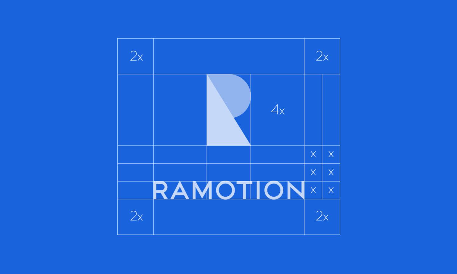
Proportion is another important rule that focuses on the relationship between elements. The size of the symbol, typography, and spacing should work together naturally. If one element dominates too much, the design may lose its visual harmony. Proper proportion ensures that each part of the logo design supports the whole composition.
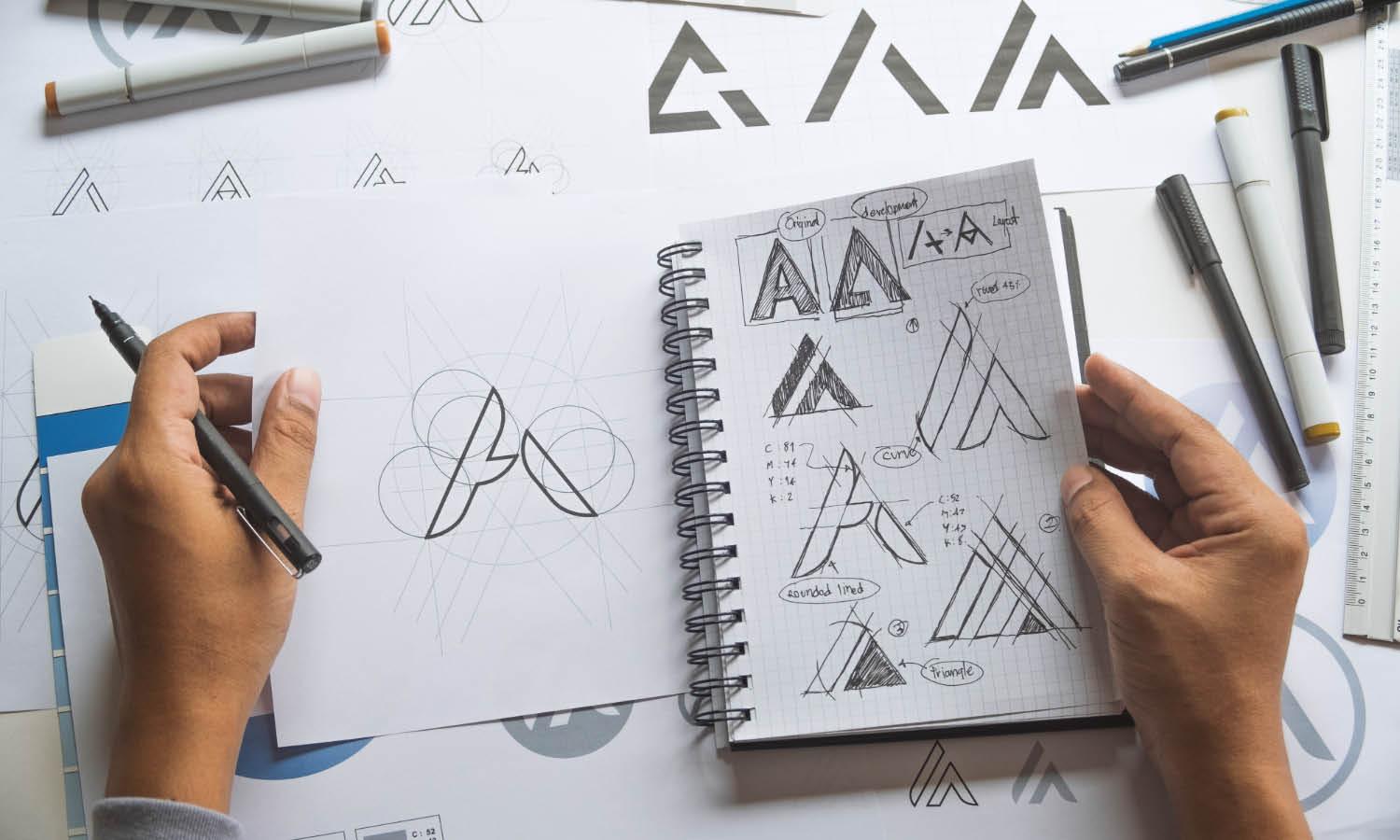
Designers often use grids or alignment guides to maintain consistent spacing and structure. These tools help create a clean layout and ensure that the elements are placed with precision. Following these rules in logo design helps maintain clarity and visual order.
By maintaining balance and proportion, designers can create logo designs that feel polished and professional. A well-structured logo design improves readability, strengthens brand identity, and leaves a strong visual impression.
Avoid Overusing Effects In Logo Design
One of the important rules in logo design is avoiding excessive visual effects. While effects such as shadows, gradients, glows, or textures can sometimes enhance a design, using too many of them can make a logo look cluttered and outdated. A clean and well-structured logo design often performs better than one filled with decorative elements.
Many professional designers follow the rule of simplicity when applying visual effects. The main goal of a logo design is to communicate the brand clearly, not to impress viewers with complicated details. When too many effects are used, the core idea of the logo can become difficult to recognize.
Another reason to limit effects in logo design is versatility. Logos need to work across many platforms such as websites, packaging, social media, and printed materials. Complex effects may not reproduce well in certain situations, especially when the logo is displayed in small sizes or printed in black and white.
Instead of relying on heavy effects, designers should focus on strong shapes, balanced typography, and thoughtful color choices. These elements create a solid foundation for a professional logo design. Subtle design touches can still be used, but they should support the overall concept rather than dominate it.
By following this rule in logo design, designers can create logos that look timeless and adaptable. A clean design without unnecessary effects ensures that the logo remains clear, professional, and effective across many different uses.
Test The Logo Design In Different Backgrounds
Testing a logo in different backgrounds is another essential rule in logo design. A logo should remain clear and visually strong regardless of where it appears. Since brands use their logo across many platforms, it must work well on light, dark, colorful, and textured backgrounds.
One of the common rules designers follow is checking how the logo design performs in both positive and negative versions. For example, a dark logo on a light background and a light logo on a dark background should both remain readable and balanced. This flexibility helps maintain strong brand visibility in different situations.
Another important step is testing the logo design on realistic applications. Designers often place the logo on mockups such as websites, packaging, signage, or social media graphics. This process helps reveal whether the logo design remains clear and visually appealing when used in real environments.
Contrast also plays a major role in this rule of logo design. If the colors of the logo blend too closely with the background, the design may become difficult to see. Ensuring good contrast helps the logo stand out and keeps the brand recognizable.
By testing the logo design in different backgrounds, designers can confirm that the logo works effectively in many situations. Following this rule ensures that the logo remains flexible, visible, and consistent across all brand materials.
Conclusion
Understanding the basic rules of logo design helps designers create visuals that are clear, memorable, and meaningful. By focusing on simplicity, relevance, balance, and versatility, a logo design can communicate a brand’s identity effectively. These rules guide designers in making thoughtful decisions about typography, color, structure, and overall composition. A well-crafted logo design does more than look attractive; it strengthens brand recognition and builds trust with the audience. By following these essential rules, designers and business owners can create logo designs that remain professional, adaptable, and visually impactful across different platforms and design applications.
Let Us Know What You Think!
Every information you read here are written and curated by Kreafolk's team, carefully pieced together with our creative community in mind. Did you enjoy our contents? Leave a comment below and share your thoughts. Cheers to more creative articles and inspirations!







Leave a Comment