How to Create A Logo Design from Scratch

Source: Mateusz Witczak, Unikat Real Estate, Dribbble, https://dribbble.com/shots/19557185-Unikat-Real-Estate
Creating a logo from scratch is a pivotal task for any designer, blending creativity with strategic thinking. A logo is more than just a visual mark; it serves as the face of a brand, encapsulating its identity and values in a single, memorable image. This process begins long before the first draft is sketched, requiring a deep understanding of the brand, its audience, and the market it operates within. Whether you're a seasoned professional or a novice looking to make your mark in the design world, developing a logo from scratch involves several crucial steps—from initial research and conceptualization to refining and finalizing the design.
This guide provides a comprehensive overview of creating a distinctive and effective logo, ensuring it not only looks appealing but also communicates the brand's essence clearly. Join us as we delve into the art and science of logo design, providing you with the tools and insights needed to craft a logo that stands the test of time.
Understand the Brand
When embarking on creating a logo from scratch, the first crucial step is to thoroughly understand the brand. This involves delving into the brand’s history, mission, values, and goals. A deep comprehension of these elements ensures that the logo will resonate with the target audience and reflect the brand's identity.
Start by interviewing stakeholders to gather insights about what the brand stands for and its market positioning. Analyze the brand’s customer demographics to understand their preferences and expectations. It's also vital to consider the emotional response the brand intends to evoke—should it inspire trust, convey luxury, or exude friendliness?
Understanding these facets helps in crafting a logo that not only stands out visually but also fortifies the brand’s message. This foundational step sets the direction for the design process, ensuring that every creative decision aligns with what the brand embodies. Remember, a well-conceived logo acts as a shorthand for the brand’s narrative, making this initial research phase indispensable.
Brainstorm Ideas
Brainstorming is a dynamic and crucial phase in logo design, especially when starting from scratch. It's the creative playground where ideas are born and explored. Begin by setting up a brainstorming session that fosters creativity. Use tools like mind maps or mood boards to facilitate the flow of ideas.
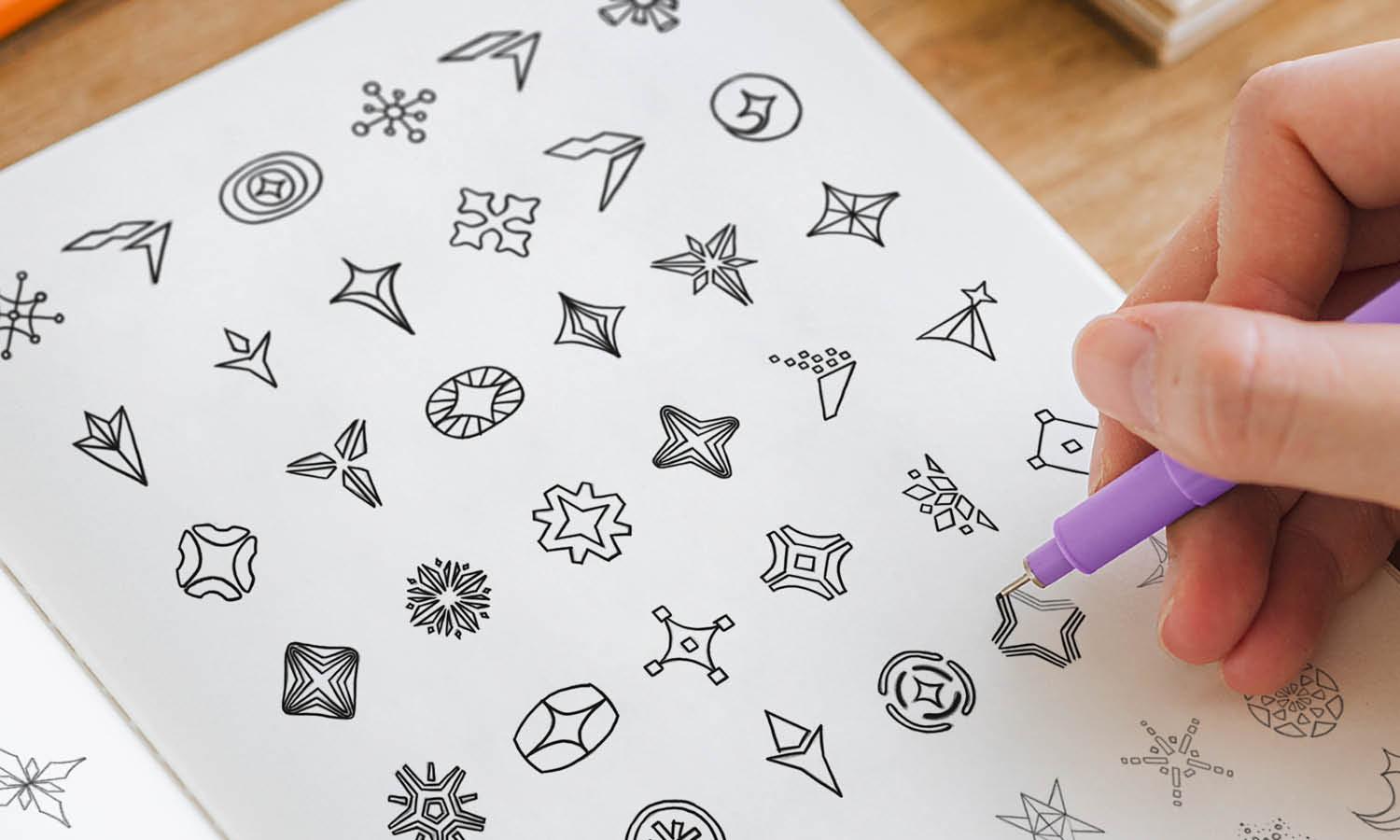
Include various stakeholders in these sessions—diverse perspectives can lead to innovative concepts. Don’t limit yourself to the first few ideas; the goal is to generate a wide array of concepts that can later be refined. Sketching plays a key role during brainstorming. Quick, rough sketches can help visualize ideas and assess their feasibility as logos.
Encourage wild ideas, as these can often lead to unique and memorable designs. As ideas are sketched out, think about the elements of the logo such as symbols, typography, and colors. Consider how these could translate the brand's essence into visual form. This stage is not about perfection but exploration. The more ideas generated, the higher the chance of discovering an effective logo that truly represents the brand from scratch.
Choose the Right Style
When initiating a logo design from scratch, selecting the right style is crucial as it communicates your brand's identity and values. Start by understanding the brand's core message and target audience. This alignment helps in choosing a design style that resonates well with the intended demographic, whether it be modern, minimalist, vintage, or whimsical.
Consider the industry standards but don't be afraid to differentiate. For instance, tech companies often favor sleek, modern logos that imply innovation, whereas a bakery might opt for a more whimsical or handcrafted style to convey warmth and personal touch.
Research competitors to ensure your logo stands out. Analyze common elements in existing logos within the same niche and brainstorm how to incorporate unique twists that elevate your brand's visibility.
Lastly, think long-term. A great logo should not only be trendy but timeless. Avoid overly complicated designs that might not scale well or adapt to different media. A simple, strong design will ensure your logo remains effective and distinctive across various applications.

Source: Ramotion, Logo Design, Logomark, Wordmark Designer Business Company, Dribbble, https://dribbble.com/shots/14919766-Drawing-Sketches
Select Colors Wisely
Color choice is pivotal in logo design from scratch, as colors evoke emotions and carry meanings that can significantly impact brand perception. Start by considering the psychological effects of colors—blue conveys trust and dependability, red evokes energy and passion, and green often represents growth and health.
Align the color choices with the brand’s identity and values. A luxury brand might lean towards black or gold to suggest sophistication and elegance, while an environmental organization could opt for greens and earth tones to symbolize nature and sustainability.
It's also important to ensure good contrast and visibility in your logo. Colors should be distinct enough to stand out in various backgrounds and scales, from large billboards to small digital icons.
Experiment with different palettes to see what best captures the brand’s essence while remaining functional across all media. Using too many colors can be overwhelming, so limit the palette to a few core colors that complement each other well.
Remember, the goal is to create a memorable and recognizable logo that effectively communicates your brand message through thoughtful color use.
Pick Appropriate Fonts
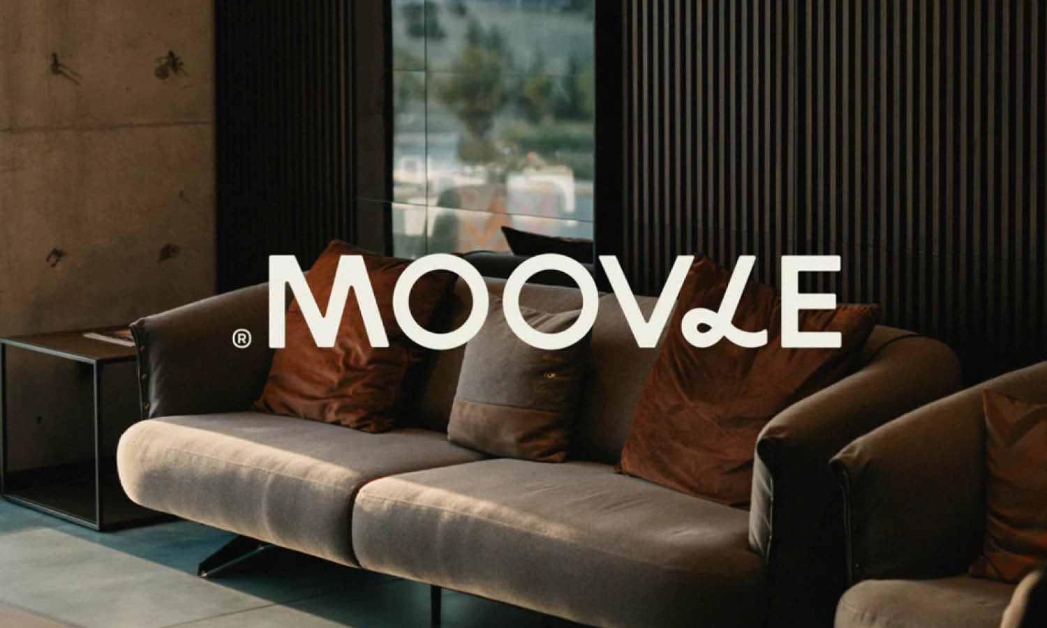
Selecting the right font is a crucial step in creating a logo from scratch, as it significantly influences the overall impact and legibility of the design. Start by understanding the brand's personality and the message it aims to convey. A font can express seriousness, whimsy, tradition, or innovation, so aligning it with the brand's identity is key.
Consider the target audience and industry. Corporate businesses often prefer clean, sans-serif fonts that communicate professionalism and modernity. In contrast, creative industries might opt for more stylized, expressive fonts to capture attention and showcase creativity.
Functionality should not be overlooked. The chosen font must be readable at various sizes and across different mediums, from digital displays to print materials. Test the legibility of your fonts by printing them in small and large scales to ensure they are versatile for all branding needs.
Avoid using overly trendy fonts that may become outdated quickly. Opt for something that has a timeless appeal yet stands out. If possible, consider customizing a typeface to create a unique aspect of your logo that can't be easily replicated.
Finally, limit the number of fonts used to maintain a cohesive and clear design. Too many typefaces can clutter the logo and dilute the brand message. Typically, one or two fonts are sufficient to maintain clarity and brand recognition.
Create Sketches
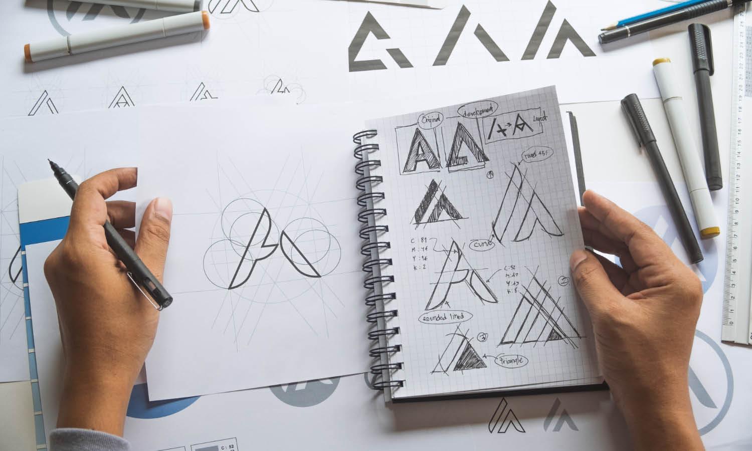
Beginning the logo design process from scratch with sketches is an essential step for cultivating creativity and refining ideas. Sketching allows for rapid exploration of concepts without the constraints of digital tools, enabling you to iterate quickly and discover effective visual solutions.
Start with broad strokes, jotting down all ideas that come to mind. These can be abstract representations or more defined shapes that relate to the brand's core values and identity. Don't worry about perfection in the initial stages; the goal is to generate a wide range of ideas.
As the sketches evolve, start to consider how they might translate into a digital format. Think about scalability and how the logo will look on different mediums, from tiny app icons to large billboards. This consideration will guide you in refining your sketches to more practical, scalable options.
Use feedback loops to your advantage. Present sketches to clients or peers to gauge reactions and gather input. This feedback is invaluable for understanding which directions are most promising and which might need reevaluation.
Once you have a set of strong contenders, begin the transition from paper to digital. The best sketches should serve as a foundation for the final logo design, combining creativity with practical application to create a compelling and functional logo that resonates with the intended audience.
Digitize Your Sketches
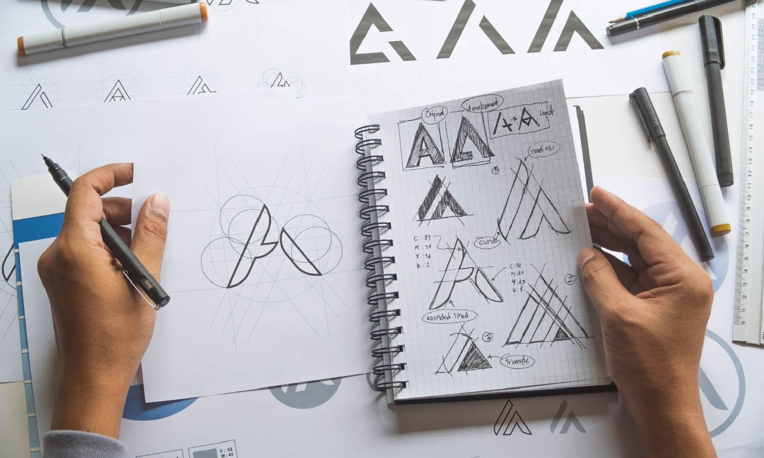
Once you have finalized your sketches for a logo design starting from scratch, the next step is to digitize them. This process involves transferring your hand-drawn concepts into digital software, which provides the tools for precision and flexibility in design adjustments.
Begin by selecting appropriate software, such as Adobe Illustrator, which is widely used for its vector capabilities that allow for scaling without loss of quality. Scan or photograph your sketches with high resolution to capture all details accurately when importing them into the digital environment.
Use the pen tool and other vector tools to trace your sketches. This step transforms your rough ideas into clean, editable lines and shapes. Pay close attention to the consistency of line weights and the neatness of the curves, as these elements significantly affect the professionalism of the final logo.
Layering in digital software also helps in organizing different elements of the logo, making it easier to edit individual components without affecting the overall design. Apply colors and fine-tune fonts as you integrate your previous decisions on style and typography into the digital form.
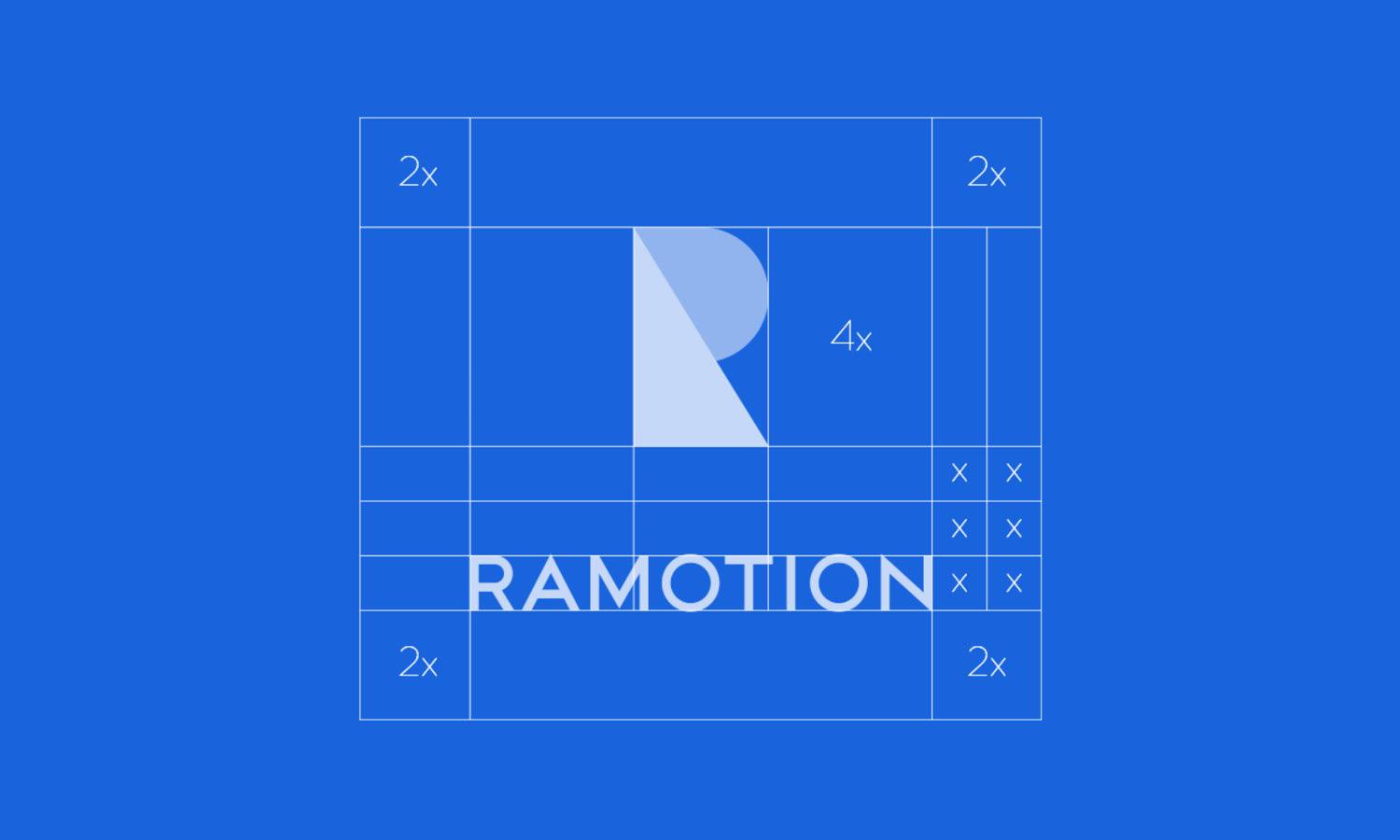
Finally, refine your digital logo by ensuring that it is aligned perfectly and that all elements are proportionally balanced. Preview the logo in various sizes and mockups to see how it performs in real-world applications. This step is critical to ensure that the logo looks great both online and in print.

Source: Wells Collins, Summer Break Wordmark Logo Concept, Dribbble, https://dribbble.com/shots/19807402-Summer-Break-Wordmark-Logo-Concepts
Simplify the Design
Simplifying your logo design is a crucial step in creating a memorable and effective visual identity from scratch. A simple logo enhances recognition and ensures it is easy to reproduce across various media.
Start by focusing on the essential elements that convey your brand’s message. Strip away any unnecessary details that do not add value to the logo’s core concept. The goal is to keep only the most potent aspects that are representative of the brand.
Evaluate each component’s usefulness and visual impact. Use negative space creatively to form shapes or letters, which can add an element of cleverness and sophistication to your design. This approach not only simplifies the design but also makes it more engaging.
Consider the scalability of the logo. A simpler design will maintain its integrity and effectiveness whether it’s displayed on a large billboard or a small business card. Avoid complex gradients and fine details that might get lost in smaller scales.
Use fewer colors and fonts to maintain clarity and improve the logo's visibility from a distance. A limited color palette and a single font family can help in creating a strong, cohesive brand identity.
Ultimately, a simplified logo design should be distinctive, scalable, and relevant to the brand, ensuring it stands the test of time and adapts seamlessly across different applications and platforms.
Get Feedback
Obtaining feedback is a critical part of the logo design process, especially when creating a logo from scratch. It helps refine your design and ensures it resonates well with your target audience. Engage a diverse group of people for feedback, including stakeholders, potential customers, and design peers, to get a broad perspective on the logo's effectiveness and appeal.
Present the logo in various contexts and formats to see how it interacts with different backgrounds and sizes. This approach gives a clearer picture of its versatility and visual impact. Ask for specific feedback on elements such as legibility, color, and emotional response, which are crucial in determining the logo’s success.
Encourage honest and constructive criticism, and be prepared to make iterations based on the feedback received. This process can unveil unforeseen issues or new ideas that enhance the logo's design. Document all feedback to analyze patterns and common themes that could guide your revisions.
Additionally, consider using online tools and surveys to gather more structured feedback. These platforms can provide quantitative data that might reveal preferences and trends among a larger audience, adding another layer of insight into the logo’s reception.
Feedback is not just about finding flaws; it's about assurance that the logo communicates the intended message and functions well across all intended platforms and media.
Ensure Versatility
A versatile logo functions effectively across different mediums and applications, which is essential when designing a logo from scratch. To ensure versatility, the logo must be recognizable, scalable, and adaptable to various uses without losing its identity.
Start by designing in black and white to focus on the logo’s form and structure without the influence of color. This helps in assessing the design’s strength purely based on its shape and composition. Ensure that the logo is legible and impactful in both small and large scales, from tiny mobile icons to expansive billboard advertisements.
Consider the different formats where the logo might be used, including digital, print, merchandise, and multimedia. It should maintain its clarity and impact on different materials and textures. This might require creating different variations of the logo, such as a simplified icon for small sizes and a more detailed version for large-scale applications.
Test the logo in real-world conditions to see how it adapts to different backgrounds and color schemes. This testing can reveal necessary adjustments to improve its functionality across diverse platforms.
A truly versatile logo will endure through time and trends, maintaining its effectiveness and relevance in various contexts, thereby supporting a strong and consistent brand identity.
Conclusion
Designing a logo from scratch is a multifaceted process that requires careful consideration of style, color, font, and versatility. Each step, from initial sketches to digital refinement, plays a crucial role in developing a logo that truly represents the brand and resonates with the target audience. Feedback is invaluable, helping to polish and perfect the design. By ensuring the logo's versatility, it can seamlessly adapt to various applications, maintaining its effectiveness across all platforms. Ultimately, a well-designed logo not only stands out visually but also embeds itself in the minds of consumers, enhancing brand recognition and loyalty.
Let Us Know What You Think!
Every information you read here are written and curated by Kreafolk's team, carefully pieced together with our creative community in mind. Did you enjoy our contents? Leave a comment below and share your thoughts. Cheers to more creative articles and inspirations!





Leave a Comment