
Here’s How to Draft & Refine Your Logo Design to Perfection

Source: Ramotion, MetaSpark Logos, Logo Mark, Modern Design Creative Concept, Dribbble, https://dribbble.com/shots/16597200-MetaSpark-Logos-logo-mark-modern-design-creative-concept
A strong logo rarely appears fully formed on the first try. Most successful designs begin as rough ideas that become clearer through testing, comparison, and careful editing. The drafting stage gives you room to explore possibilities, while refinement helps you remove weak details and strengthen the parts that communicate the brand most effectively. To refine logo design well, you need more than patience. You also need a clear process for deciding what to keep, what to adjust, and when to stop. Random changes can make a concept feel less focused, but purposeful revisions improve recognition, balance, and usability. The following steps move from early sketches to final checks, helping you develop a logo that feels considered rather than overworked.
Establish a Clear Direction Before Drafting
Refinement becomes much easier when the project begins with a defined direction. Without one, you may create attractive drafts that do not solve the actual communication problem. Before sketching, identify what the logo needs to express and what limitations should guide your decisions.
Clarify the Logo’s Main Purpose
Start by defining the logo’s role. Is it meant to make a new business feel trustworthy, help a creative brand appear distinctive, or give an established company a cleaner identity? Consider where the mark will appear most often, since a logo used mainly on packaging may require different priorities from one used primarily in an app.
Identify the Essential Brand Qualities
Choose three or four qualities that describe the intended personality. Words such as confident, welcoming, refined, energetic, or technical can help you evaluate visual choices later. A concept should not try to express every possible trait at once.
Set Useful Design Constraints
Decide early how simple, formal, expressive, or flexible the logo needs to be. Constraints reduce distractions and give the drafting process a clearer target. They also help you explain why one direction fits better than another.
Develop Rough Logo Drafts Quickly
Early drafts should explore ideas, not prove that one concept is already finished. Working quickly allows you to compare more possibilities before investing time in precise drawing, typography, or color.
Begin With Small Thumbnail Sketches
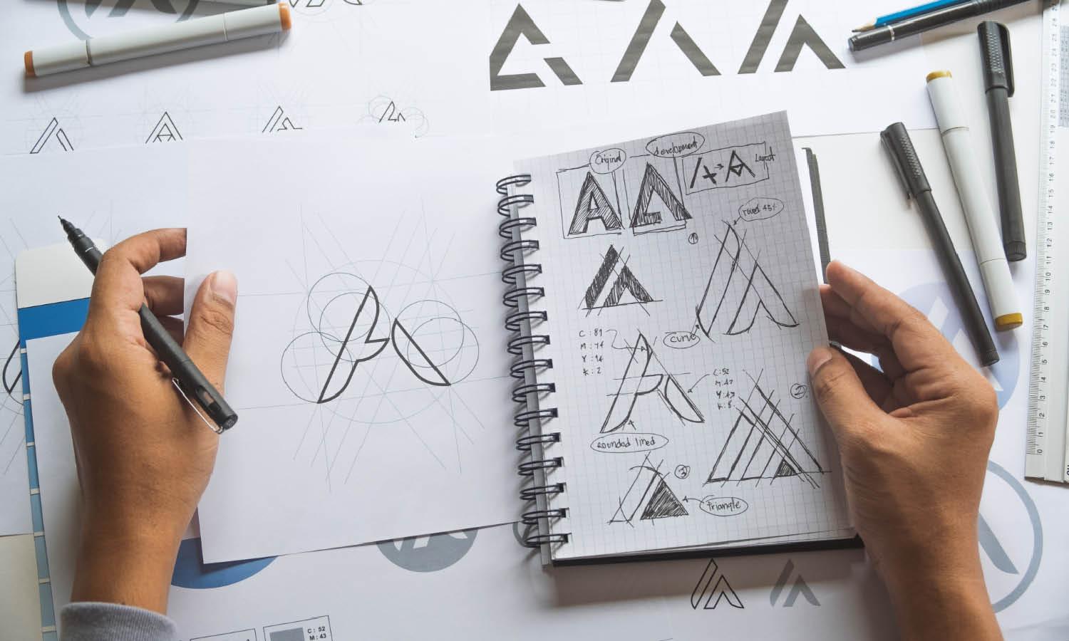
Use small boxes or simple sketch areas to develop compact compositions. At this size, you naturally focus on silhouette, placement, and overall structure. The sketches do not need clean lines. Their purpose is to reveal which arrangements have potential.
Explore Different Visual Directions
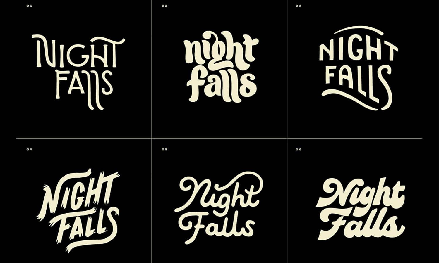
Try several approaches that suit the project, such as a symbol, wordmark, monogram, or combination mark. Change the relationship between elements rather than producing minor variations of the same idea. A broad first round gives you stronger material to evaluate.
Avoid Refining the First Idea Too Soon
The first workable concept can feel exciting, but polishing it immediately may limit your thinking. Continue drafting until you have several clearly different directions. Comparing them makes strengths and weaknesses easier to see, and it reduces the chance of keeping an idea simply because it appeared first.
Choose the Strongest Concept to Refine
Once you have a varied group of drafts, narrow them down using clear criteria. Personal attachment matters less than how well each concept serves the identity and performs as a logo.
Check Relevance and Distinctiveness
Ask whether the concept supports the brand’s intended message and avoids obvious visual clichés. A familiar symbol can still work, but it needs a specific treatment that gives it character rather than making it feel interchangeable with competitors.
Review Simplicity and Recognition
Look for a concept that can be understood quickly. Strong logos often contain fewer elements, clearer relationships, and a memorable outer shape. Simplicity does not mean plainness; it means that each part has a useful role.
Consider the Audience’s Perspective
Think about what the intended audience may notice first and how they might interpret the design. This perspective can reveal confusing symbols, an unsuitable tone, or details that rely too heavily on insider knowledge.

Improve the Shape and Composition
After choosing a direction, begin structural refinement. This stage is where you turn an expressive sketch into a controlled visual system. Focus first on form and composition before spending too much time on finishing details.
Rebuild Forms With Cleaner Geometry
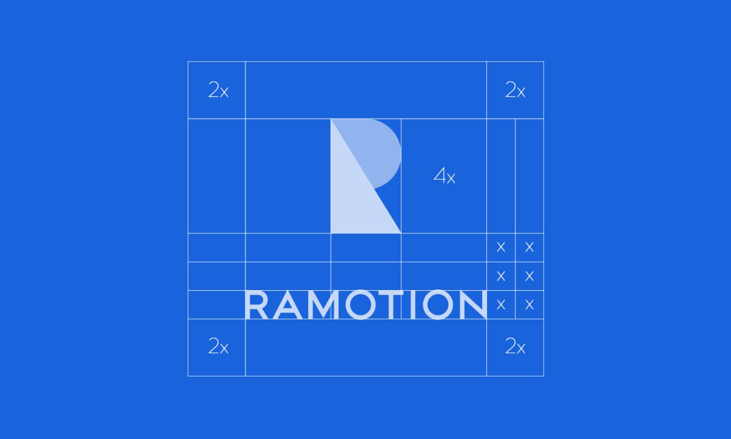
Redraw the concept using consistent curves, angles, and proportions. Avoid relying on automatic geometric perfection when a slight optical adjustment creates a better result. The goal is not mathematical neatness but visual coherence.
Strengthen Visual Balance
Compare the weight of each element. A small dark shape can feel heavier than a larger open one, so balance should be judged visually rather than by measurement alone. Adjust size, position, and spacing until the mark feels stable.
Use Negative Space Intentionally
Examine the empty areas inside and around the logo. Uneven gaps can make a design feel awkward, while well-planned negative space improves clarity and can add meaning. Check that no accidental shapes appear between elements.
Simplify Unnecessary Details
Remove lines, corners, textures, or decorative parts that do not improve recognition. Small details often disappear in reduced sizes and may weaken the main silhouette. When you refine logo design, subtraction is frequently more effective than addition.
Refine Typography and Spacing
Typography needs the same level of care as the symbol. Even a suitable typeface can feel poorly integrated when its spacing, proportions, or relationship to the icon is unresolved.
Select a Typeface That Supports the Concept
Choose letterforms that match the intended personality without competing with the symbol. Consider width, stroke contrast, shape, and readability. A highly expressive icon may pair better with quieter typography, while a simple symbol can support a more distinctive wordmark.
Adjust Kerning and Letter Relationships
Default spacing is rarely perfect for logo use. Review each letter pair and correct gaps that feel too tight or too open. Pay special attention to diagonals, rounded letters, and unusual capitals, since they often create visual spacing problems.
Balance the Wordmark and Symbol
Test the symbol and type together at several sizes. Neither should appear like an afterthought. Adjust scale, baseline, and distance until both elements feel connected while remaining readable as separate components.
Test the Logo in Black and White First
Color can make a draft feel more finished, but it can also hide weak structure. Testing the logo in black and white reveals whether the core design works without relying on a palette.
Confirm the Design Works Without Color
Convert the logo to a single solid color and check whether its shapes, hierarchy, and internal spaces remain clear. If important distinctions disappear, revise the forms before adding color again.
Introduce a Focused Color Palette
Choose a limited palette that reinforces the identity and works across relevant applications. Avoid adding extra colors simply to create interest. The strongest palette is usually the one that supports recognition without becoming the main idea.
Check Contrast and Accessibility
Test the mark on light, dark, and busy backgrounds. Make sure key elements remain visible and that color combinations provide enough separation. Prepare reversed or simplified versions when the primary logo cannot perform well in every setting.

Evaluate the Logo Across Real Applications
A logo that looks balanced on a large artboard may behave differently in actual use. Practical testing reveals problems with scale, contrast, spacing, and format before the design is approved.
Review the Logo at Different Sizes
Reduce the logo to favicon, social avatar, label, and business-card sizes. Then test it at larger scales, such as signage or displays. Watch for disappearing details, uneven line weights, or spacing that becomes too tight.
Test Different Logo Arrangements
Create horizontal, stacked, symbol-only, and wordmark versions when the identity requires them. Each variation should feel related to the main design rather than appearing separately constructed.
Place the Design in Relevant Mockups
Use mockups that reflect likely applications, not random presentation scenes. Packaging, websites, uniforms, signage, or stationery can reveal whether the logo feels appropriate in context. Mockups should support evaluation rather than distract from unresolved design issues.
Gather Focused Feedback and Revise Carefully
Feedback is most useful when it addresses the design’s goals. Broad questions often lead to vague opinions, while specific questions produce observations you can act on.
Ask Specific Questions
Ask viewers what they notice first, what qualities the logo suggests, and whether any part feels unclear. These questions reveal communication problems more effectively than asking whether someone likes the design.
Separate Useful Observations From Personal Taste
Not every preference requires a revision. Look for repeated confusion, unintended associations, or usability concerns. A single comment based only on style may not outweigh the project’s direction.
Make Revisions With a Clear Purpose
Connect each change to a defined issue. If the logo feels unbalanced, adjust weight or spacing. If the symbol is unclear, simplify its structure. Purposeful revisions protect the concept from becoming diluted through endless small edits.
Complete a Final Consistency Check
Before exporting files, inspect the full logo system carefully. Small technical inconsistencies can weaken an otherwise polished design and create problems during production.
Inspect Alignment and Proportions
Zoom in to check curves, anchor points, corners, stroke weights, and spacing. Then zoom out again to judge the design as a whole. Technical precision should support visual quality, not replace it.
Compare Every Logo Variation
Place all approved versions together and confirm that typography, colors, proportions, and symbol construction remain consistent. Differences should be intentional and based on format needs.
Remove Unnecessary Construction Elements
Delete hidden objects, unused layers, duplicate shapes, stray points, and temporary guides. Name files clearly and prepare suitable vector and raster formats. Clean source files make future use and editing much easier.
Conclusion
Learning to draft and refine logo design is less about chasing perfection and more about making disciplined decisions. A clear direction gives your ideas purpose, varied sketches create stronger choices, and structural refinement turns a rough concept into a reliable mark. Typography, color, testing, and focused feedback then help the design perform beyond the artboard. The process is complete when the logo communicates clearly, remains recognizable across applications, and supports the original goals without unnecessary detail. At that point, further changes may add complexity rather than value. Knowing when the design is resolved is part of refinement itself.
Let Us Know What You Think!
Every information you read here are written and curated by Kreafolk's team, carefully pieced together with our creative community in mind. Did you enjoy our contents? Leave a comment below and share your thoughts. Cheers to more creative articles and inspirations!
Related Articles









Leave a Comment