Finalizing Logo Design Top Techniques and Best Practices

Finalizing a logo design is a crucial step in branding that sets the tone for how a business is perceived. A well-crafted logo not only distinguishes a brand from its competitors but also fosters instant customer recognition. This process involves a blend of creativity, strategic thinking, and technical prowess. In this article, we explore top techniques and best practices in logo design that ensure your creation not only looks professional but is also effective across various platforms.
Understanding the essence of the brand is the foundation of every great logo. It's about more than just aesthetics; it's about conveying the brand's values and story through a simple yet compelling visual. Best practices in logo design emphasize simplicity, versatility, and relevance, ensuring that the logo makes a lasting impression. Whether you are a seasoned designer or just starting out, these guidelines will help you refine your approach and enhance the impact of your designs. By adhering to these principles, you can deliver logos that are not only visually appealing but also resonate deeply with the target audience.
Keep It Simple
In the realm of logo design, the principle of simplicity reigns supreme. A simple logo is not just an aesthetic choice; it's a strategic tool that enhances brand recognition and recall. Best practices in logo design advocate for minimalism because it allows your logo to be versatile and effective across various mediums. When a logo is straightforward, it communicates the brand’s essence quickly and clearly without the clutter that can dilute its message.
The most iconic logos in the world, such as the Apple logo or Nike’s Swoosh, illustrate the power of simplicity. These logos are instantly recognizable, scalable, and adaptable, proving that a less complicated design can make a stronger impact. For designers, the challenge lies in distilling the brand's identity into its simplest form without losing its significance. This often involves focusing on a single design element that captures the essence of the brand, using clean lines and limited colors.
Adhering to simplicity also aids in longevity. Trends may come and go, but a simple logo remains timeless, avoiding the need for frequent redesigns. This approach not only saves time and resources but also builds a stable brand identity that customers can trust over time. Ultimately, a simple logo design ensures clarity, memorability, and enduring appeal, making it a best practice for any designer aiming to create a lasting impact.
Focus on Versatility
Versatility is a critical aspect of modern logo design, ensuring that a logo performs well across different platforms and applications. A versatile logo adapts easily to various sizes, from a large billboard to a tiny app icon, and works effectively in both digital and physical formats. Best practices in logo design dictate that a logo should be functional in black and white as well as in color, and recognizable even when scaled down to the smallest dimensions.
To achieve versatility, designers must consider multiple use cases during the design process. This includes evaluating how the logo looks on different backgrounds, its appearance in monochrome versus full color, and its impact when used in various marketing materials. For instance, a logo should be equally effective on a website header, a promotional pen, and a corporate t-shirt.
Another aspect of versatility is the adaptability of the logo design to evolve with the brand. As businesses grow and markets change, the logo should have the flexibility to adapt without losing its core identity. This might involve designing a logo that can be updated or slightly modified over time while maintaining its recognition and relevance.
Creating a versatile logo requires a balanced approach, blending simplicity with the ability to stand out in a crowded marketplace. It should convey the brand’s message effectively, irrespective of where or how it is displayed, making versatility a cornerstone of effective logo design best practices.
Choose Colors Wisely
Choosing the right colors for a logo is a strategic decision that can significantly impact brand perception. In logo design, best practices suggest selecting colors that not only align with the brand’s identity but also enhance visibility and emotional connection. Color psychology plays a pivotal role here, as different colors evoke different feelings and associations. For example, blue often conveys trust and dependability, making it a favorite for financial institutions, while green is associated with health and sustainability.
When selecting colors, consider the cultural context as well, since color meanings can vary across different regions and cultures. It’s essential to ensure that the chosen colors resonate positively with the target audience and do not carry unintended negative connotations.
Another important aspect is contrast. Adequate contrast between the logo and its background improves readability and visibility, crucial for brand recognition. This is particularly important in digital applications where logos need to stand out on various devices and screen sizes.
Furthermore, it’s advisable to limit the color palette to a few core colors to maintain simplicity and effectiveness. A limited palette makes the logo more versatile and easily recognizable, which is vital for creating a strong brand identity. Ultimately, wise color choices can make a logo more impactful, memorable, and effective in conveying the brand’s message.

Source: Paul Wilson, Hill Architecture, Behance, https://www.behance.net/gallery/146677423/Hill-Architecture
Consider Typography
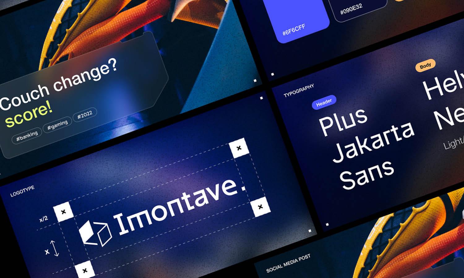
Typography in logo design is not just about choosing an attractive font; it's an integral part of conveying a brand’s personality and values. Best practices in logo design recommend selecting typefaces that reflect the brand's character while also ensuring legibility across various mediums.
When considering typography, think about the readability of the font at different sizes. A logo often needs to be scalable, appearing on large billboards as well as small business cards. The chosen font should maintain its clarity and impact at any size.
Also, consider the uniqueness of the font. Custom typefaces can help a logo stand out from the competition by adding a unique element to the brand’s visual identity. However, if opting for pre-existing fonts, select those that are less commonly used or modify them slightly to create a custom feel.
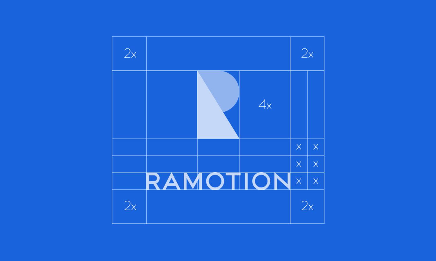
Balance is key when integrating typography with other logo elements. The text should complement and not overpower any imagery or symbols used in the logo. Additionally, alignment and spacing around the text should be carefully managed to ensure the logo looks cohesive and well-structured.
Finally, be mindful of the font’s connotations. Different styles convey different impressions—serif fonts often appear more traditional and trustworthy, while sans-serif fonts are perceived as modern and approachable. Choosing the right typeface can significantly influence how the audience perceives the brand, making typography a crucial component of effective logo design.
Test Scalability
Testing the scalability of a logo is an essential best practice in logo design, ensuring that the logo maintains its effectiveness and legibility across all sizes and applications. A scalable logo is one that looks as impressive on a billboard as it does on a business card or a mobile app icon. This flexibility is crucial for a consistent brand identity in various marketing materials and digital platforms.
To test scalability, begin by viewing the logo at different sizes and on various media. It should be recognizable and retain its visual impact whether it is enlarged for a storefront sign or reduced for a social media avatar. Pay close attention to the details of the design; intricate patterns or thin lines might get lost or become too dominant when the size changes.
Another aspect to consider is the logo's legibility in both digital and print formats. This includes testing the logo on different backgrounds to ensure it stands out and is easily identifiable in diverse settings. Use mock-ups to visualize how the logo performs in real-world scenarios, such as on merchandise, corporate stationery, or digital advertisements.
Incorporate Feedback
Incorporating feedback is a critical phase in the logo design process. Engaging clients, stakeholders, and target audience members in the feedback loop can provide invaluable insights that refine and improve the logo design. Best practices in logo design emphasize the importance of feedback as it helps ensure the logo resonates well with its intended audience and aligns with the brand’s objectives.
Start by presenting initial designs to a small group of stakeholders or potential customers. Pay attention to their reactions and comments, especially regarding the logo’s relevance, appeal, and message clarity. It’s important to approach this feedback with an open mind and consider constructive criticism as an opportunity for improvement rather than a setback.
Actively solicit specific feedback on various elements of the logo, such as color, typography, symbolism, and overall design appeal. This can be done through surveys, interviews, or focus group discussions. Use the insights gathered to make informed adjustments to the logo, enhancing its overall effectiveness and appeal.
Documenting all feedback and the changes made also provides a clear trail of the design evolution, which can be useful for final presentations to the client. It shows that the design decisions are thoughtful and responsive to input, which can strengthen the client’s trust and satisfaction with the final product.
Use Negative Space
Utilizing negative space creatively is a powerful technique in logo design. This approach involves making use of the background space within a logo to form an additional image or convey a hidden message. Effective use of negative space can make a logo not only more intriguing but also more memorable. Best practices in logo design highlight the importance of this technique for adding a layer of depth and sophistication to a logo.
When designing with negative space, it’s crucial to balance simplicity and cleverness. The FedEx logo is a classic example, where the negative space between the 'E' and 'x' forms an arrow, subtly suggesting speed and precision. This kind of design requires a meticulous approach to ensure that both the main image and the hidden message are clear and effective.
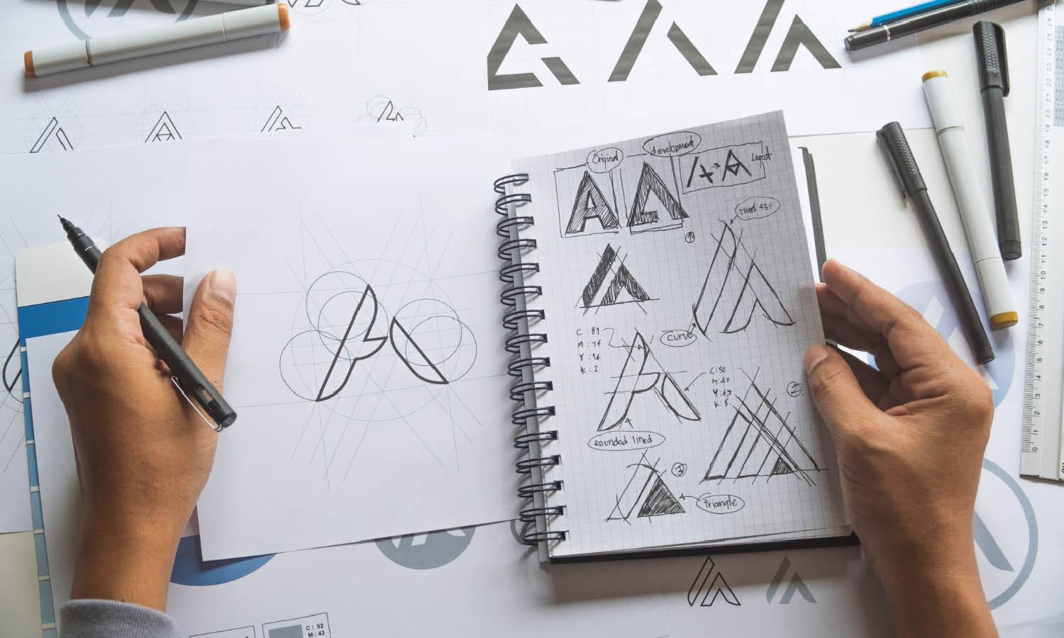
To master negative space, start by sketching out ideas that include both the positive elements (the main design) and the negative elements (the space around or between the main design). Experiment with different forms and see how they can interplay to create a dual image or message.

Source: Gabriel Eich, Pingo, Behance, https://www.behance.net/gallery/134193817/Pingo
Prioritize Originality
Originality in logo design is crucial in establishing a unique brand identity that stands out in a crowded marketplace. Best practices in logo design stress the importance of creating a logo that is not only distinctive but also relevant and reflective of the brand’s core values. An original logo serves as a strong foundation for a brand’s visual identity and helps in building brand loyalty.
To prioritize originality, begin by conducting thorough research on the industry, competitors, and target audience. This research will inform your design process, helping to avoid clichés and overused motifs within your industry. Instead, strive to find unique angles or perspectives that reflect the brand's personality.
Incorporating original design elements, whether through unique typographic treatments, innovative use of colors, or creative compositions, can set a logo apart. However, it’s important to ensure that these elements are not only original but also appropriate and resonant with the target audience.
Intellectual property considerations are also crucial; ensure that the logo does not infringe on existing trademarks, which could lead to legal issues and dilute the brand's integrity. Conducting a trademark search during the design process can safeguard against these risks.
Ultimately, an original logo not only captures the essence of the brand but also makes a lasting impression on consumers, enhancing brand recognition and value. Prioritizing originality is not just about being different; it’s about being authentically and memorably aligned with the brand’s identity.
Deliver Quality Files
Delivering quality files is a fundamental part of the logo design process, ensuring that the logo can be used effectively across all mediums and applications. Best practices in logo design dictate providing clients with a comprehensive set of file formats that cater to both digital and print needs. This ensures the logo remains consistent and high-quality in various usage scenarios.
The essential file types include vector files (such as AI or EPS), which are crucial for scaling the logo to any size without loss of quality. Vector files are indispensable for print materials where high resolution is needed. Additionally, provide raster files (like PNGs and JPEGs) for digital use, ensuring these are optimized for the web in terms of size and resolution.
It’s also important to include versions of the logo with transparent backgrounds, which are versatile for use on various overlays and backgrounds. Providing files in both RGB for digital media and CMYK for print ensures that the colors of the logo remain true to the brand’s palette in all reproductions.
Beyond file types, include different logo configurations if applicable—such as horizontal, vertical, and symbol-only versions. This variety allows for greater flexibility in how the logo can be deployed across different platforms and marketing materials.
Prepare Different Variations
Preparing different variations of a logo is critical to ensuring its versatility and applicability in various contexts. Best practices in logo design recommend creating multiple versions of a logo to accommodate different spatial and aesthetic needs. This approach not only enhances the brand's flexibility in deployment but also ensures the logo can adapt to changing brand strategies and media environments.
Begin by designing a full-color logo, which is the primary version. From there, create a monochrome version, which is particularly useful for applications where color printing is not feasible or when the logo needs to appear on backgrounds that demand a high-contrast visual. Additionally, consider creating inverted color variations for use on dark or busy backgrounds.
It’s also beneficial to prepare scaled-down versions of the logo. These should maintain legibility and impact when used at smaller scales, such as on social media icons or mobile apps. Simplifying elements or increasing spacing can help preserve the logo’s readability and identity at reduced sizes.
Another useful variation is responsive logos—logos that change in detail and complexity depending on their usage size. This could mean simplifying the logo or using only a component of it in smaller applications.
Providing clients with these variations ensures that they have a flexible set of tools to maintain brand consistency across all communications. Each version should be tested in its intended context to guarantee effectiveness, preserving the logo’s integrity and the brand’s image.
Conclusion
Finalizing a logo design requires a blend of creativity, strategic insight, and technical expertise. Following best practices in logo design ensures that the final product not only looks professional but also effectively communicates the brand's essence across various platforms. From leveraging the power of simplicity and versatility to choosing the right colors and typography, each step in the design process contributes to creating a memorable and impactful logo. Delivering quality files and preparing versatile variations further enhance the logo's functionality. By adhering to these guidelines, designers can craft logos that resonate with audiences and stand the test of time.
Let Us Know What You Think!
Every information you read here are written and curated by Kreafolk's team, carefully pieced together with our creative community in mind. Did you enjoy our contents? Leave a comment below and share your thoughts. Cheers to more creative articles and inspirations!


Leave a Comment