10 Tips to Use Multiple Logos on a Business Card

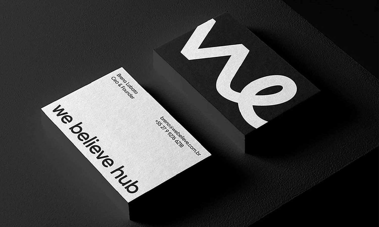
Source: Mr.Mockup, Business Card Mockups, Dribbble, https://dribbble.com/shots/18961757-Business-Card-Mockups
A business card is often the first physical impression someone receives from a brand. Because of its small size, every design element must be carefully planned, especially when more than one logo needs to appear on the same card. Many professionals today represent multiple brands, partnerships, or divisions, which makes using several logos on a single business card increasingly common.
However, placing multiple logos on a business card requires thoughtful design decisions. If the logos are not arranged properly, the card can quickly feel cluttered or confusing. A well-organized layout ensures that each logo remains clear, balanced, and visually appealing while still supporting the overall brand identity. When done correctly, a business card can communicate multiple brand connections without sacrificing readability or professionalism.
Designers must consider factors such as logo size, spacing, alignment, and visual hierarchy. These elements help guide the viewer’s eye and ensure that each logo has its own presence while still fitting within the limited space of a business card. Maintaining harmony between logos is essential so the card feels cohesive rather than overcrowded.
In this article, we will explore practical tips to help designers effectively use more than one logo on a business card. These ideas will help you create a layout that looks professional, balanced, and memorable.
Understand The Purpose Of Each Logo
When using multiple logos on a business card, the first step is understanding the purpose behind each logo. Every logo represents a brand, partnership, department, or organization, so it is important to determine why each one needs to appear on the card. A clear purpose helps you decide how prominently each logo should be displayed and prevents the business card from looking cluttered.
For example, a business card might include a personal brand logo along with a company logo. In another case, a consultant may represent several partner companies, each with its own logo. Identifying the role of every logo allows you to design the business card in a way that communicates these relationships clearly. Without this clarity, the card may confuse viewers rather than strengthen brand recognition.
It is also helpful to decide which logo is the primary identity. The main logo usually belongs to the individual or company whose contact information appears on the business card. Secondary logos can support the main brand but should not compete with it visually. This approach ensures that the most important logo receives the attention it deserves.
By defining the purpose of each logo early in the design process, you can create a business card layout that feels organized and intentional. The card will communicate multiple brand connections while still remaining professional and easy to understand. Clear planning makes it much easier to arrange logos effectively on a small business card.
Maintain A Clear Visual Hierarchy
A clear visual hierarchy is essential when placing multiple logos on a business card. Visual hierarchy refers to the way design elements guide the viewer’s attention. Because a business card has limited space, the logos must be arranged so the viewer can easily understand which brand is most important.
The primary logo should usually appear larger or in a more noticeable position on the business card. This logo represents the main identity associated with the contact details. Secondary logos can be placed slightly smaller or in supporting positions, such as near the bottom or on the back of the card. This arrangement keeps the design organized while allowing every logo to remain visible.
Size, placement, and spacing all contribute to hierarchy. A larger logo naturally draws the eye first, while smaller logos create supporting context. Designers often use alignment and grouping techniques to show relationships between logos. For example, partner logos can be placed in a row or grouped together in a consistent size.
Maintaining hierarchy also prevents the business card from appearing chaotic. If all logos are the same size and placed randomly, the design may feel overwhelming. Instead, a thoughtful hierarchy ensures that each logo plays a clear role within the layout.
By controlling visual hierarchy, designers can create a business card that highlights the most important logo while still presenting multiple brands in a professional and balanced way.
Keep The Business Card Layout Balanced
Balance plays a major role when placing multiple logos on a business card. Because a business card is small, even a few design elements can quickly make the layout feel crowded. A balanced design helps ensure that every logo fits naturally within the space while keeping the card visually pleasing and easy to read.
When arranging logos, consider how visual weight is distributed across the business card. Larger logos naturally attract more attention, so placing them thoughtfully prevents one side of the card from feeling heavier than the other. Designers often balance a large logo with smaller elements, such as text, icons, or additional logos, to maintain harmony across the layout.
Another effective approach is using symmetrical or asymmetrical balance. Symmetrical layouts place logos evenly on both sides of the business card, creating a clean and formal appearance. Asymmetrical layouts can also work well when elements are arranged creatively while still maintaining visual stability. Both methods can highlight each logo while keeping the card organized.
White space is also important for maintaining balance. Leaving enough space around each logo prevents the design from feeling cramped. This spacing helps the viewer focus on each logo individually while still understanding the overall structure of the business card.
A balanced layout ensures that multiple logos coexist without competing for attention. When the elements are distributed carefully, the business card looks professional, structured, and visually appealing.

Source: Andrew Wiseman, Jacket Brand Identity, Dribbble, https://dribbble.com/shots/19375750-Jacket-Brand-Identity
Use Consistent Spacing Between Logos
Consistent spacing is one of the simplest yet most important techniques when placing multiple logos on a business card. Without proper spacing, the logos may appear cluttered or difficult to distinguish. Maintaining even spacing between logos allows each one to remain clear while improving the overall readability of the business card.
Designers often rely on equal margins and alignment guides to create consistent spacing. By keeping a uniform distance between logos, the layout looks more intentional and organized. This technique also prevents one logo from appearing more crowded than another, which could unintentionally reduce its visual importance.
Spacing is especially important when logos differ in shape or orientation. Some logos may be wide and horizontal, while others are compact or vertical. Consistent spacing helps unify these differences, allowing the logos to coexist smoothly on the business card without disrupting the layout.
It is also helpful to maintain space between the logos and other elements on the card, such as contact information or graphic details. Giving each logo room to breathe ensures that the viewer can easily identify the brands represented on the business card.
By using consistent spacing, designers create a cleaner and more professional business card. Each logo becomes easier to recognize, and the entire layout feels more structured and visually comfortable to read.
Limit The Number Of Logos Displayed
One of the most important design decisions when creating a business card with multiple logos is limiting how many logos appear on the card. Even though a designer may want to represent several brands, too many logos can quickly overwhelm the small space of a business card. Keeping the number of logos reasonable helps maintain clarity and professionalism.
A business card should communicate information quickly. When viewers look at the card, they should immediately understand the main identity behind it. If the card contains too many logos, the design may feel cluttered and confusing. Instead of strengthening brand presence, an overloaded business card can make it harder for people to recognize each logo clearly.
Designers should focus on including only the most relevant logos. For example, the primary logo usually represents the individual or company listed on the business card. Supporting logos might represent partnerships, parent companies, or affiliated brands. By carefully selecting which logos are truly necessary, the design remains clean and focused.
Another advantage of limiting logos is improving readability. When there are fewer logos, each one can be displayed at a comfortable size without shrinking them too much. This ensures that every logo remains recognizable and visually strong.
A thoughtful approach to the number of logos helps create a business card that feels organized and effective. Instead of overwhelming the viewer, the design highlights the most important logos while keeping the overall layout simple and professional.
Choose Complementary Logo Sizes
Choosing complementary logo sizes is essential when placing multiple logos on a business card. Because each logo may have a different shape or style, adjusting their size helps create a harmonious layout. Proper sizing ensures that every logo remains visible without overpowering the rest of the design.
Typically, one logo should act as the primary visual element on the business card. This main logo is often slightly larger because it represents the primary brand or professional identity. Secondary logos can appear smaller while still remaining clear and readable. This size difference helps establish a visual hierarchy that guides the viewer’s attention.
Designers should also consider the proportions of each logo. Some logos are wide and horizontal, while others are compact or circular. Simply scaling every logo to the same width may not create a balanced result. Instead, adjust sizes based on how each logo visually occupies space on the business card.
Maintaining consistent proportions prevents logos from appearing distorted or awkward. It is important to scale logos proportionally so their original design integrity remains intact. Clear and well-sized logos reinforce professionalism and improve brand recognition.
When complementary sizes are used thoughtfully, the business card becomes easier to read and more visually appealing. Each logo plays its role within the layout, creating a balanced design that represents multiple brands effectively.

Source: Younique, Flanco Business Cards, Dribbble, https://dribbble.com/shots/15300424-Flanco-business-cards
Align Logos With The Card’s Grid System
Using a grid system is one of the most effective ways to organize multiple logos on a business card. A grid provides a structured framework that helps designers align elements consistently across the layout. When several logos appear on the same business card, alignment becomes especially important to maintain a clean and professional appearance.
A grid system divides the business card into evenly spaced columns or sections. This structure allows each logo to sit neatly within its own space while maintaining visual consistency. Instead of placing logos randomly, designers can position them along the grid lines to create a balanced and organized layout.
Alignment also improves readability. When logos follow a clear structure, the viewer can quickly understand how the different brands are related. For example, logos placed in a horizontal row may represent partners, while logos grouped in one area may represent affiliations. The grid helps communicate these relationships clearly.
Using a grid also helps maintain consistent spacing between logos, text, and other design elements. Contact information, icons, and decorative graphics can align with the same grid, making the entire business card feel cohesive. This consistency strengthens the visual structure of the card.
By aligning each logo within a grid system, designers can manage multiple elements without creating clutter. The result is a business card that looks organized, professional, and visually comfortable to read, even when it contains several logos.
Use Color Harmony For All Logos
Color harmony is another key factor when designing a business card that includes multiple logos. Because each logo may use different brand colors, combining them on a single card requires careful consideration. Without color harmony, the design may feel chaotic or visually overwhelming.
One helpful approach is to keep the background of the business card simple and neutral. A white, black, or subtle tone allows each logo to stand out clearly without competing with the background. This approach helps maintain visual balance while ensuring that each logo remains recognizable.
Designers should also consider how the colors of different logos interact with each other. If several logos use bold or bright colors, spacing and placement become even more important. Giving each logo enough breathing room prevents the colors from clashing visually.
Another technique is using monochrome or simplified versions of logos when appropriate. Some brands provide alternative logo variations that use a single color. These versions can create a more unified appearance on a business card while still representing each brand accurately.
Maintaining color harmony ensures that the overall design feels cohesive. Instead of competing for attention, each logo contributes to a balanced visual experience. A thoughtful use of color allows a business card to showcase multiple logos while still appearing clean, professional, and easy to read.
Place Logos Strategically On The Card
Strategic placement is essential when designing a business card that contains multiple logos. Because a business card has limited space, every element must be positioned carefully to maintain clarity and visual balance. Thoughtful placement ensures that each logo remains visible while supporting the overall design of the card.
One effective strategy is separating the primary logo from secondary logos. The main logo often appears near the top or center of the business card, where it naturally attracts attention. Supporting logos can be placed along the bottom edge, the corner of the card, or even on the back side. This arrangement allows the viewer to recognize the main brand first while still acknowledging additional affiliations.
Designers should also consider how the logo placement interacts with contact details. A business card must still prioritize important information such as the person’s name, job title, phone number, and website. Logos should enhance the design rather than compete with these essential details.
Using alignment and spacing helps reinforce strategic placement. For example, placing logos in a horizontal row or grouping them in one area can create a clear visual structure. This technique keeps the layout organized and prevents the design from feeling scattered.
When logos are placed thoughtfully, the business card communicates multiple brand connections without overwhelming the viewer. Strategic positioning ensures that each logo contributes to the design while maintaining a clean and professional layout.
Ensure Logos Remain Readable At Small Sizes
Readability is a critical factor when placing multiple logos on a business card. Since a business card is small, logos often need to be reduced in size to fit comfortably within the layout. If a logo becomes too small, it may lose important details and become difficult to recognize.
Designers should always test how each logo looks when scaled down. Some logos contain intricate shapes, thin lines, or small text that may not remain clear at smaller sizes. Simplified or alternate versions of a logo can sometimes work better on a business card because they maintain visibility even when reduced.
Vector logo files are especially helpful for maintaining clarity. Because vector graphics scale without losing quality, they ensure that the logo remains sharp and professional on the business card. Using high-quality files prevents pixelation and preserves the integrity of the design.
Contrast also plays an important role in readability. A logo should stand out clearly against the background color of the business card. Strong contrast helps ensure that even a smaller logo remains noticeable and easy to identify.
By focusing on readability, designers can confidently include multiple logos without sacrificing clarity. Each logo remains recognizable, and the business card continues to deliver a strong and professional first impression.
Let Us Know What You Think!
Every information you read here are written and curated by Kreafolk's team, carefully pieced together with our creative community in mind. Did you enjoy our contents? Leave a comment below and share your thoughts. Cheers to more creative articles and inspirations!


Leave a Comment