How To Prepare Logo Designs For Prints

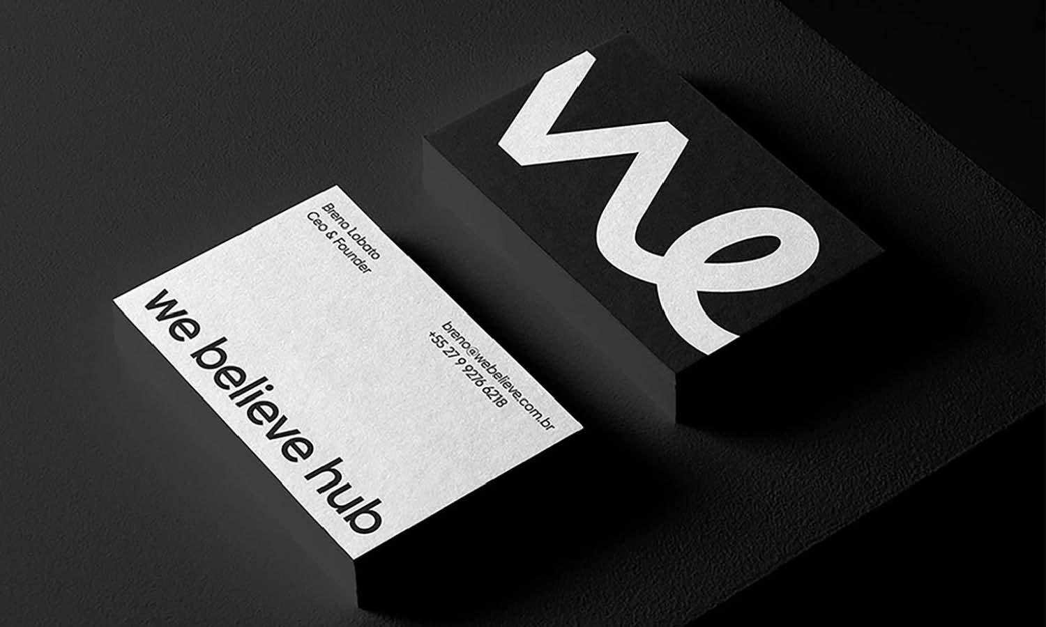
Source: Mr.Mockup, Business Card Mockups, Dribble, https://dribbble.com/shots/15091771-Business-Card-Mockups
Preparing logo designs for prints is a crucial step for any designer or business aiming to maintain brand consistency across various physical media. Whether it's for business cards, promotional materials, or large banners, ensuring that your logo accurately represents your brand in print is essential. This process involves understanding the technical aspects of print design, including color fidelity, resolution, and material specifics. By mastering these elements, you can prevent common printing pitfalls that might compromise your design's effectiveness and aesthetic appeal.
Moreover, adapting your logo for different print formats requires attention to detail and an understanding of how prints are produced. From selecting the appropriate file formats to understanding the impact of different printing techniques, every decision plays a pivotal role in how the final product will look. This guide will provide you with essential tips and techniques to ensure that your logo designs translate flawlessly from digital to print, maintaining the integrity and impact of your brand’s visual identity.
Use Vector Files
When preparing logo designs for prints, one of the most critical steps is to utilize vector files. Unlike raster images, which are made up of pixels and can lose clarity when scaled, vector graphics are composed of paths or strokes based on mathematical expressions. This allows them to be resized without any loss of quality, ensuring that your logo remains sharp and clear at any size, from a tiny stamp to a massive billboard.
Vector formats such as Adobe Illustrator's AI, CorelDRAW's CDR, or the universal EPS and SVG, are industry standards for print because they provide flexibility in editing and scalability. These file types preserve the integrity of your design's lines and shapes, allowing for precise adjustments and color changes without degradation.
Moreover, using vector files simplifies the printing process. Printers can easily manipulate vector files to suit different materials and methods, reducing the risk of errors and misprints. For logo designs that need to make a strong and lasting impression in printed form, vector files are not just a recommendation; they are a necessity. Embracing vector graphics from the beginning of your design process will save time, reduce printing issues, and result in a professional-looking product that faithfully represents your brand.
Maintain Simplicity
Simplicity is a key principle in designing logos that are intended for print. A simple logo design not only ensures that it is memorable and easily recognizable but also guarantees that it will print well across various applications and sizes. Complex logos with intricate details can lose their clarity when printed, especially on smaller scales such as promotional pens or business cards.
To achieve simplicity, focus on minimalistic design elements that convey your brand’s message clearly and directly. Use clean, uncluttered lines and limit the number of colors and fonts to enhance readability and reproduction quality. This doesn't mean your logo has to be stark or boring; instead, it should be distilled to its most essential form.
A straightforward logo design is also more versatile for use in both digital and print media. It adapts better to different backgrounds and textures and is easier to reproduce in various printing methods, whether offset, digital, or screen printing. Additionally, a simple logo is often more timeless and less likely to require redesigns as trends change.
When designing, repeatedly test and refine your logo to ensure it maintains its effectiveness and intent at all sizes. Removing unnecessary elements can often strengthen a brand's identity, making the logo more impactful. By maintaining simplicity, you ensure your logo remains functional and aesthetically pleasing in any printed form.
Use Contrasting Colors
Utilizing contrasting colors is a fundamental design principle, especially crucial when preparing logo designs for prints. Contrast enhances the visibility and legibility of your logo, making it more impactful and easier to recognize at a glance. This is particularly important for print media, where distinct colors help your logo stand out against varied backgrounds and textures.
When choosing colors for your logo, consider how they interact. Colors that contrast strongly with each other, like black and white or blue and yellow, can make your logo more readable and visually appealing. On the other hand, similar colors or those with low contrast can blend into one another, reducing visibility, especially in smaller prints.
Incorporating contrasting colors also involves understanding color psychology and its effect on brand perception. Colors evoke emotions and can convey your brand’s attributes effectively if chosen wisely. For instance, red evokes excitement and passion, while blue can denote trust and dependability.
Always test your color choices in the actual material and size of your final print product. This testing can prevent potential issues, such as colors that appear vibrant on screen but muddy or indistinct in print. Consulting with a print professional can also provide insights into how different colors behave on different print substrates.

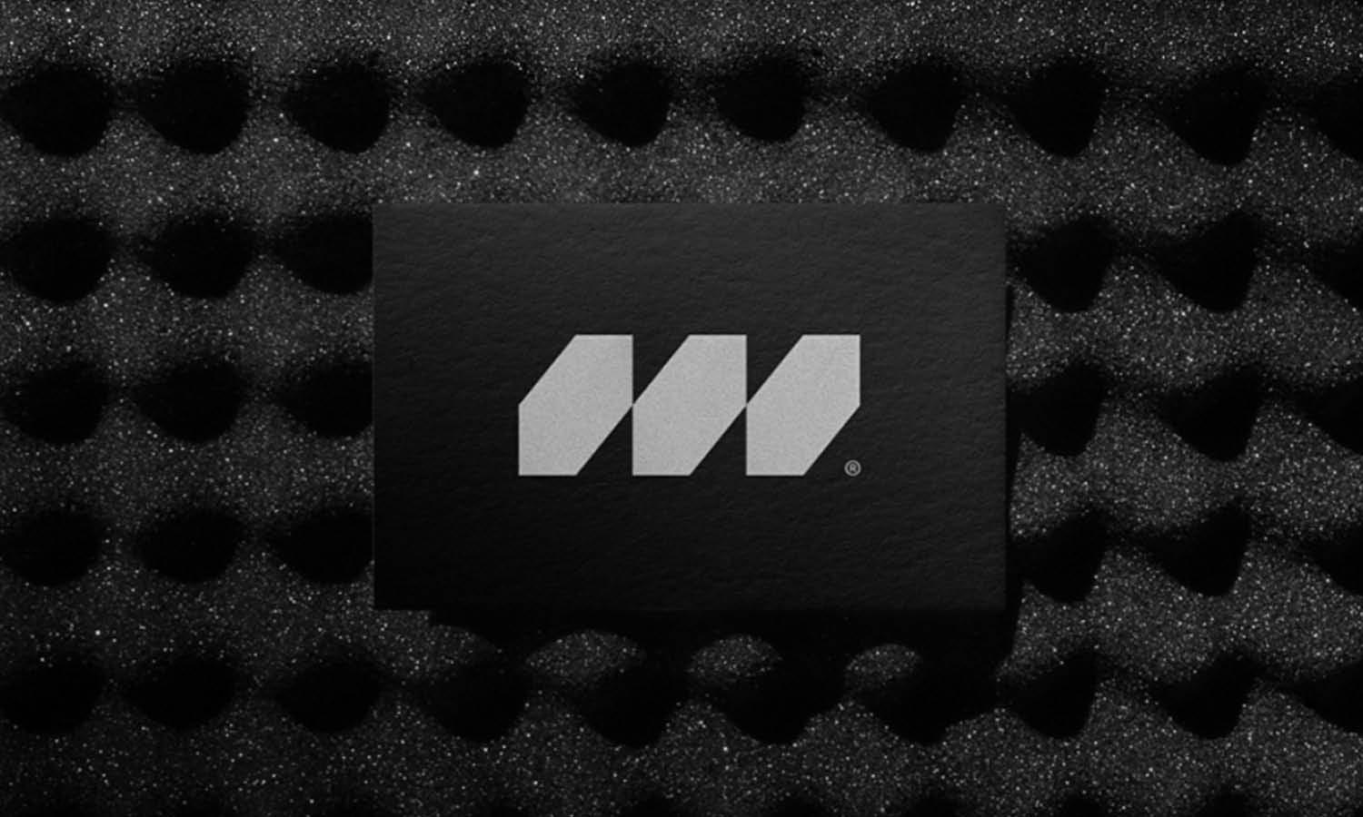
Soruce: Mr.Mockup, Corporate Stationary Mockups, Dribble, https://dribbble.com/shots/15758098-Corporate-Stationery-Mockups
Avoid Thin Lines and Intricate Details
When designing logos intended for print, it is crucial to avoid thin lines and intricate details. Such elements may look appealing on digital screens but can pose significant challenges in print, where they may not render correctly, leading to a loss of detail and potentially diminishing the logo's effectiveness.
Thin lines might break up or become invisible when printed, especially at smaller sizes. Intricate details can also blend together, causing the logo to appear muddled and unclear. To ensure your logo remains legible and impactful, opt for bolder, cleaner lines that maintain their integrity across various print methods and scales.
Additionally, consider the printing process itself. Different techniques, such as screen printing or offset, have varying levels of precision. Some methods are better suited for simple, bold designs, while others can handle more complexity. Knowing the limitations and capabilities of these printing techniques can guide your design decisions, ensuring a successful reproduction of your logo.
Before finalizing your logo, conduct print tests on different types of materials and scales. These tests can help identify any potential issues with line weight or detail that may not be evident on a computer screen. Adjustments based on these tests can greatly improve the final look of your printed logo.
Select the Right Color Mode
Choosing the right color mode is fundamental when preparing logo designs for prints. Digital designs are typically created in RGB (Red, Green, Blue), the color mode native to electronic displays. However, the print industry predominantly uses CMYK (Cyan, Magenta, Yellow, Black) color mode, which is essential for accurately producing print materials.
The transition from RGB to CMYK can significantly impact the appearance of your logo if not managed correctly. Colors that appear vibrant on your monitor may not translate directly to print, often resulting in muted or off-tint outputs. This discrepancy occurs because RGB has a wider color gamut than CMYK, meaning some colors simply cannot be replicated using standard printing inks.
To ensure your logo's colors are consistent and effective in print, always convert your design to CMYK as part of your preparation. This allows you to preview and adjust the colors specifically for print output, reducing surprises during the printing process. For best results, it's advisable to consult with your printer on the color settings they recommend and even run a few test prints to see how your colors appear on the chosen material.
Understanding and utilizing the correct color mode is not just about aesthetic fidelity—it’s about brand consistency across all platforms and media. By selecting the right color mode for prints, you ensure that your logo maintains its intended impact, no matter where it appears.
Consider the Print Size
When preparing logo designs for prints, considering the size at which your logo will be displayed is essential. A logo must be versatile, scalable, and legible across all sizes and mediums, from the smallest stationery to the largest billboard. This adaptability ensures that your brand is consistently recognized and represented, regardless of where it appears.
Before finalizing your logo design, it is crucial to plan for different print sizes. For smaller items like business cards, ensure that the logo is visible and distinctive without overwhelming the space. Conversely, for larger formats like banners or posters, the logo should be impactful and legible from a distance. This may require adjusting elements such as line thickness, spacing, and size of text within the logo to maintain clarity and effectiveness.
Additionally, consider the technical limitations of printing processes. Some details that are clear in a digital format may not translate well to print, especially at varying sizes. It's beneficial to test print your logo at several scales to identify any issues that could affect its presentation. Communicating with your printer can also provide insights into what works best for different formats and materials, ensuring that your logo always looks its best.
Incorporate Bleed
Incorporating bleed into your logo design is an essential step when preparing it for print. Bleed refers to a margin outside the final trim size of your printed piece where the design extends, ensuring there are no unprinted edges in the final product. This is particularly crucial for items like business cards, brochures, or any printed material where your logo will be near the edge.
The standard bleed size is typically 1/8 inch (about 3mm) beyond each edge of the design. This extra space allows for slight discrepancies that can occur during the cutting process of printing. Without a bleed, minor shifts in the production process could result in unwanted white edges, making your final product look unprofessional.
To set up bleed correctly, extend the background color or any design elements that touch the edge of your artwork through the bleed area. This setup is particularly important for logos that use vibrant backgrounds or have important graphical elements that reach the edge of the design.
Ensuring that your design files are set up with proper bleed is straightforward but critical. Most graphic design software tools offer guides on how to set up bleeds. Additionally, always double-check with your printer for their specific requirements, as bleed dimensions can vary slightly based on the printing process and machinery used.

Source: Bonumo, Business Cards Design, Dribble, https://dribbble.com/shots/19756115-Business-Cards-Design
Check Resolution
When preparing logo designs for prints, ensuring the resolution is high enough is critical for achieving sharp and clear results. Resolution in printing is measured in DPI (dots per inch), with 300 DPI being the standard for high-quality print output. Logos with lower resolution can appear blurry, pixelated, or washed out when printed, which can significantly undermine the professional appearance of your branding materials.
To ensure your logo maintains its quality in print, start by creating or exporting your design at 300 DPI or higher. This applies particularly if the logo will be used in large formats, such as banners or posters, where high resolution is even more crucial to avoid quality loss when scaled up.
When handling vector logos, resolution concerns are less of a problem because vectors are resolution-independent and maintain clarity at any size. However, if your logo design includes raster images, pay careful attention to their original resolution and avoid scaling beyond their current size.
Before sending your logo to print, it's a good practice to check the resolution by printing a test piece at the actual size it will be used. This allows you to inspect the logo's clarity and make any necessary adjustments. Also, consult with your printer about their specific resolution requirements, as different printing techniques might demand different DPI settings to achieve the best results.
Prepare Multiple File Types
When preparing logo designs for print, providing multiple file types is crucial to accommodate different printing technologies and requirements. This preparation ensures that your logo can be reproduced accurately, whether it’s for digital printing, screen printing, offset lithography, or specialty processes.
The most common file types for print include PDF, EPS, TIFF, and sometimes high-resolution PNG. Each format serves a unique purpose:
PDF is widely accepted for its ability to maintain high quality and compatibility across various devices and printing services.
EPS is preferred for large-scale prints and specialty items because it supports vector graphics, ensuring that your logo remains crisp and clear at any size.
TIFF offers high resolution with detailed image data, making it suitable for high-quality print jobs.
PNG can be useful for digital proofs due to its transparency support, although it’s not typically used for professional printing.
In addition to selecting the right file types, it’s important to include all necessary variations of your logo. This includes different color schemes (full color, black and white, grayscale) and configurations (horizontal, vertical, icon-only) to provide flexibility depending on the print context.
Consult with your printing service to understand their specific requirements. They may need files set with particular color profiles, resolutions, or other settings to ensure the best outcome. Providing comprehensive file preparations not only facilitates a smoother printing process but also enhances the final quality of your printed materials, faithfully reflecting your brand’s visual identity.
Test on Different Materials
Testing your logo on various materials is an essential step in the print preparation process, ensuring that your design maintains its quality across different substrates. Each material—from paper and cardstock to textiles and plastics—reacts differently to ink and printing techniques, which can significantly affect the appearance of your logo.
For instance, a logo that looks vibrant on a glossy brochure might appear dull when printed on a matte finish or fabric. This variance can be due to the material's absorbency, texture, and color, which can alter how colors and details are perceived. By testing your logo on the intended materials beforehand, you can anticipate these changes and adjust your design accordingly.
It’s also important to consider the environmental conditions the material will be exposed to, such as outdoor elements for banners or frequent handling for business cards. Some materials may require specific inks or printing processes to ensure longevity and color fastness.
Collaborating with your printer can provide valuable insights into the best practices for each material type. Printers can recommend adjustments to your logo design, such as increasing contrast or adjusting color saturation, to compensate for material characteristics.
Conclusion
Preparing your logo for print is a crucial step in maintaining your brand's integrity across various materials and formats. By following best practices such as using vector files, selecting the right color modes, and testing on different materials, you ensure that your logo design translates effectively from screen to print. Additionally, understanding the importance of file types and resolutions helps in achieving the highest quality in your printed outputs. These efforts culminate in a logo that not only looks professional but also resonates with your audience consistently, reinforcing your brand's identity wherever it appears.
Let Us Know What You Think!
Every information you read here are written and curated by Kreafolk's team, carefully pieced together with our creative community in mind. Did you enjoy our contents? Leave a comment below and share your thoughts. Cheers to more creative articles and inspirations!


Leave a Comment